
Introduction
In recent years, the popularity of creative web design has soared. Designers and developers are continually exploring new ways to make websites more visually appealing and engaging for users. Among the various elements that contribute to an eye-catching web design, HTML cards have become a favorite choice for displaying content in a stylish and organized manner.
HTML and CSS play a crucial role in creating these visually appealing web components. By combining the structural power of HTML with the styling capabilities of CSS, designers can create beautiful, interactive, and responsive web elements that enhance the overall user experience. This blog post delves into the world of creative HTML cards, providing insights and a step-by-step guide to creating your own stunning designs.
Understanding Creative HTML Cards
HTML cards are versatile design elements used in modern web design to present content in a visually appealing and organized manner. These cards typically contain images, text, and links, and can be customized to fit various styles and purposes. The modular nature of HTML cards allows for easy reuse and adaptation, making them a popular choice for showcasing content on websites.
Importance in Modern Web Design:
- Visual Appeal: HTML cards add a clean, structured look to web pages, making content more engaging.
- Organized Presentation: Cards help break down information into manageable, digestible chunks.
- Responsive Design: HTML cards can be easily styled to adapt to different screen sizes, enhancing the user experience across devices.
- Interactivity: Cards can incorporate interactive elements such as hover effects, animations, and links, making them dynamic and engaging.
Benefits of Using HTML Cards for Showcasing Content:
| Benefit | Description |
|---|---|
| Modularity | HTML cards are modular, allowing for easy reuse and consistency across a website. This modularity also simplifies the development process, as individual cards can be styled and updated independently. |
| Flexibility | Cards can be customized to suit various content types, including articles, product listings, profiles, and more. This flexibility makes them suitable for a wide range of applications in web design. |
| Enhanced User Experience | By organizing content into cards, users can quickly scan and find the information they need. Interactive features such as hover effects and animations further enhance the user experience by making the interface more engaging. |
| Improved SEO | Well-structured HTML cards can improve a website’s search engine optimization (SEO) by providing clear, organized content that is easy for search engines to index. |
HTML cards are not only functional but also aesthetically pleasing, making them a valuable component in modern web design. They provide a balance between form and function, allowing designers to create visually compelling layouts that also enhance usability. As web design continues to evolve, the use of HTML cards is likely to grow, offering even more innovative ways to present content effectively.
2. Analyzing the CodePen Example
The provided CodePen example showcases stylish HTML cards that demonstrate effective use of HTML, CSS, and JavaScript to create visually appealing and interactive elements.
Introduction to the provided CodePen example showcasing stylish HTML cards:
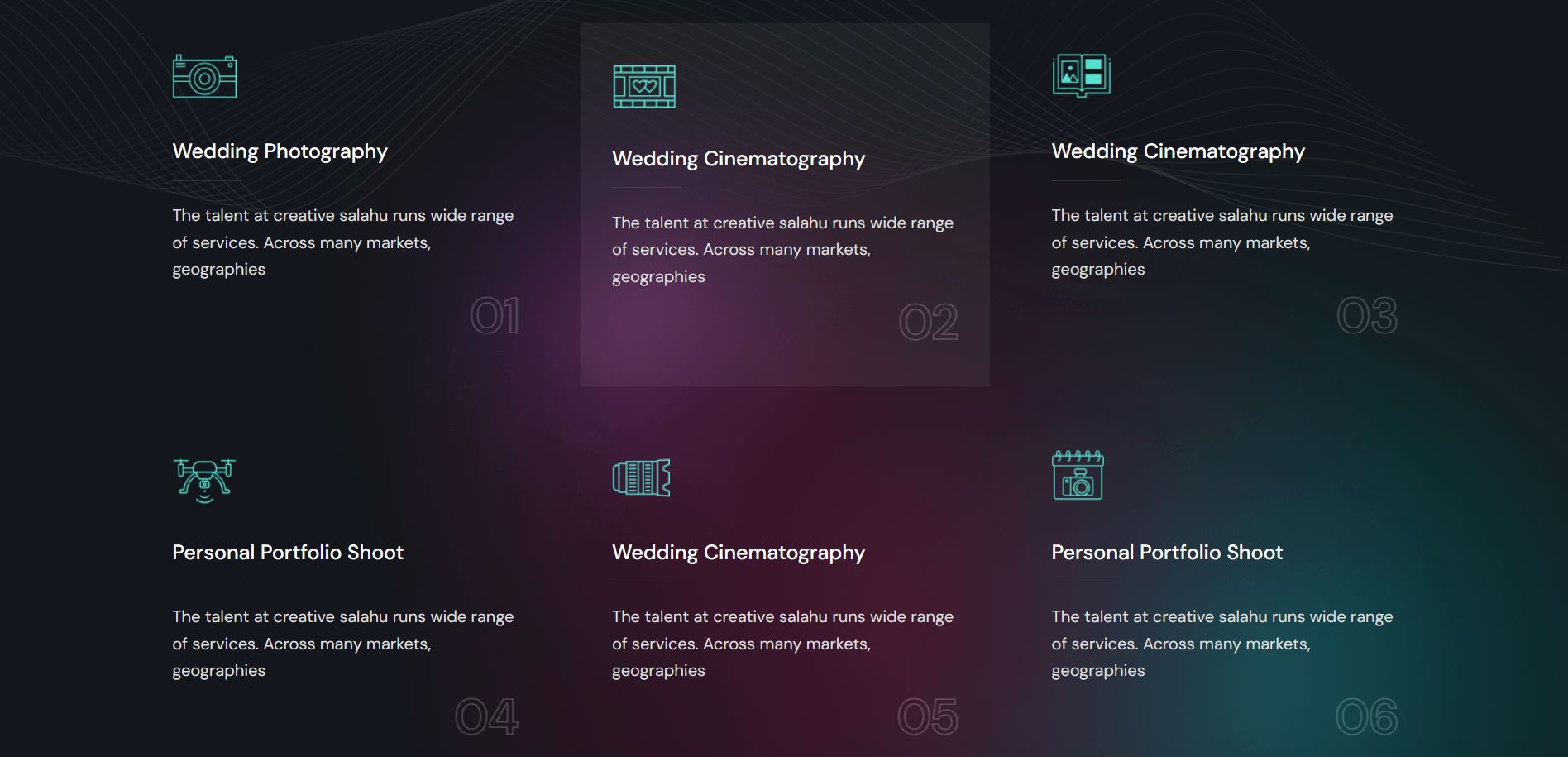
The CodePen example features a series of HTML cards designed to highlight various services or portfolio items. Each card includes a distinct icon, a heading with a clickable link, a brief description, and a count indicator. These elements are styled to enhance visual appeal and user engagement.
Highlight of the structure of the HTML markup and the corresponding CSS styles:
The HTML structure consists of multiple div elements with classes like card-column and card-details, each containing nested elements such as card-icon, card-heading, card-description, and card-count. These elements are styled using CSS classes defined in the accompanying style.css file, which controls layout, colors, fonts, and hover effects.
Overview of the JavaScript functionality for interactive card behavior:
The JavaScript code enhances the interactivity of the cards by adding a hover effect. When a user hovers over a card, it activates the active class on that card, highlighting it. This functionality is achieved using jQuery to toggle classes and manage the visual state of the cards dynamically.
By dissecting this example, developers can gain insights into creating similar HTML card layouts that are both aesthetically pleasing and functional, making it a valuable resource for learning and inspiration in web design.
See the Pen
Creative HTML Cards | Style 2 by CreativeSalahu (@CreativeSalahu)
on CodePen.
Design Breakdown: Key Elements
In this section, we will discuss the key design elements of the HTML cards featured in the CodePen example. These elements include the card layout structure, styling details, and interactive effects achieved through CSS transitions.
Card Layout Structure:
The card layout structure is crucial for organizing content in a visually appealing manner. The design uses a combination of columns and rows to arrange the cards:
- Columns and Rows: The cards are organized within a container that contains a row. Each row holds multiple card columns, ensuring that the cards are evenly distributed and aligned. This layout is achieved using Flexbox for a flexible and responsive design.
- Responsive Design: The layout adapts to different screen sizes, ensuring that the cards look great on both desktop and mobile devices. Media queries are used to adjust the number of columns and the card sizes based on the screen width.
Styling Details:
The visual appeal of the cards is enhanced through careful styling of backgrounds, fonts, and icons:
- Background: The cards have a transparent background with a subtle background image applied to the entire section. This adds depth and texture to the design. Additionally, active cards have a slightly darker background to differentiate them from inactive ones.
- Fonts: The design uses the “DM Sans” font for a clean and modern look. Font sizes, weights, and line heights are carefully chosen to ensure readability and visual hierarchy.
- Icons: Each card includes an icon representing the service offered. The icons are styled with a maximum size to ensure they fit well within the card layout without overpowering the other elements.
Interactive Effects on Hover:
Interactivity is a key aspect of making the cards engaging. CSS transitions are used to create smooth hover effects:
- Hover Effects: When a user hovers over a card, the background color and the icon image transition smoothly to indicate the active state. This effect is achieved using CSS transitions on the background-color and transform properties.
- Active State: The active card has distinct styling to make it stand out. The heading text color and the underline width change on hover, providing a visual cue to the user.
.card-details:hover .card-heading:after {
    width: 100%;
    background-color: #43ffec;
}
.card-details .card-details--inner .card-icon img {
    transition: all 0.5s ease-in-out;
}
By carefully combining layout structure, styling details, and interactive effects, the design of these HTML cards achieves a balance between aesthetics and functionality. The result is a set of visually appealing and engaging web components that enhance the overall user experience.
Step-by-Step Implementation Guide
In this section, we will provide a step-by-step guide to implement the HTML cards as showcased in the CodePen example. This guide includes setting up the HTML structure, adding CSS styles for layout and responsiveness, and implementing JavaScript for interactive hover effects.
Step 1: Setting up the HTML Structure
Begin by creating the HTML structure for the cards. Each card is placed within a column, and columns are grouped within a row inside a container. Here is the basic HTML setup:
<section class="creative-cards style-one">
    <div class="container">
        <div class="row">
            <div class="card-column">
                <div class="card-details">
                    <div class="card-details--inner">
                        <div class="card-icon">
                            <img class="light-icon" src="icon1.png" alt="icon" />
                        </div>
                        <div class="card-detail">
                            <h3 class="card-heading"><a href="#">Service Title</a></h3>
                            <p class="card-description">Service description here</p>
                            <h6 class="card-count">01</h6>
                        </div>
                    </div>
                </div>
            </div>
            <!-- Repeat for additional cards -->
        </div>
    </div>
</section>
Step 2: Adding CSS Styles for Card Layout and Responsiveness
Next, add the CSS styles to create the card layout and ensure responsiveness. This involves defining styles for the container, rows, columns, and individual card elements:
<style>
body {
    font-size: 17px;
    line-height: 30px;
    font-weight: 400;
    font-family: "DM Sans", sans-serif;
    margin: 0;
    background-color: #13161C;
    background-image: url('background.png');
    background-repeat: no-repeat;
    background-size: auto;
}

.creative-cards {
    padding: 115px 0;
    background-image: url('texture.png');
    background-size: contain;
    background-position: top center;
    background-repeat: no-repeat;
}

.container {
    max-width: 1300px;
    margin: 0 auto;
    padding: 0 15px;
}

.row {
    display: flex;
    flex-wrap: wrap;
}

.card-column {
    flex: 0 0 33.333%;
    padding: 0 15px;
    margin-bottom: 30px;
}

.card-details {
    padding: 30px;
    transition: all 0.5s ease-in-out;
    background: transparent;
}

.card-details.active {
    background-color: rgba(221, 221, 221, 0.06);
}

.card-details--inner {
    display: flex;
    flex-direction: column;
    gap: 40px;
}

.card-icon img {
    max-width: 70px;
    max-height: 50px;
    transition: all 0.5s ease-in-out;
}

.card-heading {
    font-size: 20px;
    font-weight: 500;
    margin: 0 0 15px;
    color: #fff;
    transition: all 0.5s ease-in-out;
}

.card-heading a {
    text-decoration: none;
    color: #fff;
}

.card-heading:after {
    content: '';
    display: block;
    width: 67px;
    height: 1px;
    background-color: rgba(255, 255, 255, 0.1);
    transition: all 0.5s ease-in-out;
}

.card-details:hover .card-heading:after {
    width: 100%;
    background-color: #43ffec;
}

.card-description {
    font-size: 16px;
    line-height: 26px;
    color: #DDDDDC;
    margin: 0;
}

.card-count {
    font-size: 48px;
    font-weight: 600;
    text-align: right;
    -webkit-text-stroke: 1px rgba(255, 255, 255, 0.2);
    -webkit-text-fill-color: transparent;
    margin: 0;
}

/* Responsive Styles */
@media (max-width: 992px) {
    .creative-cards {
        padding: 60px 0;
    }
    .card-column {
        flex: 0 0 50%;
        margin-bottom: 40px;
    }
}

@media (max-width: 480px) {
    .card-column {
        flex: 0 0 100%;
        margin-bottom: 20px;
    }
}
</style>
Step 3: Implementing JavaScript for Interactive Hover Effects
Finally, add JavaScript to enable interactive hover effects on the cards. This can be done using jQuery for simplicity:
<script src="https://code.jquery.com/jquery-3.6.0.min.js"></script>
<script>
$(document).ready(function(){
    $('.card-details').mouseenter(function(){
        $(this).addClass('active');
        $('.card-bg').removeClass('active');
    }).mouseleave(function(){
        $(this).removeClass('active');
        $('.card-bg').addClass('active');
    });
});
</script>
By following these steps, you can create stylish and interactive HTML cards that enhance the visual appeal and user experience of your website. The combination of HTML for structure, CSS for styling, and JavaScript for interactivity allows you to build dynamic and engaging web components.
5. Enhancing Functionality with JavaScript
JavaScript plays a crucial role in enhancing user interaction on websites by enabling dynamic behaviors and responsive elements. It allows developers to create engaging and interactive experiences that exceed the capabilities of static content.
Explain the role of JavaScript in enhancing user interaction:
JavaScript empowers developers to add interactive features to web pages, such as hover effects, animations, form validations, and dynamic content updates. These functionalities provide immediate feedback to users, making the browsing experience more intuitive and engaging.
Code snippet for adding interactive hover effects using jQuery:
<script src="https://code.jquery.com/jquery-3.6.0.min.js"></script>
<script>
$(document).ready(function(){
    $('.card-details').mouseenter(function(){
        $(this).addClass('active');
        $('.card-bg').removeClass('active');
    }).mouseleave(function(){
        $(this).removeClass('active');
        $('.card-bg').addClass('active');
    });
});
</script>
This jQuery snippet demonstrates how to implement interactive hover effects on HTML cards. When a user hovers over a card with the class card-details, the script adds the active class to highlight the card and removes the active class from other cards with the class card-bg. This simple yet effective functionality enhances visual feedback and improves user interaction with the cards.
By leveraging JavaScript and libraries like jQuery, developers can create dynamic and responsive web components that elevate the overall usability and appeal of their websites.
6. Responsive Design Considerations
Responsive design is a critical aspect of modern web development, ensuring websites adapt seamlessly to various devices and screen sizes. It involves creating flexible layouts and fluid designs that adjust dynamically based on the user’s viewport.
Importance of responsive design in modern web development:
Responsive design addresses the diverse ways users access the web today, from smartphones and tablets to desktop computers. It ensures that websites maintain functionality, readability, and visual appeal across different devices, enhancing user experience and engagement.
Media queries for adapting the card layout across different screen sizes:
<style>
/* Base styles for cards */

/* Larger screens (desktops and laptops) */
@media (min-width: 992px) {
    .card-column {
        flex: 0 0 33.333%;
        padding: 0 15px;
    }
}

/* Medium screens (tablets) */
@media (max-width: 991px) {
    .card-column {
        flex: 0 0 50%;
        padding: 0 15px;
    }
}

/* Small screens (phones) */
@media (max-width: 480px) {
    .card-column {
        flex: 0 0 100%;
        padding: 0 15px;
    }
}
</style>
These media queries adjust the card layout based on screen size breakpoints. On larger screens, cards occupy one-third of the container width per column, optimizing space. For medium screens like tablets, cards span 50% width to maintain readability and aesthetics. On smaller screens such as phones, cards stack vertically to fit narrower viewports, ensuring content remains accessible and user-friendly.
By integrating responsive design principles and utilizing media queries effectively, developers enhance accessibility and usability across diverse devices, delivering a consistent and enjoyable browsing experience to all users.
7. Conclusion
In conclusion, creative HTML cards are powerful elements in modern web design, offering numerous benefits that enhance both visual appeal and user experience. By utilizing HTML, CSS, and JavaScript effectively, developers can create engaging and interactive components that elevate the overall quality of websites.
Recap the benefits of using creative HTML cards in web design:
- Enhanced visual presentation of content.
- Improved user engagement through interactive elements.
- Organized and structured display of information.
- Scalability and adaptability across different devices.
- Facilitation of creative and innovative design solutions.
We encourage readers to explore and experiment with the provided CodePen example to gain insights into implementing stylish HTML cards on their own projects. This example not only showcases the potential of HTML cards but also demonstrates the integration of CSS for styling and JavaScript for adding interactive hover effects.
Final thoughts on leveraging HTML, CSS, and JavaScript for creative web projects:
As demonstrated throughout this blog post, the combination of HTML, CSS, and JavaScript offers limitless possibilities for creating dynamic and visually appealing web components. Whether you are a beginner or an experienced developer, mastering these technologies allows you to innovate and deliver compelling web experiences that captivate users.
By leveraging creative HTML cards and harnessing the power of frontend technologies, you can transform your web design projects into immersive and impactful digital solutions.
8. Call to Action
We invite you to explore more design inspirations and interactive examples on platforms like CodePen. These platforms provide a wealth of resources and ideas that can spark creativity and innovation in your own projects.
Feel free to experiment with the provided CodePen example showcasing creative HTML cards:
Additionally, you can discover professional services and collaborate with us through:
We encourage you to share your experiences and creations, and don’t hesitate to reach out for customized web design solutions that meet your specific needs. Let’s transform your ideas into stunning realities together!