
In the dynamic realm of web design, intuitive navigation stands as a cornerstone for engaging user experiences. The ability for visitors to seamlessly traverse a website not only facilitates exploration but also fosters a sense of satisfaction and efficiency. In this introductory segment, we delve into the critical role of intuitive navigation within web design and offer an overview of how creating horizontal menu tabs can significantly enhance the overall user experience.
Importance of Intuitive Navigation in Web Design
Navigating a website should be a fluid and effortless experience for users. Intuitive navigation eliminates confusion and frustration, guiding visitors towards their desired destinations with ease. Whether browsing a blog, shopping for products, or exploring a portfolio, users expect intuitive navigation to aid their journey and facilitate interaction.
Overview of Creating Horizontal Menu Tabs for Improved User Experience
Horizontal menu tabs present a visually appealing and organized approach to website navigation. By condensing navigation options into a sleek horizontal bar, users can quickly access different sections of a website without cluttering the interface. In this post, we’ll explore the process of creating horizontal menu tabs using HTML, CSS, and jQuery, offering insights and techniques to elevate the user experience and streamline navigation.
Join us as we embark on a journey to enhance your website’s navigation and delight your visitors with intuitive horizontal menu tabs. Let’s dive in!
Understanding Horizontal Menu Tabs
Horizontal menu tabs serve as a fundamental element in website navigation, offering users a clear and organized pathway to explore various sections of a website. In this section, we’ll delve into the concept of horizontal menu tabs, exploring their role in website navigation and the benefits they bring to organizing content effectively.
Explanation of Horizontal Menu Tabs and Their Role in Website Navigation
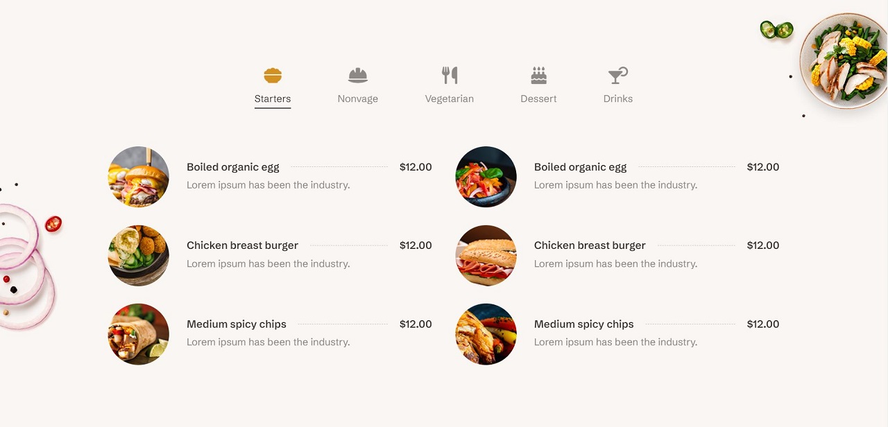
Horizontal menu tabs, also known as tabbed navigation or tab menus, are a user interface design pattern commonly used to present navigation options horizontally across the top of a webpage. Each tab typically represents a different section or category of content within the website. When clicked or tapped, the corresponding content associated with the tab is displayed to the user, providing quick access to relevant information.
Horizontal menu tabs streamline navigation by condensing multiple options into a compact and visually appealing format. This approach not only conserves screen real estate but also ensures that users can easily identify and access different sections of a website without overwhelming the interface.
Benefits of Using Horizontal Menu Tabs for Organizing Content
- Clear Organization: Horizontal menu tabs provide a clear and structured layout for organizing content, making it easy for users to locate specific information within the website.
- Enhanced Visual Hierarchy: By visually grouping related content under distinct tabs, horizontal menu tabs establish a clear hierarchy of information, guiding users towards relevant sections of the website.
- Space Efficiency: Horizontal menu tabs conserve screen space by presenting navigation options in a compact horizontal bar, allowing more room for displaying content on the page.
- Intuitive Navigation: The familiar tabbed interface mimics the navigation patterns found in desktop applications, offering users an intuitive and seamless browsing experience.
- Improved User Engagement: With quick and easy access to different sections of the website, users are more likely to explore additional content, leading to increased engagement and interaction.
By understanding the role and benefits of horizontal menu tabs, web designers can leverage this versatile navigation pattern to create user-friendly websites that facilitate effortless exploration and discovery. In the following sections, we’ll explore techniques for implementing and customizing horizontal menu tabs using HTML, CSS, and jQuery. Let’s dive deeper into the world of web design and navigation!
Setting Up Your Project
See the Pen
Horizontal Menu Tabs using Html, Css and Jquery by CreativeSalahu (@CreativeSalahu)
on CodePen.
Before diving into the intricacies of creating horizontal menu tabs, it’s essential to ensure that your project is properly set up with the necessary tools and technologies. In this section, we’ll provide an introduction to the tools and technologies needed, followed by a step-by-step guide to creating the basic HTML structure for the menu tabs.
Introduction to the Tools and Technologies Needed
To create horizontal menu tabs, you’ll need a basic understanding of HTML, CSS, and jQuery. Here’s a brief overview of each:
- HTML (Hypertext Markup Language): HTML provides the structure and content of your web page. It defines the elements and their relationships, such as headings, paragraphs, links, and lists.
- CSS (Cascading Style Sheets): CSS is used to style and layout HTML elements. It allows you to control the appearance of your web page, including colors, fonts, spacing, and positioning.
- jQuery: jQuery is a fast, small, and feature-rich JavaScript library that simplifies DOM manipulation and event handling. It provides a convenient way to add interactivity and animations to your web page.
Creating the Basic HTML Structure for the Menu Tabs
Follow these steps to create the basic HTML structure for your horizontal menu tabs:
- Start with a New HTML File: Open your preferred text editor and create a new HTML file.
- Add the HTML Boilerplate: Begin your HTML file with the standard boilerplate structure, including the
<!DOCTYPE html>declaration,<html>,<head>, and<body>tags. - Link External CSS Stylesheet: Within the
<head>section of your HTML file, link an external CSS stylesheet using the<link>tag. This will allow you to apply custom styles to your menu tabs. - Link jQuery Library: Similarly, include a link to the jQuery library within the
<head>section of your HTML file. You can either download the jQuery library and host it locally or use a CDN link. - Create the Menu Tabs: Within the
<body>section of your HTML file, create the basic structure for your menu tabs using unordered lists (<ul>) and list items (<li>). Each list item will represent a tab in your horizontal menu.
With the basic HTML structure in place, you’re now ready to move on to the next steps of styling and adding interactivity to your horizontal menu tabs. In the following sections, we’ll explore techniques for customizing the appearance and behavior of your menu tabs using CSS and jQuery. Let’s continue our journey toward creating dynamic and engaging web experiences!
Styling Your Menu Tabs with CSS
With the basic HTML structure in place, it’s time to enhance the visual appeal and usability of your horizontal menu tabs using CSS. In this section, we’ll cover how to apply CSS styles for layout and visual design, as well as making your menu tabs responsive for different screen sizes.
Applying CSS Styles for Layout and Visual Design
- Reset CSS: Start by resetting default browser styles to ensure consistency across different browsers. This can be achieved using a CSS reset stylesheet or a few reset rules.
- Container Styles: Apply styles to the container element holding your menu tabs to set the width, height, padding, and margin.
- Menu List Styles: Style the unordered list (
<ul>) to remove default list styling and apply a horizontal layout. - Menu Tab Styles: Style the list items (
<li>) to enhance their appearance, including background color, text color, padding, and margins.
Making the Menu Tabs Responsive for Different Screen Sizes
- Media Queries: Use CSS media queries to apply different styles based on the device’s screen size. Define breakpoints where the layout or styling should change to accommodate smaller screens.
- Responsive Layout: Adjust the layout and styling to ensure the menu remains user-friendly on mobile devices. This may involve stacking the tabs vertically and increasing touch target sizes.
By applying these CSS styles, your horizontal menu tabs will not only look visually appealing but also function effectively across a range of devices and screen sizes. In the next section, we’ll explore how to add interactivity to your menu tabs using jQuery, making them more dynamic and engaging for users. Let’s continue enhancing our web project!
Adding Interactivity with jQuery
With your horizontal menu tabs now styled beautifully with CSS, it’s time to add interactivity using jQuery. In this section, we’ll explore how to use jQuery for dynamic interactions and animations, making your menu tabs more engaging and responsive to user actions.
Utilizing jQuery for Dynamic Interaction with the Menu Tabs
jQuery simplifies the process of adding dynamic behaviors to your web elements. By using jQuery, you can easily select elements, handle events, and create animations. Here, we’ll focus on how to make your menu tabs interactive so that content changes smoothly when a tab is clicked.
Writing jQuery Code to Handle Tab Interactions and Animations
- Include jQuery in Your Project: Make sure you have included the jQuery library in your HTML file. You can use a CDN for convenience:
- Basic jQuery Setup: Write your jQuery code inside a document ready function to ensure it runs after the DOM is fully loaded:
- Tab Interaction: Write jQuery code to handle click events on the menu tabs. When a tab is clicked, the corresponding content should be displayed, and the previously active tab’s content should be hidden.
- Initial Setup: Ensure that the first tab is active and its content is visible when the page loads:
- HTML Structure for Tab Content: Your HTML should have corresponding content sections for each tab. Each section should have an ID that matches the
hrefattribute of the tab links:
By implementing this jQuery code, you can create a seamless and dynamic interaction for your horizontal menu tabs. Users will enjoy a smooth transition between content sections, enhancing their overall experience on your website.
In the next section, we’ll explore techniques for enhancing the user experience further by optimizing animations and ensuring accessibility across all devices. Let’s continue building a more interactive and user-friendly web project!