
Introduction
In today’s digital landscape, a hero section plays a pivotal role in shaping a website’s first impression and user experience. It serves as a visually striking introduction that instantly captures visitors’ attention and conveys essential information about the brand or service.
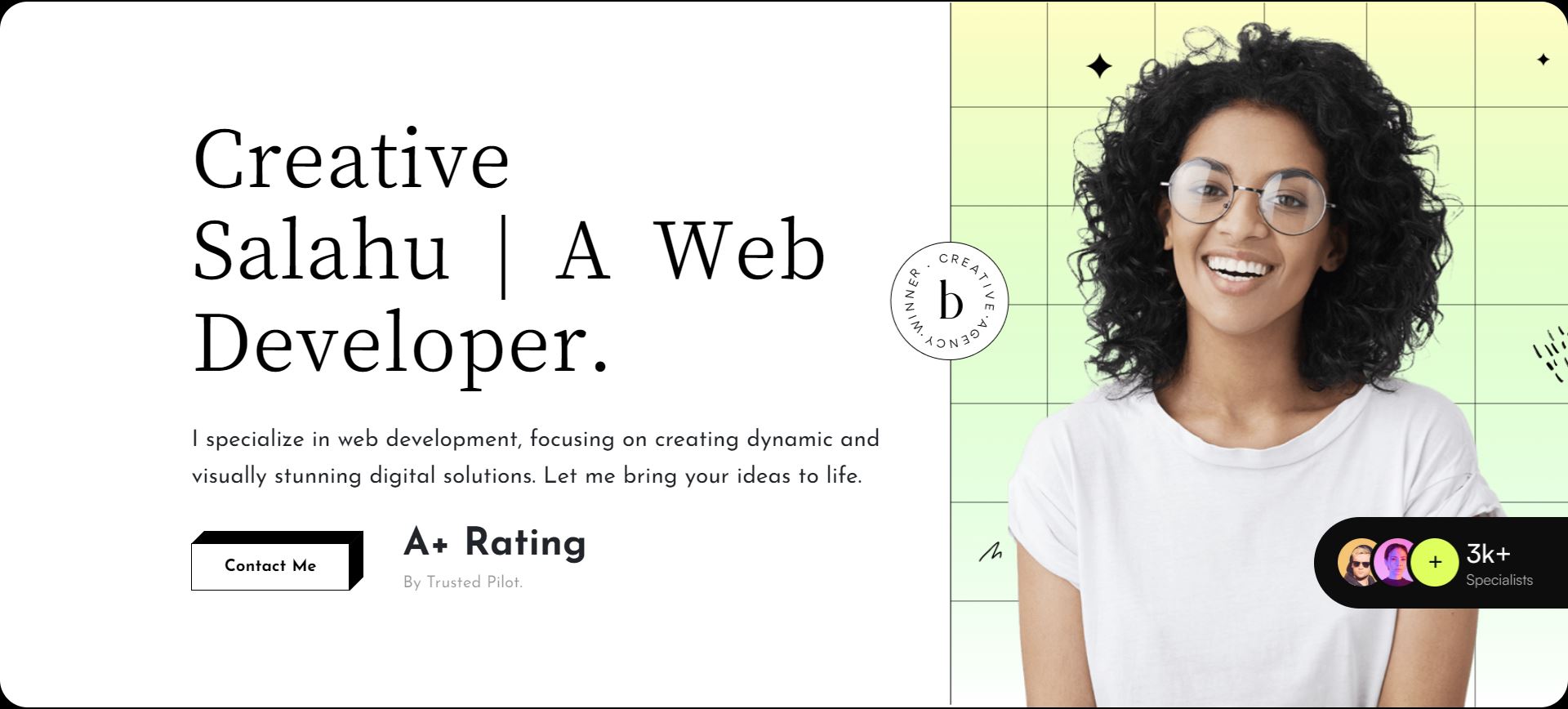
The provided CodePen example showcases a meticulously crafted HTML structure and CSS styling tailored for a digital agency’s hero section. This example demonstrates effective use of layout grids, responsive design principles, and aesthetic elements to enhance user engagement and brand identity.
Understanding the Hero Section Components
Creating an effective hero section involves a structured approach to HTML markup and CSS styling. Let’s delve into the specific components used in the provided CodePen example:
Breakdown of HTML structure:
-
- The hero section is encapsulated within a
<section>tag with classes that define its styling, such as.creative-hero--section. - Within the section, nested
<div>elements are employed for organizing content. This structure aids in maintaining clarity and modularity within the codebase. - Key HTML tags utilized include:
<h1>: Used for the main headline or title of the hero section. In this example, it displays “Creative Salahu | A Web Developer.”<p>: Represents paragraphs of text, used here to provide a brief description of the web developer’s specialization.<a>: This anchor tag serves as a call-to-action button, inviting users to “Contact Me” via a hyperlink.
- The hero section is encapsulated within a
CSS styling overview:
The CSS styles applied to the hero section are crucial for achieving a cohesive and visually appealing design. Here’s an overview of the CSS classes and their significance:
| Class | Description |
|---|---|
.creative-hero--section |
Defines overarching styles for the hero section, including background colors, borders, and positioning. |
.hero-section--bg |
Applies background styles to create a visually distinct area within the hero section. In this case, it sets a white background with rounded corners. |
.hero-content |
Controls the styles for the main content area within the hero section, managing text alignment, spacing, and other visual aspects. |
.creative-cta--wrap |
Wraps the call-to-action button and additional content, ensuring proper alignment and spacing. |
Specific styles applied within these classes include:
-
-
- Typography: Font sizes, styles, and weights to enhance readability and visual hierarchy.
- Backgrounds: Utilization of background images or colors to complement the content and brand identity.
- Button Design: Styling of the call-to-action button to make it stand out, including hover effects for interactivity.
-
This structured HTML and CSS approach not only ensures a well-organized codebase but also contributes to a polished and professional presentation of content, effectively capturing the audience’s attention and encouraging engagement.
See the Pen
Creative HTML Hero Section — Digital Agency by CreativeSalahu (@CreativeSalahu)
on CodePen.
Exploring Design and Layout
Designing a compelling hero section involves careful consideration of layout, responsiveness, and visual elements. Let’s explore how these aspects are implemented in the provided CodePen example:
Layout Design:
The hero section utilizes a grid system akin to Bootstrap, leveraging classes such as .container, .row, and .col-lg-6 to achieve a structured layout:
-
-
.container: Provides a responsive fixed-width container to centralize content and maintain consistency across different screen sizes..row: Acts as a flex container for organizing grid columns, ensuring proper alignment and spacing..col-lg-6: Specifies column widths based on the viewport size (here, large screens), optimizing content placement and readability.
-
Responsive Design Considerations:
The hero section is designed to be responsive, adapting seamlessly to various device sizes. This responsiveness is achieved through media queries, which adjust styles based on viewport dimensions:
-
-
- Media queries like
@media (max-width: 1399px),@media (max-width: 981px), and@media (max-width: 767px)are employed to modify layout, typography, and other CSS properties for optimal viewing on tablets, smartphones, and desktops. - This ensures that content remains accessible and visually appealing across a wide range of devices, enhancing user experience.
- Media queries like
-
Visual Elements:
The hero section incorporates visual elements that enhance its aesthetic appeal and reinforce brand identity:
-
-
- Background Images: Utilizes CSS to set background images that complement the content and evoke a sense of professionalism. Backgrounds are strategically chosen to avoid visual clutter and maintain focus on the main content.
- Decorative Shapes: CSS is used to position decorative shapes within the hero section, enhancing visual interest without overshadowing the main content.
- Image Positioning: Images within the hero section, such as the avatar and decorative shapes, are positioned using CSS properties like
position: absolute;andz-index. This ensures precise placement and layering, contributing to the overall design harmony.
-
By integrating these design and layout principles, the hero section not only captures attention but also reinforces the digital agency’s branding and professionalism, making a lasting impression on visitors.
CSS Techniques for Enhanced User Engagement
Effective CSS techniques can significantly enhance user engagement within a hero section. Here’s how animation and transitions are utilized in the provided CodePen example:
Animation Effects:
The hero section employs the @keyframes rule to create a subtle yet impactful fade-in effect:
-
-
- The
@keyframes fadeInLeftanimation gradually increases the opacity of elements from 0% to 100% while simultaneously translating them horizontally, providing a smooth entrance for content as the page loads. - This animation is applied to elements like the main heading (
<h1>) and paragraph text (<p>), enhancing visual appeal and capturing user attention. - Timing functions and delays can be adjusted within
@keyframesto fine-tune animation speed and synchronization with other page elements.
- The
-
Transition Effects on Hover:
Interactive elements such as buttons benefit from transition effects that activate when users hover over them:
-
-
- Buttons styled with CSS classes like
.creative-cta-btn autilize thetransitionproperty to smoothly animate changes in background color and text color upon hover. - This subtle effect provides visual feedback, indicating to users that the button is clickable and encouraging interaction.
- Transition durations and easing functions can be adjusted in CSS to achieve desired responsiveness and user experience.
- Buttons styled with CSS classes like
-
These CSS techniques not only add aesthetic appeal but also improve usability by guiding user interaction and enhancing overall engagement within the hero section. By combining animation and transitions thoughtfully, the digital agency can create a dynamic and memorable experience for website visitors.
Optimization and Performance Tips
Optimizing the hero section is crucial for ensuring fast loading times and a smooth user experience. Here are some best practices to consider:
Minimizing HTTP Requests by Consolidating CSS:
-
-
- Combine CSS Files: Merge multiple CSS files into a single file to reduce the number of HTTP requests required to load stylesheets. This consolidation improves load times, especially on initial page load.
- Use CSS Minification: Minify CSS files by removing unnecessary whitespace, comments, and redundant code. This reduces file size, further optimizing load speed without impacting functionality.
- Utilize Browser Caching: Leverage caching mechanisms to store CSS files locally on users’ devices. This minimizes server requests for subsequent visits to the website, enhancing overall performance.
-
Ensuring Images are Optimized for Web Use:
-
-
- Image Compression: Use tools to compress and optimize images without compromising quality. Smaller file sizes reduce bandwidth usage and accelerate page loading times.
- Choose Appropriate Formats: Select the most suitable image formats (e.g., JPEG, PNG, SVG) based on content and use case. SVGs are ideal for scalable graphics, while JPEGs and PNGs are suitable for photographs and illustrations, respectively.
- Implement Lazy Loading: Employ lazy loading techniques to defer the loading of images until they are needed, such as when they enter the viewport. This strategy conserves bandwidth and speeds up initial page rendering.
-
Considering Performance Impacts of Animations and Transitions:
-
-
- Opt for CSS Animations: Prefer CSS animations over JavaScript-based alternatives whenever possible. CSS animations are typically smoother and more performant, leveraging hardware acceleration for better efficiency.
- Limit Animation Complexity: Keep animations simple and lightweight to avoid excessive CPU and GPU usage, which can lead to slower performance on lower-end devices.
- Test and Refine: Continuously monitor and optimize animations and transitions to ensure they contribute positively to user experience without compromising page load speed or responsiveness.
-
By implementing these optimization strategies, the digital agency can create a high-performing hero section that delivers a seamless and engaging user experience. Prioritizing speed and efficiency not only enhances user satisfaction but also contributes to improved search engine rankings and overall website performance metrics.
Conclusion
Creating an impactful HTML hero section is crucial for establishing a strong first impression and engaging users effectively. Here’s a recap of the key elements discussed:
-
-
- Structured HTML and CSS: Utilize semantic HTML tags and well-defined CSS classes to organize content and apply consistent styling across devices.
- Grid System and Responsive Design: Implement a responsive grid system like Bootstrap’s to ensure optimal layout and usability on various screen sizes.
- Visual Elements and Animation: Incorporate visually appealing elements, such as background images and CSS animations, to enhance aesthetic appeal and user engagement.
- Optimization Techniques: Minimize HTTP requests, optimize images, and carefully consider the performance implications of animations and transitions to improve load times and user experience.
-
As digital agencies strive to differentiate themselves in a competitive landscape, experimentation and customization are essential:
-
-
- Experiment with different layouts, color schemes, and content strategies to find what resonates best with your target audience.
- Customize the hero section to reflect your agency’s unique brand identity and core values, ensuring consistency across all digital touchpoints.
-
Apply the insights gained from optimizing your hero section to enhance your own digital agency website:
-
-
- Implement responsive design principles to cater to mobile users effectively.
- Optimize images and CSS to improve page loading times and overall performance.
- Continuously refine and iterate based on user feedback and analytics data to achieve optimal results.
-
By focusing on these elements and embracing a mindset of continuous improvement, digital agencies can create compelling hero sections that not only captivate visitors but also drive conversions and support business growth.
Start transforming your digital agency website today by applying these proven strategies and watch as your online presence evolves into a powerful marketing asset.
Final Thoughts
Continual improvement is the cornerstone of successful web design. In today’s dynamic digital landscape, staying ahead requires not only keeping up with the latest trends and technologies but also continuously refining user experiences.
By embracing a mindset of continual improvement in web design:
-
-
- You can adapt to evolving user preferences and behaviors, ensuring your website remains relevant and engaging.
- Regular updates and optimizations help enhance usability, accessibility, and overall performance, leading to improved user satisfaction and retention.
- Feedback from analytics, user testing, and customer interactions provides valuable insights that drive informed design decisions and iterative enhancements.
-
As you embark on your journey to elevate your digital agency’s online presence, remember that every improvement, no matter how small, contributes to a more impactful and memorable user experience.
Stay tuned for more insightful articles and resources on web design techniques, trends, and best practices. Explore my profiles for further inspiration and collaboration:
Thank you for joining me on this journey towards creating exceptional web experiences. Let’s continue to innovate and inspire through thoughtful and effective web design.