Text borders in WordPress can add an extra layer of visual appeal to your content, making it easier for your readers to digest information. Whether you’re working on a blog post, a landing page, or an online portfolio, incorporating text borders can enhance the overall design and readability of your content. In this guide, we’ll walk you through what text borders are and how you can effortlessly include them in your WordPress site. Let’s dive in!
Why Use Text Borders?

Text borders are more than just decorative elements; they serve a practical purpose on your web pages. Here are some great reasons to consider using text borders:
- Enhanced Readability: Borders can help distinguish different sections of your text, making it easier for readers to follow along.
- Visual Appeal: A well-placed border can make your content look polished and professional, enhancing the overall aesthetic of your website.
- Highlighting Important Information: Utilizing borders to enclose critical information like quotes or calls to action can grab your audience’s attention.
- Brand Identity: Customizing text borders can align with your brand’s colors and style, reinforcing your visual identity.
- Responsive Design: Text borders are adaptable to various screen sizes, ensuring that your content looks great on both desktop and mobile devices.
Incorporating text borders could be just what you need to elevate your content and engage your audience more effectively! Stay tuned as we explore how to implement these features in your WordPress posts.
Methods to Add Text Borders in WordPress

Adding text borders in WordPress can greatly enhance the visual appeal of your content, making it stand out and guiding the reader’s attention to important information. Fortunately, there are several methods to achieve this effect, and you don’t need to be a coding whiz to do it! Let’s explore some common methods:
- Using Custom CSS: If you’re comfortable with a bit of code, Custom CSS is a powerful way to add borders around your text. This method allows you to customize the border’s color, style, and size.
- Utilizing Page Builders: Popular page builders like Elementor or Beaver Builder come with built-in border features. You can easily adjust the borders for your text blocks with a few clicks.
- WordPress Block Editor: Since the introduction of the Block Editor (Gutenberg), adding borders has become increasingly accessible. With its block-based approach, you can add borders to text elements without any coding knowledge.
- Plugins: There are various WordPress plugins dedicated to styling text and other elements. These plugins usually offer additional features for customizing borders, shadows, and other effects.
Each of these methods offers its own unique advantages, so you can choose the one that best suits your needs and comfort level. Ready to start adding borders? Let’s dive into using the WordPress Block Editor!
Using the WordPress Block Editor (Gutenberg)

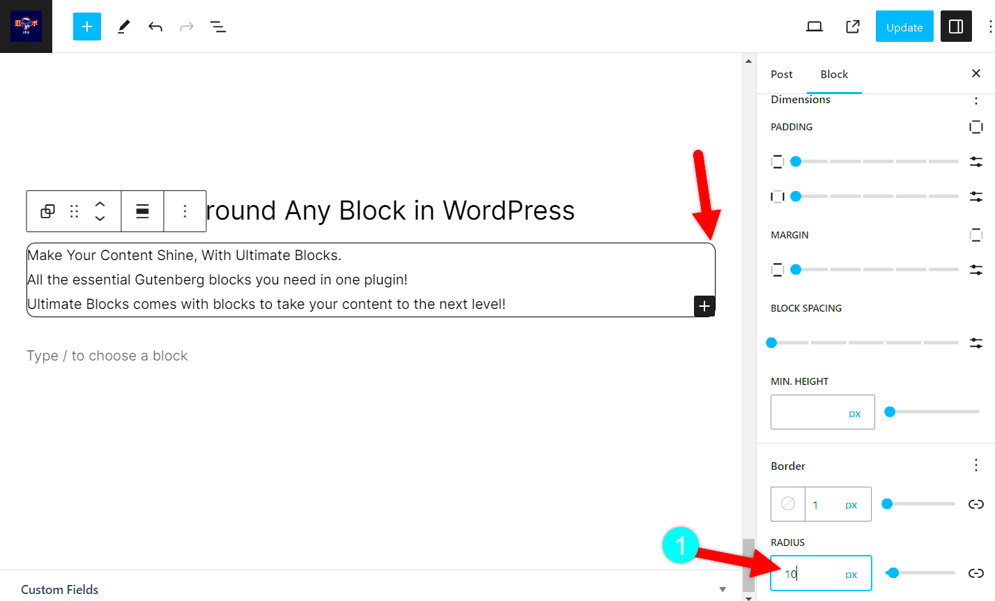
The WordPress Block Editor, commonly known as Gutenberg, revolutionized how we create and format content on WordPress. Adding text borders with Gutenberg is user-friendly and simple! Here’s how to do it in just a few steps:
- Create a New Block: Start by adding a new post or editing an existing one. Click on the + icon to insert a new block. You can choose from various blocks such as Paragraph, Heading, or Quote.
- Access Block Settings: Once you’ve created your text block, select it. On the right-hand sidebar, you’ll see the Block settings. This is where the magic happens!
- Add a Border: Look for the ‘Advanced’ section in the block settings. Here, you can add custom CSS classes that you’ll use to define your text border.
- Custom CSS: Now, navigate to Appearance > Customize > Additional CSS in your WordPress dashboard. Here’s a simple CSS code snippet you can use:
.my-custom-border { border: 2px solid #FF5733; /* Change the color and thickness as needed */ padding: 10px; /* Add some space around the text */ border-radius: 5px; /* Optional: round the corners */ } - Save and Publish: Once you’ve added the custom CSS, return to your post and apply the custom class you created earlier. Hit ‘Publish’ or ‘Update’, and voilà! Your text block now has a beautiful border.
There you have it! That’s how you can effortlessly add text borders using the Gutenberg editor. This method gives you maximum control without the steep learning curve of coding. Want to explore more design options? Keep experimenting!
Custom CSS for Text Borders

If you’re looking to add a personal touch to your WordPress website, using Custom CSS for text borders can be an effective solution. Not only does it give you full control over how your text looks, but it also offers a way to stand out in the ever-growing online space. Here’s how you can add custom text borders using CSS:
First off, you’ll want to access the Customizer. Go to your WordPress dashboard, then navigate to Appearance > Customize. From there, you find the option for Additional CSS. This is where the magic happens!
Here’s a simple example of how you can add a border around your text:
h1 { border: 2px solid #000; /* Solid black border */ padding: 10px; /* Space between border and text */ border-radius: 5px; /* Rounded corners */}In this example:
- h1: This is the HTML tag you want to style (you can change this to h2, p, etc., depending on your needs).
- border: You can customize the thickness, style, and color of the border.
- padding: This adds some space between the text and the border for a cleaner look.
- border-radius: This gives it a sleek, rounded appearance.
Once you’ve added your custom CSS, hit Publish and see your text borders come to life! Custom CSS is not just flexible; it’s a great way to learn more about front-end design!
Plugins for Adding Text Borders
If diving into CSS feels daunting, fear not! WordPress also offers a plethora of plugins that can help you add text borders with minimal effort. These plugins are designed for users of all skill levels, making it easier to create beautiful text designs without needing to know code. Here are some highly-rated plugins you might consider:
| Plugin Name | Description | Key Features |
|---|---|---|
| Ultimate Addons for Gutenberg | This plugin extends the functionality of the WordPress block editor. |
|
| CSS Hero | A premium plugin that allows you to customize your site visually. |
|
| Elementor | A popular page builder with robust customization options. |
|
Using these plugins can save you time and simplify the process of adding text borders and other design elements. Just install your chosen plugin, and follow its intuitive interface to style your text according to your vision. Happy customizing!
Styling Your Borders: Tips and Best Practices
Adding text borders in WordPress can enhance the visual appeal of your content, but it’s essential to style them thoughtfully. Here are some tips and best practices to ensure your borders elevate your design rather than clutter it.
- Choose the Right Width: Borders come in all shapes and sizes. Opt for a width that complements your text without drawing too much attention away from the content. A 1px to 3px border is usually a safe bet.
- Color Matters: Select a color that contrasts with your background but harmonizes with the overall palette of your website. Using a brand color can help maintain consistency.
- Experiment with Styles: Don’t shy away from trying different border styles, like dashed or dotted lines. This can add an inviting touch to your text. Consider using CSS properties for borders:
border-style: dashed;can create a playful look. - Use Padding Wisely: Make sure to include adequate padding inside the border. This creates space between the text and the border, making it easier to read and visually more appealing.
- Test Across Devices: Always preview your borders across different devices and screen sizes. What looks great on a desktop may not necessarily have the same impact on mobile.
Lastly, keep in mind that less can often be more. A well-styled border should enhance your content, not overwhelm it. Stay consistent and apply these best practices, and you’ll be on your way to creating an aesthetically pleasing design!
Responsive Design Considerations
In today’s digital landscape, making your WordPress site responsive is not just an option; it’s a necessity. As you incorporate text borders into your design, consider how they will behave on various devices. Here are some key points to keep in mind regarding responsive design:
- Fluid Widths: Instead of fixed widths for your borders, consider using percentages. This allows borders to adjust naturally with the size of the screen. For example, setting a border width as a percentage could help maintain a proportional look.
- Media Queries: Utilize CSS media queries to tailor border styles for different devices. With this approach, you can modify border thickness or even hide them entirely on smaller screens if necessary.
- Typography Scaling: Scale your font sizes along with your borders. Keeping your text and borders proportionate ensures that they don’t look awkward or out of place on smaller screens.
- Test Across Multiple Devices: After you’ve made adjustments, test your website on various devices—including smartphones, tablets, and desktops. Emulators can be helpful, but nothing beats real-world testing.
- Performance Considerations: Make sure that added borders don’t slow down your site. Heavy images or intricate designs might impact loading times, so find the right balance.
Responsive design isn’t just a trend; it’s a fundamental aspect of web development. By considering these responsive design aspects when adding text borders, you’ll ensure your website looks great no matter where it’s being viewed. With a little effort, you can accommodate all users, enhancing aesthetics and functionality at the same time!
Common Issues and Troubleshooting
When adding text borders in WordPress, you may encounter a few common issues. These can range from styling not showing up correctly to borders overlapping with other elements. Let’s dive into some typical problems and how to troubleshoot them effectively.
- CSS Not Applying: Sometimes, the CSS styles may not reflect on your site. Make sure to check that:
- You have added the CSS code to the correct stylesheet.
- The class or ID you are targeting matches the HTML structure of your post or page.
- You clear your browser cache or any caching plugins on your site.
- Borders Overlapping with Other Elements: If your text border seems to run into other content, consider adjusting the margin or padding. You can fix this by:
- Inspecting the element using the browser’s developer tools.
- Modifying the margin and padding settings in your CSS to create more space.
- Responsive Issues: Borders can look different on mobile devices. To ensure a responsive design:
- Use media queries in your CSS to adjust border properties for various screen sizes.
- Test your site on different devices to ensure borders behave as expected.
- Conflicts with Other Plugins: Certain plugins may override your styles. If this happens:
- Temporarily disable plugins to identify conflicts.
- Consider custom CSS solutions that are more specific to counteract the conflicting styles.
By being aware of these common issues and knowing how to troubleshoot them, you can enhance your experience while adding text borders in WordPress!
Conclusion and Final Thoughts
Adding text borders in WordPress is a fantastic way to elevate the visual appeal of your content. By following the tips and methods outlined in this guide, you can easily customize borders to suit your website’s design. But remember, the key to a polished look lies in a bit of experimentation and fine-tuning.
To recap, here are some important takeaways:
- Utilize the right tools: Whether it’s through the Gutenberg editor, page builders, or custom CSS, the right tools can make all the difference.
- Don’t shy away from CSS: If you want precise control over the design, diving into custom CSS is worth it. There’s always room for creativity!
- Test everything: Always preview your changes across multiple devices and browsers to ensure a consistent experience.
So, whether you want to make your headings pop or create unique sections within your posts, text borders can be a simple yet effective addition. Embrace the learning curve, and have fun experimenting with various styles and methods. When done right, these borders can not only enhance readability but also perfectly align with your website’s aesthetic!


