Iconography plays a pivotal role in modern design, especially in web and app development. Beautiful icons not only enhance visual appeal but also improve user experience by making navigation simpler and more intuitive. This guide will explore fundamental aspects of iconography and analyze successful designs on Dribbble to help you create stunning icons.
Understanding Iconography in Modern Design
 Iconography refers to the visual language of symbols and icons that represent ideas, actions, or objects. In modern design, icons serve as immediate visual cues that help users navigate interfaces. They can communicate meaning without needing text, making them essential in various applications. There are several key aspects to consider when developing icons:
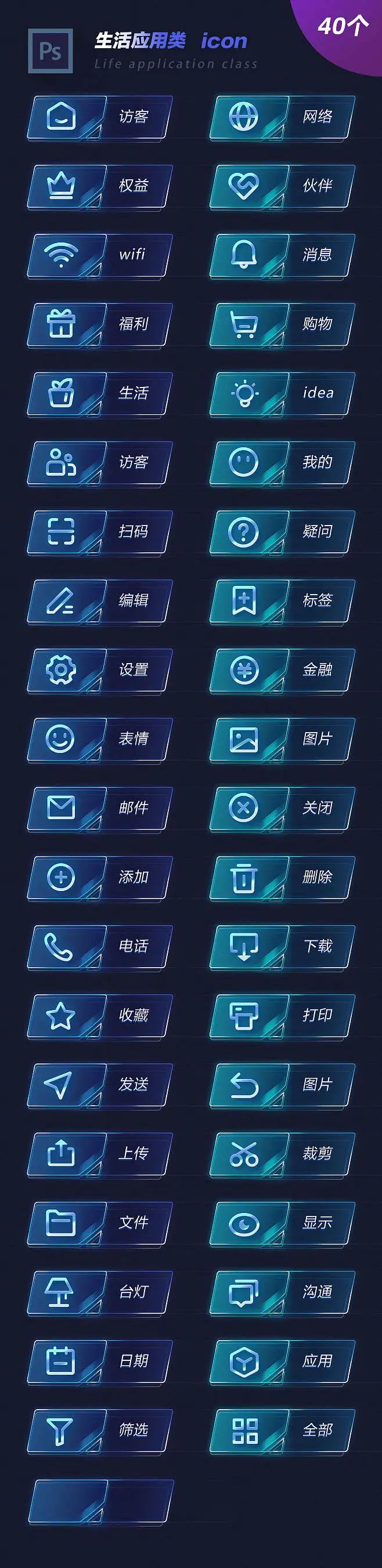
- Simplicity: Icons should be straightforward and easily recognizable. Complicated designs can confuse users.
- Consistency: Use a consistent style throughout your icons to create a cohesive visual language.
- Scalability: Icons should be designed in a way that they remain clear and effective, regardless of size.
- Context: Icons must be relevant to the action they represent and aligned with the overall theme of the design.
By focusing on these principles, designers can create icons that not only enhance aesthetics but also contribute to a seamless user experience.
Analyzing Successful Icon Designs on Dribbble
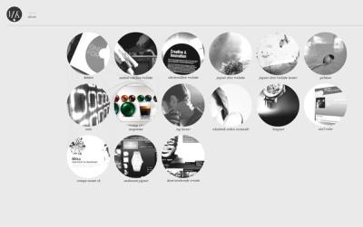
 Dribbble is a thriving platform for designers to showcase their work, including iconic designs. Analyzing successful icon designs on Dribbble reveals several patterns and best practices:
| Design Element | Observations |
|---|---|
| Color Palette | Many successful icons utilize bold, harmonious colors that draw attention while remaining pleasing to the eye. |
| Shape and Form | Round shapes are often used for a friendly, approachable feel, while sharper shapes convey modernity and structure. |
| Use of Negative Space | Utilizing negative space creatively can add depth and intrigue to an icon’s design. |
| Functionality | Effective icons combine aesthetic appeal with functionality, ensuring that the user immediately understands their purpose. |
By studying these successful designs, designers can glean valuable insights into creating their own impactful iconography for web and app interfaces.
Essential Tools for Creating Icons
 Creating stunning icons doesn’t have to be a daunting task. Luckily, there are plenty of amazing tools available to bring your iconography vision to life. Whether you’re just starting out or you’re a seasoned designer, these tools can streamline your workflow and help you create beautiful icons. Here’s a quick list of essential tools to consider:
- Adobe Illustrator: A staple in the graphic design community, Illustrator offers powerful vector graphic capabilities, which is perfect for icon design.
- Sketch: Ideal for designing user interfaces and web applications, Sketch provides a robust environment for creating scalable icons.
- Figma: This cloud-based design tool is fantastic for collaboration, making it easy to share and refine icon designs in real time.
- Inkscape: A free, open-source vector graphics editor that is suitable for those who are just starting out wanting to create icons without the financial investment.
- Canva: For quick designs and templates, Canva can be a great tool to create simple icons, especially if you’re not a professional designer.
Each of these tools has its strengths, so choosing one depends on your specific needs and comfort level. Remember, the best icon designs often come from a combination of the right tool and your unique creativity!
Steps to Create Your Own Unique Icons
 Now that you have the tools, let’s dive into the steps to create your own unique icons. Here’s a structured approach to guide you through the process:
- Research and Inspiration: Before you start designing, gather inspiration. Browse platforms like Dribbble or Behance to see current trends and discover styles that resonate with you.
- Sketch Your Ideas: Let your creativity flow! Sketch out rough ideas on paper or a digital tablet. Don’t worry about perfection; the goal is to brainstorm and explore different concepts.
- Choose a Style: Decide on a visual style that suits your project—minimalist, flat, or three-dimensional. Consistency in style is crucial for a cohesive icon set.
- Start Designing: Begin the design process using your chosen tool. Focus on creating clean lines, balanced shapes, and appropriate colors that fit your branding.
- Test and Gather Feedback: Share your icons with peers or potential users. Getting feedback can help you refine your designs and ensure they communicate effectively.
- Finalize and Export: Once you’re satisfied with your icon designs, make sure to export them in various formats (such as SVG, PNG, and JPG) suitable for your web or app requirements.
By following these steps, you’ll not only create unique icons but also develop a strong understanding of the design process. Remember, practice makes perfect, so keep experimenting and refining your skills!
Best Practices for Icon Design
When it comes to icon design, following a set of best practices can make a significant difference in usability, aesthetics, and user engagement. Here are some essential tips to consider:
- Keep it Simple: Icons should communicate messages quickly and clearly. Aim for clarity over complexity—avoid unnecessary details that can complicate the design.
- Consistency is Key: Use a uniform style throughout your project. This includes line weight, colors, and shapes. Consistency helps users understand your interface more intuitively.
- Focus on Scalability: Your icons should look great at any size. Design with scalability in mind, ensuring that your icons remain recognizable and legible when scaled up or down.
- Use Familiar Symbols: Recognizable icons allow for quicker comprehension. Tap into common symbols and imagery that users are already familiar with, like a magnifying glass for search or a gear for settings.
- Test for Clarity: Run usability tests to see if your icons convey the intended meaning. Observing real users interacting with your icons can provide invaluable insights.
By implementing these practices, you can create icons that not only look great but also enhance the overall user experience on your web and app platforms.
Incorporating Icons Into Web and App Interfaces
Once you’ve designed beautiful icons, the next step is integrating them effectively into your web and app interfaces. Here’s how to do so seamlessly:
- Hierarchy Matters: Use icons to establish a visual hierarchy. Larger icons can indicate primary actions, while smaller icons may represent secondary options. This helps direct user attention where it’s most needed.
- Align with Text: Pairing icons with descriptive text can help clarify their purpose. Try to place them alongside headings or buttons to create a cohesive look, ensuring they complement rather than clutter the design.
- Be Mindful of Space: Ensure that icons have enough whitespace around them to breathe. This prevents the interface from feeling cramped, allowing users to focus on important elements without distraction.
- Color Palette Integration: Utilize your brand’s color palette when designing icons to ensure they fit seamlessly into your visual language. This strengthens brand recognition and helps maintain a cohesive look.
- Accessibility Considerations: Always factor in accessibility when incorporating icons. Use tooltips, alt text, or labels to make sure that all users, including those with visual impairments, can understand icon functions.
By following these strategies, you can effectively incorporate your icon designs into your web and app platforms, enhancing not only the aesthetic appeal but also the overall user experience.
Common Mistakes to Avoid in Iconography
Creating beautiful icons that effectively communicate your message is an art form in itself. However, there are some common pitfalls that designers often fall into. Here are the top mistakes to steer clear of when working on iconography:
- Lack of Clarity: Icons are meant to convey messages quickly. If your icon is too complex or abstract, users may not understand its purpose. Always aim for simplicity and clarity.
- Inconsistent Style: Using different styles, colors, or levels of detail in your icons can create a disjointed user experience. Keep your iconography consistent throughout your design.
- Ignoring the Context: An icon might look great on its own, but it needs to function well within the context of the app or web page. Consider how your icons interact with text and other design elements.
- Overusing Effects: While effects like gradients and shadows can enhance an icon, overdoing them can lead to confusion and make your icons look outdated. Stick to a clean design!
- Neglecting Accessibility: Always remember to consider users with visual impairments. High contrast and clear labels can help ensure your icons are accessible to everyone.
- Ignoring Feedback: Designers can sometimes be too attached to their ideas. Don’t hesitate to seek feedback from peers or target users to see how well your icons work.
Avoiding these common mistakes can significantly improve the effectiveness of your iconography, making your web or app design not only more beautiful but also more functional.
Trends in Icon Design to Watch For
Icon design is ever-evolving, and staying updated on current trends can give your work a fresh edge. Here’s a look at some exciting trends in icon design that you should be aware of:
- Minimalist Icons: Less is more! Minimalist icons focus on essential shapes and lines, making them versatile and easy to understand.
- Line Art: Thin, continuous lines will see a rising trend. This style is not only sleek but also gives a modern touch to designs.
- 3D Elements: Icons with a three-dimensional look can add depth and interest. With advancements in web technology, 3D icons are becoming more feasible for web and app use.
- Animated Icons: Subtle animations can bring icons to life, enhancing user interaction. Consider transitions that guide users and add dynamism to your design.
- Bold Colors: Vibrant colors are making a comeback, allowing for expressive and eye-catching designs. Using unexpected color combinations can set your icons apart.
- Geometric Shapes: Expect to see more designs incorporating geometric shapes, which give a clean and structured appearance while maintaining visual interest.
Keeping an eye on these trends will not only inspire your creativity but also ensure that your icons remain relevant in the fast-paced world of design.
Resources for Inspiration and Learning
Creating beautiful icons for web and app design can sometimes feel daunting, but luckily, there are countless resources available to help spark your creativity and enhance your skills. Here’s a list of some fantastic places to find inspiration and valuable learning materials:
- Dribbble: A hub for designers to showcase their work, Dribbble is packed with creative icons and design styles. Browse through different categories or search for specific themes to fuel your creativity.
- Behance: Similar to Dribbble, Behance features portfolios from designers worldwide. Look for projects that focus on icon design to see what’s trending and how different styles can be applied.
- Pinterest: A goldmine for visual inspiration, Pinterest allows you to search for icon-related content and save your favorite finds to boards for easy reference.
- Google Fonts and The Noun Project: Not only do these platforms provide ready-to-use icons, but they also showcase different styles, which can inspire your designs or complete projects.
- Design Blogs and YouTube Channels: Blogs like Smashing Magazine and YouTube channels dedicated to design often provide in-depth tutorials on icon creation, including software tips and best practices.
By immersing yourself in these resources, you’ll not only find inspiration but also enhance your skills and learn from other talented designers. Remember, every great icon starts with a simple idea, and the right inspiration can lead to stunning designs!
Showcasing Your Icons to the Design Community
Once you’ve crafted your beautiful icons, showcasing them effectively is key to gaining recognition in the design community. Here are some strategies to help you share your work:
- Dribbble and Behance: Post your icons on these platforms with well-written descriptions and tags to reach a wider audience. Use high-quality images to capture attention, and consider creating mockups to show your icons in context.
- Social Media: Utilize platforms like Instagram, Twitter, and LinkedIn to share your work. Join design-focused groups on Facebook or Reddit to engage with like-minded individuals and foster connections.
- Design Contests: Participate in icon design challenges or contests, which can help you gain visibility and constructive feedback from experts and peers alike.
- Create a Personal Portfolio: Crafting your own website or portfolio can be an excellent way to present not only your icons but also your entire body of work, providing context and showing your growth as a designer.
- Networking: Attend design meetups, webinars, or online workshops to connect with other designers. Sharing your icons in these settings can lead to valuable feedback and potential collaborations.
Remember, showcasing your icons is not just about visibility—it’s about sharing your unique design perspective and engaging with the community. Be proud of your work, and don’t hesitate to seek out opportunities to showcase your creativity!