
Introduction
In this blog post, we will explore a stylish and modern card design using HTML and CSS. These cards feature a unique skewed background and smooth hover effects, making them visually appealing for various uses such as portfolios, services, or product features. The layout is responsive, ensuring a seamless experience across different devices, from desktops to mobile phones.
We will cover the key features of these creative HTML cards, provide step-by-step instructions on how to use the code, and offer customization tips to fit your specific needs. By the end of this post, you will have a clear understanding of how to create and implement these attractive card designs using HTML and CSS.
Features of the Creative HTML Cards
See the Pen
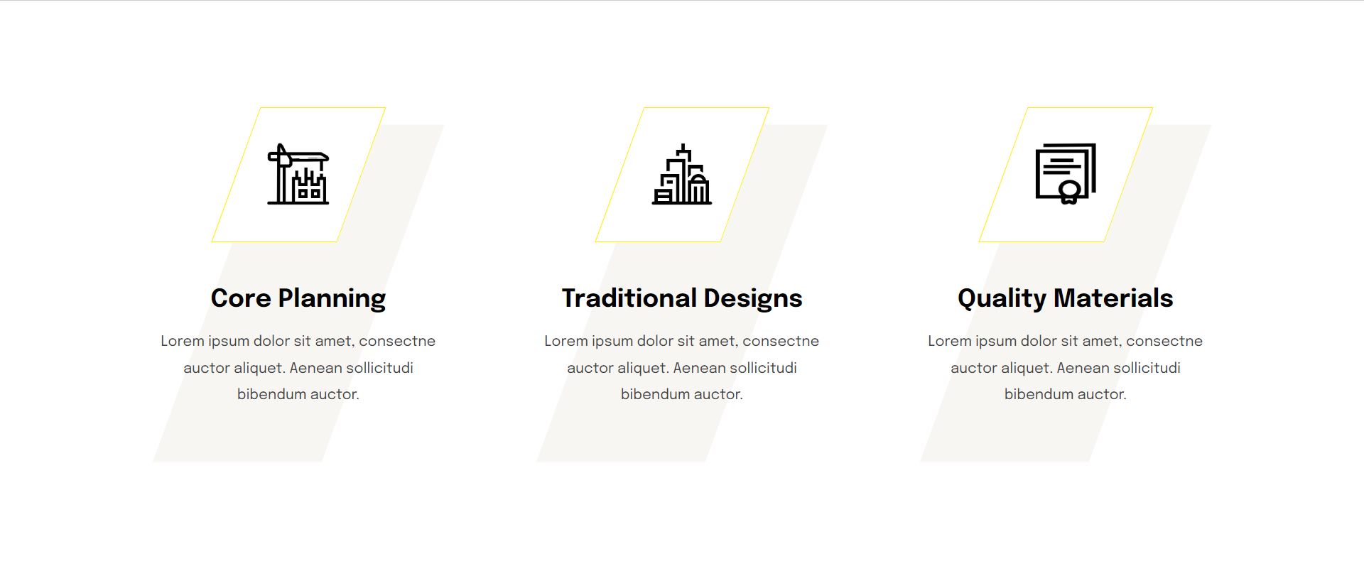
Creative HTML Cards | Style 1 by CreativeSalahu (@CreativeSalahu)
on CodePen.
The creative HTML cards showcased in this post come with a variety of features that make them stand out. Below is an overview of these features:
Overview of the Card Design
The card design is both stylish and modern, featuring clean lines and a sleek layout. Each card is designed to be visually appealing and functional, providing a perfect way to display content such as portfolio items, service descriptions, or product features.
Unique Skewed Background and Hover Effects
One of the most distinctive features of these cards is the unique skewed background. This design element gives the cards a dynamic and engaging look. Additionally, the cards have smooth hover effects:
- On hover, the background color changes smoothly.
- A “Read More” button is revealed, encouraging user interaction.
Responsive Design for Different Devices
The card layout is fully responsive, ensuring that the design looks great on all devices, from desktops to mobile phones. The responsive design adjusts the layout as follows:
| Device | Layout Adjustment |
|---|---|
| Desktop | Cards are displayed in a three-column layout. |
| Tablet | Cards are displayed in a two-column layout for better readability. |
| Mobile | Cards are displayed in a single-column layout for optimal viewing. |
Custom Icons and Modern Typography
Each card includes a unique custom icon that enhances its visual appeal. These icons are centered and styled to maintain aesthetic harmony. Additionally, the cards use the “Epilogue” font, known for its clean and modern look, which contributes to the overall sleek design.
External Links for Additional Information
Each card features an external link, making it easy to direct users to additional resources or information. For instance, the cards in this example link to a Fiverr profile, providing a seamless way for users to learn more about the services offered. The external links are clearly highlighted and accessible, ensuring a user-friendly experience.
In summary, these creative HTML cards combine unique design elements, responsiveness, and user-friendly features to provide an engaging way to display various types of content. Whether you are showcasing a portfolio, listing services, or highlighting products, these cards offer a visually appealing and functional solution.
Step-by-Step Guide to Using the Code
1. Setting Up the HTML Structure
To get started with these creative HTML cards, you need to set up the HTML structure. You can copy the provided HTML structure into a CodePen editor or any HTML file of your choice. Follow these steps:
Step 1: Open CodePen or your preferred HTML editor.
Step 2: Copy the HTML structure below and paste it into the editor:
<section class="creative-cards style-one">
  <div class="container">
    <div class="row">
      <div class="card-column">
        <div class="card-details">
          <div class="card-icons">
            <img class="light-icon" src="https://imgpanda.com/upload/ib/1yIWjyG41o.png" alt="icon" />
          </div>
          <h3><a href="https://www.fiverr.com/aliali44">Core Planning</a></h3>
          <p>Lorem ipsum dolor sit amet, consectne auctor aliquet. Aenean sollicitudi bibendum auctor.</p>
          <a class="read-more-btn" href="https://www.fiverr.com/aliali44"><i class="fa-solid fa-angles-right"></i></a>
        </div>
      </div>
      <div class="card-column">
        <div class="card-details">
          <div class="card-icons">
            <img class="light-icon" src="https://imgpanda.com/upload/ib/Q4tSh2ctkH.png" alt="icon" />
          </div>
          <h3><a href="https://www.fiverr.com/aliali44">Traditional Designs</a></h3>
          <p>Lorem ipsum dolor sit amet, consectne auctor aliquet. Aenean sollicitudi bibendum auctor.</p>
          <a class="read-more-btn" href="https://www.fiverr.com/aliali44"><i class="fa-solid fa-angles-right"></i></a>
        </div>
      </div>
      <div class="card-column">
        <div class="card-details">
          <div class="card-icons">
            <img class="light-icon" src="https://imgpanda.com/upload/ib/YQdOwN6IDJ.png" alt="icon" />
          </div>
          <h3><a href="https://www.fiverr.com/aliali44">Quality Materials</a></h3>
          <p>Lorem ipsum dolor sit amet, consectne auctor aliquet. Aenean sollicitudi bibendum auctor.</p>
          <a class="read-more-btn" href="https://www.fiverr.com/aliali44"><i class="fa-solid fa-angles-right"></i></a>
        </div>
      </div>
    </div>
  </div>
</section>
Now, your HTML structure is set up and ready for the next steps, where we will style the cards using CSS and make them interactive with hover effects.
2. Styling with CSS
Next, we need to style the HTML structure using CSS. You can include the provided CSS either in a <style> tag within the HTML file or in an external stylesheet. Follow these steps:
Step 1: If you prefer to include the CSS in a <style> tag, add the following code inside the <head> section of your HTML document:
<style>
  @import url('https://fonts.googleapis.com/css2?family=Epilogue:ital,wght@0,100..900;1,100..900&display=swap');
  body {
    font-size: 17px;
    line-height: 30px;
    font-weight: 400;
    -moz-osx-font-smoothing: grayscale;
    word-break: break-word;
    -webkit-font-smoothing: antialiased;
    font-family: "Epilogue", sans-serif;
    margin: 0;
    background: #fff;
  }
  * {
    box-sizing: border-box;
  }
  .creative-cards {
    padding: 120px 0;
    position: relative;
  }
  .creative-cards .container {
    max-width: 1320px;
    width: 100%;
    padding-right: .75rem;
    padding-left: .75rem;
    margin-right: auto;
    margin-left: auto;
  }
  .creative-cards .container .row {
    display: flex;
    flex-wrap: wrap;
  }
  .creative-cards .container .row .card-column {
    flex: 0 0 auto;
    width: 33.33333333%;
    text-align: center;
    max-width: 100%;
    padding-right: 15px;
    padding-left: 15px;
  }
  .card-details {
    width: 80%;
    margin: auto;
    position: relative;
    transition: .3s ease-in-out;
  }
  .card-details:before {
    content: "";
    width: 190px;
    height: 380px;
    background: #f7f6f2;
    position: absolute;
    left: 50%;
    top: 50%;
    transform: translate(-50%, -50%) skew(-20deg, 0deg);
    z-index: -1;
    transition: .3s ease-in-out;
  }
  .card-details:hover:before {
    background-color: #fffab3;
  }
  .card-icons {
    width: 140px;
    height: 150px;
    position: relative;
    margin: auto;
    display: flex;
    align-items: center;
    justify-content: center;
  }
  .card-icons:before {
    content: "";
    position: absolute;
    top: 0;
    left: 0;
    border: 1px solid;
    width: 100%;
    height: 100%;
    transform: skew(-20deg, 0deg);
    background: #fff;
    border-color: #ffee02;
    transition: .3s ease-in-out;
  }
  .card-details:hover .card-icons:before {
    background-color: #ffee02;
  }
  .card-icons img {
    position: relative;
    width: 70px;
    height: 70px;
  }
  .card-details h3 {
    margin-bottom: 15px;
    margin-top: 50px;
    font-weight: 700;
    font-size: 1.75rem;
    line-height: 1.2;
  }
  .card-details h3 a {
    color: #000;
    text-decoration: none;
  }
  .card-details p {
    font-size: 16px;
    line-height: 30px;
    color: #444;
    font-weight: 400;
    margin-bottom: 30px;
  }
  .read-more-btn {
    width: 50px;
    height: 50px;
    display: flex;
    justify-content: center;
    align-items: center;
    border: 1px solid;
    border-radius: 100%;
    margin: auto;
    background: #fff;
    transform: translateX(-10px);
    opacity: 0;
    visibility: hidden;
    border-color: #ffee02;
    transition: .3s ease-in-out;
    text-decoration: none;
  }
  .read-more-btn i {
    color: #000;
    font-size: 12px;
  }
  .card-details:hover .read-more-btn {
    transform: translateX(0);
    opacity: 1;
    visibility: visible;
  }

  /* ============= Responsive Ipad ==================== */
  @media (max-width: 992px) {
    .creative-cards .container .row .card-column {
      flex: 0 0 auto;
      width: 50%;
      margin-bottom: 40px;
    }
  }

  /* ============= Responsive Iphone ==================== */
  @media (max-width: 480px) {
    .creative-cards .container .row .card-column {
      flex: 0 0 auto;
      width: 100%;
      margin-bottom: 20px;
    }
    .card-details {
      width: 100%;
    }
    .read-more-btn {
      transform: translateX(0px);
      opacity: 1;
      visibility: visible;
    }
  }
</style>
Step 2: If you prefer to use an external stylesheet, save the CSS code in a file (e.g., styles.css) and link it in the <head> section of your HTML document like this:
<link rel="stylesheet" href="styles.css">Now, your HTML cards will be styled according to the provided CSS, featuring a unique skewed background, smooth hover effects, and a responsive layout that looks great on any device.
Customizing the Cards
Customizing the Card Content, Links, and Icons
To make the cards fit your specific needs, you can customize the content, links, and icons. Here’s how you can do it:
- Changing the Content: Modify the
<h3>and<p>tags inside each.card-detailsdiv to update the titles and descriptions of the cards. - Updating Links: Change the
hrefattribute of the<a>tags to point to the desired URLs. For example, update the links to direct users to your portfolio, service pages, or product details. - Replacing Icons: Change the
srcattribute of the<img>tags to use your custom icons. Make sure the icons are properly sized and optimized for web use.
<div class="card-details">
  <div class="card-icons">
    <img class="light-icon" src="path/to/your/custom-icon.png" alt="icon" />
  </div>
  <h3><a href="your-link.html">Your Title</a></h3>
  <p>Your custom description goes here.</p>
  <a class="read-more-btn" href="your-link.html"><i class="fa-solid fa-angles-right"></i></a>
</div>
Tips on Selecting and Integrating Custom Icons
When choosing custom icons, consider the following tips:
- Consistency: Ensure that all icons have a consistent style and size to maintain a cohesive look across all cards.
- Format: Use scalable vector graphics (SVG) for better quality and faster loading times. PNGs with transparent backgrounds are also suitable.
- Optimization: Optimize icons for the web to reduce file size without compromising quality. Tools like ImageOptim can help.
- Sources: Websites like Flaticon and Icons8 offer a wide range of free and premium icons.
Guidance on Adjusting the Color Scheme and Typography
To adjust the color scheme and typography, follow these steps:
- Changing Colors: Modify the CSS properties to change the background, text, and border colors. Update the
background-colorandcolorproperties in the CSS code. - Example:
.card-details:before {
  background: #your-color; /* Change this to your desired background color */
}

.card-details:hover:before {
  background-color: #your-hover-color; /* Change this to your desired hover background color */
}

.card-details h3 a {
  color: #your-text-color; /* Change this to your desired text color */
}- Updating Typography: Modify the font family, size, and weight in the CSS. The current design uses the “Epilogue” font. You can change it by updating the
@importURL and font-family property. - Example:
@import url('https://fonts.googleapis.com/css2?family=YourChosenFont:[email protected]&display=swap');

body {
  font-family: "YourChosenFont", sans-serif;
}
By following these guidelines, you can easily customize the creative HTML cards to match your brand or personal style, ensuring a unique and professional appearance.
Detailed Breakdown of the Code
HTML Explanation
The HTML structure is designed to create a visually appealing and interactive card layout. Here’s a detailed breakdown of each section and its purpose:
Overall Structure
The HTML is encapsulated within a <section> tag with a class of creative-cards style-one. This section contains a container for the card elements:
<section class="creative-cards style-one">
  <div class="container">
    <div class="row">

    </div>
  </div>
</section>
This structure sets up the overall layout, allowing for a flexible and responsive design.
Container and Row
The <div class="container"> and <div class="row"> tags are used to structure the content within the section. The container class centers the content and sets a maximum width, while the row class allows for a flexbox layout, enabling the cards to be arranged in a row:
<div class="container">
  <div class="row">

  </div>
</div>
Card Columns
Each card is contained within a <div> with the class card-column. This class ensures that each card takes up a third of the available width on larger screens, and adjusts accordingly for smaller screens:
<div class="card-column">
  <div class="card-details">

  </div>
</div>
Card Details
The card-details class contains all the elements of an individual card, including the icon, title, description, and read more button:
<div class="card-details">
  <div class="card-icons">
    <img class="light-icon" src="icon-url" alt="icon" />
  </div>
  <h3><a href="link-url">Card Title</a></h3>
  <p>Card description goes here.</p>
  <a class="read-more-btn" href="link-url"><i class="fa-solid fa-angles-right"></i></a>
</div>- Icon: The
card-iconsdiv contains an<img>tag for the icon. Thelight-iconclass is used to style the icon. - Title: The card title is wrapped in an
<h3>tag with a link (<a>) to another page or resource. - Description: The card description is contained within a
<p>tag, providing a brief summary of the card content. - Read More Button: The
read-more-btnis a link styled as a button, which includes an icon (<i>) from the Font Awesome library for a visual cue.
This structure allows each card to be self-contained, making it easy to add, remove, or modify cards without affecting the overall layout.
CSS Explanation
Detailed Explanation of the CSS Rules
The CSS rules are designed to create a modern and responsive card layout with interactive hover effects. Here’s a breakdown of the key CSS rules:
@import url('https://fonts.googleapis.com/css2?family=Epilogue:ital,wght@0,100..900;1,100..900&display=swap');
body {
  font-size: 17px;
  line-height: 30px;
  font-weight: 400;
  -moz-osx-font-smoothing: grayscale;
  word-break: break-word;
  -webkit-font-smoothing: antialiased;
  font-family: "Epilogue", sans-serif;
  margin: 0;
  background: #fff;
}
* {
  box-sizing: border-box;
}
.creative-cards {
  padding: 120px 0;
  position: relative;
}
.creative-cards .container {
  max-width: 1320px;
  width: 100%;
  padding-right: .75rem;
  padding-left: .75rem;
  margin-right: auto;
  margin-left: auto;
}
.creative-cards .container .row {
  display: flex;
  flex-wrap: wrap;
}
.creative-cards .container .row .card-column {
  flex: 0 0 auto;
  width: 33.33333333%;
  text-align: center;
  max-width: 100%;
  padding-right: 15px;
  padding-left: 15px;
}
.card-details {
  width: 80%;
  margin: auto;
  position: relative;
  transition: .3s ease-in-out;
}
.card-details:before {
  content: "";
  width: 190px;
  height: 380px;
  background: #f7f6f2;
  position: absolute;
  left: 50%;
  top: 50%;
  transform: translate(-50%, -50%) skew(-20deg, 0deg);
  z-index: -1;
  transition: .3s ease-in-out;
}
.card-details:hover:before {
  background-color: #fffab3;
}
.card-icons {
  width: 140px;
  height: 150px;
  position: relative;
  margin: auto;
  display: flex;
  align-items: center;
  justify-content: center;
}
.card-icons:before {
  content: "";
  position: absolute;
  top: 0;
  left: 0;
  border: 1px solid;
  width: 100%;
  height: 100%;
  transform: skew(-20deg, 0deg);
  background: #fff;
  border-color: #ffee02;
  transition: .3s ease-in-out;
}
.card-details:hover .card-icons:before {
  background-color: #ffee02;
}
.card-icons img {
  position: relative;
  width: 70px;
  height: 70px;
}
.card-details h3 {
  margin-bottom: 15px;
  margin-top: 50px;
  font-weight: 700;
  font-size: 1.75rem;
  line-height: 1.2;
}
.card-details h3 a {
  color: #000;
  text-decoration: none;
}
.card-details p {
  font-size: 16px;
  line-height: 30px;
  color: #444;
  font-weight: 400;
  margin-bottom: 30px;
}
.read-more-btn {
  width: 50px;
  height: 50px;
  display: flex;
  justify-content: center;
  align-items: center;
  border: 1px solid;
  border-radius: 100%;
  margin: auto;
  background: #fff;
  transform: translateX(-10px);
  opacity: 0;
  visibility: hidden;
  border-color: #ffee02;
  transition: .3s ease-in-out;
  text-decoration: none;
}
.read-more-btn i {
  color: #000;
  font-size: 12px;
}
.card-details:hover .read-more-btn {
  transform: translateX(0);
  opacity: 1;
  visibility: visible;
}
Responsive Design Adjustments
Responsive design ensures that the card layout looks great on different devices. Media queries are used to adjust the layout for tablets and mobile phones:
/* ============= Responsive Ipad ==================== */
@media (max-width: 992px) {
  .creative-cards .container .row .card-column {
    flex: 0 0 auto;
    width: 50%;
    margin-bottom: 40px;
  }
}

/* ============= Responsive Iphone ==================== */
@media (max-width: 480px) {
  .creative-cards .container .row .card-column {
    flex: 0 0 auto;
    width: 100%;
    margin-bottom: 20px;
  }
  .card-details {
    width: 100%;
  }
  .read-more-btn {
    transform: translateX(0px);
    opacity: 1;
    visibility: visible;
  }
}
These media queries adjust the card columns to display two cards per row on tablets and one card per row on mobile phones. Additionally, the .card-details width is set to 100% for better readability on smaller screens.
Hover Effects and Transitions
The CSS includes smooth hover effects and transitions to enhance interactivity:
.card-details {
  transition: .3s ease-in-out;
}
.card-details:before {
  transition: .3s ease-in-out;
}
.card-details:hover:before {
  background-color: #fffab3;
}
.card-details:hover .card-icons:before {
  background-color: #ffee02;
}
.card-details:hover .read-more-btn {
  transform: translateX(0);
  opacity: 1;
  visibility: visible;
}
.read-more-btn {
  transition: .3s ease-in-out;
}
These rules ensure that the background color of the card, the border of the icon, and the visibility of the “Read More” button change smoothly when the user hovers over the card. The transition properties provide a smooth and visually appealing effect.
Use Cases for the HTML Cards
Examples of How These Cards Can Be Used in Various Contexts
Portfolios
Creative HTML cards can be effectively used in personal and professional portfolios to showcase work samples, projects, and achievements. Each card can represent a different project, providing a brief description and a link to more detailed information.
- Project Highlights: Use cards to highlight key projects, including images, descriptions, and links to live demos or case studies.
- Skills Showcase: Each card can detail a specific skill or technology you specialize in, with icons and relevant descriptions.
Service Listings
Service providers can utilize these cards to list and describe the various services they offer. The interactive design makes it easy for potential clients to understand and engage with the services.
- Service Descriptions: Highlight each service with a brief description, unique icon, and a call-to-action link for more information or to book the service.
- Client Testimonials: Use cards to showcase client feedback, including short testimonials and links to detailed reviews.
Product Features
Businesses can use these cards to showcase the features of their products in an engaging and organized manner. Each card can represent a different feature or benefit, making it easy for customers to understand the value of the product.
- Feature Highlights: Detail each feature of a product with icons, descriptions, and links to more comprehensive explanations or tutorials.
- Promotional Offers: Use cards to promote special offers, discounts, or new product launches, with eye-catching visuals and direct links to purchase pages.
Benefits of Using Such Stylish and Modern Cards on Websites
- Enhanced Visual Appeal: The unique skewed background and hover effects make the cards visually appealing, helping to capture and retain visitors’ attention.
- Responsive Design: The cards are designed to be fully responsive, ensuring a seamless experience across all devices, from desktops to mobile phones. This adaptability enhances user experience and accessibility.
- Interactive Elements: The hover effects and transitions provide a dynamic and interactive user experience, encouraging engagement and interaction with the content.
- Customizable: The cards are highly customizable, allowing you to adjust the content, icons, and links to fit your specific needs. This flexibility makes them suitable for a wide range of applications and industries.
- Professional Look: Using the “Epilogue” font and carefully selected color schemes gives the cards a modern and professional appearance, enhancing the overall look and feel of the website.
- Easy Integration: The provided HTML and CSS code snippets make it easy to integrate these cards into any website, whether it’s a personal blog, a business site, or an online portfolio.
Overall, these creative HTML cards provide a stylish and functional way to display content, making them a valuable addition to any website looking to improve its visual appeal and user engagement.
Conclusion
In this comprehensive guide, we’ve explored how to create stylish and interactive HTML cards using CSS. Let’s recap the main points covered:
- We started by introducing the concept of creative HTML cards and highlighted their versatility in various contexts such as portfolios, service listings, and product features.
- We discussed the key features of the cards, including their unique skewed background, interactive hover effects, responsive design, custom icons, and the use of the “Epilogue” font for a modern look.
- We provided a step-by-step guide on how to implement these cards in your projects, including copying the HTML structure and integrating the provided CSS.
- We explored customization options, including tips on selecting and integrating custom icons, and guidance on adjusting the color scheme and typography to suit your website’s theme.
- We delved into a detailed breakdown of the HTML and CSS code, explaining each section’s purpose and functionality.
- Finally, we discussed various use cases for these cards and highlighted the benefits of using such stylish and modern designs on websites.
Now, it’s your turn to get creative! Experiment with the code provided, customize the cards to fit your unique needs, and integrate them into your projects. Whether you’re building a portfolio, showcasing services, or highlighting product features, these HTML cards offer a visually appealing and functional solution.
We encourage you to share your creations or ask any questions you may have in the comments section below. Your feedback and contributions are valuable as we continue to explore new ways to enhance web design with HTML and CSS.
Happy coding!
Call to Action
Explore more web design resources and tutorials:
- Check out our CodePen profile for additional creative HTML and CSS projects.
- Visit our Fiverr profile to hire us for your web design needs.
- Connect with us on Upwork for freelance opportunities.
Follow us on Twitter for more web design tips, tutorials, and updates.
Stay inspired and continue refining your web design skills. Thank you for reading!