Creating visually captivating layouts is essential for attracting visitors to your website. With WordPress Elementor, grid designs have never been easier or more dynamic. Elementor allows you to craft creative layouts that not only look good but also enhance user experience. This powerful plugin provides a comprehensive set of design tools, enabling both beginners and seasoned developers to create impressive, professional-looking grids that are fully customizable and responsive on various devices. Let’s delve deeper into the wonders of Elementor grid designs and explore how to elevate your website aesthetics.
Why Choose Elementor for Grid Layouts?

Choosing Elementor for your grid layouts comes with a plethora of benefits that set it apart from other page builders. Here’s why it’s the go-to choice for many:
- User-Friendly Interface: Elementor features a drag-and-drop interface that’s intuitive, which means you can design your grid without any coding knowledge.
- Responsive Design: No need to worry about how your layout will appear on different devices. Elementor makes it easy to create responsive grids that look great on desktops, tablets, and smartphones.
- Flexible Customization: With a wide range of widgets, styles, and templates, Elementor allows you to customize every aspect of your grid layout, from spacing to colors, ensuring it aligns with your brand identity.
- Pre-built Templates: Elementor offers numerous ready-made grid templates that you can import and tweak to fit your needs, saving you valuable time.
- Advanced Animation Effects: Make your grid layouts engaging with hover effects and animations that bring your content to life, boosting user interaction.
In summary, Elementor is an exceptional tool for designing grid layouts that are not only visually appealing but also enhance functionality. There’s no doubt that it provides the flexibility and creativity that modern web design demands.
Exploring Various Grid Types in Elementor

When it comes to designing your website, the grid layout is crucial. It not only helps in organizing content but also gives your site a visually appealing touch. Elementor makes it incredibly easy to explore various grid types that can fit your style and meet your website’s needs. Let’s dive into some popular grid options you can utilize in Elementor.
- Standard Grid: This is the classic approach where items are displayed in neat rows and columns. It’s perfect for galleries or any content-heavy pages.
- Masonry Grid: If you want your content to feel more organic, the masonry layout allows for variable heights among items, which creates an eye-catching, staggered effect. It’s great for portfolios or photo galleries!
- Horizontal Grid: This type aligns content horizontally, making it ideal for displaying products. You can have a clean and professional look, focusing on individual items.
- Carousel Grid: Want to showcase multiple items but save space? The carousel grid allows users to scroll through items horizontally, making it fun and interactive.
- Grid with Filters: This type combines grid design with functionality, allowing users to filter content according to their preferences. It’s particularly useful for e-commerce sites.
In summary, Elementor provides a rich selection of grid designs that cater to different needs and aesthetics. By experimenting with these grid types, you can better engage your audience and keep them browsing your content!
How to Create a Basic Grid Layout with Elementor
Creating a grid layout with Elementor is a straightforward process, even if you’re a beginner! With its intuitive drag-and-drop interface, you’ll be able to build beautiful grid designs in no time. Let’s go through the steps to create a basic grid layout.
- Add a New Section: Once you’ve logged into your WordPress dashboard, navigate to the page you want to edit with Elementor. Click on the “Edit with Elementor” button, then click on the plus (+) icon to add a new section.
- Select Column Structure: Choose the number of columns you want for your grid layout. You can always adjust this later if needed.
- Drag and Drop Widgets: After selecting your layout, drag and drop the widget of your choice (like Image, Text, or Video) into each column. This is where your content comes to life!
- Adjust Settings: Click on each widget to customize settings. You can adjust padding, margins, backgrounds, and add custom styles to fit your theme.
- Responsive Design: Don’t forget to check the responsive settings for mobile and tablet views. Elementor allows you to modify designs for various devices easily.
- Preview and Publish: After you’re satisfied with your grid layout, hit the eye icon to preview how it looks. If everything appears as it should, click the “Publish” button to make it live!
And just like that, you’ve created a stunning grid layout using Elementor. The beauty of this platform lies in its flexibility, allowing you to tweak and design until your heart’s content! Happy designing!
Advanced Grid Design Techniques
When it comes to taking your grid designs to the next level, there are several advanced techniques you can employ using WordPress Elementor. These methods will not only enhance the visual appeal of your layouts but also improve user experience and interactivity. Let’s dive into some of these transformative techniques!
- CSS Grid and Flexbox: Leverage the power of CSS Grid and Flexbox to create dynamic layouts that adapt seamlessly to varying screen sizes and orientations. These tools provide flexibility in arranging elements while maintaining proper alignment.
- Custom Breakpoints: Set custom breakpoints to control how your grid displays across different devices. This helps ensure that your design remains consistent and user-friendly, regardless of the screen size.
- Hover Effects: Add engaging hover effects to your grid items. Consider using scaling, shadowing, or transitions to create a more interactive experience. These effects can make your content more inviting and encourage user interactions.
- Dynamic Content: Use Elementor’s dynamic content feature to pull in posts, products, or custom fields automatically. This not only saves time but also keeps your layouts fresh and relevant without requiring constant manual updates.
- Animations: Incorporate subtle animations within your grid. Whether it’s fading in items as they scroll into view or sliding them from the side, animations can add an exciting touch to your overall design.
By employing these advanced grid design techniques, you can create visually stunning layouts that not only look professional but also enhance engagement and usability.
Responsive Design: Ensuring Your Grid Looks Great on All Devices
In today’s multi-device world, ensuring that your grid layouts are responsive is essential. No one enjoys trying to navigate a website that’s difficult to use on their smartphone or tablet. Luckily, Elementor makes it easy to ensure your designs look great everywhere! Here’s how to optimize your grid for all devices:
| Device Type | Key Considerations | Elementor Features |
|---|---|---|
| Desktop | Utilize ample space for detailed layouts; consider multi-column arrangements. | Desktop Preview and Custom Widths |
| Tablet | Adjust padding and margins for a more compact view; transition to fewer columns. | Responsive Control for Breakpoints |
| Mobile | Single-column layouts often work best; ensure touch targets are large enough for easy tapping. | Mobile Preview and Font Scaling |
Here are some additional tips to enhance your responsive grid design:
- Use Fluid Grids: Set your grid items to use percentages instead of fixed pixel values for widths to allow for automatic adjustments based on screen size.
- Test Regularly: Always check your website on various devices and browsers to identify any layout issues. Utilizing Elementor’s preview options can be a big time-saver here!
- Optimize Images: Make sure your images are responsive. Use Elementor’s settings to set max widths and consider applying lazy loading for faster loading times.
Ultimately, a well-designed, responsive grid ensures a smooth user experience across devices, making your website both appealing and functional. With these strategies, you’re set to create compelling grid designs that cater to all users!
Incorporating Images and Media into Your Grid
When it comes to crafting stunning grid layouts in WordPress Elementor, incorporating images and other media effectively can elevate your design to new heights. Think of images as the soul of your grid; they grab attention and convey information faster than text ever could. So, how do you go about integrating them seamlessly?
First off, consider the type of images you want to showcase. Here’s a quick checklist:
- High Quality: Always use high-resolution images to maintain professionalism.
- Relevant: Ensure that the images relate to the content or theme of your site.
- Variety: Mix different types of media (e.g., photos, illustrations, videos) to keep things engaging.
In Elementor, you can easily drag and drop image widgets into your grids. But there are a few advanced techniques to make your media stand out:
- Image Overlays: Use overlays to add text or color effects over your images to enhance visibility.
- Lightbox Effects: Consider implementing lightbox features so users can click on images for a larger view.
- Video Backgrounds: If appropriate, use videos in the background of grid sections for dynamic effects.
Lastly, don’t forget about responsiveness! Always preview how your media looks on different devices, adjusting sizes and positions as needed to ensure a seamless user experience. By thoughtfully incorporating images and media, your grids will not only look appealing but also communicate your message effectively.
Styling Your Grid: Colors, Fonts, and Spacing
Styling your Elementor grid takes it from ordinary to extraordinary. Colors, fonts, and spacing are the trifecta of visual design that can dramatically change how your content is perceived. Let’s break down how you can get creative with each of these elements.
Colors: Choose a color palette that aligns with your brand identity. A cohesive color scheme enhances aesthetic appeal and can improve user engagement. Consider these options:
- Monochromatic: Use varying shades of a single color for a sleek and modern look.
- Complementary: Use colors that are opposite each other on the color wheel for vibrant contrast.
- Analogous: Pick colors that are next to each other on the wheel for a harmonious feel.
Fonts: Typography matters, folks! Your choice of fonts can set the tone of your grid. Here’s what to keep in mind:
- Limit Font Families: Stick to 2-3 font families to avoid muddiness.
- Hierarchy: Use different sizes and weights to create a visual hierarchy, guiding the viewer’s eye.
- Readability: Choose fonts that are easy on the eyes, especially for body text.
Spacing: Adequate padding and margins create breathing space between elements. A messy grid is distracting! Consider these techniques:
- Use padding around elements to boost focus.
- Implement margins to separate grid sections for clarity.
- Ensure consistent line heights for text blocks to improve readability.
By thoughtfully styling your grid with colors, fonts, and spacing, you can create an inviting and visually appealing web layout that resonates with your audience and keeps them coming back for more.
9. Using Add-ons and Widgets for Enhanced Grid Functionality
When it comes to creating stunning grids on your WordPress site using Elementor, leveraging add-ons and widgets can take your design game to a whole new level. These tools provide you with advanced functionality and customization options that go beyond the standard Elementor capabilities. This means you can make your grid layouts not just attractive but also interactive and user-friendly.
There are numerous add-ons available specifically for Elementor, and each offers different features to enhance your grid designs. Here’s a quick list of some popular add-ons you might consider:
- Essential Addons for Elementor: This plugin offers a wide variety of elements, including post grids and advanced gallery options. You can easily filter and sort the content displayed in your grids.
- Happy Addons: Known for its unique features like the live copy and paste options, Happy Addons also provides several creative widgets to help you build engaging grid layouts.
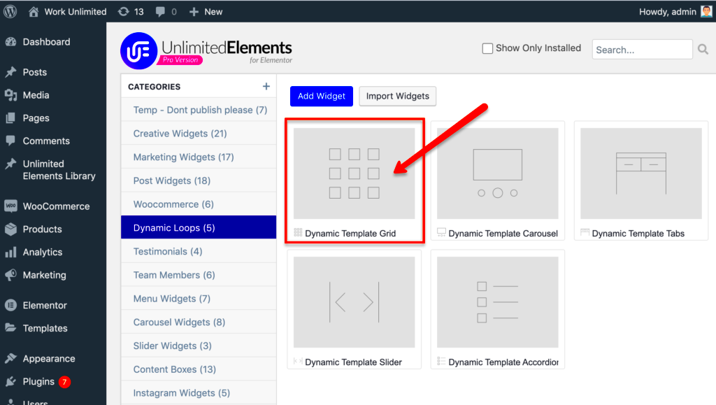
- Ultimate Elements: This plugin comes packed with impressive grid system features that enable users to create image and content grids effortlessly.
Besides add-ons, keep in mind that the right use of widgets can significantly enhance grid functionality. For instance, widgets like the Image Gallery, Icon Box, and Post Carousel can be combined to create rich, layered grid layouts.
Remember, the goal is to maintain a balance between aesthetics and functionality. Using these add-ons and widgets not only enriches the visual appeal of your website but also enhances the user experience, making your site more interactive and engaging. So, experiment and see which combinations work best for your vision!
10. Case Studies: Inspiring Examples of Grid Designs
Sometimes, the best way to understand the potential of Elementor grid designs is to look at real-life examples. Case studies provide a window into how different businesses and creators have successfully implemented grid layouts. Let’s explore some inspiring sites that effectively utilize grid designs.
1. Creative Agency A: This agency used a masonry grid layout to showcase their portfolio. The unevenly-sized grid blocks create visual interest, guiding the visitor’s eye to explore various projects. Each project features a hover effect that reveals more details, enhancing user interaction.
2. Fashion Blog B: Using a straightforward blog post grid, Fashion Blog B categorized their entries by style type and season. The post thumbnails are uniform in size with sleek pagination, making it easy for visitors to navigate through centuries of fashion insights.
3. Travel Website C: This travel website embraced a grid gallery for showcasing breathtaking visuals from around the globe. By using lightbox functionality, users can expand images for a closer look, making the design not just aesthetically pleasing but also functional.
4. E-commerce Store D: This store implemented a grid system for product listings, complete with filters based on categories. Shoppers can easily toggle between a grid and list view, allowing for a customized shopping experience.
These examples illustrate that grid designs can be versatile and tailored to suit various purposes. So, when you’re considering your own WordPress Elementor grid layout, think about the goals you have in mind and how inspiring these case studies can help guide your creativity!
Troubleshooting Common Grid Layout Issues
When designing your website with Elementor’s grid layouts, you might encounter a few hiccups along the way. Don’t worry; it’s all part of the creative process! Let’s take a look at some common issues and how to troubleshoot them effectively.
- Element Overlap: Sometimes, elements may overlap due to improper spacing settings. Make sure to check the padding and margin settings for each element. A quick fix is to adjust the column width or use the ‘z-index’ property to layer elements correctly.
- Inconsistent Column Heights: Uneven rows can disrupt the aesthetic appeal of your layout. To resolve this, ensure that all columns contain elements of similar height or use the ‘Equal Height’ option in Elementor settings for that specific section.
- Responsive Design Issues: What looks great on a desktop may not translate well to mobile. Always preview your layout using the responsive mode in Elementor. Adjust the visibility settings and customize column widths for different screen sizes to achieve a mobile-friendly design.
- CSS Conflicts: If you’ve added custom CSS, conflicts may arise. Debugging can be as simple as inspecting the element through the browser’s developer tools. Disable custom styles one at a time to isolate the cause of your issue.
- Slow Loading Times: Large images in your grid layout can affect load speed. Optimize your images using tools like TinyPNG or Smush. Additionally, consider using lazy loading to enhance performance.
Remember, every problem has a solution! With a bit of patience and creativity, you can resolve these issues and create stunning grid designs that will captivate your visitors.
Conclusion: Elevating Your Website with Custom Grid Designs
In today’s digital landscape, your website is often the first impression potential customers have of your brand. Custom grid designs in WordPress using Elementor can elevate your site’s aesthetic and functionality to new heights! Here’s a quick recap of how you can make the most out of grid layouts:
- Enhanced Visual Appeal: Grids offer a clean, organized look that attracts users’ attention. By using various layouts, you can highlight your content dynamically.
- Improved User Experience: A well-structured grid layout helps visitors navigate your site easily. When users find what they’re looking for without frustration, they’re more likely to engage with your content.
- Responsive Adaptability: With Elementor’s powerful tools, you can ensure that your grid designs adapt beautifully to all devices, offering a seamless experience for mobile and desktop users alike.
- Creative Freedom: Don’t be afraid to experiment! Custom grids allow for endless possibilities. Use colors, fonts, and animations to build a unique identity for your brand.
As you journey through your design process, keep in mind that the only limit is your creativity. So, roll up your sleeves, dive into Elementor’s custom grid designs, and watch your website transform into a stunning showcase of your brand’s identity!


