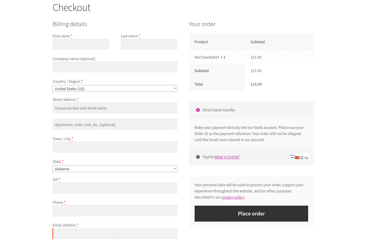
When it comes to online shopping, the checkout page is the critical last step that often determines whether a visitor becomes a paying customer. WooCommerce, being one of the most popular eCommerce platforms, offers robust functionalities but also presents unique challenges in optimizing the checkout experience. In this blog post, we’ll dive deep into the essentials of WooCommerce checkout page optimization, exploring techniques that enhance user experience, reduce cart abandonment, and ultimately increase your sales. By focusing on a seamless checkout process, you can transform potential drop-offs into satisfied customers.
Importance of a Streamlined Checkout Process
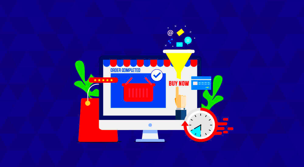
A streamlined checkout process isn’t just a nice-to-have; it’s an absolute necessity for any successful online store. Here’s why:
- Reduces Cart Abandonment: Studies show that nearly 70% of online shoppers abandon their carts. A lengthy or complicated checkout process is a primary reason behind this statistic. Simplifying each step can significantly reduce those numbers.
- Enhances User Experience: A well-organized checkout page provides clarity. When customers can easily navigate through payment and shipping options, they are more likely to complete their purchases.
- Increases Conversion Rates: Every additional step in your checkout can deter customers. A streamlined process minimizes friction, meaning more users convert into buyers.
- Improves Customer Trust: Transparency in pricing, security during payment transactions, and simplicity improve trust. Customers want to feel secure, and a clear and easy checkout process can help bolster their confidence.
- Mobile Optimization: With the rise of mobile shopping, ensuring that your checkout process is mobile-friendly is crucial. A seamless mobile experience can significantly enhance user satisfaction.
In conclusion, the importance of a streamlined checkout process cannot be overstated. Optimizing your WooCommerce checkout page can mean the difference between a successful sale and a lost customer. So, let’s dive into the specifics of how to achieve this optimization in your online store!
Assessing Your Current Checkout Performance
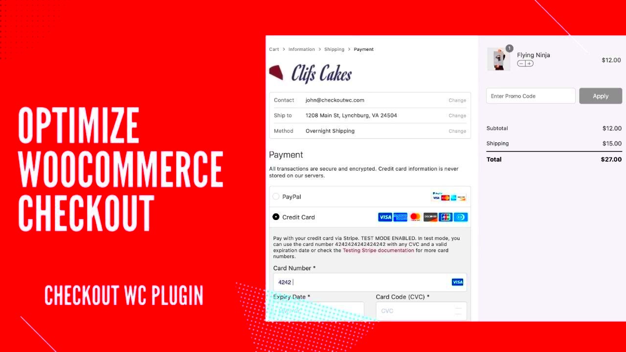
To optimize your WooCommerce checkout page, the first step is to assess its current performance. Understanding how your checkout page is functioning can help you identify areas for improvement. Start by looking into key metrics that directly affect the user experience and ultimately your sales.
- Abandonment Rate: One of the most critical metrics is the checkout abandonment rate. It tells you how many customers start the checkout process but don’t complete it. A high rate could signal issues with the checkout process or unexpected costs.
- Conversion Rate: This tells you the percentage of users who complete their purchase after visiting the checkout page. A low conversion rate may indicate that your checkout process is too complex or frustrating.
- Time on Checkout Page: Keep an eye on how long customers spend on the checkout page. If they linger too long, they may be encountering issues that are making the process cumbersome.
To gather these insights, you can use tools like Google Analytics or WooCommerce reports. Look for trends over time and any correlations with site updates or marketing campaigns. After gathering this data, consider reaching out to customers for feedback. A simple survey can reveal pain points. Once you understand your current performance, you can prioritize the changes that will make the most impact on your checkout page’s effectiveness.
Key Elements for an Effective Checkout Page
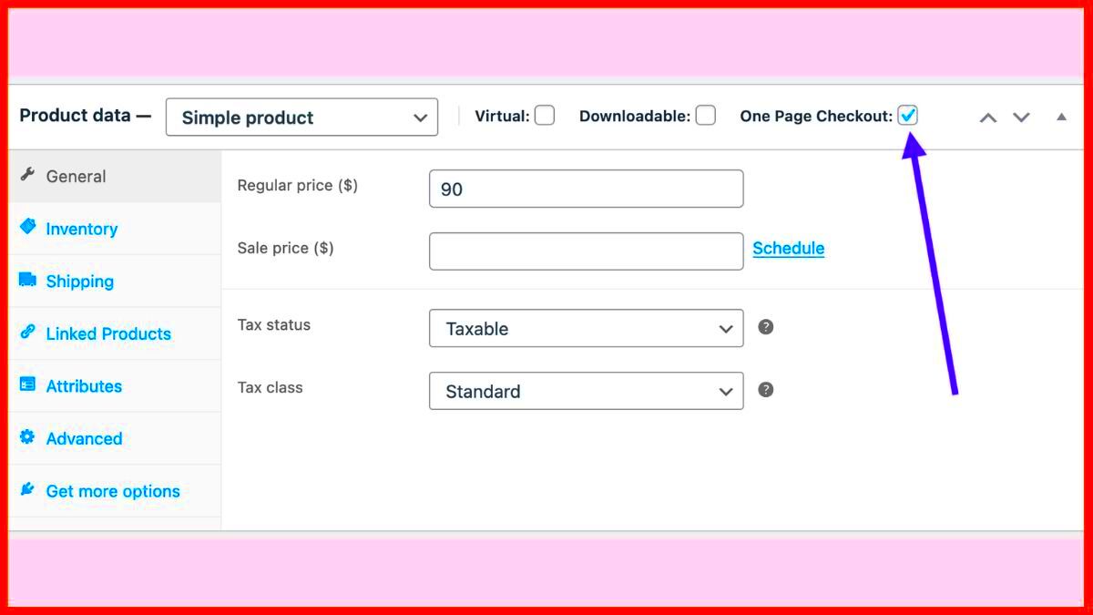
An effective checkout page is crucial for converting potential customers into buyers, and there are several key elements that can make or break this experience. By ensuring your checkout page has these features, you’ll likely see an increase in completed transactions.
| Key Element | Description |
|---|---|
| Simplicity | A clean and straightforward design minimizes distractions. Use clear language and logical flow to guide users through the process. |
| Guest Checkout Option | Allow customers to make purchases without creating an account. This reduces barriers and speeds up the checkout process. |
| Progress Indicators | Show users where they are in the checkout process, such as “Step 1 of 3.” This can manage expectations and reduce anxiety. |
| Multiple Payment Options | Offering various payment methods (credit cards, PayPal, etc.) caters to a wider audience and makes transactions easier. |
| Security Assurances | Display security badges and SSL encryption to instill trust and confidence, reassuring customers that their information is safe. |
Additionally, make sure to include a summary of the order, including shipping costs and total price. It’s essential for customers to see exactly what they are paying for, as unclear costs can lead to abandonment. Testing different layouts and elements can help you find the most effective combination. Ultimately, a seamless and customer-friendly design contributes significantly to a successful WooCommerce checkout page.
Designing a User-Friendly Checkout Layout
When it comes to e-commerce, the checkout page can often be the deciding factor between a completed sale and an abandoned cart. A well-designed, user-friendly checkout layout helps streamline the process and enhances the overall shopping experience for your customers. Here are some key elements to consider:
- Clear Navigation: Customers should easily understand how to navigate through the checkout. Use prominent buttons, clear labels, and a logical flow to guide them through each step.
- Minimalist Design: Keep the design simple and uncluttered. Avoid overloading the page with information or distractions. Focus on the essential elements needed to complete the purchase.
- Progress Indicators: Show customers where they are in the checkout process with a progress bar. This visual guide helps set expectations and reassures them that they’re close to finishing their order.
- Mobile Responsiveness: Ensure your checkout layout is optimized for mobile devices. With a significant number of shoppers using smartphones for purchases, it’s crucial that your design adapts smoothly to different screen sizes.
- Trust Signals: Display trust badges, security logos, and customer testimonials prominently. These signals can significantly reduce cart abandonment by instilling confidence in your customers.
Incorporating these elements into your checkout layout can significantly enhance user experience, leading to higher conversion rates and satisfied customers!
Optimizing Checkout Fields and Forms
Optimizing the checkout fields and forms is another crucial step in ensuring a seamless shopping experience. A well-thought-out form reduces friction and encourages more customers to complete their purchase.
- Limit Fields: Only ask for essential information. The fewer fields there are, the quicker customers can complete their order. Typically, the needed fields include:
- Name
- Shipping Address
- Payment Information
- Use Inline Validation: Implement real-time validation on form fields. This means customers receive immediate feedback if they’ve entered incorrect information, such as an invalid email or address.
- Autofill Options: Enable autofill for standard fields to save customers time. A user can simply tap to accept their stored information—making the process quicker and reducing frustration.
- Label Placement: Position labels above or within the fields themselves. This way, customers can see what they’re required to enter without losing sight of the field itself.
- Offer Guest Checkout: Allow customers to check out without creating an account. While account creation encourages repeat business, many customers prefer a quick checkout option, especially for impulse buys.
By meticulously optimizing checkout fields and forms, you enhance the likelihood of completed purchases, reduce cart abandonment, and create a better experience for your customers. Remember, every small improvement can lead to significant gains in conversions!
Implementing Trust Signals and Security Features
Have you ever hesitated at a checkout page, questioning whether your personal information would be secure? You’re not alone! Implementing trust signals and security features on your WooCommerce checkout page can significantly reduce buyers’ apprehensions, leading to higher conversion rates.
Trust signals are those little nudges that help customers feel at ease. They can be as simple as showcasing security badges, encryption icons, or even customer reviews. Here’s a list of effective trust signals you should consider:
- SSL Certificate: Ensure your website is secured with an SSL certificate. An “https” before your URL signals that customer data is encrypted.
- Payment Badges: Display trusted payment methods like PayPal, Visa, and Mastercard. Familiar logos can ease consumer anxiety.
- Money-Back Guarantee: Promising a refund shows confidence in your product and reassures customers about their purchase.
- Customer Reviews and Testimonials: Display positive reviews prominently on your checkout page to help potential buyers feel more assured.
- Clear Return Policy: Having a straightforward return policy can alleviate fears about making the wrong choice.
Additionally, don’t skimp on security features. Ensure that your checkout process is secure and straightforward. Use reCAPTCHA to prevent bot attacks, and consider including a short privacy policy statement at checkout. This will help customers know you value their privacy and security, making them feel more comfortable about completing their purchase.
Enhancing Mobile Responsiveness
With more and more consumers shopping on their smartphones, enhancing mobile responsiveness on your WooCommerce checkout page is crucial. A seamless mobile experience can make all the difference in whether a visitor completes their purchase or abandons their cart.
So, what exactly does it mean to enhance mobile responsiveness? Let’s break it down:
- Responsive Design: Use a theme that automatically adjusts to different screen sizes. This ensures your checkout page looks great on both mobile and desktop.
- Optimized Form Fields: Simplify forms for mobile users. Use dropdown menus, checkboxes, and auto-fill wherever possible to speed up the checkout process.
- Large Clickable Buttons: Ensure buttons are easily clickable, with ample spacing to reduce accidental clicks.
- Fast Loading Times: Optimize images and scripts to ensure your mobile checkout page loads quickly—nobody likes to wait!
Testing is key! Regularly test the checkout process on various devices and screen sizes to identify any hiccups. Ask users for feedback on their experience and be open to making changes. Remember, a mobile-friendly checkout can be the deciding factor that encourages a customer to complete their purchase, rather than abandon their cart. Happy optimizing!
Incorporating Payment Options and Methods
When it comes to optimizing your WooCommerce checkout page, offering multiple payment options is crucial. Think about it: when customers reach the payment stage, they want convenience and flexibility. If they can’t find a payment method that suits their needs, they might just abandon their cart and head for the exit. So, how can you ensure that doesn’t happen?
First off, consider integrating popular payment gateways. Here’s a quick list of options you might include:
- Credit/Debit Cards: Visa, MasterCard, American Express.
- PayPal: A globally trusted option.
- Apple Pay and Google Pay: For customers who love mobile wallet payments.
- Stripe: Great for handling recurring payments.
- Cryptocurrency: An emerging trend that some shoppers appreciate.
Don’t just stop at offering these methods. Make sure to enhance the user experience in the payment process. For instance:
- Provide a secure payment seal to assure customers their information is protected.
- Implement auto-fill for address fields to speed up the process.
- Clear checkout buttons—use contrasting colors to make the action buttons stand out.
By ensuring that your customers can pay in a way that makes them comfortable, you’ll see fewer abandoned carts and increased conversions. Keep testing and tweaking until you find the perfect mix!
Utilizing Progress Indicators
When customers are in the midst of checking out, they appreciate knowing how much longer they have to go before they complete their purchase. This is where progress indicators come into play. These visual cues can make a world of difference in user experience. So, what are they exactly?
Progress indicators are visual representations showing the stages in the checkout process. They could be as simple as a bar or as detailed as steps outlined with labels. Here are some benefits to using progress indicators:
- Reduces Anxiety: Shoppers can see how far they’ve come and what lies ahead.
- Improves Usability: Clearly defined stages enhance understanding of the process.
- Encourages Completion: The satisfaction of moving through steps motivates users to finish.
For an effective progress indicator, consider the following best practices:
| Best Practice | Description |
|---|---|
| Keep it Simple | Use clear, concise labels for each step like “Shipping,” “Payment,” and “Review.” |
| Visual Appeal | Employ colors and icons to make each step visually engaging. |
| Highlight Current Step | Make sure the current step is emphasized to reduce confusion. |
In conclusion, utilizing progress indicators not only enhances the checkout process but makes it less intimidating for customers. Combine that with various payment options, and you’re setting the stage for a seamless, optimized checkout experience.
Strategies for Reducing Abandonment Rates
Abandonment rates during the checkout process can be a painful dagger to your e-commerce efforts. It’s crucial to identify and implement effective strategies that can help reduce these rates and turn potential losses into confirmed sales. Here are some tried-and-true methods you can adopt:
- Simplify the Checkout Process: Aim to minimize the number of steps involved in the checkout. The clearer and more straightforward the process, the less likely users are to abandon their carts. Ideally, aim for a one-page checkout.
- Guest Checkout Option: Not everyone wants to create an account just to buy a product. Adding a guest checkout option can significantly reduce friction and cater to impulse buys.
- Display Trust Signals: Ensure you are using SSL certificates, and display trusted payment options and security badges. This builds consumer confidence and can encourage them to complete their transaction.
- Provide Multiple Payment Options: Different customers prefer different payment methods. Including options like PayPal, credit cards, and even cryptocurrency can help meet a wider array of preferences.
- Transparent Pricing: Hidden costs can be a major deterrent for customers. Be upfront about shipping fees, taxes, and any other additional costs as early in the process as possible.
- Use Cart Reminders: Email reminders can be highly effective. Send a follow-up to customers who abandon their carts, perhaps offering a small discount as an incentive to return.
Testing and Analyzing Checkout Performance
Understanding how well your checkout page is performing is just as crucial as optimizing it. By systematically testing and analyzing the performance, you can pinpoint issues and successes alike. Here’s how you can approach this critical aspect:
| Testing Method | Description | Benefits |
|---|---|---|
| A/B Testing | Compare two different versions of your checkout page to see which performs better. | Identifies the most effective layout, copy, or call-to-action. |
| Heatmaps | Visual tools that track user clicks and interactions on your page. | Gives insight into user behavior and can highlight confusing content areas. |
| Analytics Tools | Tools like Google Analytics can offer detailed insights into traffic, conversions, and abandonment rates. | Helps identify bottlenecks where users drop off. |
Once you have your testing data, analyze it to make informed decisions about changes. Look for patterns, such as:
- High drop-off rates at specific steps in the checkout process.
- Common exit pages or user feedback indicating frustration.
- Long loading times that correlate with increased abandonment.
By consistently testing and analyzing your checkout performance, you’ll continuously refine the shopping experience, ultimately leading to fewer abandoned carts and more completed purchases.
Conclusion and Next Steps for Optimization
Optimizing the WooCommerce checkout page is essential for reducing cart abandonment rates and enhancing overall user experience. A seamless and efficient checkout process encourages customers to finalize their purchases, ultimately boosting sales. Here are key strategies to ensure your checkout page is optimized:
- Simplify Checkout Process: Limit the number of form fields to the essential information needed for completing a purchase.
- Enable Guest Checkout: Allow customers to make purchases without creating an account, reducing friction during the checkout.
- Improve Loading Speeds: Optimize images and scripts to ensure the checkout page loads quickly on all devices.
- Implement Autofill Features: Use browser autofill capabilities to save customers time when entering address details.
- Offer Multiple Payment Options: Include various payment methods (credit cards, PayPal, etc.) to cater to diverse customer preferences.
- Incorporate Trust Signals: Display security badges and customer reviews to instill trust in potential buyers.
- Mobile Optimization: Ensure the checkout page is fully responsive and user-friendly on mobile devices.
- Use Progress Indicators: Show a progress bar to inform customers about their current position in the checkout process.
By focusing on these elements, you’ll create a more intuitive and appealing checkout experience that encourages customers to complete their purchases. Continuous testing and adjustments based on user feedback and analytics are crucial for maintaining an optimized checkout page. Regularly update strategies to stay ahead of changing consumer expectations and technological advancements, ensuring your WooCommerce store remains competitive.

