Dropdown menus are a popular way to organize website navigation, especially if you have multiple pages or categories. They help users find content quickly without cluttering the main menu bar. In WordPress, creating dropdown menus is quite simple, even if you’re not a coding expert. With just a few clicks, you can add submenus to your existing navigation, making your site more organized and user-friendly. Let’s explore why you should consider using dropdown menus and how to set them up on your WordPress site.
Why an Interactive Dropdown Menu is Important for Your Website

An interactive dropdown menu adds a professional touch to your website, enhancing the overall user experience. Here are some key reasons why integrating an animated dropdown menu can be beneficial:
- Improves User Navigation: Dropdown menus help visitors find specific sections of your website without getting lost. This reduces bounce rates and encourages users to explore more content.
- Organizes Content Efficiently: If you have multiple categories, services, or blog posts, a dropdown menu keeps everything neatly tucked away, making your site look clean and well-structured.
- Boosts Engagement: Interactive animations capture attention. When users hover over your menu, smooth transitions and animations can make your site feel more dynamic and engaging.
- Enhances Mobile Usability: Many dropdown menus are mobile-friendly by default, offering easy navigation on smartphones and tablets. This is crucial as more people browse on mobile devices.
Overall, an interactive dropdown menu can elevate your website’s appearance while providing a better user journey. It’s a small addition with a big impact.
Step-by-Step Guide to Creating a Dropdown Menu in WordPress
Setting up a dropdown menu in WordPress is easier than you might think. Follow this simple guide to get started:
- Log in to Your WordPress Dashboard: Head to your WordPress admin panel by visiting
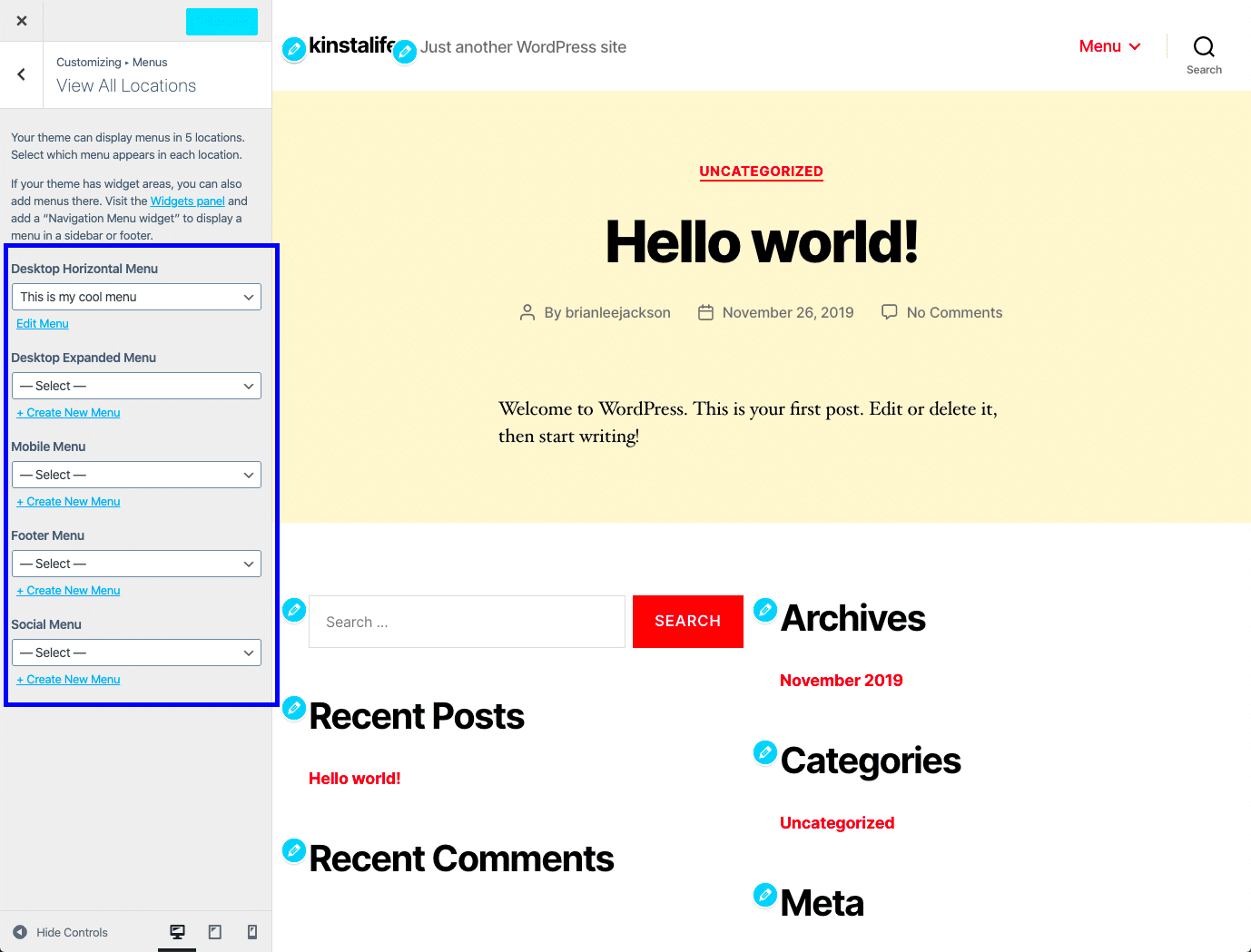
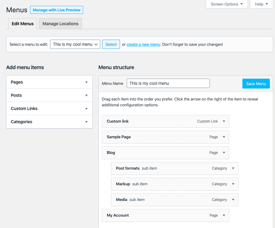
yourwebsite.com/wp-adminand logging in. - Navigate to the Menu Settings: Go to Appearance > Menus. If you don’t have a menu yet, click Create a New Menu.
- Add Menu Items: Choose the pages, posts, or custom links you want to include in your menu. Click Add to Menu.
- Create a Dropdown: To make a submenu, drag the menu item slightly to the right under a parent item. This will create a hierarchy.
- Enable Menu Animation (Optional): If you want to add animations, you can use custom CSS or a plugin. For example, adding a
transitioneffect can make your dropdown appear smoother. - Save Your Menu: Once everything looks good, click Save Menu. Don’t forget to assign it to a location, like the header or footer.
That’s it! You’ve successfully created a dropdown menu. For even more customization, consider using plugins or adding custom CSS to enhance the look and feel of your dropdown.
Adding Custom Animation Effects to Your Dropdown Menu
Adding animations to your dropdown menu can make your website more engaging and visually appealing. Not only do animations capture attention, but they also provide a smoother user experience. Here’s how you can easily add custom animations to your WordPress dropdown menu:
- Using CSS for Basic Animations: You can add a simple hover effect with CSS. For example:
.submenu {
    display: none;
    transition: all 0.3s ease-in-out;
}
.menu-item:hover .submenu {
    display: block;
}
This code creates a smooth fade-in effect when users hover over a menu item.
- Leverage JavaScript for Advanced Effects: If you want more dynamic animations like sliding or bouncing, use JavaScript or jQuery. For instance,
slideToggle()can be used for a sliding effect. - Use WordPress Plugins: There are several plugins available that let you add animations without touching a single line of code. Look for options like Max Mega Menu or WP Mega Menu to easily integrate animated dropdowns.
- Test for Performance: Keep in mind that heavy animations can slow down your site. Always test the performance impact of any animations you add, especially on mobile devices.
Animations, when used correctly, can significantly improve your site’s visual flow and help guide users through your content. Just remember to keep it subtle so it enhances the experience without being distracting.
Best Plugins for Enhancing Dropdown Menus in WordPress
If you want to take your dropdown menus to the next level, consider using WordPress plugins that offer advanced features and customization. Here are some top plugins to enhance your dropdown menus:
| Plugin | Features | Price |
|---|---|---|
| Max Mega Menu |
|
Free (Pro version available) |
| WP Mega Menu |
|
Free |
| UberMenu |
|
Premium ($25 one-time fee) |
Using these plugins can save you time and effort, especially if you’re not comfortable with coding. They offer a variety of features that can transform your basic dropdown menu into a fully interactive navigation system.
Common Mistakes to Avoid When Setting Up Dropdown Menus
While dropdown menus are great for organizing content, there are some common pitfalls that you should avoid. Here are a few mistakes to watch out for:
- Overloading the Menu: Adding too many items to your dropdown can overwhelm users. Stick to a maximum of 7-10 items per dropdown to keep it user-friendly.
- Poor Mobile Optimization: Ensure that your dropdown menus are responsive. Menus that look great on desktop can be difficult to navigate on mobile devices. Use plugins or CSS media queries to optimize for smaller screens.
- Slow Loading Times: Heavy animations or images in your dropdown can slow down your website. Optimize your code and images to maintain quick load times.
- Unclear Labels: Use clear and concise labels for your menu items. Avoid jargon or overly creative names that can confuse visitors.
- Forgetting Accessibility: Dropdown menus should be accessible for all users, including those using screen readers. Add
arialabels and keyboard navigation support to improve accessibility.
Avoiding these mistakes will help you create a dropdown menu that enhances user experience and supports your website’s goals. Focus on clarity, simplicity, and responsiveness to get the best results.
Tips for Optimizing Your Dropdown Menu for Mobile Users
With the increasing number of mobile users, it’s crucial to optimize your dropdown menu for smaller screens. A well-designed mobile menu ensures that visitors can easily navigate your site, regardless of the device they’re using. Here are some tips to enhance your dropdown menu for mobile users:
- Use a Hamburger Menu Icon: Instead of displaying a full menu, use a collapsible hamburger icon (☰). This saves space and keeps your mobile layout clean.
- Enable Touch-Friendly Menus: Make sure your dropdown menus are touch-responsive. Increase the size of clickable areas to avoid accidental taps.
- Implement Smooth Slide Animations: Sliding effects are more intuitive on mobile. Use CSS or plugins that support smooth slide-in and slide-out animations for your dropdowns.
- Optimize for Speed: Mobile users expect fast loading times. Minimize the use of heavy scripts and images in your menus to improve performance.
- Test on Various Devices: Regularly test your menu on different mobile devices to ensure it works seamlessly. Use browser developer tools or online emulators for quick testing.
- Consider Sticky Menus: Sticky menus stay at the top of the screen as users scroll down. This feature can improve navigation, especially on longer pages.
By following these tips, you can create a mobile-friendly dropdown menu that enhances user experience and encourages visitors to stay longer on your site.
FAQs for Setting Up Dropdown Menus in WordPress
Here are some frequently asked questions to help you troubleshoot and enhance your dropdown menus in WordPress:
- How do I create a dropdown menu in WordPress?
Go to Appearance > Menus in your WordPress dashboard. Add the pages you want and drag them slightly to the right to create a dropdown effect. Then, save the menu. - Can I add animations to my dropdown menu without coding?
Yes! There are several plugins, like Max Mega Menu or WP Mega Menu, that allow you to add animations with just a few clicks. - Why is my dropdown menu not working on mobile?
If your dropdown menu isn’t working on mobile, check your theme’s settings for responsive design options. You may need to add custom CSS or use a mobile-friendly menu plugin. - How can I make my dropdown menu accessible?
To make your menu accessible, addaria-labelsand ensure keyboard navigation is supported. This helps users with disabilities easily navigate your site. - What are the best plugins for advanced dropdown menus?
Some of the best plugins include UberMenu for extensive customization, WP Mega Menu for drag-and-drop functionality, and Superfly for stylish, vertical menus.
These FAQs should help you get the most out of your WordPress dropdown menus. If you run into any issues, explore WordPress forums or seek professional support for solutions.
Final Thoughts on Improving Navigation with Animated Dropdown Menus
Dropdown menus are an essential part of website navigation, especially if you have a lot of content to organize. By adding animations and optimizing for mobile users, you can significantly improve the overall user experience. Keep these key takeaways in mind:
- Focus on Usability: A simple, user-friendly menu structure will help visitors find what they’re looking for quickly.
- Enhance with Subtle Animations: Adding subtle animations can make your site feel modern and engaging, but avoid overdoing it to prevent slow loading times.
- Test for Mobile Compatibility: Always ensure that your menus are mobile-friendly, as a large portion of users will be accessing your site on their phones or tablets.
- Use Plugins for Advanced Features: If you want extra functionality without coding, look into popular plugins that offer easy customization and animation options.
In the end, a well-designed dropdown menu not only enhances your site’s navigation but also leaves a positive impression on your visitors. Take the time to implement these tips, and you’ll likely see an improvement in user engagement and site performance.


