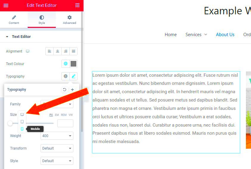
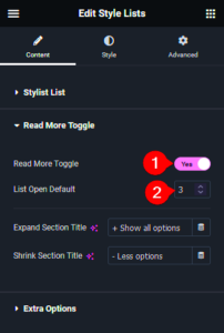
When creating a website using Elementor, one of the key design choices you’ll face is setting the base font size. It might seem like a small detail, but it plays a significant role in how your content is perceived. By default, Elementor uses a standard base font size of 16px, but sometimes you might want to adjust this to better fit your design or improve accessibility. In this post, we’ll dive into the importance of base font size and how to set it to 10px.
Understanding Why Base Font Size Matters
Base font size is much more than just a stylistic choice; it affects the readability, aesthetics, and overall user experience of your website. Here are some reasons why the base font size is crucial:
- Readability: A well-chosen base font size ensures that your text is legible on all devices. Setting a smaller base size, like 10px, can help maintain a clean look without overwhelming users with oversized text.
- Design Consistency: The base font size sets the tone for your entire website. Having a standard size ensures that headings, paragraphs, and other text elements remain consistent throughout, allowing for a cohesive visual experience.
- User Experience: A smaller base font size can enhance the user experience by fitting more information on the page without compromising clarity. This is especially beneficial for content-heavy sites.
- Accessibility: While some may argue that smaller text can be hard to read, it can be combined with proper color contrast and spacing to maintain accessibility standards.
Before making any changes, consider your audience and the type of content you’re presenting. Different users may have different needs when it comes to font size, so establishing a base size should be a thoughtful decision!
How to Access Elementor Settings
Accessing the Elementor settings is quite straightforward, and it’s one of the first things you’ll want to do when optimizing your website’s design. Whether you’re building a new page or editing an existing one, here’s how to get there:
- Log into Your WordPress Dashboard: Start by logging into your WordPress admin area. This is typically done by visiting
yourwebsite.com/wp-adminand entering your credentials. - Navigate to the Page or Template: Once you’re in the dashboard, find the page you want to edit. You can do this by selecting Pages from the menu on the left. Hover over the desired page and click on Edit with Elementor.
- Access Site Settings: After the Elementor editor opens, look for the hamburger icon (three horizontal lines) located in the upper left corner. Click it to reveal the menu options.
- Open the Global Settings: In the menu, you will see various options. Select Site Settings. This is where you can modify broader settings that will apply across your website.
And there you have it! You’re now in the right place to adjust key settings, including the base font size. Just remember, these changes can affect the overall look of your site, so take your time to explore the options available to you.
Step-by-Step Guide to Setting Base Font Size to 10px
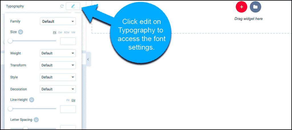
Setting your base font size to 10px in Elementor can help create a cleaner and more cohesive look throughout your website. Follow this step-by-step guide to achieve your desired font settings:
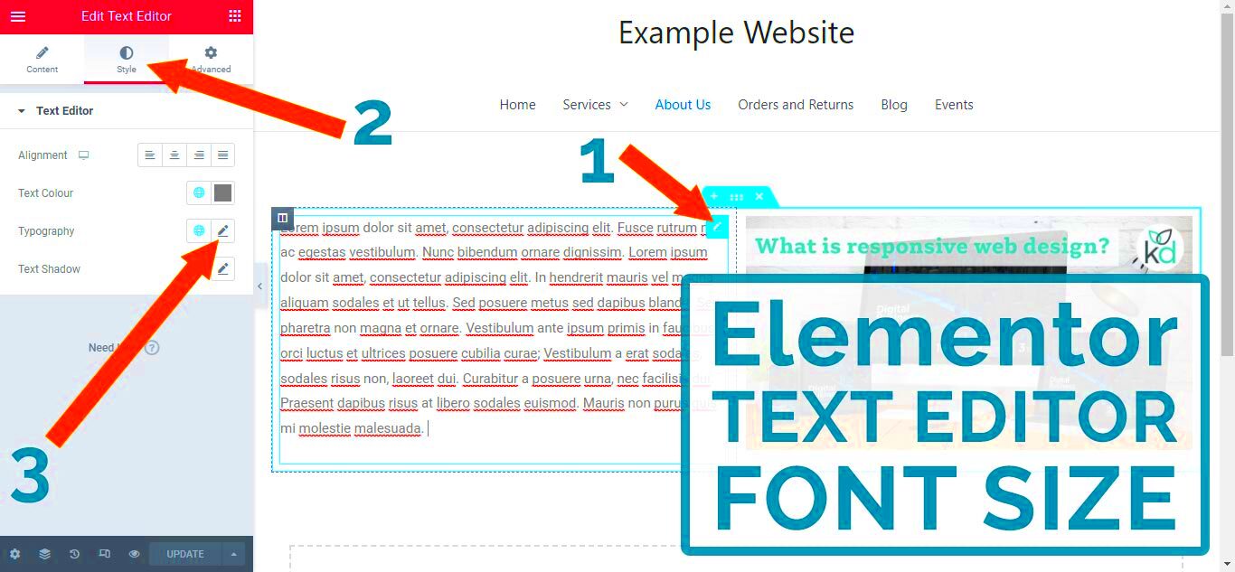
- Once in the Site Settings: After accessing the Site Settings as explained previously, you’ll see various options including Typography.
- Select Typography: Click on the Typography option. This section controls all text-related settings across your site.
- Adjust Base Size: Locate the Base Font Size setting. It might be under a section labeled Global Typography. Here, you can enter your preferred base font size.
- Set Font Size to 10px: Type “10” in the box and make sure to select “px” from the dropdown menu next to it.
- Preview Your Changes: Once you’ve set the base font size, it’s crucial to preview your site. Look for the Preview Changes button, often represented by an eye icon. This allows you to see how the site looks with your new settings.
- Save Your Changes: If everything looks good, don’t forget to click the Update button to save your changes. Otherwise, your adjustments won’t be applied.
And that’s it! You’ve successfully set your base font size to 10px. Keep in mind that this can affect legibility across devices, so always check your mobile settings as well. Happy designing!
Adjusting Other Typography Settings
Once you’ve set your base font size to 10px in Elementor, the next logical step is to tweak other typography settings to ensure your text looks just right. Typography isn’t just about the size; it also encompasses font type, line height, letter spacing, and text color. These factors significantly impact how your content is perceived by readers.
Here’s a breakdown of key typography settings you should consider adjusting:
- Font Families: Select fonts that reflect your brand. Consider the mood and theme of your content. Google Fonts integrates seamlessly with Elementor, offering a plethora of choices.
- Line Height: This is crucial for readability, particularly when your base font size is small. A good rule of thumb is to set the line height to 1.5 times the font size.
- Letter Spacing: For smaller font sizes, increased letter spacing can improve legibility. Try adjusting this setting in increments until it feels comfortable.
- Text Color: Make sure your text stands out against the background. Good contrast is essential for readability—think about using darker shades on lighter backgrounds and vice versa.
Don’t forget, consistency is key. The typography settings should reflect your entire site’s theme—don’t mix too many styles, as this can create visual confusion.
Once you’ve adjusted these settings, take a moment to preview changes on your Elementor editor. It allows you to see how the typography aligns with your design before publishing.
Testing Your Changes on Different Devices
In today’s mobile-centric world, ensuring that your website looks great on all devices is absolutely essential. After setting your base font size and adjusting other typography settings, the next best step is to test everything on various devices. Elementor provides responsive settings that allow you to fine-tune your design for different screen sizes.
Here are a few considerations for testing your changes:
- Desktop: Ensure that your typography settings look good on larger screens. Pay attention to the proportion of text size, line height, and spacing in relation to other elements.
- Tablet: This is where things can change quite a bit. You might need to adjust your font size or spacing settings to ensure a seamless experience. Check if the text is readable and well-aligned.
- Mobile: Often, smaller screens require the most adjustments. Make sure your text isn’t cramped or overflowing beyond its container. Remember, most mobile users will appreciate larger touch points and easily readable text.
| Device | Suggested Font Size | Line Height |
|---|---|---|
| Desktop | 10px – 16px | 1.5 |
| Tablet | 12px – 18px | 1.4 |
| Mobile | 14px – 20px | 1.6 |
After testing, make any necessary tweaks directly in Elementor’s responsive settings. Remember, the goal is to create a pleasant reading experience across all devices! Finally, don’t forget to check out how your website’s typography renders in different web browsers. A small yet significant step towards a polished final product.
7. Common Issues and Troubleshooting Tips
When adjusting the base font size in Elementor to 10px, you might encounter some common issues. No worries, though! Here are a few problems you may face along with simple troubleshooting tips to help you get back on track.
- Inconsistent Font Size Across Devices: Sometimes, you may find that the font size looks different on mobile or tablet devices compared to desktop. This can happen due to responsive settings in Elementor.
- CSS Overrides: If you’ve applied custom CSS or if your theme has its own styles, it might override your Elementor settings. Inspect elements in your browser to check for conflicting CSS rules.
- Browser Cache: Changes might not reflect immediately because of browser caching. Clear your cache or check the site in an incognito window to see the updates.
To quickly troubleshoot, follow these steps:
- Check your responsive settings in Elementor to make sure the font size is consistent across all devices.
- Inspect any custom CSS rules or settings in your theme that may affect the font size.
- Clear your browser cache and test the font size adjustments in incognito mode.
If these tips don’t resolve the issue, consider reaching out to Elementor’s support team or checking their extensive documentation and community forums. They offer a treasure trove of information that can help you solve any tricky problems that come your way.
8. The Impact of Base Font Size on Accessibility
The base font size of your website plays a crucial role in accessibility. Setting a base font size to 10px might seem like a benign choice, but it can have significant implications for users, especially those with visual impairments or reading difficulties. Here are some key points to consider:
- Readability: Text that is too small can be challenging to read. While 10px may look sleek on certain designs, it can strain the eyes and discourage users from engaging with your content.
- Adaptability: A base font size of 10px limits the ability of users to adjust text size comfortably. Accessibility standards suggest allowing users to zoom or adjust their view without losing content structure.
- SEO Considerations: Search engines increasingly prioritize user experience. If users struggle to read your content, they might leave your site quickly, leading to higher bounce rates that can affect your SEO rankings.
To ensure a more accessible experience, consider the following best practices:
| Best Practices | Description |
|---|---|
| Choose an Optimal Base Size | Consider setting your base font size to at least 16px for better readability across various devices. |
| Use Relative Units | Utilize em or rem units for font sizes, as they scale better with the user’s browser settings. |
| Test for Accessibility | Always use accessibility tools to evaluate how easy your text is to read and adjust as necessary. |
By thoughtfully considering your base font size, you’re not just enhancing usability; you’re fostering a more inclusive web experience for all of your visitors. Small adjustments can make a world of difference!
Conclusion: Best Practices for Font Sizing in Elementor
Setting the base font size in Elementor to 10px can significantly enhance your design flexibility and responsiveness when building websites. However, achieving optimal typography goes beyond merely adjusting the base size. Here are some best practices to keep in mind:
- Utilize REM Units: Whenever possible, use REM (Root EM) units instead of pixels for font sizes. This promotes scalability and improves accessibility, particularly for users who may need larger text.
- Leverage Elementor’s Typography Settings: Elementor offers diverse typography options. Use these to adjust sizes for various devices (desktop, tablet, mobile) to ensure consistency across platforms.
- Maintain Readability: Always prioritize readability over style. Ensure that your text contrasts well with the background, and that font sizes are adequate for reading without strain.
- Implement Hierarchical Sizing: Establish a clear hierarchy in your text sizes. Using larger fonts for headings and smaller sizes for body text helps guide users’ attention effectively. A typical scale might look like this:
| Element | Font Size (px) |
|---|---|
| Body Copy | 10px |
| H1 | 24px |
| H2 | 20px |
| H3 | 18px |
In conclusion, while setting the base font size to 10px in Elementor can be advantageous, it’s essential to also focus on other aspects of typography to create a visually appealing and user-friendly website.

