In today’s fast-paced digital world, having a responsive WordPress menu is essential for any website. As users increasingly access sites from various devices—be it a smartphone, tablet, or desktop—it’s crucial that your menu adapts seamlessly to different screen sizes. A well-designed responsive menu enhances user experience, keeps visitors engaged, and can significantly improve navigation efficiency.
Responsive menus are designed to collapse or transform based on the screen size, ensuring that users can easily find what they’re looking for without frustration. This adaptability not only enhances usability but can also positively influence your website’s SEO performance by reducing bounce rates and encouraging longer site engagement.
Whether you’re building a blog, an e-commerce store, or a portfolio site, creating a responsive menu using tools like Elementor opens up a world of creative possibilities. Let’s dive deeper into what makes a responsive WordPress menu effective and why it matters in today’s website design landscape.
Understanding Elementor: A Brief Overview
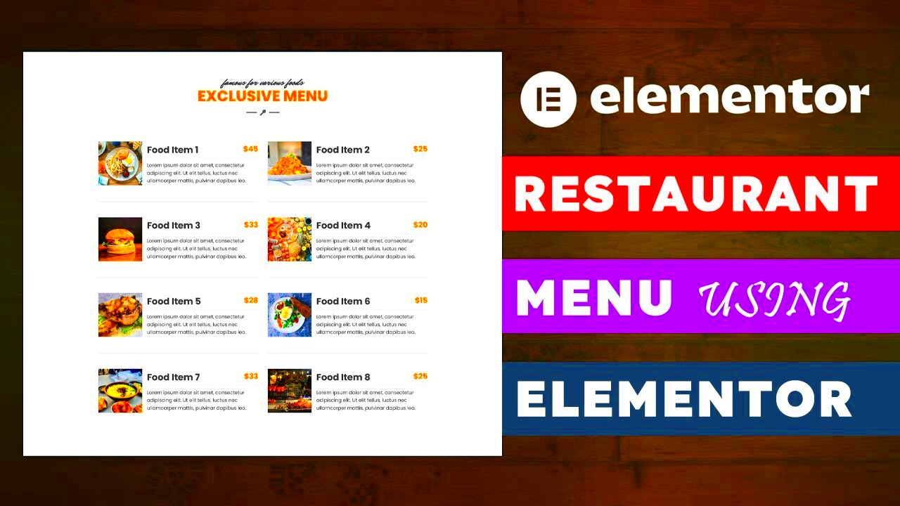
Elementor is a powerhouse page builder for WordPress that has revolutionized the way we design websites. With its intuitive drag-and-drop interface, Elementor allows users—regardless of their technical skills—to create stunning, responsive layouts effortlessly. Here are a few key highlights of Elementor:
- User-Friendly Interface: Its visual editor makes it easy to see your changes in real time, which means no more guesswork.
- Pre-designed Templates: Elementor comes with a plethora of templates that can serve as a solid foundation for your design.
- Responsive Design Controls: You can fine-tune how your elements look on different devices ensuring a cohesive experience across all platforms.
- Widgets and Add-ons: With a wide range of widgets, you can easily add functionalities like buttons, forms, and sliders to your menu.
In essence, Elementor empowers you to build anything from a simple blog to a complex e-commerce platform without writing a single line of code. Its flexibility and powerful features make it a fantastic choice for creating responsive WordPress menus that are not only functional but also visually appealing.
Why Responsive Menus Matter for Your WordPress Site
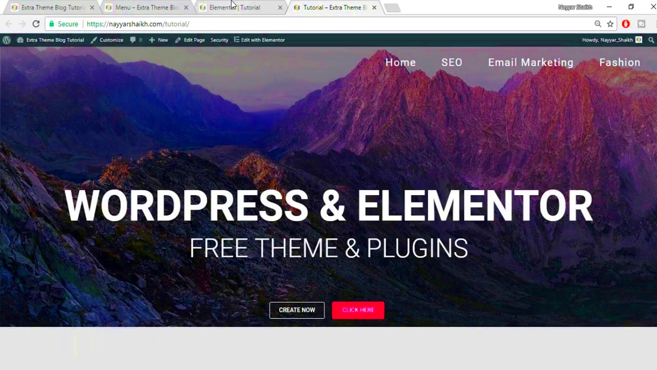
In today’s digital world, a website is often the first point of contact between a business and its audience. With increasing mobile usage, ensuring that your website is easy to navigate on any device is crucial. This is where responsive menus come into play. But why exactly should you prioritize responsive menus for your WordPress site? Let’s break it down:
- Improved User Experience: A responsive menu adapts to the screen size, making navigation seamless across devices. Users can easily find what they’re looking for, whether they’re on a smartphone, tablet, or desktop.
- Higher Engagement: When users can navigate your site without frustration, they are more likely to explore your content, leading to longer session durations and increased engagement.
- SEO Benefits: Search engines, like Google, prioritize user-friendly websites. A well-structured, responsive menu can enhance your site’s SEO, potentially boosting your rankings in search results.
- Consistent Branding: A responsive menu can help maintain your brand’s identity, regardless of the device. Consistency is key for recognition and trust.
- Fewer Bounce Rates: If users can’t find what they need quickly, they’re likely to leave your site. A responsive menu can significantly reduce bounce rates by making navigation straightforward.
In essence, a responsive menu isn’t just about aesthetics; it’s about creating a user-friendly experience that keeps visitors coming back for more. So, if you aim to enhance user satisfaction and engagement on your WordPress site, investing in responsive menus is a must!
Getting Started with Elementor for Menu Design
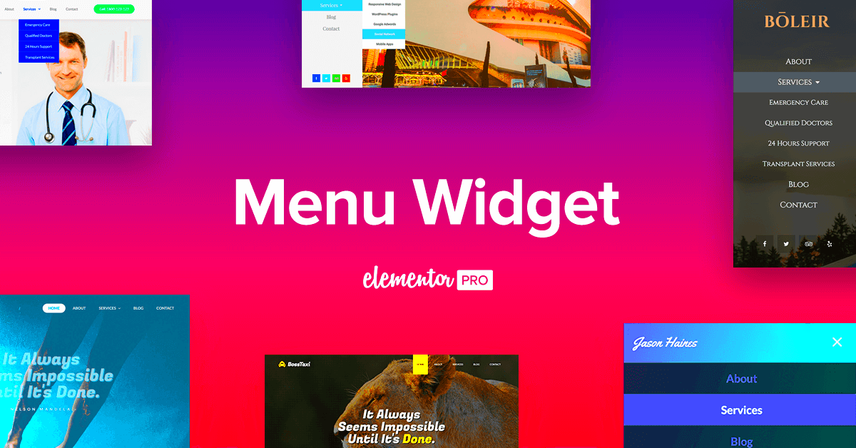
If you’re ready to dive into menu design using Elementor, you’re in for a treat! Elementor is a user-friendly page builder that makes creating and customizing menus a breeze, even if you don’t have any coding experience. Let’s walk through the steps to get you started:
- Install the Elementor Plugin: First things first, you’ll need to have the Elementor plugin installed on your WordPress site. Just go to the Plugins section in your dashboard, click Add New, search for “Elementor,” and install it.
- Create a New Header: After installing Elementor, you can create a new header template. Go to Templates > Add New, select Header, and give it a name.
- Use the Nav Menu Widget: Drag and drop the Nav Menu widget into your header template. This is where you’ll customize your site’s menu options.
- Customize Design: Here’s where the fun begins! With Elementor, you can change colors, typography, padding, and more to ensure your menu matches your site’s aesthetics.
- Make it Responsive: Don’t forget to check the responsive settings! Elementor allows you to adjust how your menu looks on different devices—desktop, tablet, and mobile. Make adjustments as needed.
- Publish Your Menu: Once you’re happy with your design, hit the publish button. You can choose where you want this header to appear (entire site, specific pages, etc.).
And there you go! With these steps, you’re well on your way to creating a stunning, responsive menu that enhances navigation on your WordPress site. Elementor’s drag-and-drop functionality and intuitive interface make the whole process enjoyable and straightforward.
5. Step-by-Step Guide to Creating a Responsive Menu
Creating a responsive menu in WordPress using Elementor is a straightforward yet powerful task. The beauty of Elementor is that it allows you to design menus that work seamlessly on all devices. Here’s a step-by-step guide to help you create your very own responsive menu:
- Install and Activate Elementor: If you haven’t done so already, install the Elementor plugin from your WordPress dashboard. Go to Plugins > Add New, search for Elementor, install, and activate it.
- Create a New Header Section: Navigate to Templates > Theme Builder. Click on Add New and select Header. This opens the Elementor editor where you can design your custom header.
- Add a Nav Menu Widget: Drag the Nav Menu widget from the Elementor panel onto your header section. This widget will pull in the menus you’ve created in your WordPress dashboard.
- Select Your Menu: In the settings for the Nav Menu widget, choose the menu you wish to display from the dropdown. Remember, it should be pre-created under Appearance > Menus.
- Customize Menu Alignment: Choose the alignment of your menu (left, center, right) according to your design preference. Use the options listed under the Layout settings.
- Responsive Settings: In the Elementor panel, switch to the mobile view. Here, you can adjust the spacing, typography, and alignment specific to mobile devices.
- Publish and Test: Once you are satisfied with your responsive menu design, click the Publish button. Always test it on different devices to ensure it looks and functions perfectly.
That’s it! You’ve successfully created a responsive menu using Elementor that will enhance your site’s navigation experience!
6. Customizing Your Responsive Menu Design
Now that you have your responsive menu up and running, it’s time to give it a personal touch! Customizing your responsive menu design in Elementor can significantly enhance the aesthetic appeal of your site. Here’s how you can do it:
- Styling the Menu Item: Click on the Nav Menu widget and head over to the Style tab. Here, you can modify:
- Typography: Change font size, weight, and style. Choose a font that fits your website’s theme.
- Text Color: Adjust the color for normal, hover, and active states to help guide users’ attention.
- Padding and Margin: Customize the space around your menu items to achieve a cleaner layout.
With these customization options, you can create a distinctive and appealing responsive menu that resonates with your website’s audience!
7. Enhancing User Experience with Mobile-First Design
When it comes to web design today, the focus has shifted significantly towards mobile-first design. This approach prioritizes the needs and preferences of mobile users, ensuring that your website is both functional and visually appealing on smaller screens. With the increasing use of smartphones to access the internet, selecting a mobile-first strategy is no longer optional; it’s essential.
So, how does this relate to responsive WordPress menu designs using Elementor? Well, it all starts with simplicity and accessibility. A mobile-first menu should be easy to navigate, allowing users to find what they’re looking for without fumbling through endless options. Here are some key features of a user-friendly mobile menu:
- Touch-Friendly Buttons: Make sure that buttons are large enough to be tapped easily without zooming in.
- Collapsible Menus: Use dropdowns and accordions to declutter the interface and make it easier for users to browse.
- Clear Labels: Be succinct with menu titles; use familiar terms to guide your users effectively.
- Fast Loading Times: Optimize images and scripts to ensure your menu loads quickly, reducing user frustration.
Moreover, incorporating elements like a sticky menu or a ‘hamburger’ icon can keep navigation easily accessible while not detracting from the user experience. Implementing responsive designs with Elementor will help maintain a consistent and enjoyable experience across various devices, ultimately enhancing user satisfaction.
8. Best Practices for Responsive Menu Design
Designing a responsive menu is key for any website, as it directly impacts navigation and user engagement. When you’re using Elementor, there are several best practices to keep in mind to ensure your menus are not only functional but also aesthetically pleasing.
Here are some essential guidelines to follow when designing your responsive menu:
- Limit Menu Items: Too many options can overwhelm users. Aim for a clean and concise list, ideally keeping it under seven main items.
- Prioritize Important Links: Make sure the most relevant links are easily accessible, ideally situated at the top of your menu.
- Utilize Visual Cues: Arrows or icons can suggest dropdowns and submenus, giving users a hint that there’s more to explore.
- A/B Testing: Experiment with different designs and configurations to discover what works best for your audience.
- Maintain Consistency: Use consistent fonts, colors, and styles across all devices to reinforce your brand identity.
Furthermore, using media queries in conjunction with Elementor’s built-in responsive settings will help tailor the appearance of your menu based on the screen size. Always remember to test your designs thoroughly on various devices to ensure a seamless experience for every user.
Common Issues and Troubleshooting Tips
Even with the powerful tools provided by Elementor for creating responsive WordPress menus, you might run into a few hiccups along the way. But don’t worry! With a bit of troubleshooting knowledge, you can easily navigate through these common issues. Here are some frequent problems you might encounter and how to resolve them:
- Menu Not Displaying Properly: Sometimes, after creating a responsive menu, it may not show up as intended. This could be due to caching issues. Clear your browser cache and refresh the page to see if the menu appears correctly.
- Dropdown Menus Not Working: If your dropdown menus fail to open, it could be an issue with JavaScript conflicts. Inspect your site’s console for errors and ensure all plugins are up-to-date.
- Alignment Issues: If your menu appears misaligned, check your Elementor settings. Sometimes, padding and margin settings can throw everything off. Go to the ‘Advanced’ tab of your menu widget and adjust the values.
- Mobile Responsiveness Problems: If your menu looks great on desktop but not on mobile, ensure you’ve configured the mobile settings in Elementor. Switch to mobile view using the responsive mode icon and make necessary adjustments.
- Font and Color Inconsistencies: If your menu fonts or colors don’t match your site branding, check the global color and typography settings in Elementor to maintain consistency.
By keeping these troubleshooting tips in mind, you can tackle most common menu issues, ensuring users enjoy a seamless navigation experience on your site!
Conclusion: Elevating Your Site with Responsive Menus
In today’s digital landscape, having a responsive menu is not just a nice-to-have feature; it’s an essential component for enhancing user experience on your WordPress website. With Elementor, you have the ability to create beautifully designed, functional menus that adapt to every screen size, making navigation easy and intuitive for your visitors.
Remember, a well-crafted menu should:
- Be Easy to Navigate: Ensure visitors can find what they’re looking for without unnecessary clicks or confusion.
- Enhance Aesthetics: A stylish menu adds to the visual appeal of your site, reflecting your brand’s identity effectively.
- Improve Accessibility: Responsive menus help all users, including those on mobile devices, access your content effortlessly.
- Encourage User Engagement: A well-structured menu can lead to increased page views and lower bounce rates.
By leveraging Elementor’s robust features, you’re not just designing a menu; you’re creating a positive first impression that will keep your users coming back for more. Take the plunge today and elevate your site with responsive menus that look great and work even better!

