Welcome to the world of overlay design in Divi WordPress themes! If you’re looking to enhance the visual appeal and functionality of your website, understanding how to effectively use overlays is crucial. In simple terms, overlays are graphical elements that sit atop your content, adding layers of depth and interactivity. They’re not just decorative; they can significantly improve user experience when done right. In this post, we’ll explore what overlays are, how they work, and why they’ve become a staple in modern web design.
Understanding Overlays: What They Are and Why They Matter

So, what exactly is an overlay? Simply put, an overlay is a layer of visual content that covers another element on your web page. This layer can be a semi-transparent color, an image, or even text, which enhances the underlying content without completely obscuring it. But here’s the kicker—overlays serve multiple purposes, making them more than just eye candy!
Why should you consider using overlays in your Divi website? Here are some compelling reasons:
- Enhanced Visual Appeal: Overlays can add a rich, modern touch to your design, making your website more attractive.
- Improved Readability: When text overlays a busy background, a semi-transparent color can enhance readability, ensuring your message gets across.
- Highlighting Content: Overlays can draw attention to specific elements, like call-to-action buttons or testimonials, guiding your users on what to do next.
- Responsive Design: They can easily adapt to different screen sizes, helping maintain visual quality across devices.
- Dynamic Interactivity: From hover effects to click actions, overlays can provide interactive elements that engage users.
Incorporating overlays into your Divi theme not only elevates your design but also enriches user experience. Ready to dive deeper into creating effective overlays? Let’s go!
Key Features of Divi WordPress Themes

Divi is a powerful WordPress theme developed by Elegant Themes, and it’s not just about good looks. It comes packed with a variety of features that make it a favorite among web developers, designers, and business owners alike. Here’s a closer look at some of the key features that set Divi apart:
- Drag-and-Drop Builder: The intuitive drag-and-drop interface makes it easy for anyone to create stunning layouts without needing to write a single line of code.
- Responsive Editing: With Divi, your designs automatically adjust across devices. You can further customize the look for desktops, tablets, and mobiles to ensure a seamless experience for users.
- Pre-made Layouts: Choose from hundreds of pre-made layouts that can be imported and customized. These layouts cover a wide range of categories, making it easy to kickstart your design process.
- Custom CSS Control: For the more technically inclined, Divi allows you to add custom CSS directly within the builder, providing an extra layer of flexibility for your designs.
- Extensive Module Options: Divi comes with a plethora of content modules—including sliders, galleries, buttons, forms, and more—that you can use to build your pages.
- Built-in A/B Testing: With Divi’s split testing feature, you can experiment with different layouts and designs to find out what works best for your audience, allowing for continuous optimization.
These features, combined with regular updates and a vibrant community of users, make Divi WordPress themes an excellent choice for anyone looking to create professional, visually appealing websites with ease.
How to Create an Overlay Using Divi Builder
Creating overlays in Divi is a fantastic way to enhance your web design without overwhelming your visitors. An overlay can often add important information, calls to action, or visually appealing effects to your existing content. Here’s a step-by-step guide on how to create an overlay using the Divi Builder:
- Open the Divi Builder: Start by editing the page you want to work on and enable the Divi Builder. You can choose to build from scratch or load a pre-made layout.
- Add a New Section: Click the ‘+’ button to add a new section. Choose ‘Regular Section’ for a standard overlay.
- Insert a Row: Once you have the section, add a row. You can select the number of columns based on your design needs.
- Insert a Module: Add a ‘Blurb’ or ‘Image’ module within the row. This content will serve as the main subject of your overlay.
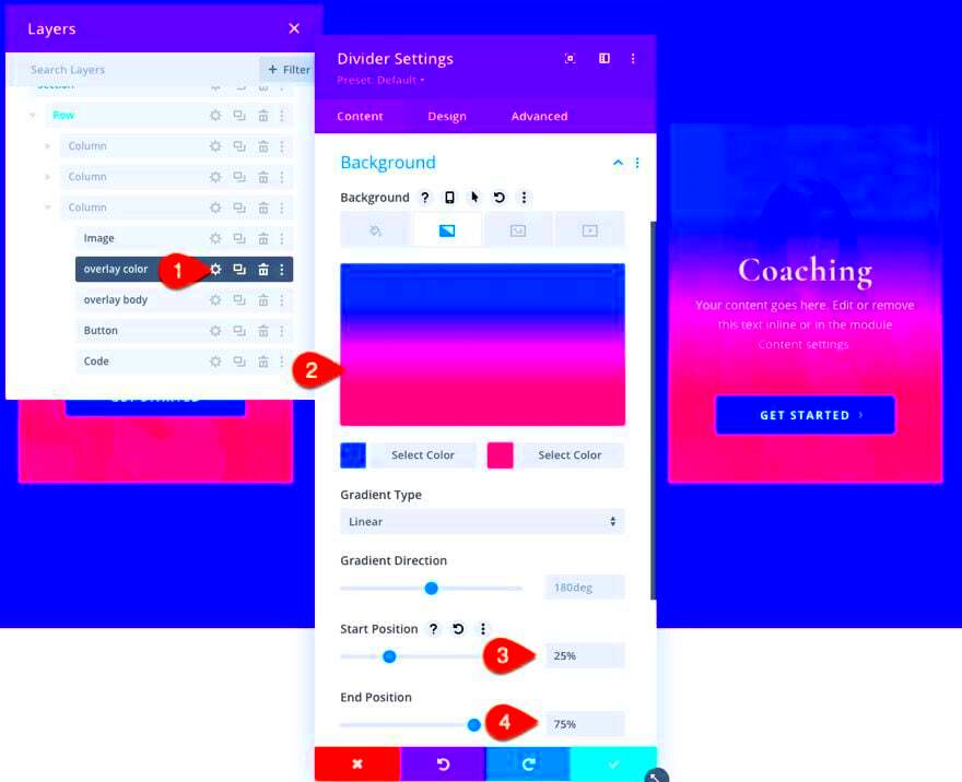
- Set Background Overlay: Click on the section settings, then go to the ‘Background’ tab. Here’s where you can choose a solid color, gradient, or even an image to use as your overlay.
- Adjust Transparency: To create an overlay effect, adjust the transparency settings. This allows the background to remain visible while the foreground captures attention.
- Add Text or Other Modules: To complete your overlay, you can include text, buttons, or icons as needed. Make sure they stand out against the overlay background.
- Preview & Save: Finally, always preview your design before saving. Ensure that everything looks good on both desktop and mobile views.
By following these steps, you can effortlessly create attractive overlays in your Divi-built pages, enhancing user engagement and aesthetic appeal. Happy designing!
Best Practices for Overlay Design
When creating overlays in Divi WordPress themes, following some best practices can enhance both aesthetics and functionality. Here are some key guidelines to keep in mind:
- Contrast is Key: Ensure that your overlay has a strong contrast with the underlying content. This makes text and images more readable and helps draw the user’s attention.
- Keep It Simple: Avoid cluttering the overlay with too much text or unnecessary elements. A clean and straightforward layout is more appealing and effective.
- Responsive Design: Ensure your overlays look good on all devices. Divi is great for this—be sure to test how overlays appear on mobile, tablet, and desktop screens.
- Use Subtle Animations: Adding gentle fade-ins or slide-ins can create a more dynamic experience without overwhelming users. Divi allows for a variety of animation effects, so experiment to find the perfect fit.
- Prioritize Accessibility: Make sure that overlays are accessible to all users. This includes using sufficient color contrast, alt text for images, and ensuring that keyboard navigation works well.
- Test for Usability: Remember to gather feedback on your overlay design. A/B testing can reveal what works best for your audience, allowing you to fine-tune your design.
By adhering to these best practices, you can create overlays that not only capture attention but also enhance the overall user experience within your Divi WordPress themes.
Examples of Effective Overlay Designs in Divi
To illustrate the power of overlays in Divi, here are some notable examples that showcase effective design and functionality:
| Example | Description |
|---|---|
| Full-Screen Overlay | This type of overlay covers the entire screen, providing a focused interaction. It’s often used for call-to-action (CTA) elements, like sign-up forms or special announcements. |
| Image Overlay with Text | By placing text over an image, this design offers a visually appealing way to convey information. Text with a slight drop shadow enhances readability and provides a polished look. |
| Mosaic Gallery with Hover Effects | Divi makes it easy to create a mosaic gallery where images reveal pertinent details on hover. This interactive approach keeps the design clean while offering essential info as needed. |
| Video Overlay | A video overlay is an engaging way to communicate a message. Users can see a video or a short animation that plays behind the overlay content, capturing attention effectively. |
These examples highlight the versatility of overlay designs in Divi WordPress themes. Whether used for CTAs, galleries, or just adding some flair, an effective overlay can significantly improve the user experience and keep visitors engaged.
Common Mistakes to Avoid in Overlay Design
Designing overlays can be tricky, and there are some common pitfalls that many developers, even seasoned ones, can fall into. Here’s a look at those mistakes—and how to avoid them.
- Overloading with Information: One big error is cramming too much content into an overlay. Remember, overlays are meant to deliver concise information. Aim for clarity and brevity. Limit text to essential points to keep things tidy.
- Poor Color Contrast: If your overlay’s text isn’t easily readable due to poor color choices, then what’s the point? Always ensure there’s enough contrast between text and background. A simple white text on a dark background often works well.
- Neglecting Accessibility: Accessible design is crucial. Failing to account for colorblind users or those with screen readers can alienate a segment of your audience. Use ARIA attributes and ensure keyboard navigability.
- Disregarding User Experience: It can be tempting to create intricate designs, but never forget about the user. Your overlay should enhance, not obstruct, the user experience. Always ask yourself how the overlay benefits the user.
- Inconsistent Placement: Consistency is key in design. If your overlays pop up in various spots with varying designs, it can confuse users. Stick to a standard location and style for a cohesive experience.
- Forgetting Mobile Users: If you’re only designing for desktop, you’re missing out on a huge mobile audience. Ensure your overlays are mobile-friendly—this means responsive design, as well as touch-friendly elements.
- Ignoring Loading Times: Remember that overlays often contain rich media like images or videos. If these take too long to load, users might exit before they even see your overlay. Optimize images and keep file sizes reasonable.
Avoiding these common mistakes can significantly enhance the effectiveness of your overlays, leading to a better user experience and achieving the desired goals.
Responsive Design: Ensuring Overlays Work on All Devices
In today’s mobile-first world, ensuring that your overlays function seamlessly on all devices is more important than ever. Responsive design isn’t just a nice-to-have; it’s essential. Let’s dive into a few strategies for optimizing your overlays for various screen sizes.
- Flexible Layouts: Use percentages or viewport units for width and height instead of fixed dimensions. This approach allows your overlays to resize naturally to fit different screens.
- Media Queries: Implement CSS media queries to adjust styles based on device characteristics, such as screen width and resolution. Tailoring your styles for different breakpoints helps ensure overlays look great on any device.
- Touch-Friendly Elements: Since mobile users interact with their screens differently, make sure buttons and interactive elements in your overlays are big enough to tap comfortably without zooming in.
- Testing on Multiple Devices: Test your overlays on different devices and browsers to catch any issues early. Tools like BrowserStack can help emulate devices you might not physically have.
- Hide Unnecessary Elements: On smaller screens, sometimes less is more. Consider hiding certain elements or simplifying the content to prevent overcrowding on small screens.
- Consider Load Times: Mobile users often have slower connections. Optimize images and scripts to decrease loading times, ensuring the overlay displays instantaneously.
- Viewport Meta Tag: Don’t forget to include the viewport meta tag in your theme. This tag helps browsers render your overlay correctly on mobile devices and is foundational for responsive design.
By focusing on responsive design for your overlays, you’ll create a user-friendly experience that caters to every visitor, regardless of how they choose to browse your site.
Conclusion and Final Thoughts
In summary, implementing overlay design in Divi WordPress themes can significantly enhance the aesthetic appeal and usability of your website. By carefully choosing and customizing overlays, you elevate user engagement and create a modern look that captures attention.
Here are some key takeaways to consider regarding overlay design in Divi:
- Versatility: Overlays can be applied across various sections such as headers, calls-to-action, image galleries, and more.
- Style Options: Divi allows users to adjust colors, opacities, and animations, ensuring that overlays match your website’s branding.
- Improved Readability: Using overlays can improve text legibility against busy backgrounds, making your content easier to consume.
- User Engagement: Overlay designs can direct users’ attention to specific elements, increasing interaction and click-through rates.
- Responsive Design: Divi’s overlays are fully responsive, ensuring a seamless experience on both desktop and mobile devices.
Moreover, when designing overlays, it is important to consider performance aspects. Overlays should enhance the user experience without compromising load times. You can utilize Divi’s built-in performance settings to maintain a fast, user-friendly site.
By focusing on overlay design, you will not only boost the visual identity of your WordPress site but also improve how visitors interact with your content. Experimenting with different overlay combinations can help you find the perfect balance that works for your brand.
In conclusion, overlay design in Divi WordPress themes is a powerful tool that, when used effectively, can lead to a more engaging and visually appealing website. Embrace the capabilities of overlays to elevate your online presence.


