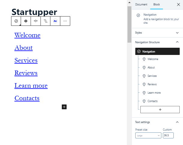
Optimizing your WordPress menu is an essential step in improving the user experience on your website. A well-structured and easy-to-use menu helps visitors find what they need quickly, which can enhance engagement and reduce bounce rates. WordPress offers a variety of options for customizing menus, but it’s crucial to ensure they are intuitive, organized, and responsive. This blog will guide you through the importance of menu optimization, best practices, and practical tips to help you improve your website’s navigation.
Understanding the Importance of User-Friendly Navigation
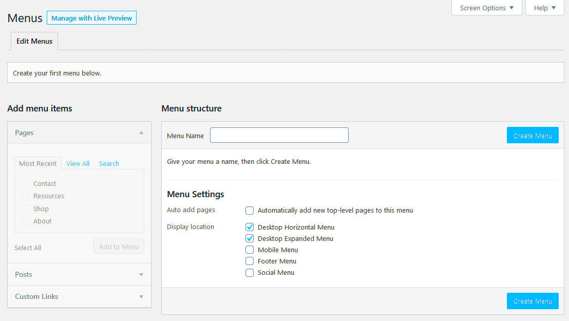
Good website navigation is the foundation of a positive user experience. Visitors want to find information quickly and easily without feeling frustrated. If your WordPress site has a confusing or cluttered menu, users may leave your site before even exploring your content. Here’s why user-friendly navigation is so important:
- Improved User Engagement: Clear and simple navigation helps users interact more with your site, encouraging them to explore additional pages.
- Better SEO: A well-organized menu can help search engines crawl your site more effectively, which can boost your rankings.
- Reduced Bounce Rate: When users can easily find what they need, they are more likely to stay on your site longer.
- Mobile Optimization: With more users browsing from mobile devices, responsive and easy-to-navigate menus are crucial for mobile traffic.
By focusing on creating user-friendly navigation, you ensure that visitors have a positive experience on your site, which can lead to increased conversions and returning visitors.
Best Practices for Optimizing WordPress Menus
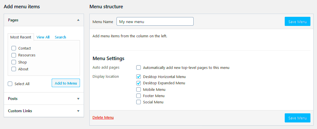
Optimizing your WordPress menu can make a significant difference in the usability of your site. Here are some best practices you can follow to ensure your menu is both functional and easy to use:
- Keep It Simple: Don’t overcrowd your menu with too many options. Stick to the essentials and organize your pages logically.
- Use Descriptive Labels: Menu labels should clearly describe the content on each page. Avoid jargon and be straightforward.
- Limit Dropdown Menus: While dropdown menus are useful, too many can make navigation complicated. Use them sparingly and ensure the labels are clear.
- Make It Mobile-Friendly: With mobile users in mind, your menu should adapt to different screen sizes. Make sure it’s easy to tap, scroll, and navigate on mobile devices.
- Highlight Important Pages: Use a primary menu to showcase your most important pages. Secondary options can be included in a footer or sidebar menu.
- Test Regularly: Regularly check your menus on both desktop and mobile devices to ensure everything is working correctly.
By following these best practices, you ensure that your visitors can easily find the content they are looking for, improving both user experience and site performance.
How to Organize Menu Items for Easy Access
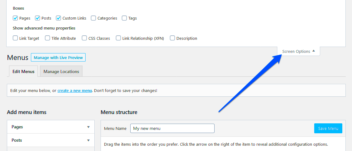
Organizing your WordPress menu items correctly is key to making your website easy to navigate. If your menu is cluttered or poorly structured, visitors may struggle to find important information, leading to frustration and higher bounce rates. Here’s how you can organize your menu items for maximum ease of access:
- Prioritize Important Pages: Place your most visited or essential pages, such as ‘Home,’ ‘Contact,’ and ‘About Us,’ at the beginning of the menu. This helps users quickly access the main sections of your site.
- Use Categories and Subcategories: Group related pages together in categories to reduce clutter. For example, if you have a blog, group posts under topics or tags.
- Avoid Overloading the Menu: Limit the number of items in your menu. Too many options can overwhelm users. Stick to the essential pages, and consider using submenus if needed.
- Consistency is Key: Make sure the menu’s structure is consistent across all pages. A user should always know where to find specific content, no matter where they are on your site.
- Include a Search Option: Adding a search bar to your menu can help users quickly find content without needing to browse through multiple pages.
By keeping your menu organized and user-friendly, you make it easier for visitors to navigate your site, leading to a better user experience overall.
Using Custom Menus to Improve User Experience
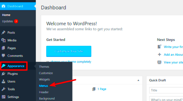
Custom menus offer a great way to personalize your website’s navigation and tailor it to the needs of your users. WordPress allows you to create custom menus that fit your site’s style and functionality. Here’s how custom menus can improve user experience:
- Personalized Navigation: With custom menus, you can create menus that reflect your site’s structure and make navigation easier. For example, you can add specific links to categories, services, or product pages.
- Control Over Layout: Custom menus allow you to decide how items are displayed. You can opt for horizontal or vertical layouts, and adjust spacing to ensure everything is clear and readable.
- Dynamic Menus: Use custom menus to show different options to different users. For example, if you run an ecommerce site, you can display different menus based on user roles, like logged-in customers or guest visitors.
- Improve SEO: Custom menus help search engines crawl your site more effectively. By linking to important pages, you guide both users and search engines to relevant content, improving SEO.
- Consistency Across Devices: Custom menus can be easily optimized for mobile, ensuring that your site looks great and is easy to navigate on all devices.
Custom menus are a simple yet powerful way to improve your website’s navigation. They give you control over how users interact with your content, leading to a smoother and more personalized experience.
Integrating Dropdown Menus for Enhanced Navigation
Dropdown menus are an excellent way to organize multiple menu items under one heading. They make it possible to include more content without overwhelming the main navigation. Here’s how integrating dropdown menus can enhance your site’s navigation:
- Save Space: Dropdown menus allow you to keep your main navigation clean and uncluttered while still offering a wide range of options. This is especially useful for websites with a lot of content or pages.
- Organize Content: Dropdowns make it easier to categorize related pages, helping users find what they need faster. For instance, you can group all blog posts, case studies, or product categories under one main menu item.
- Improve Aesthetics: Well-designed dropdown menus can look sleek and modern, enhancing your site’s visual appeal. Use subtle animations or hover effects to make them engaging.
- Better Mobile Experience: Dropdowns are useful on mobile devices because they provide compact navigation. Mobile menus can be neatly organized into collapsible dropdowns, improving usability on smaller screens.
- Multi-Level Dropdowns: For more complex sites, multi-level dropdown menus allow users to navigate deeper into content categories without leaving the main menu. However, be cautious not to overcomplicate these menus, as too many levels can confuse users.
Dropdown menus, when used appropriately, can significantly enhance your WordPress site’s navigation. They allow you to organize content efficiently and improve both desktop and mobile user experiences.
Tips for Mobile-Friendly WordPress Menus
With the increasing number of users browsing the internet from mobile devices, having a mobile-friendly menu is more important than ever. Mobile users have different navigation needs compared to desktop users, and it’s essential to design menus that work well on smaller screens. Here are some practical tips to ensure your WordPress menu is mobile-friendly:
- Use a Hamburger Menu: A hamburger menu (three horizontal lines) is a popular and space-saving solution for mobile navigation. It keeps the menu hidden until the user taps on it, creating a clean layout.
- Make Menus Touch-Friendly: On mobile, make sure your menu items are large enough to tap easily without accidentally selecting the wrong option. Increase padding around each link to make it more touch-friendly.
- Optimize Menu for Speed: Mobile users often rely on mobile data, so it’s important to keep your menus lightweight and fast-loading. Avoid large images or heavy scripts that might slow down the menu.
- Keep Menu Simple: Avoid including too many items in the mobile menu. Mobile screens have limited space, so prioritize your most important pages or use submenus to keep things tidy.
- Use Sticky Menus: Sticky menus stay at the top of the screen as users scroll down. This ensures that the menu is always easily accessible, even as users navigate through different sections of your site.
By following these tips, you’ll make sure that your WordPress menu works seamlessly on mobile devices, providing an excellent experience for your users regardless of the screen size.
Frequently Asked Questions
When optimizing WordPress menus, there are common questions that often arise. Here are answers to some frequently asked questions:
- How can I add a custom menu in WordPress? To add a custom menu, go to the WordPress dashboard, navigate to Appearance > Menus, and create a new menu. You can add pages, posts, categories, and custom links to this menu.
- Can I create a mega menu in WordPress? Yes! You can create a mega menu using plugins like Max Mega Menu or WP Mega Menu. These plugins allow you to display multiple columns of links in a single dropdown, perfect for large websites.
- How do I make my menu mobile-friendly? To make your menu mobile-friendly, use responsive design techniques. Many WordPress themes come with built-in mobile menu options, but you can also customize the menu for mobile using CSS or plugins.
- How do I customize the WordPress menu layout? You can customize the layout of your WordPress menu by using custom CSS or by choosing a theme that supports custom menu layouts. Some themes allow you to change the layout through the theme settings or the WordPress customizer.
- Why is my WordPress menu not displaying correctly? If your WordPress menu isn’t displaying correctly, it could be due to a theme or plugin conflict. Try deactivating plugins or switching to a default theme like Twenty Twenty-One to troubleshoot the issue.
Conclusion on Optimizing WordPress Menus
Optimizing your WordPress menu is a crucial step in improving the user experience on your website. A well-structured, easy-to-navigate menu makes it easier for visitors to find what they need, leading to longer visits, reduced bounce rates, and increased conversions. Whether you’re organizing menu items for easy access, using custom menus to personalize navigation, or integrating dropdowns to save space, there are many ways to enhance your menu design.
Additionally, ensuring that your menus are mobile-friendly is no longer optional. With mobile traffic on the rise, having a menu that adapts seamlessly to different screen sizes is essential. Implementing the tips for mobile-friendly menus will help keep your site accessible and functional for all users.
Remember, the goal is to create an intuitive and straightforward navigation system that allows users to interact with your site easily. Regularly testing and optimizing your menus based on user feedback will help you continuously improve your site’s navigation, keeping your visitors happy and engaged.

