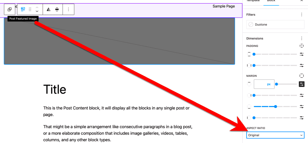
When diving into the world of WordPress, one often overlooks the importance of image aspect ratios. However, understanding how to optimize these ratios can significantly enhance your website’s visual appeal and performance. In this post, we’ll explore what aspect ratios are, why they’re crucial for your site’s design, and how you can effectively manage them in WordPress. Let’s get started!
Understanding Aspect Ratio: Definition and Importance
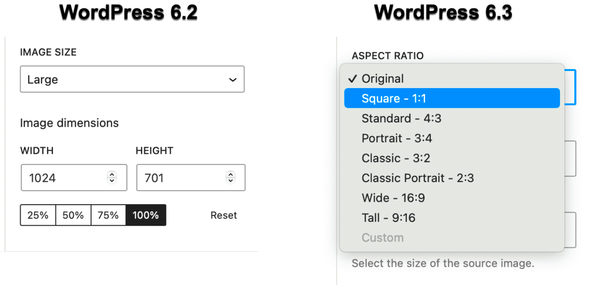
So, what exactly is an aspect ratio? Simply put, it’s the relationship between the width and height of an image, expressed as a ratio like 16:9 or 4:3. The first number represents the width, while the second represents the height. This ratio plays a crucial role in how images are displayed across different devices and screens. Here’s why aspect ratio matters:
- Visual Consistency: Maintaining a consistent aspect ratio across images keeps your website looking polished and professional.
- User Experience: Proper aspect ratios ensure that images fit well within their designated spaces, maintaining usability and accessibility.
- SEO Benefits: Search engines prefer optimized resources. Images with the right aspect ratios can improve load times and overall site ranking.
- Responsive Design: In today’s mobile-first world, images must adapt to various screen sizes. Correct aspect ratios help maintain clarity and proportion on any device.
To make it more tangible, here’s a simple table showing some common aspect ratios:
| Aspect Ratio | Usage |
|---|---|
| 16:9 | Widescreen videos, modern TVs |
| 4:3 | Standard definition television, classic photography |
| 1:1 | Social media posts, profile pictures |
Understanding and optimizing your image aspect ratio in WordPress is a stepping stone to achieving a visually appealing and functionally effective website.
Common Aspect Ratios for Various Media Types
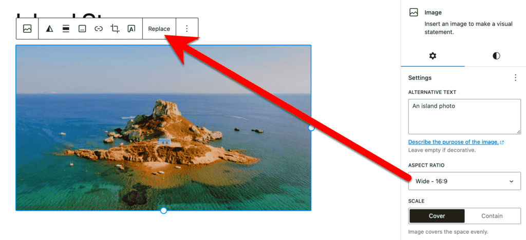
When it comes to visual media, understanding aspect ratios is essential for creating appealing content. Different types of media traditionally use various aspect ratios to fit specific formats and devices. So let’s break down some common aspect ratios you might encounter.
- 16:9 (Widescreen) – This is the most popular aspect ratio for video. It’s used in televisions, YouTube videos, and most modern displays. If you’re creating a video, this is the standard you should aim for.
- 4:3 (Standard) – This classic ratio was once the norm for TV screens and older video formats. While it’s less common now, you might find it in certain educational videos or older content. But beware—it can look dated if you’re not aiming for a vintage vibe!
- 1:1 (Square) – Instagram popularized the square aspect ratio, making it perfect for posts and profile pictures. This format is great for maintaining consistency across platforms, especially if your images adapt well to cropping.
- 2:3 (Portrait) – Often used for photographs, especially in print. Portrait mode is ideal if you’re showcasing an individual subject, like a person or a product, making it stand out in the frame.
- 21:9 (Ultrawide) – Gaining popularity in cinematic features, this ratio is used for immersive experiences. It’s perfect for film-making or when you want to provide a more cinematic feel to your videos.
Choosing the right aspect ratio is the first step in ensuring your images and videos look stunning—and it really sets the stage for viewer engagement!
How WordPress Handles Image Aspect Ratios
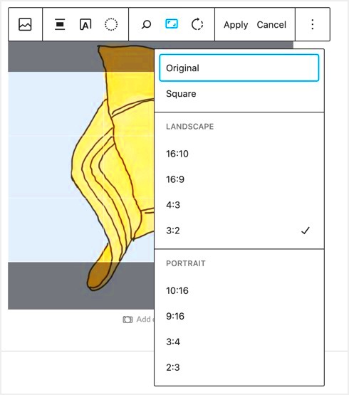
WordPress is a flexible platform that provides users the tools needed to work with various image aspect ratios efficiently. So, how does WordPress manage these ratios? Let’s dive in!
When you upload an image, WordPress automatically generates several sizes to accommodate different display options. Here’s how it works:
| Image Size | Dimension (in pixels) | Uses |
|---|---|---|
| Thumbnail | 150 x 150 | Posts, widgets, galleries |
| Medium | 300 x 300 (or height adjusts proportionally) | Inline within posts |
| Large | 1024 x 1024 (or height adjusts proportionally) | Featured images, large content blocks |
| Full Size | As uploaded | Direct link or high-quality display |
Additionally, you can specify custom aspect ratios for images when you use the Image Block in the WordPress editor. This means you have full control over how your visuals appear across different devices, ensuring they look great on everything from big screens to mobile.
Furthermore, plugins exist to help manage aspect ratios more efficiently by automatically resizing images based on pre-defined settings. This can be a real timesaver!
In summary, WordPress makes it easy to manage image aspect ratios, ensuring that no matter what type of media you’re working with, your visuals remain sharp and effective.
Steps to Optimize Image Aspect Ratio in WordPress
Optimizing the image aspect ratio in WordPress is crucial to enhancing your site’s performance and overall aesthetic. Here’s a simple step-by-step guide to help you through the process:
- Identify the Desired Aspect Ratio: Before you optimize, you need to know what aspect ratio works best for your design. Common ratios include:
- 1:1 (Square)
- 16:9 (Widescreen)
- 4:3 (Standard)
Following these steps ensures your images not only look good but also load faster, improving your website’s overall performance and user experience.
Using Image Editing Tools and Plugins
WordPress offers a plethora of tools and plugins that can simplify the process of optimizing image aspect ratios. Let’s explore some of the popular options:
- Canva: An online design tool that offers easy image resizing and cropping options. You can set custom dimensions easily to fit your desired aspect ratio.
- Adobe Photoshop: A powerful editing software that allows precise control over image dimensions and quality. Use the crop tool to set your aspect ratio accurately before uploading it to WordPress.
- WordPress Plugins: There are some excellent plugins available, such as:
| Plugin Name | Key Features |
|---|---|
| Smush | Image optimization for faster loading times and automatic resizing. |
| Imagify | Automatic image resizing and optimization without compromising quality. |
| Resize Image After Upload | Automatically resizes images on upload to save space and fit your desired dimensions. |
By leveraging these tools and plugins, you can easily ensure that your images are optimally sized, enhancing the visual appeal of your website while maintaining fast load times. Happy optimizing!
Responsive Design and Aspect Ratio Integration
With the rise of mobile devices, responsive design has become a cornerstone for modern web development, and understanding how to integrate image aspect ratios in this context is essential. Responsive design aims to ensure that a website looks great and functions well on a variety of devices, from desktops to tablets to smartphones. A crucial part of this is maintaining appropriate aspect ratios for images.
Aspect ratios define the proportional relationship between an image’s width and height. When integrating images responsively, it’s vital to consider how their aspect ratios will behave. Here are a few points to think about:
- Fluid Images: Using CSS properties like
max-width: 100%;allows images to scale down on smaller screens while maintaining their aspect ratio. - CSS Aspect Ratio Boxes: With the help of CSS, you can create aspect ratio boxes using the
aspect-ratioproperty, ensuring that the images render correctly regardless of screen size. - Image Format Considerations: Different image formats (JPEG, PNG, WebP) can impact loading times and responsiveness, so choose wisely for your site needs.
- Media Queries: Use media queries in your CSS to not just modify styles, but also to switch out images based on the device resolution or size.
By carefully planning how to incorporate aspect ratios into your responsive design, you can provide users with a seamless visual experience across all devices, ensuring your images are striking and engaging without compromising on quality.
Testing and Analyzing Image Performance
Testing and analyzing image performance is a critical step in optimizing your WordPress site. If your images are slowing down your website, it can lead to less engagement and higher bounce rates—definitely not what you want! Here’s how to effectively test and analyze image performance:
1. Use Page Speed Tools: Utilizing tools like Google PageSpeed Insights, GTmetrix, or WebPageTest can give you a clear understanding of how your images are affecting load times. They provide suggestions on how to optimize further for better performance.
2. Check Load Times: By analyzing your site with tools mentioned above, pay close attention to the load times. Even a few seconds can make a substantial difference in user satisfaction.
3. Test Different Formats: Sometimes, experimenting with various image formats can lead to significant size reductions and better loading times. SWAP JPG for WebP or PNG depending on the scenario to see what works best for your needs.
4. Implement Lazy Loading: This technique loads images only when they enter the viewport. You can test how lazy loading impacts your site’s performance by enabling and disabling it in different scenarios.
5. Monitor User Engagement: Analyze how image performance correlates with user engagement metrics. Tools like Google Analytics can help track whether improved load times positively affect average session duration or bounce rates.
Taking these steps gives you not just clarity on your image performance but equips you with data-driven insights to make informed optimization decisions. It’s always about finding that balance between image quality and site speed!
Common Mistakes to Avoid When Setting Aspect Ratios
When it comes to optimizing image aspect ratios in WordPress, even seasoned users can trip up on a few common pitfalls. Understanding these mistakes can save you time and headaches down the line. Here’s a round-up of what to watch out for:
- Ignoring the Context: One of the biggest blunders is failing to consider the context in which your images will be viewed. For example, an image sized for a mobile screen might look outstanding on a smartphone, but it could appear blurry or cropped on a desktop. Always tailor your aspect ratio to the device!
- Overlooking Responsive Design: In our mobile-first world, it’s crucial to ensure that your images look great on any device. Remember that a fixed aspect ratio might not be responsive across various screen sizes. Utilize CSS to adjust the image resolutions according to the viewport.
- Using the Wrong Tools: Relying on subpar image editing tools can lead to distorted images. Make sure you use reliable software for your image manipulation. Professional tools often allow for more precise control over aspect ratios and other settings.
- Neglecting SEO Practices: Think twice before neglecting your image SEO. An improper aspect ratio might diminish your image quality, affecting loading times and ultimately your search rankings. Always optimize your images and use meaningful alt texts.
- Failure to Test: Just setting an aspect ratio doesn’t mean it will work perfectly across all platforms or browsers. Always test how your images appear in different contexts – desktop, tablet, and mobile. You might be surprised by the inconsistencies!
By steering clear of these common mistakes, you’ll be well on your way to optimizing image aspect ratios in WordPress effectively!
Conclusion: Balancing Quality and Performance in WordPress
As we wrap up this discussion on optimizing image aspect ratios in WordPress, it’s essential to understand the delicate balance between quality and performance. High-quality images draw users in, but if they take too long to load, you risk losing audience engagement. Here’s how to strike that balance:
- Prioritize Your Images: Not all images carry the same weight. Determine which images are essential for your content and focus on optimizing those first. Keep an eye on hero images or featured images, which often attract immediate attention.
- Use the Right Formats: Different image formats serve different purposes. JPEGs are great for photos, while PNGs might be better for images with transparency. WebP is also gaining popularity due to its excellent compression without compromising quality.
- Optimize Before Uploading: Whenever possible, pre-optimize your images before uploading them to the WordPress media library. This can be done using various tools that allow you to compress images while maintaining an excellent aspect ratio.
- Leverage Lazy Loading: Implementing lazy loading can significantly enhance your site’s performance by only loading images as they come into the user’s viewport. This helps improve load times and reduces bandwidth usage.
- Regular Maintenance: Don’t overlook the importance of regular audits. Review your existing images periodically to see if any need re-optimization or adjustments to their aspect ratios as your site evolves.
By mastering the balance between image quality and performance, you can significantly enhance the user experience on your WordPress site. Remember, a well-optimized image isn’t just about aesthetics; it’s a key element in ensuring that your visitors stay engaged and your site runs smoothly.

