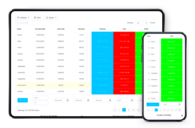
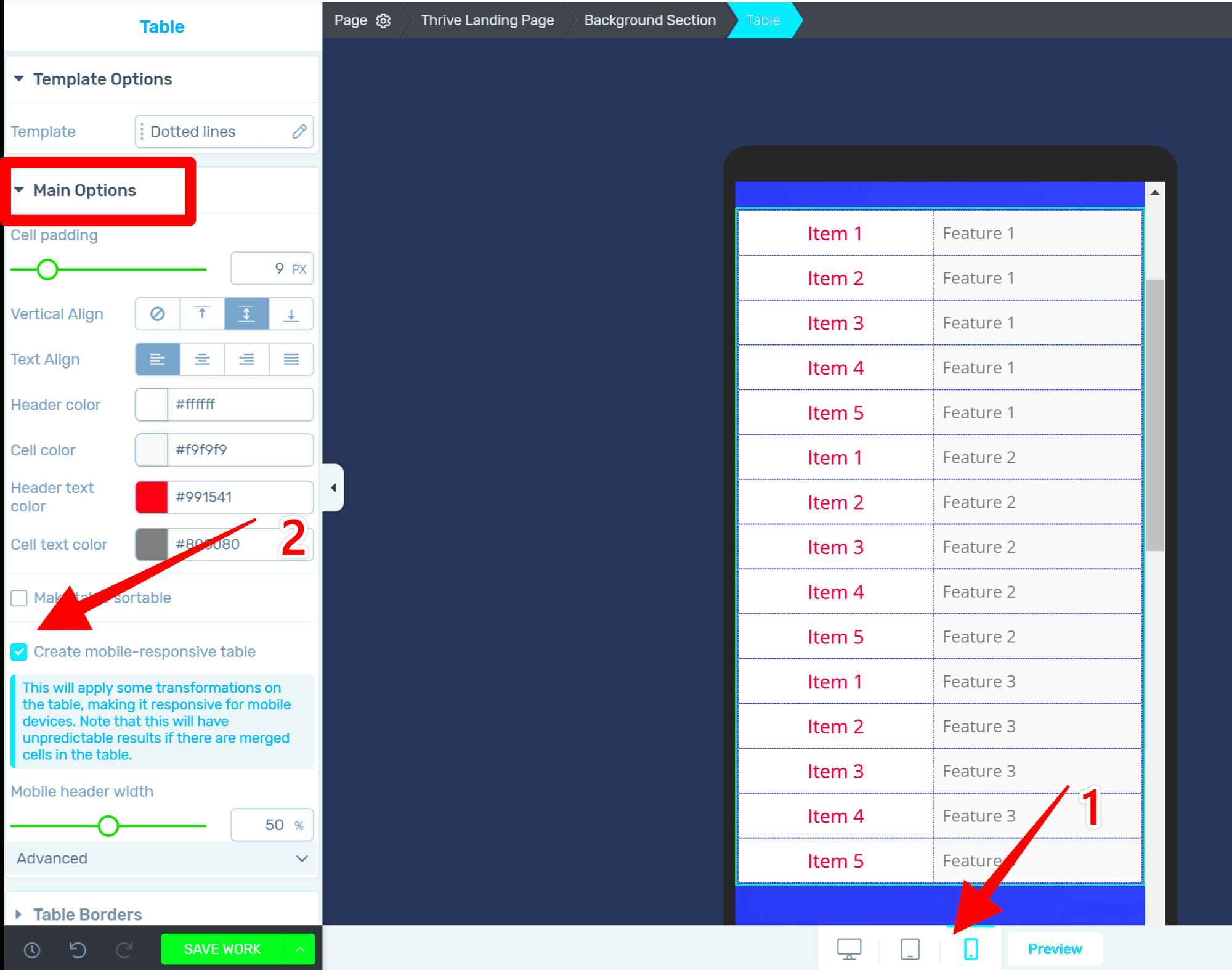
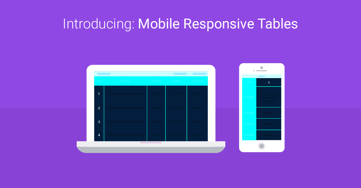
In today’s digital age, having a mobile-friendly website is no longer just an option; it’s a necessity. One critical aspect of your site is how your tables are displayed on mobile devices. Mobile responsive tables ensure that your content remains accessible and visually appealing, no matter what device your visitors are using. With myriad screen sizes out there, responsive tables adapt seamlessly, allowing users to interact with your data effortlessly and without frustration. Let’s dive into why these tables are crucial for your WordPress site!
Importance of Mobile Responsiveness in Web Design

Mobile responsiveness is a game-changer in web design and offers several compelling benefits. Here’s why it should be at the top of your priority list:
- User Experience: A well-structured, mobile-responsive table keeps your users engaged. No one enjoys zooming in to read tiny text. When tables adapt to screen sizes, users can quickly and easily digest information.
- Search Engine Ranking: Search engines like Google prioritize mobile-friendly sites in their ranking algorithms. By ensuring your tables are responsive, you can improve your search visibility and attract more organic traffic.
- Accessibility: Responsive tables provide better accessibility for all users, including those with disabilities. This inclusivity is important for ethically-minded brands and meets legal standards in many regions.
- Increased Conversion Rates: When users have a positive experience navigating your site, they’re more likely to stay longer and convert, whether that means signing up for a newsletter or making a purchase.
To sum up, the importance of mobile responsiveness in web design cannot be overstated. Embracing mobile-responsive tables will enhance user engagement, improve search rankings, and ultimately lead to greater success for your WordPress site!
Choosing the Right Table Plugin for WordPress

When it comes to WordPress, the plethora of table plugins available can be overwhelming. Each plugin promises to make your tables look amazing and function seamlessly. However, choosing the right one for your specific needs is crucial. Let’s break it down into key considerations to help you make an informed decision.
- Ease of Use: Look for a plugin that is user-friendly, especially if you’re not tech-savvy. A straightforward interface allows you to create and edit tables without needing to delve deep into code.
- Responsive Design: Ensure the plugin offers responsive tables. This means your tables should look good on both desktop and mobile devices. Test the plugin’s demo to see how well it adjusts.
- Customization Options: Different projects require different designs. Choose a plugin that provides ample customization options, like changing colors, fonts, and sizes.
- Integration: Consider how well the plugin integrates with other tools and platforms you use. Compatibility with popular page builders and themes saves you headaches down the line.
- Support and Documentation: Check if the plugin has good support, tutorials, and FAQs. A robust community and excellent documentation can be lifesavers when you encounter issues.
- Performance: Opt for a plugin that doesn’t bloat your site. A slow-loading table can deter users, so keep an eye on the performance ratings and reviews.
Taking the time to evaluate these factors will lead you to the ideal table plugin that meets your requirements, providing you with the functionality and aesthetic appeal you desire for your WordPress site.
Basic HTML and CSS for Creating Responsive Tables

So you want to create your own responsive tables? No problem! Understanding the basics of HTML and CSS is the foundation. Here’s a simple guide to help you get started.
Creating a Basic Table in HTML
Here’s how to structure a basic HTML table:
<table> <tr> <th>Header 1</th> <th>Header 2</th> </tr> <tr> <td>Data 1</td> <td>Data 2</td> </tr></table>In this snippet:
- <table>: Starts your table.
- <tr>: Defines a new row.
- <th>: Represents a header cell, showcasing titles.
- <td>: Represents a standard data cell.
Making the Table Responsive with CSS
Now, let’s beautify our table and make it responsive using CSS. The trick is to ensure it adjusts based on the device’s screen size:
table { width: 100%; border-collapse: collapse;}th, td { border: 1px solid #ddd; padding: 8px; text-align: left;}@media screen and (max-width: 600px) { table, thead, tbody, th, td, tr { display: block; }}Here’s what the CSS does:
- Sets the table width to 100% for full responsiveness.
- Uses border-collapse to make borders more neat.
- In the media query, it makes the table elements block-level elements when the screen width goes below 600 pixels, stacking them vertically for easier reading.
And there you go! With just a little HTML and CSS, you can create stunning, responsive tables that look great on any device.
Utilizing WordPress Themes for Responsive Tables

When it comes to designing mobile-responsive tables on your WordPress website, one of the simplest yet effective strategies is to leverage existing WordPress themes. Many modern themes come with built-in support for responsive tables. This means you won’t need to dive deep into code or complex configurations. Here’s how you can make the most out of
- Choose a Responsive Theme: Start by selecting a theme that explicitly states it’s mobile-friendly. Look for themes that support grid layouts as these typically offer better support for responsive designs.
- Check for Table Shortcodes: Some themes provide shortcodes specifically for tables. Using these can streamline the process significantly and ensure that the tables adapt well to various screen sizes.
- Utilize Theme Customization Options: Most themes come with customization features. Dive into the theme customizer and see if there are options for styling and displaying tables.
- Review Theme Documentation: Don’t forget to check the theme’s documentation. It often contains valuable tips and tricks on implementing responsive tables effectively.
- Test on Various Devices: After setting up your tables, always remember to test them on different devices. Using tools like Google’s Mobile-Friendly Test can help identify any issues that need rectifying.
Incorporating responsive tables into your WordPress site using themes is not only efficient but also enhances the user experience significantly. This makes your content accessible, attractive, and easy to read on any device!
Implementing Bootstrap for Responsive Tables
If you’re looking to add a professional touch to your WordPress site, implementing Bootstrap for your responsive tables is a fantastic option. Bootstrap is a front-end framework that makes web development quicker and easier, particularly when it comes to responsive design. Here’s how you can get started:
- Include Bootstrap in Your Theme: You can add Bootstrap to your WordPress theme by downloading Bootstrap and uploading it to your theme’s directory, or by using a CDN. The latter is usually easier and saves you from managing files.
- Create Table Markup: Using Bootstrap, you can create tables by utilizing classes like
.tableand.table-responsive. For instance, a basic table can start with:
<div class="table-responsive"> <table class="table"> <thead> <tr><th>Header 1</th><th>Header 2</th></tr></tr> </thead> <tbody> <tr><td>Data 1</td><td>Data 2</td></tr> </tbody> </table></div>- Responsive Behaviors: With Bootstrap, tables will automatically adjust to fit different screen widths. The
.table-responsiveclass allows users to scroll horizontally if the table is too wide for the screen, keeping all the data intact. - Customizing Tables: Bootstrap offers various classes for styling your tables. You can use classes like
.table-stripedor.table-hoverto enhance the aesthetics and interactivity of your tables. - Test Your Table Layout: Always preview your tables after implementing Bootstrap to ensure they present well on all devices. This is crucial for maintaining a professional look and ensuring usability across various platforms.
By implementing Bootstrap, you’re not just enhancing the visual appeal of your tables; you’re also ensuring that they function beautifully across all devices, which is vital in today’s mobile-centric world. So get started, and enjoy the seamless experience Bootstrap can provide!
Using CSS Media Queries for Custom Designs
When it comes to creating mobile-responsive tables, CSS media queries are your best friend. They allow you to apply different styles based on the size and orientation of the device being used. This means you can create a more tailored user experience, ensuring your tables look great whether they’re viewed on a desktop, tablet, or smartphone.
Let’s dive deeper into how you can utilize media queries effectively. For starters, you’ll want to target specific screen widths to adjust your table’s layout. Here’s how a simple media query might look:
@media only screen and (max-width: 600px) { table { display: block; /* Makes the table responsive */ overflow-x: auto; /* Allows horizontal scrolling on small devices */ width: 100%; /* Ensures the table takes up the full width */ } th, td { padding: 10px; /* Adds some breathing room */ display: block; /* Stacks the cells vertically for better readability */ width: 100%; /* Makes cells adapt to the full width */ }}
By implementing the code above, you’re setting the stage for a mobile-friendly design. Feel free to adjust the ‘max-width’ value based on where you want your table to start responding. You can also add more complex styles or breakpoints for even more granular control over your design.
Don’t forget to test your design on various devices to ensure that the changes look just as good as you envisioned. With CSS media queries, the flexibility is in your hands!
Best Practices for Responsive Table Design
When designing tables for mobile devices, following best practices can make a world of difference. Not only does this enhance usability, but it also improves the overall aesthetic of your WordPress site. Here are some key considerations:
- Keep It Simple: Avoid overcrowding your tables with too much information. Stick to the essentials to provide clarity.
- Flexible Widths: Use percentages instead of fixed pixel widths. This allows your tables to adapt to various screen sizes seamlessly.
- Utilize Vertical Stacking: For smaller screens, consider stacking table rows vertically. This makes it easier for users to read the information.
- Hide Less Important Data: Use CSS to hide columns that are not crucial for mobile users. You can make them accessible via a toggle if needed.
- Responsive Overflow: Allow overflow for tables that cannot be shrunk beyond a certain point. Horizontal scrolling can be a lifesaver.
Additionally, you may want to focus on typography. Clear, legible fonts at appropriate sizes are critical. You can also enhance user experience with interactive elements, such as sorting or filtering.
| Practice | Description |
|---|---|
| Keep It Simple | Avoid overcrowding your tables to ensure readability. |
| Flexible Widths | Use percentages to allow tables to adapt to screen sizes. |
| Vertical Stacking | Consider stacking rows vertically for better readability on mobile. |
| Hide Less Important Data | Use CSS to conceal non-essential columns on small screens. |
| Responsive Overflow | Enable horizontal scrolling for tables that can’t be shrunk. |
Incorporating these best practices into your responsive design will not only enhance functionality but also improve user engagement on your WordPress site. Happy designing!
Common Challenges and Solutions in Mobile Responsive Tables
When it comes to mobile responsive tables, there are a few common challenges that developers and designers often face. Understanding these issues can help streamline the design process and contribute to a better user experience.
- Space Constraints: Mobile screens are significantly smaller than desktops, making it tricky to fit complex tables that display lots of information.
- Legibility: Text can become jumbled or too small on mobile devices, leading to a poor reading experience.
- Scrolling Issues: Users might find it irritating if they have to scroll both horizontally and vertically to view content.
- Browser Compatibility: Not all mobile browsers handle CSS and HTML in the same way, which can lead to inconsistencies across devices.
So, what are some effective solutions to these challenges?
- Prioritize Information: Start by identifying which data points are most critical for mobile users. You might even use a “View More” link to keep the table clean while still allowing access to all data.
- Utilize CSS for Flexibility: Use media queries to create responsive designs that adapt to different screen sizes. This allows you to display essential information at a glance without losing context.
- Vertical Tables: Consider displaying data in a vertical format rather than the traditional horizontal table layout. This format can often provide better readability on mobile devices.
- Test Across Devices: Make sure to test your tables on various devices and browsers to ensure compatibility. Use responsive design testing tools for quicker feedback.
By acknowledging these common challenges and implementing practical solutions, you can create mobile responsive tables that are not only user-friendly but also visually appealing!
Examples of Well-Designed Responsive Tables
Looking for inspiration to elevate your mobile table designs? Here are some fantastic examples that demonstrate how responsive tables can be effectively utilized on WordPress sites:
| Website | Design Features | Why It Works |
|---|---|---|
| WordPress.org | Simple layout, collapsible sections | Users can easily navigate and find documentation without overwhelming content. |
| Smashing Magazine | Horizontal scrolling enabled for detailed comparisons | Users can swipe to view detailed data while keeping the interface clean. |
| Codecanyon | Dropdown views for detailed data points | Minimizes clutter while allowing access to additional information. |
These examples show that responsive tables can still be functional while looking great! By drawing inspiration from such designs, you can create your own tables that enhance user experience on mobile devices.
Conclusion and Next Steps
In today’s digital landscape, a mobile-responsive design is not just a preference but a necessity for any website, especially those built on WordPress. Tables, which are vital for displaying data clearly, must also adapt smoothly to various screen sizes. Implementing mobile-responsive table designs enhances user experience by ensuring that all visitors can access information easily, regardless of the device they use. Below are some of the key takeaways and next steps to consider for your WordPress site:
- Choose a Responsive Theme: Before diving into table designs, ensure your WordPress theme is responsive. This will create a solid foundation for mobile optimization.
- Use Plugins: Consider using plugins like TablePress or WP Table Builder that offer mobile-friendly designs and customization options.
- Utilize CSS Media Queries: Write custom CSS to adjust the layout of your tables for different screen sizes effectively.
- Test Your Design: Regularly check how tables appear on various devices using tools like Google Mobile-Friendly Test.
- Monitor User Feedback: Keep an eye on how users interact with your table data and adjust designs based on feedback.
By following these steps, you can ensure that your tables not only enhance the aesthetic appeal of your site but also improve the overall functionality and user experience. Implementing mobile-responsive table designs will not only cater to the needs of your audience but also reflect the professionalism and responsiveness of your brand.


