Aspect ratios are a fundamental concept in design, especially in web development. They represent the proportional relationship between an element’s width and its height. Understanding aspect ratios is crucial, particularly when you’re working with visual content on your website. Keeping a consistent aspect ratio ensures that your images, videos, and containers look balanced and aligned, which enhances the overall user experience. In this post, we’ll delve deeper into the importance of the 16:9 aspect ratio, especially in the context of Elementor, a popular page builder for WordPress.
Understanding 16:9 Aspect Ratio

The 16:9 aspect ratio, often referred to as “widescreen,” has become the standard for many visual formats, including HD television and most modern web content. Let’s break it down to understand why this ratio is so popular and how to implement it effectively in Elementor:
- Definition: The 16:9 aspect ratio means that for every 16 units of width, there are 9 units of height. This ratio can be expressed in fraction form as 16/9.
- Common Uses: You’ll often see this aspect ratio in:
- Televisions
- Computer Monitors
- Smartphones
- YouTube videos
- Web design and multimedia presentations
- Benefits: There are several advantages to using a 16:9 aspect ratio:
- Uniformity: Creates a consistent look across different devices.
- Versatility: Great for both landscape and portrait content.
- Compatibility: Most modern media players and web formats support this ratio.
- Example: When setting a video to a 16:9 aspect ratio, you might have dimensions like 1280×720 (HD) or 1920×1080 (Full HD).
Understanding and applying the 16:9 aspect ratio can immensely improve the aesthetic quality of your Elementor containers, ensuring that your content is displayed in a pleasing and functional manner.
Why Maintain a 16:9 Aspect Ratio in Web Design?

When it comes to web design, the aspect ratio is a crucial element that can significantly influence user experience. The 16:9 aspect ratio, commonly associated with television and video content, has become a standard for web designers. But why is it so important to maintain this ratio? Here are a few compelling reasons:
- Consistency Across Devices: With users accessing websites on various devices – from desktops to mobile phones – maintaining a 16:9 aspect ratio ensures that your media remains consistent across different screen sizes. This consistency helps in presenting a unified visual identity, no matter how visitors engage with your content.
- Enhanced Visual Appeal: The 16:9 ratio is naturally pleasing to the eye, especially for videos and images. By adhering to this aspect ratio, you can create a visually balanced and appealing layout that holds the viewer’s attention longer.
- Better Video Integration: If your website includes video content (and let’s be honest, which modern site doesn’t?), using a 16:9 aspect ratio can improve playback and overall interaction. As most video players default to this ratio, your content integrates seamlessly.
- Improved User Engagement: An aesthetically pleasing website often translates to better user engagement. When users find your site easy to navigate and pleasing to look at, they’re more likely to stay longer and return in the future.
- SEO Benefits: A well-structured layout, including appropriate use of images and videos in the right aspect ratio, can positively impact your site’s SEO. Search engines favor websites that offer a great user experience, hence potentially boosting your rankings.
Setting Up Elementor for 16:9 Aspect Ratio
Now that we understand the significance of maintaining a 16:9 aspect ratio, let’s look into how to set this up in Elementor. Elementor, a popular website builder, makes it quite simple to achieve this goal with just a few steps:
- Open Your Elementor Editor: Start by opening the page you want to work on in the Elementor editor. This is where you’ll create and customize your layout.
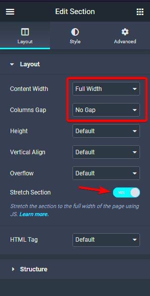
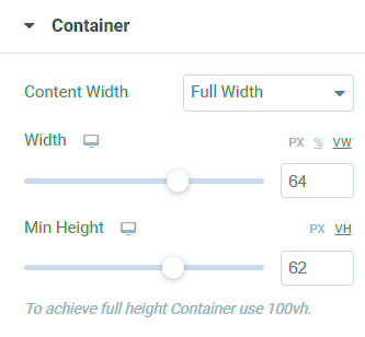
- Select the Container: Click on the container or section where you want to apply the 16:9 ratio. Once selected, navigate to the ‘Layout’ settings in the left panel.
- Set the Height: An essential step in maintaining the aspect ratio is setting the correct height. Go to ‘Height’ under the Layout settings and input a value that corresponds to your width divided by 16 multiplied by 9. For example, if your width is 800px, then the height should be 450px (800px * 9/16).
- Adjust Background Settings: If you want your background image or video to fit perfectly, go to the ‘Style’ tab and ensure the background size is set to ‘Cover’. This will keep your background visually appealing without distortion.
- Responsive Settings: Finally, adjust the responsiveness settings. Make sure your aspect ratio looks good on tablets and mobile devices. You can customize the width and height for different devices under the responsive settings.
By following these simple steps, you can ensure that your containers maintain the 16:9 aspect ratio, enhancing the overall user experience on your website. Happy designing!
Using Custom CSS for Perfect Aspect Ratio
When it comes to maintaining a 16:9 aspect ratio, sometimes the tools provided by Elementor aren’t enough to achieve your design goals. This is where custom CSS comes into play. By adding some tailored CSS rules, you can ensure that your containers consistently adhere to the desired aspect ratio, regardless of the screen size.
Here’s how you can do it:
- Identify the Container: You first need to know which container you want to modify. Is it an image, a video, or a section of your site? Understanding this will guide your CSS implementation.
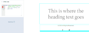
- Add Custom CSS: On the Elementor editor, navigate to the Advanced tab of the widget you’re modifying, and input your custom CSS. You might add the following code:
.my-container { position: relative; padding-top: 56.25%; /* 16:9 Aspect Ratio */ } .my-container > .content { position: absolute; top: 0; left: 0; right: 0; bottom: 0; }This code snippet ensures that the height of your container is always 56.25% of its width, maintaining the 16:9 ratio. Be sure to replace .my-container with the actual class of your container.
Using custom CSS not only gives you greater control over your layout but also helps you avoid unwanted stretching or squeezing of content, keeping your design polished and professional.
Responsive Design Considerations
In today’s world, mobile responsiveness is crucial. With a variety of devices used to access websites, ensuring your layout looks great on all screen sizes while preserving the 16:9 aspect ratio can be quite the challenge. However, it’s essential to keep a few key considerations in mind.
Here are some responsive design tips:
- Media Queries: Implement CSS media queries to adjust styles based on device characteristics like width and height. This enables you to redefine your containers dynamically. For instance:
@media (max-width: 768px) { .my-container { padding-top: 75%; /* Adjust to maintain ratio on smaller screens */ }}- Fluid Containers: Use percentages rather than fixed units. For instance, setting widths in percentages can make your containers fluid, adjusting seamlessly across various screen resolutions.
- Test Across Devices: Always preview your design on multiple devices. Elementor’s preview feature is handy, but testing physically on different devices will bring out any issues that need addressing.
- Optimizing Content: Consider how content flows within your containers. Text, images, and videos should be proportionate and legible on smaller screens. This adjustment is sometimes necessary to keep the viewer’s experience optimal.
By adopting these responsive design considerations, you’ll not only maintain that sleek 16:9 aspect ratio but will also ensure a visually appealing experience for users, no matter what device they’re using.
Common Mistakes to Avoid
When it comes to maintaining a 16:9 aspect ratio for Elementor containers, there are several common pitfalls that you might want to steer clear of. These mistakes can compromise the visual appeal and effectiveness of your design, so let’s explore them in detail:
- Neglecting Mobile Responsiveness: One of the biggest mistakes is assuming a design that looks great on a desktop will automatically translate well onto mobile devices. Remember, maintaining a 16:9 aspect ratio does not mean sacrificing the user experience. Always test your design across various screen sizes to ensure it looks good everywhere.
- Hardcoding Dimensions: While it might be tempting to hardcode container widths and heights, this is often a slippery slope. Instead, use relative units like percentages or viewport-based dimensions to maintain flexibility, especially as screen sizes can vary greatly.
- Overlooking Padding and Margins: Keep an eye on how padding and margins can alter the overall aspect ratio. Even slight modifications can throw off your design. Make it a habit to check your container settings in Elementor to ensure consistency.
- Ignoring Image and Video Proportions: Not all images and videos will fit your 16:9 aspect ratio perfectly. Be wary of distortion when placing media elements within your containers. Make sure to crop or adjust these elements accordingly.
- Failing to Use Custom Breakpoints: Elementor allows custom breakpoints, a feature that can help maintain your 16:9 aspect ratio across various devices. Ignoring this feature can lead to inconsistent layouts.
By being aware of these common mistakes, you can save time and ensure a more polished result for your Elementor containers.
Testing and Adjusting Your Design
Once you’ve set up your Elementor containers to maintain a 16:9 aspect ratio, the next step is testing and adjusting your design to ensure it meets your expectations and performs well across different platforms. Here are some tips to help you through this process:
- Previewing Responsively: Use Elementor’s built-in responsive preview feature to check how your design looks on mobile, tablet, and desktop. Pay close attention to how elements scale and whether the aspect ratio is maintained across devices.
- Conducting Browser Tests: Each browser has its quirks. Be sure to check your design on multiple browsers (e.g., Chrome, Firefox, Safari) to catch any inconsistencies that could affect your containers’ appearance.
- Using Developer Tools: Tools like Chrome DevTools allow you to simulate device screen sizes. This is an excellent way to identify misalignments or issues in aspect ratio without requiring physical devices for testing.
- Gathering User Feedback: Sometimes, the best insights come from actual users. Encourage feedback from peers or your audience about the design’s functionality and aesthetic appeal. This information can be invaluable for making improvements.
- Adjusting Layout Settings as Needed: Don’t hesitate to tweak your layout settings. Sometimes a small adjustment here and there—like changing padding or margins—can significantly enhance the cohesiveness of your design and keep that 16:9 feel intact.
By diligently testing and adjusting your design, you ensure that your Elementor containers not only maintain their 16:9 aspect ratio but also provide a seamless user experience.
Conclusion and Key Takeaways
Maintaining the 16:9 aspect ratio for Elementor containers is crucial for ensuring that your visuals and layouts are both aesthetically pleasing and functional across various devices. This widely used aspect ratio allows for a more balanced and immersive viewing experience, aligning well with modern design standards. Here are some key points to remember:
- Understanding Aspect Ratios: A 16:9 aspect ratio means that for every 16 units of width, there are 9 units of height. This format is optimal for multimedia content, including images and videos.
- Using Elementor’s Features: Elementor provides various tools to help designers maintain this ratio effortlessly. Use the “Dimensions” settings to set fixed heights based on widths or vice-versa.
- Responsive Design: Ensure the aspect ratio is consistently maintained across different screen sizes. Additionally, utilize responsive settings to adjust the dimensions appropriately on mobile devices.
Table: Aspect Ratio Guidelines for Different Devices
| Device Type | Recommended Width (px) | Recommended Height (px) |
|---|---|---|
| Desktop | 1280 | 720 |
| Laptop | 1920 | 1080 |
| Tablet | 768 | 432 |
| Mobile | 375 | 210 |
By meticulously applying these practices, you can ensure your Elementor containers not only look great but also function seamlessly on any device, enhancing the overall user experience.


