If you’re into design, creating eye-catching visuals, or just love exploring new fonts, Shutterstock Fonts is a treasure trove worth checking out. Shutterstock isn’t just about stock photos — they also offer a vast library of high-quality fonts that can really elevate your projects. Whether you’re working on a website, branding, or a personal project, the right font can make all the difference. Using
How to Access and Download Fonts from Shutterstock
Getting started with Shutterstock Fonts is pretty straightforward. First, you’ll need a Shutterstock account. If you don’t have one yet, just sign up on their website — it’s quick and free. Once you’re logged in, navigate to the Fonts section, which you can find through the main menu or by searching for “Fonts” in the search bar.
Once there, you’ll see a vast collection of fonts organized by categories, styles, or popularity. Take your time to browse and find the perfect match for your project. When you find a font you like, simply click on it to view details, including licensing options and previews.
To download a font, select the license type that suits your needs. Shutterstock offers different licensing options, so make sure to choose the one appropriate for your intended use—whether personal, commercial, or extended. After selecting, click the “Download” button. The font file will usually be in a ZIP format, so you’ll need to extract it on your computer.
Once extracted, install the font on your computer:
- On Windows: Right-click the font file and choose “Install.”
- On Mac: Double-click the font file and click “Install Font” in the Font Book app.
After installation, your font will be available across most design software like Adobe Photoshop, Illustrator, Canva, or even in your system’s font menu. Remember to always check the licensing terms, especially if you’re using the fonts for commercial projects, to ensure you’re compliant with Shutterstock‘s licensing policies.
Integrating Shutterstock Fonts into Your Design Projects
Once you’ve picked out the perfect Shutterstock fonts for your project, the next step is figuring out how to seamlessly incorporate them into your design work. Whether you’re working on a website, logo, poster, or social media graphics, integrating fonts correctly ensures your final product looks polished and professional.
First things first—make sure you have access to the fonts. If you’re using Shutterstock’s subscription or licensing plan, downloading and installing fonts is straightforward. Typically, you’ll download a font file (usually in .ttf or .otf format) from your Shutterstock account, then install it on your computer. For Windows, right-click the font file and select “Install”; on Mac, double-click the font file and click “Install Font.”
Once installed, you can access the fonts via your preferred design software—be it Adobe Photoshop, Illustrator, InDesign, Canva, or even online editors. Most programs will automatically recognize the new fonts once installed. To use them, simply select your text, then choose your Shutterstock font from the font dropdown menu.
Integrating fonts isn’t just about choosing the right typeface—it’s about pairing it with your overall design elements. Here are some tips to do it effectively:
- Maintain consistency: Use your Shutterstock fonts consistently across your project to create a cohesive look. For example, pick one font for headings and another complementary font for body text.
- Mind hierarchy: Use different font weights or sizes to establish visual hierarchy. Bold or larger fonts work well for titles, while lighter, smaller fonts suit captions or body copy.
- Pair with complementary elements: Match your fonts with colors, images, and layout styles that enhance their readability and aesthetic appeal.
If you’re working on a website, consider embedding the fonts via web font services or licensing options that support web use. Many Shutterstock fonts come with web font licenses, allowing you to embed them directly into your site via CSS, ensuring your design looks consistent across platforms.
Finally, always preview your design on different devices and screen sizes. Fonts can sometimes look different depending on display resolution or browser rendering. Adjust font sizes and line spacing as needed to ensure readability and visual harmony.
Tips for Choosing the Right Shutterstock Fonts for Your Style
Selecting the perfect font can feel overwhelming with so many options available. But don’t worry—there are some simple guidelines to help you pick the right Shutterstock fonts that truly resonate with your style and message.
Start by defining your project’s vibe. Are you aiming for a modern, sleek look? Or maybe something more playful and whimsical? Your font choice should reflect this tone. For instance:
| Style | Example Fonts | Use Case |
|---|---|---|
| Modern & Minimalist | Sans-serif fonts like Open Sans, Montserrat | Tech websites, clean branding, professional presentations |
| Elegant & Classic | Serif fonts like Playfair Display, Georgia | Luxury brands, editorial layouts, invitations |
| Fun & Playful | Display fonts or handwritten styles like Pacifico, Comic Neue | Children’s products, greeting cards, casual branding |
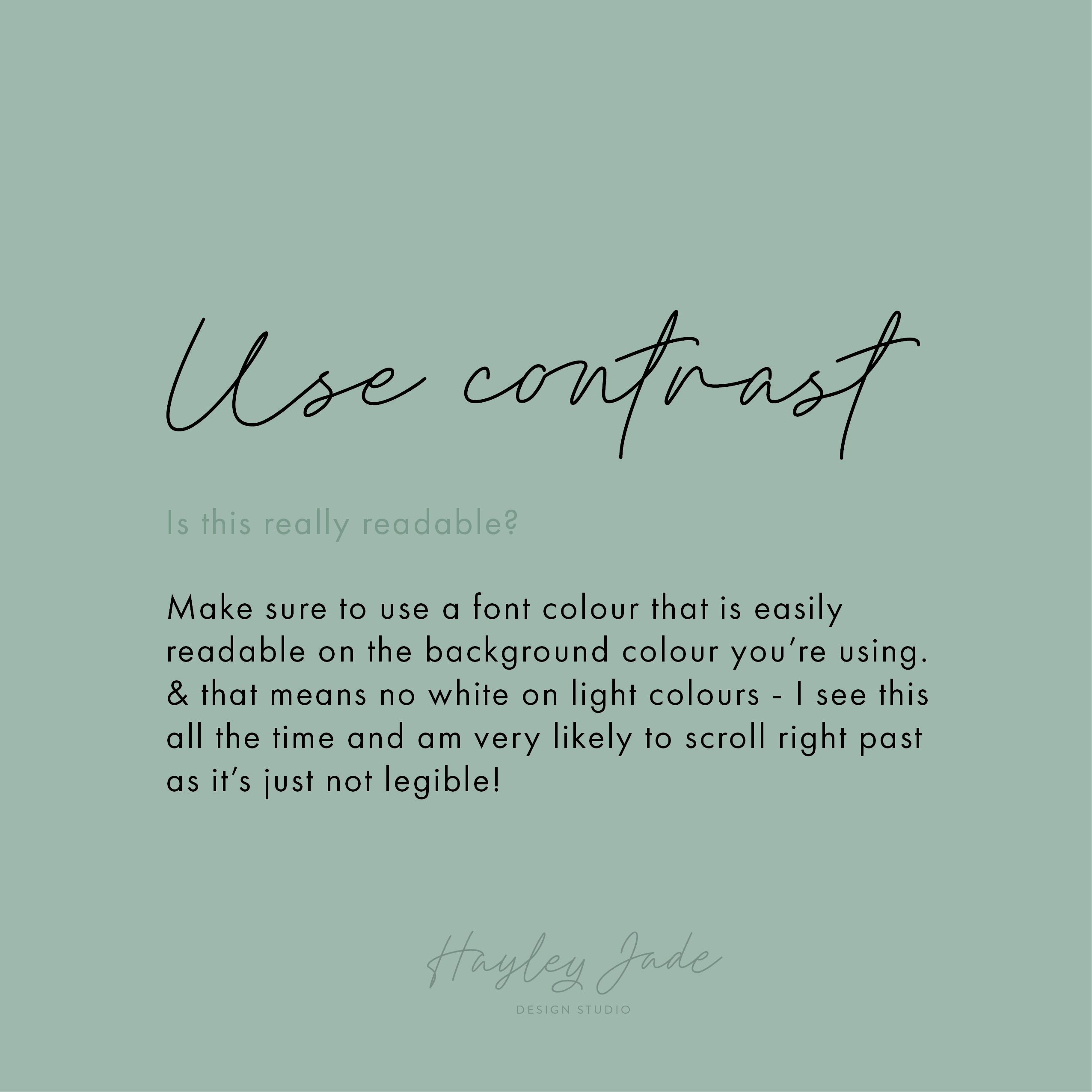
Next, consider readability. Your audience needs to easily read your message, so avoid overly decorative fonts for long blocks of text. Use more elaborate fonts sparingly—perhaps just for headlines or accents.
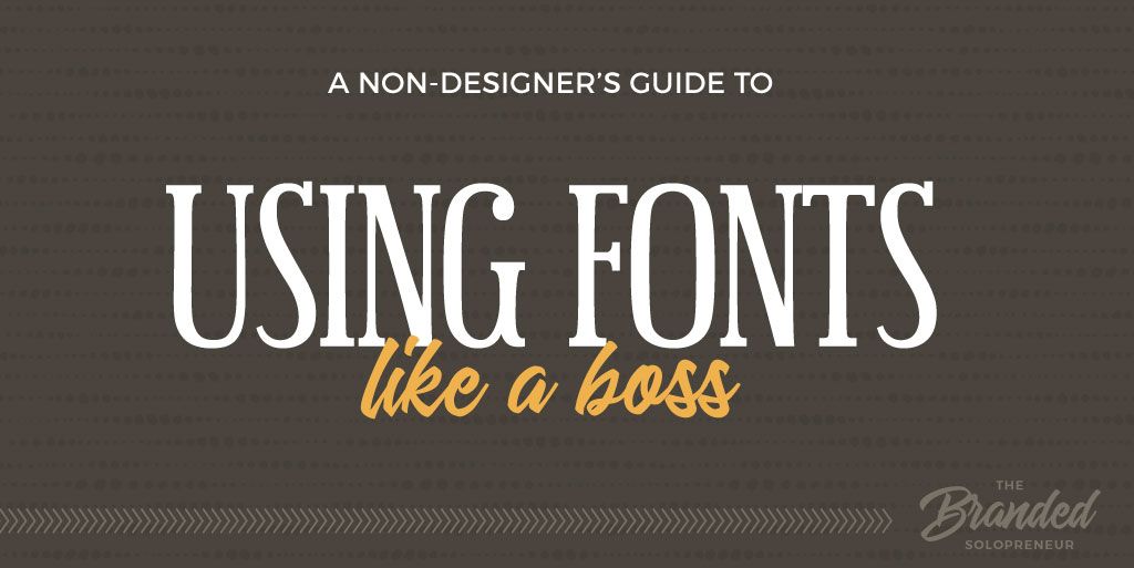
Additionally, think about font pairing. Combining two fonts that complement each other can elevate your design. A common approach is pairing a sans-serif with a serif, or mixing a bold display font with a simple body font. Shutterstock offers plenty of versatile options that work well together, so don’t be afraid to experiment.
Another tip is to pay attention to licensing. Ensure the fonts you choose are licensed for your intended use—digital, print, commercial, etc. Shutterstock makes this easy by clearly listing licensing terms for each font.
Finally, trust your instincts and don’t be afraid to test out a few options. Sometimes, a font might look great in the catalog but not quite fit your project’s personality. Print out samples, view on different screens, and get feedback from colleagues or friends to find the perfect match.
Remember, the right font can make or break your project’s overall feel. Take your time, explore your options, and choose fonts that not only look great but also support your message and brand identity.
Legal Considerations When Using Shutterstock Fonts
Before you dive headfirst into using Shutterstock fonts for your projects, it’s super important to understand the legal side of things. Fonts are a bit like digital assets—they come with specific licensing rules that protect the designers and creators behind them. Ignoring these can lead to serious legal headaches down the line, so let’s break down what you need to know.
First off, when you purchase or download a font from Shutterstock, you’re not necessarily getting unrestricted rights to use it however you want. Many fonts are licensed for specific types of projects, such as personal use, commercial use, or both. Always read the license agreement carefully to see what’s allowed. For example, some licenses might restrict you from embedding fonts into software or distributing them as part of a product.
Here are some key points to keep in mind:
- Check the license type: Shutterstock offers different licensing options, like Standard and Enhanced licenses. Standard licenses usually cover most common uses like websites and printed materials, but if you’re planning to embed fonts in digital products or merchandise, you might need an upgraded license.
- Don’t redistribute fonts: Even if you’re working on a team or with a client, sharing font files directly without proper licensing can be a violation. Instead, provide the font through the licensed platform or embed it where allowed.
- Mind the embedding rights: If you want to embed fonts into apps, eBooks, or other digital products, double-check if your license covers embedding. Sometimes, you’ll need a special license for this purpose.
- Respect copyright and intellectual property: Remember, fonts are intellectual property. Using a font beyond what your license permits can lead to legal issues, including fines or takedowns.
One more tip: keep records of your licenses and purchases. If any questions arise later, having proof of licensing can save you a lot of hassle. Also, if you’re ever unsure about the license terms, don’t hesitate to reach out to Shutterstock’s support team—they’re usually happy to clarify.
In short, being mindful of licensing ensures you can enjoy the creative benefits of Shutterstock fonts without the worry of legal trouble. It’s always better to be safe than sorry—so take a moment to review your licenses before you start designing!
Conclusion and Final Tips for Using Shutterstock Fonts Successfully
And there you have it—your comprehensive guide to making the most out of Shutterstock fonts in your projects! Whether you’re designing a sleek website, eye-catching posters, or social media graphics, these fonts can really elevate your work when used thoughtfully.
To wrap things up, here are some final tips to help you use Shutterstock fonts like a pro:
- Choose the right font for your project: Think about the tone and message you want to convey. A playful font might work great for a kids’ brand, but a more elegant serif might be better for a luxury product.
- Mix and match fonts wisely: Don’t be afraid to combine fonts, but keep it balanced. Use no more than two or three different fonts in a single project to maintain cohesion and readability.
- Pay attention to readability: Even the most beautiful font won’t work if your audience can’t read it. Test your fonts at different sizes and on various screens or print materials.
- Use font pairing guides: Shutterstock often provides suggestions for pairing fonts that complement each other. Leverage these to create harmonious designs.
- Keep your licenses in order: Always verify that your license covers your intended use, especially if you plan to distribute or embed your project into digital or physical products.
- Stay updated: Fonts and licensing terms can change. Make it a habit to check for updates or new licenses from Shutterstock to ensure ongoing compliance.
Remember, the key to successful font use is blending creativity with responsibility. With these tips, you’ll be able to craft stunning visuals that are both legally sound and visually appealing. Happy designing!