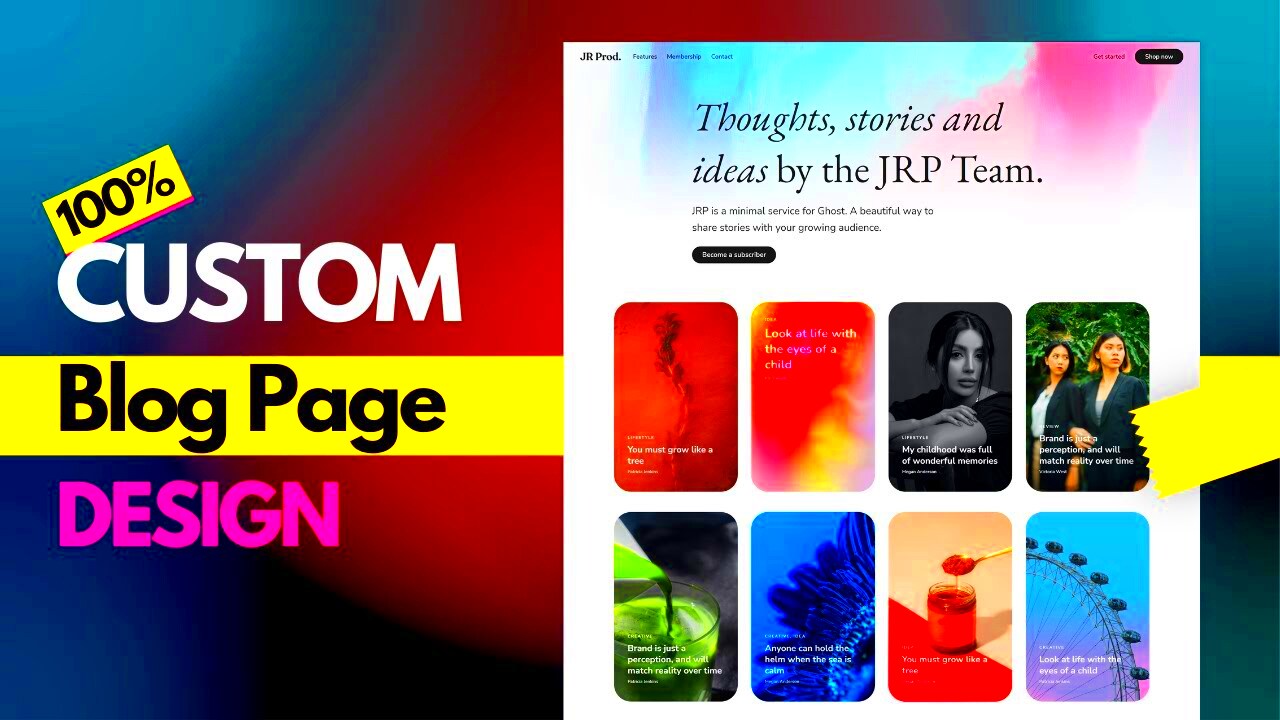
Skinning a website refers to the process of customizing its appearance while maintaining the core functionality. This is where aesthetics meet usability. Whether you’re an entrepreneur looking to establish your brand identity or a blogger wanting to create an attractive online space, skinning is essential. It offers a way to make your website stand out in a crowded digital landscape without diving into complex coding.
Why Choose Elementor for Web Design?
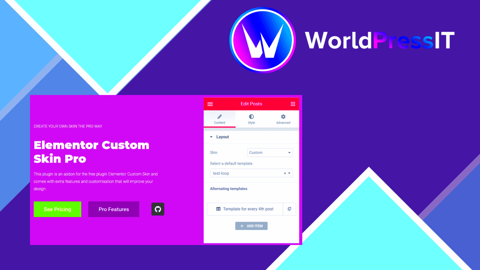
Elementor has emerged as a go-to page builder for many web designers and developers. But why should you consider it for your website skinning project? Here are some compelling reasons:
- User-Friendly Interface: Elementor’s drag-and-drop interface makes it incredibly easy for anyone, even those with no coding background, to start designing. You can see changes in real time!
- Customizable Templates: With a plethora of pre-built templates, you can give your site a professional look quickly. Just pick one and start customizing!
- Responsive Design: Elementor automatically adjusts your site to look great on all devices, ensuring that your visitors have a seamless experience, whether on desktop or mobile.
- Dynamic Content: If you want to go beyond the basics, Elementor allows you to incorporate dynamic content, giving you more control over how your information is presented.
- Third-Party Integrations: Easily integrate with a wide range of plugins and tools, enhancing the functionality of your website without any hassle.
- Regular Updates: Elementor is consistently updated, meaning you always have access to the latest features and improvements that enhance your design options.
In short, Elementor isn’t just about making a site look pretty; it’s a powerful tool designed to give you flexibility, efficiency, and a sleek, professional finish.
Understanding the Basics of Website Skinning
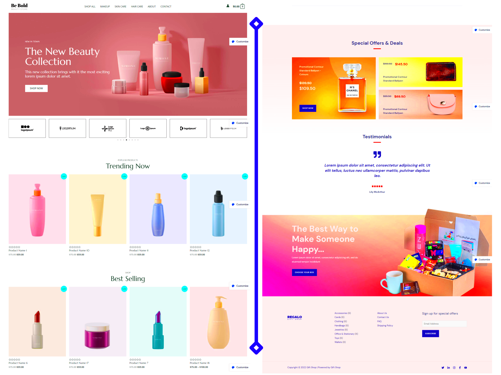
Website skinning is essentially the process of changing the appearance of a website while keeping its core functionality intact. Think of it as giving your site a fresh coat of paint or a complete makeover without tearing down the structure. It’s all about aesthetics and usability, ensuring that users have a pleasant experience while navigating through your content.
Now, what does it involve exactly? Here are a few basic elements:
- Colors: Choosing a color palette is pivotal. It should resonate with your brand identity and evoke the right emotions in your audience. Remember, colors can significantly impact user behavior!
- Typography: The typefaces you select can convey different feelings. A professional site may use serif fonts for reliability, while a trendy site may opt for modern sans-serifs.
- Layouts: The arrangement of elements on your website creates a visual structure. This can include headers, footers, sidebars, and main content areas.
- Images and Graphics: High-quality images can grab attention and add depth to your site. Use visuals that align with your brand messaging.
- Widgets and Features: Consider which plugins or widgets will enhance the user experience. Social media feeds, contact forms, and galleries are great options!
Understanding these core aspects will lay a solid foundation for creating a website that not only looks good but also performs well. With Elementor, you can customize these elements easily, allowing your creativity to shine!
Setting Up Your Elementor Environment
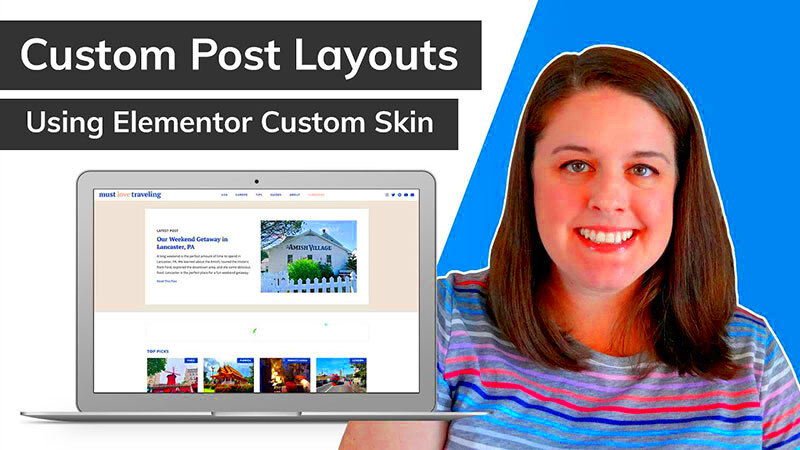
Before diving into skinning your website with Elementor, you’ll want to ensure that your environment is properly set up. This will make the whole process smoother and more enjoyable.
First things first, you need a WordPress installation. If you haven’t done this already, here’s a quick guide:
- Choose a Hosting Provider: Select a reliable hosting service that supports WordPress installation.
- Install WordPress: Most hosting providers offer one-click WordPress installations, making this step a breeze.
Once WordPress is in place, it’s time to install Elementor. Here’s how you do it:
- Navigate to the Dashboard: Go to your WordPress admin area.
- Select ‘Plugins’: Click on ‘Add New’ and search for Elementor.
- Install & Activate: Click ‘Install Now’ and then ‘Activate’ once the installation is complete.
Now that you have Elementor up and running, consider the following tips for optimizing your environment:
- Pick the Right Theme: Select a compatible theme for Elementor that allows for extensive customization.
- Configure Settings: Go through Elementor’s settings, adjusting options like layout and default colors to better fit your vision.
- Familiarize Yourself with the Interface: Spend a little time playing around with the editor. It’s user-friendly and intuitive, but knowing where everything is can save time later.
With your Elementor environment set up and ready to go, you’re well on your way to crafting a stunning website that reflects your unique style and professionalism!
Choosing the Right Theme for Your Project
When it comes to skinning a website with Elementor, the first big step you need to take is choosing the right theme. The theme sets the foundation for your design, influencing everything from layout to flexibility. There are so many options available, but how do you know which one is right for you? Here’s a friendly guide to help you pick the perfect theme for your project!
- Consider Your Niche: Select a theme that resonates with your industry. For eCommerce, a theme with built-in product showcase features is a must, while blogs might benefit from layouts that highlight articles.
- Check Elementor Compatibility: Not all themes are created equal. Be sure to choose a theme that’s fully compatible with Elementor, ensuring that you can make the most out of its powerful features.
- Look for Responsiveness: In today’s mobile-first world, opting for a responsive theme is non-negotiable. Test how it looks on various devices to ensure a seamless user experience.
- Evaluate Customization Options: A theme that offers plenty of customization options will allow you to create a unique look. Look for themes with diverse colors, typography choices, and layout adjustments.
- Support and Updates: Choose a theme that provides good support from its developers and regularly receives updates. This is crucial for security and compatibility as WordPress evolves.
In essence, your theme should echo your brand’s voice while also providing the flexibility to craft a standout website through Elementor. So, take a little extra time in this step—it’ll pay off in spades later!
Customizing Your Header and Footer
The header and footer of your website are like the bookends of your content, framing your overall design and offering an opportunity to express your brand’s identity. Customizing these sections within Elementor can transform your website from generic to eye-catching. Here’s how to do it effectively!
- Access Template Builder: Head over to Elementor’s Template Builder where you can create a custom header and footer. This is where the magic begins!
- Choose a Layout: Decide whether you want a centered, left-aligned, or right-aligned header. Play around with different layouts to find the one that suits your style best.
- Add Essential Elements: Include critical elements like your logo, navigation menu, social media icons, and a call to action. Use the drag-and-drop feature to arrange these items in a way that’s visually appealing.
For footers, consider the following:
- Include Important Links: Don’t miss the chance to add links to privacy policy, contact, and FAQ sections in your footer. This enhances user navigation.
- Incorporate Widgets: Elementor allows you to add widgets to your footer—this is your chance to include a newsletter signup, recent posts, or even an Instagram feed to keep your audience engaged.
Once you’re happy with both the header and footer, don’t forget to preview your changes. It’s the final touches that make your site shine, and by customizing these components, you’re well on your way to achieving a polished, professional look!
Designing the Home Page for Maximum Impact
Your website’s home page is your digital storefront—it’s where you make your first impression! This is the space that should captivate your audience and communicate your brand’s core message instantly.
To design an attention-grabbing home page using Elementor, consider the following elements:
- Hero Section: Start with a striking hero image or slider. This is the first thing visitors see, so choose high-quality visuals that reflect your brand’s identity.
- Compelling Headline: Write a bold, clear headline that summarizes what you offer. It should be intriguing enough to make visitors want to learn more.
- Call to Action (CTA): Every home page needs a strong CTA. Use buttons that stand out—think contrasting colors that draw the eye. For instance, “Get Started” or “Learn More” can guide users to where you want them to go.
- Navigation: Ensure your menu is intuitive. A well-structured navigation bar helps users find what they’re looking for without frustration.
- Social Proof: Incorporate testimonials or success stories. This builds credibility and trust, making visitors more likely to engage with your content.
Remember, less is often more. Leave some white space—this can enhance readability and make your content pop!
As you build the home page, constantly ask yourself: “Does this reflect the professional image I want to project?” If not, it might be time to revisit your layout and design elements!
Creating Engaging Inner Pages
Once your home page is designed to capture and hold attention, it’s time to focus on your inner pages. These pages are just as crucial as the home page because they serve to educate, inform, and convert visitors!
Here’s how to create engaging inner pages with Elementor:
- Consistent Branding: Maintain consistency in fonts, colors, and imagery across all pages. This familiarity helps with brand recognition.
- Clear Layout: Use sections, columns, and various Elementor widgets to break down text and information. This makes content more digestible.
- Visuals Matter: Incorporate images, videos, or infographics. Visual elements appeal to our natural tendencies, making information more memorable.
- Interactive Elements: Use sliders, tabs, or accordions to deliver content dynamically. It keeps users engaged and encourages them to explore.
- Internal Links: Include links to other relevant pages or blog posts. This creates a web of interrelated content, keeping users on your site longer.
Lastly, always end with a clear CTA—whether it’s directing users to a contact form, a subscription option, or a product page. Inner pages should lead your visitors seamlessly toward their next steps in their journey!
Engaging inner pages don’t just inform; they inspire action, turning casual visitors into loyal customers!
Using Elementor Widgets for Enhanced Functionality
One of the standout features of Elementor is its extensive library of widgets that can elevate your website’s functionality without complicated coding. These widgets allow you to add various elements to your website that engage users and enhance their experience. Let’s explore some essential widgets you can leverage:
- Heading Widget: Perfect for creating attention-grabbing titles. You can customize font size, color, and style to match your brand.
- Image Widget: Displays images beautifully. You can also link images to pages or other content, enhancing navigation.
- Button Widget: Generates clickable buttons to guide users toward actions like signing up for newsletters or purchasing products.
- Video Widget: Embeds videos directly into your site. This is excellent for product demos or engaging content.
- Form Widget: Creates contact forms seamlessly. You can easily collect leads and engage with your audience.
Remember, functionality is key. Mixing and matching these widgets allows you to create unique layouts and designs tailored to your user needs. Additionally, exploring third-party Elementor add-ons can significantly expand your options. Just make sure to keep it user-friendly and intuitive.
Styling Your Elements for a Cohesive Look
Styling is crucial when it comes to ensuring your website has a cohesive and professional look. Elementor makes styling your elements a breeze with its intuitive drag-and-drop interface. Here are some tips to help ensure your site’s aesthetics are consistent:
- Color Palette: Choose a color scheme that reflects your brand’s identity. Stick to a limited number of colors to maintain consistency throughout your site.
- Font Selection: Use no more than two to three fonts across your website. This helps create uniformity and enhances readability.
- Spacing and Alignment: Pay attention to margins and paddings between elements. Consistent spacing creates a clean layout that guides visitors’ eyes.
- Backgrounds: Use background images or colors that complement your overall design. Just ensure that they don’t overpower your content.
Elementor provides styling options that let you customize every element easily. Utilize the advanced settings for typography, hover effects, and transitions to give your site that extra polish. A cohesive look not only enhances user experience but also builds trust and credibility in your brand. So take the time to fine-tune these details, because they make all the difference!
Responsive Design Considerations
When it comes to building a professional-looking website with Elementor, one aspect you can’t afford to overlook is responsive design. Today, users access websites through an array of devices, from desktops to smartphones and everything in between. Ensuring your website offers a seamless experience across all these devices is crucial.
Here are some key considerations to keep in mind for responsive design:
- Fluid Grids: Utilize a fluid grid layout that adapts to different screen sizes. Unlike fixed layouts, fluid grids adjust proportions based on the screen size, making your content more adaptable.
- Media Queries: Leverage media queries in your CSS to apply different styles for different devices. This allows you to control things like font size, layout, and other visual elements to enhance readability on smaller screens.
- Mobile-First Approach: Start designing your site for mobile devices first. This strategy forces you to prioritize essential content and features, ensuring that your design is user-friendly on smaller screens before scaling up for desktops.
- Testing Across Devices: It’s essential to test your design on various devices and screen sizes. Emulators can be handy, but there’s no substitute for real-world testing to see how your site performs on actual devices.
- Touch-Friendly Elements: Ensure that buttons and links have enough padding so they’re easily clickable on touchscreen devices. A touch-friendly experience can make all the difference for mobile users.
By keeping these responsive design considerations in mind, you can create a website that not only looks stunning on any device but also provides a fantastic user experience that keeps your visitors coming back!
Testing Your Website Before Launch
So, you’ve put in the hard work using Elementor to skin your website, and now it’s almost time to launch! But before you hit that big red button, you really need to test your website thoroughly. Think of it as a dress rehearsal before the big performance. The goal is to ensure everything works as intended, and your site is as user-friendly as possible.
Testing can feel overwhelming, but breaking it down into manageable steps makes it easier:
- Functionality Testing: Click every link, fill out every form, and interact with all buttons. Make sure they work as expected. It’s crucial that users can navigate your site seamlessly without hitting any dead ends.
- Browser Compatibility: Check how your website performs in different browsers such as Chrome, Firefox, Safari, and Edge. Your audience likely uses a variety of browsers, so ensuring a consistent experience is key.
- Mobile Responsiveness: As discussed before, check how your site looks and functions on various devices. Use tools like Google’s Mobile-Friendly Test to help with this!
- Loading Speed: A slow website can drive users away. Utilize performance testing tools like GTmetrix or Google PageSpeed Insights to evaluate and optimize your site’s loading time.
- SEO Auditing: Before launch, make sure your site is optimized for search engines. Check meta tags, descriptions, and alt text for images. Tools like Yoast SEO can assist in this area.
Once you’ve ironed out all the kinks and ensured everything runs smoothly, you’ll be ready to launch with confidence. Your professional-looking website, skinning it beautifully with Elementor, deserves to shine!
Conclusion and Next Steps
In conclusion, skinning a website using Elementor can dramatically enhance its visual appeal and functionality. With the intuitive drag-and-drop interface, you can create a professional-looking website without extensive coding knowledge. By following the steps outlined throughout this guide, you can successfully customize your website’s design to reflect your brand and engage your audience.
As you move forward, consider the following next steps to improve and refine your Elementor website:
- Experiment with Templates: Utilize Elementor’s template library to find pre-designed structures that suit your needs. Customize them further to make them unique to your brand.
- Optimize for Mobile: Ensure your website is responsive. Elementor allows you to adjust settings for mobile and tablet views separately for an optimized design.
- Incorporate Add-ons: Explore third-party Elementor add-ons to extend functionality. These can provide unique elements and custom features that enhance user experience.
- Improve SEO: Integrate SEO best practices into your design. Utilize headings properly, optimize images, and consider loading speed to enhance your search engine visibility.
- Gather Feedback: After launching your site, solicit feedback from users. Make adjustments based on their experiences to improve usability and functionality.
- Keep Learning: Stay updated with update releases from Elementor and the latest web design trends to keep your site current and engaging.
By implementing these next steps, you will not only maintain your website’s professional appearance but also ensure it remains effective in achieving your goals. Start applying these practices today to get the most out of your Elementor experience!

