Hiding HTML elements in Elementor can be a game changer for web designers. Whether you’re looking to streamline your pages or create a more focused user experience, knowing how to hide elements effectively can help. Elementor, with its drag-and-drop functionality, provides an intuitive way to manipulate your page’s layout—even down to hiding specific items. In this guide, we’ll walk you through everything you need to know about this useful feature, giving you the confidence to customize your site precisely how you want it.
Understanding the Need for Hiding Elements

Every website has different goals and audiences, so the need to hide elements can vary widely. Here are some common reasons why one might want to hide HTML elements in Elementor:
- Improving User Experience: Sometimes less is more. By hiding irrelevant buttons or sections, you can guide users more effectively through your content.
- Testing Variants: If you’re running A/B tests, hiding specific elements can help you assess their performance without completely removing them from your design.
- Mobile Responsiveness: What looks great on desktop may not translate well to mobile. Hiding certain elements on smaller screens can make your site feel more streamlined.
- Seasonal Promotions: If you run seasonal campaigns, you might want to hide outdated content until it’s relevant again.
To sum it up, hiding HTML elements isn’t just about aesthetics; it’s about functionality and providing the best possible experience to your users. Remember, every design choice you make should serve a purpose and align with your website’s overall goals.
Methods to Hide HTML Elements in Elementor

When working with Elementor, a powerful page builder for WordPress, you have several methods at your disposal to hide HTML elements, allowing you to customize the appearance of your pages without permanently deleting elements from your design. Here’s a breakdown of some of the most effective methods:
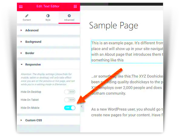
- Using the Responsive Options: Elementor allows you to adjust the visibility of elements based on the device being used. For instance, you might want a specific widget to be visible on desktop but hidden on mobile devices. You can do this by selecting the element and going to the ‘Advanced’ tab, then finding the ‘Responsive’ section where you’ll see options to hide the element on different devices.
- Using the Navigator: If you’ve got multiple layers of content, the Elementor Navigator is a lifesaver. Right-click on the desired element in the navigator, and choose ‘Hide’ to quickly remove it from view, which is particularly useful for organizing your layout without losing any of your hard work.
- Apply Conditions with Display Settings: Some elements can be conditionally visible based on user behavior, such as roles or specific conditions set through plugins. You can use display settings to hide elements in these cases based on user interaction.
These methods can enhance the user experience by focusing on what’s necessary and relevant, streamlining the overall design, and ensuring that your pages look great across all devices.
Using Custom CSS to Hide Elements
Custom CSS is a powerful tool that gives you the flexibility to hide HTML elements in Elementor that the basic options might not cover. For those who are a bit tech-savvy or willing to dive into some code, this can unlock a whole new level of customization. Here’s how to do it:
- Identify the Element: First, you need to find the CSS class or ID of the element you wish to hide. You can do this by using your browser’s developer tools (right-click the element and select ‘Inspect’).
- Go to the Custom CSS Section: In Elementor, select the element you want to hide, go to the ‘Advanced’ tab, and look for the ‘Custom CSS’ box. Note that this feature is available in Elementor Pro.
- Add Your CSS Code: In the Custom CSS field, you can write your CSS to hide the element. For instance, the code below will hide an element with a specific class:
selector { display: none;}Replace the “selector” with the class or ID you identified earlier. This simple CSS rule effectively removes the element from view without deleting it from the Elementor editor, giving you the freedom to toggle visibility as needed.
Using custom CSS adds an extra layer of flexibility, allowing you to control the visibility of elements based on specific conditions, responsive design, and much more. Just remember, always check how these changes appear across different devices!
5. Applying Visibility Settings in Elementor
When it comes to customizing your Elementor pages, one of the most powerful features at your disposal is the Visibility Settings. This tool lets you control which elements appear on your page based on various conditions. Whether you’re optimizing for user experience or simply decluttering your design, understanding these settings can significantly enhance your website’s look and feel.
To apply visibility settings in Elementor, follow these steps:
- Select the Element: Click on the element you wish to hide or show on specific views. This could be anything from an image, text box, or button.
- Access Advanced Settings: On the left panel, navigate to the Advanced tab. This is where all the magic happens.
- Go to Responsive Settings: Inside the Advanced tab, look for the section named Responsive. This is your main hub for visibility adjustments.
- Choose Visibility Options: You’ll see options to Hide on Desktop, Hide on Tablet, and Hide on Mobile. Check the boxes that correspond to the devices where you want the element to be hidden. For example, if you want an image to be invisible on mobile devices, just check the Hide on Mobile box.
- Save Your Changes: Don’t forget to save your changes by clicking the Update button at the bottom of the panel. This ensures your visibility settings are applied.
Using the visibility settings effectively allows you to curate the content your audience sees, ensuring a tailored experience that resonates with their needs!
6. Hiding Elements on Specific Devices
In today’s digital environment, we access websites across a variety of devices—from desktops and laptops to tablets and smartphones. This diversity poses a unique challenge for web designers, particularly regarding how content is displayed. Thankfully, Elementor makes it incredibly easy to hide elements on specific devices, ensuring that your site looks great on any screen.
Here’s how you can hide elements on specific devices:
- Open the Page Editor: Navigate to the Elementor page editor where your desired element resides.
- Select the Element: Click on the element you want to hide. This can be anything from a row to a widget.
- Go to the Advanced Tab: On the left side panel, switch over to the Advanced tab, which gives you full control over the element.
- Responsive Options: Scroll down to the Responsive section. Here, you’ll find options to hide the element based on the type of device.
- Select Your Device: Check the box for the devices where you want the element to be hidden (Desktop, Tablet, Mobile). This way, you can show or hide content without altering the main design!
Consider a scenario where you have a complex navigational menu meant for desktop users. On mobile devices, it may be more user-friendly to hide this menu and replace it with a simpler hamburger icon. Hiding elements judiciously improves user experience and ensures your site remains functional no matter the device.
Keep in mind that testing your site on multiple devices is crucial after making these adjustments. This way, you can confirm everything looks just right!
7. Testing Your Changes
Once you’ve made adjustments to hide or show HTML elements in Elementor, it’s crucial to test those changes to ensure they work as expected. Think of this step as a mini-audit of your page. You wouldn’t want to push something live that might confuse your visitors or create a less-than-ideal user experience. So, how do you go about this? Let’s break it down.
First, refresh your page after saving your changes. Often, elements may not display as hidden or visible until you perform a refresh. Open your page in different browsers or devices to see the effects. Here’s what you can do:
- Check on Desktop: Open the page in a desktop browser. Make sure you’re viewing it on a regular screen size.
- Mobile Preview: Use Elementor’s mobile responsiveness tool to check how it appears on smaller screens. This is important since mobile users are a significant portion of web traffic.
- Clear Caches: If you’re using a caching plugin, clear your cache after changes. Cached versions may not show your updates immediately.
Don’t just stop at visual checks! Test any functionality associated with the elements you’ve modified:
- Click on buttons or links.
- Check form submissions if applicable.
Doing these checks ensures that your website works well and looks great for all users.
8. Common Issues and Troubleshooting
Even the best of us run into hiccups while working with Elementor. But don’t worry—most issues can be resolved with some straightforward troubleshooting. Here are some common problems you might encounter while hiding HTML elements, along with tips on how to fix them.
| Issue | Solution |
|---|---|
| Element Still Visible | Ensure that you’ve correctly applied the hiding rules. Check the settings, and try refreshing your page. |
| Changes Not Saving | Sometimes, browser cache can be the culprit. Clear your browser cache or check if your WordPress cache needs to be cleared. |
| Mobile Responsiveness Issues | Use Elementor’s responsive settings to revisit your options. You may need to apply different settings for desktop and mobile views. |
If you’re still facing issues, check out community forums, or Elementor’s documentation, as these resources can often provide insights and answers.
By addressing common pitfalls early on, you set yourself up for a smoother experience, ensuring that your hidden elements are working exactly as you intended.
Conclusion
In this guide, we explored various methods to hide HTML elements on Elementor pages, empowering you to customize your website’s appearance according to your needs. Whether you’re looking to improve user experience, streamline design, or temporarily remove elements for testing purposes, Elementor provides multiple tools to achieve this.
Here’s a quick summary of the key methods:
- Using the Navigator: You can easily hide elements by selecting them in the Navigator panel and choosing the “Hide” option.
- Custom CSS: For more control, applying custom CSS rules directly in Elementor offers powerful flexibility. This approach can hide elements based on specific conditions or media queries.
- Responsive Settings: Elementor allows you to hide elements based on the device type (desktop, tablet, mobile), ensuring your site looks great on all screens.
- Advanced Settings: The “Advanced” tab in the Elementor editor also includes options to control visibility using conditions, roles, or dynamic visibility features.
By utilizing these features, you can create a cleaner, more engaging webpage that focuses on what truly matters. Remember to test your changes across different devices to ensure a seamless experience for all users. With just a few clicks, you can enhance the overall functionality and aesthetic of your Elementor pages.


