Welcome to the world of Elementor, where designing your website becomes a breeze! One of the essential skills in web design is image cropping. It may sound simple, but it’s a game-changer when it comes to creating visually appealing pages. Cropping images helps emphasize the subject in your photos and maintain a clean, professional aesthetic. In this guide, we’ll navigate through the easy steps on how to crop images in Elementor, ensuring your visuals are as stunning as your content!
Understanding the Image Widget

Before diving into the cropping process, let’s familiarize ourselves with the Image Widget, an essential feature in Elementor. This widget is not just a simple tool for placing images; it’s packed with functionalities that allow for almost infinite creative possibilities. Here’s what you need to know:
- What is the Image Widget? The Image Widget allows you to add images to your Elementor layout effortlessly. You can adjust the size, alignment, and link options to enhance your design.
- Accessing the Widget: You can find the Image Widget in the Elementor sidebar. Simply drag and drop it into your desired section on the page.
- Customization Options: Once you’ve added your image, you can customize it with the following settings:
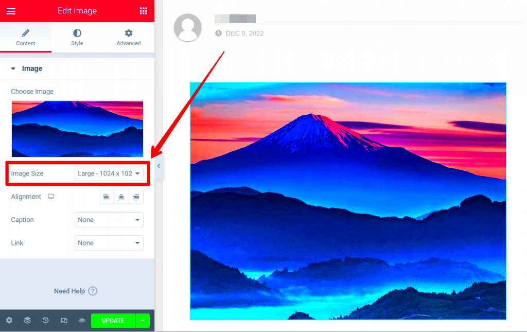
- Image Size: Choose from predetermined sizes or set a custom dimension.
- Alignment: Position your image to the left, center, or right to fit your layout.
- Linking: Add a link to the image for easy navigation, directing visitors to other pages or external sites.
- Caption: Add a caption to provide context or information about the image.
- Responsive Control: Control how your images look on different devices. Ensure they’re not just pretty on desktops but also tablets and mobiles!
Once you’re acquainted with the Image Widget, you’re one step closer to mastering image cropping and enhancing your site’s visual appeal!
3. Step-by-Step Guide to Cropping Images

Are you ready to enhance the visual appeal of your website? Cropping images in Elementor is an essential skill that can help you focus on what truly matters in your visuals. Let’s break down the process step-by-step to make it as easy as pie!
Step 1: First things first! Open up your WordPress dashboard and navigate to your Elementor page. Once you’re there, locate the section where you’d like to add your image.
Step 2: Click on the “+” icon to add a new section or use an existing one. Choose the “Image” widget from the Elementor panel, and drag it into your section.
Step 3: After placing your image widget, click on the image itself or the “Choose Image” button to upload an image from your media library or upload a new one.
Step 4: Once the image is selected, go to the Style tab. Here comes the fun part! Look for the Image Position option which allows you to position the image. You can select options like “Top”, “Center”, or “Bottom” to see how it feels visually.
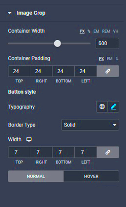
Step 5: Now, let’s crop! Under the Image Crop option, you can adjust the image width and height to trim away the parts you don’t want. You can either use the sliders or input specific dimensions directly.
Step 6: Don’t forget the Preview. Before you finalize, hit the preview button so you can see how your cropped image looks on the live page.
Step 7: If you’re satisfied, just click the Update button. Voila! You’ve successfully cropped your image using Elementor!
4. Using the Image Editor in Elementor

Did you know that Elementor comes packed with an image editor? This powerful tool lets you make quick edits without needing external software. It’s user-friendly and intuitive, especially when you’re looking to crop images quickly and efficiently.
To get started, you’ll want to dive into your Elementor page where the image widget resides. Here’s how to use the image editor:
- Accessing the Editor: Click on the image you want to edit. In the Elementor panel on the left, you’ll see an option labeled Image Editor.
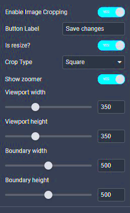
- Finding the Crop Tool: Within the image editor, you’ll notice several options such as Resize, Crop, and Transform. Click on Crop to start your journey.
- Adjusting the Crop: Drag the corners of the cropping box to select the area of the image you want to keep. A grid will appear, helping you to position it just right.
- Aspect Ratio: If you want your image to remain a specific aspect ratio (say, 16:9 or 4:3), check the box for Maintain Aspect Ratio to ensure a proportional crop.
- Applying Your Changes: Once you are satisfied with how your image looks, click Save Changes. You can quickly revert if anything feels off.
Using Adobe Photoshop or other complex tools can feel cumbersome at times. But with Elementor’s built-in image editor, you have all the control you need right at your fingertips. It streamlines your workflow and saves valuable time. Give it a try and watch your website transform!
5. Advanced Cropping Techniques
When you’ve mastered the basics of cropping images in Elementor, it’s time to elevate your game with some advanced techniques. These methods not only enhance your aesthetic appeal but can also improve the overall user experience on your website. Let’s dive into some of the best advanced cropping techniques!
- Aspect Ratios: Understand the different aspect ratios you can use. Choosing the right ratio for your images matters, especially on mobile devices. Common ratios include 16:9 for videos, 4:3 for photographs, and 1:1 for social media images. Adjust the aspect ratio during cropping to make sure your content looks great on all screens.
- Focus Points: Always crop with focus points in mind. This means considering where the viewer’s eye will naturally land. By strategically placing your focal point in your cropped image, you can draw attention to key features and improve engagement.
- Layering Techniques: If you’re feeling extra creative, consider layering multiple cropped images. You can create stunning visual effects and more dynamic layouts. This technique requires some finesse, but the results can be breathtaking.
- Use of Shadows and Borders: When cropping, think about adding some depth with shadows or borders. This can help separate the images from the background and create a more engaging look.
- Responsive Cropping: Keep in mind that your images will be viewed on various devices. Use Elementor’s responsive settings to adjust your crops based on screen size. This flexibility ensures your website retains its visual quality across all platforms.
6. Best Practices for Cropping Images
Cropping images might seem simple, but there are several best practices to keep in mind to ensure your visuals are nothing short of stunning. Here’s a handy guide to help you perfect your cropping game!
| Practice | Description |
|---|---|
| Keep it Consistent | Maintain a consistent style throughout your images. Whether it’s using similar aspect ratios or color effects, consistency helps to create a cohesive look for your website. |
| High-Quality Images | Start with high-resolution images to ensure that when you crop them, the quality remains intact. Low-quality images can look pixelated and unprofessional. |
| Prioritize Composition | Follow compositional techniques like the Rule of Thirds. This principle suggests dividing your image into a 3×3 grid and positioning key elements along the lines or intersections to create a balanced look. |
| Test on Multiple Devices | After cropping, always preview your images on different devices to ensure they look great everywhere. What works on a desktop might not work as well on mobile! |
| Consider Context | Before hitting the crop button, ask yourself how the image fits into your overall message. Ensure that the cropped image enhances and doesn’t detract from your content. |
By following these best practices, you can ensure that your cropped images not only look great but also contribute positively to your website’s overall aesthetics and functionality. Happy cropping!
Common Issues and Troubleshooting
When it comes to cropping images in Elementor, most tasks go smoothly. However, you may encounter some common issues that can disrupt your workflow. No worries; we’re here to help you troubleshoot these problems swiftly. Here are some frequent hiccups and how to sort them out:
- Image Not Cropping Properly: If the image seems unresponsive to your crop adjustments, make sure you’re not locked in a specific aspect ratio. Check the settings in Elementor to see if you’ve selected a fixed size.
- Low Image Quality: Occasionally, cropping can cause images to lose clarity. Always use high-resolution images as your starting point. Additionally, ensure that you’re saving the image in a suitable format.
- Changes Not Showing Up: After cropping your image, if the changes do not reflect on your site, try clearing your browser cache. In some cases, you may need to refresh the page or even re-publish your changes in Elementor.
- Elementor Not Responsive: If your cropped images look great on desktop but distorted on mobile, check to make sure you’ve set different sizes for responsive views. Use the ‘Responsive Mode’ feature in Elementor to adjust accordingly.
By keeping these troubleshooting tips in mind, you can fix most cropping issues swiftly and keep your project on track!
Conclusion: Enhance Your Designs with Proper Image Cropping
Image cropping is more than just altering pictures; it’s a vital part of web design that can significantly affect aesthetics and user experience. When done right in Elementor, cropping can enhance the visual appeal of your site and ensure that your content grabs your audience’s attention the moment they land on your page.
Here’s a quick recap of how cropping can elevate your designs:
- Focus on the Subject: Cropping helps to emphasize the essential parts of an image, drawing viewers’ focus exactly where it needs to be.
- Consistent Visual Style: Utilizing a uniform crop across your images can create a cohesive look and feel throughout your website.
- Improved Load Times: Cropped images are often smaller in file size, which can lead to faster load times. This is great for user experience and SEO!
Remember, practice makes perfect! Experiment with cropping in Elementor and don’t hesitate to adjust multiple times until you achieve the desired outcome. Happy designing!


