Ever wanted to add a splash of color to a black-and-white photo or creatively modify your images? Shutterstock Editor is a fantastic tool that makes this possible, whether you’re a professional designer or just someone who loves tinkering with images. One of its coolest features is image colorization, which allows you to bring old photos back to life or experiment with new color schemes effortlessly. In this guide, we’ll walk you through how to use Shutterstock Editor for colorizing images, starting with the basics of what it is and how it can help you create stunning visuals.
Steps to Upload Your Image to Shutterstock Editor
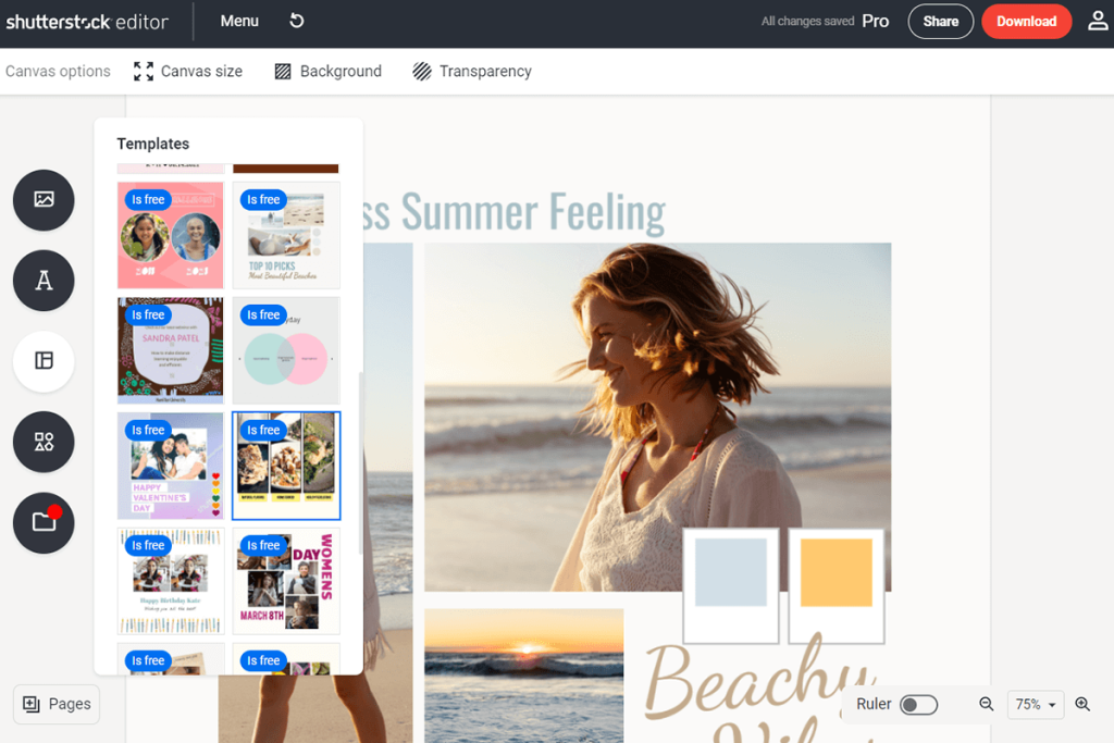
Getting started with Shutterstock Editor is simple and straightforward. Follow these easy steps to upload your image and prepare it for colorization:
- Sign in or create an account: Head over to the Shutterstock Editor website and log in. If you’re new, signing up is quick and free.
- Access the editor: Once logged in, click on the “Create” button or select “Editor” from the dashboard to open the editing interface.
- Locate the upload option: Look for the “Upload” button, usually represented by a cloud icon with an upward arrow, and click on it.
- Select your image: Browse your computer or device to find the photo you want to work on. Supported formats typically include JPEG, PNG, and TIFF.
- Upload your image: After selecting your file, click “Open” or “Upload” to start the process. The image will appear in the editor’s workspace once uploaded.
That’s it! Now your image is ready for the next steps, including cropping, adjusting, and most excitingly, colorizing. Remember, the smoother your original image quality, the better your colorization results will be. Happy editing!
Using the Color Adjustment Tools in Shutterstock Editor
Once you’ve uploaded your image into Shutterstock Editor, the next step is to fine-tune its colors to match the vibe you’re aiming for. The color adjustment tools are your best friends here—they give you precise control over brightness, contrast, saturation, and more, helping your image pop or look more subdued depending on your needs.
Let’s break down some of the main tools and how to use them:
- Brightness and Contrast: These are fundamental adjustments. Increasing brightness makes your image lighter, while decreasing it darkens the overall look. Contrast boosts the difference between light and dark areas, adding depth or making the image more dramatic.
- Saturation: This controls how vivid the colors appear. Want a more vibrant, lively image? crank up the saturation. Prefer a more muted, vintage feel? dial it down.
- Hue: This shifts all the colors in your image along the color wheel. For example, changing hues can turn a blue sky into a teal or a red flower into a pink one. It’s perfect for creative color shifts or correcting color casts.
- Color Temperature: Adjusts the warmth of your image. Moving towards warmer tones adds yellows and reds, giving a sunrise or cozy feel. Cooler tones introduce blues and greens, perfect for a calm, tranquil vibe.
- Vibrance: Similar to saturation but more subtle. It enhances the intensity of the more muted colors without over-saturating the already vibrant ones, keeping your image looking natural.
To use these tools effectively:
- Start with small adjustments—less is often more.
- Preview changes frequently to see how they impact the overall look.
- Use the sliders to find the perfect balance that enhances your image without making it look unnatural.
Remember, the goal is to highlight your subject and set the mood, not to completely overhaul the colors unless that’s your artistic intention. By mastering these adjustment tools, you’ll be able to bring out the best in your images and create a polished, professional look.
Applying Color Filters and Effects for Better Results
Sometimes, a simple color adjustment isn’t enough to give your image that wow factor. That’s where color filters and effects come into play—they can instantly transform the mood, style, and impact of your image with just a few clicks.
In Shutterstock Editor, applying filters and effects is straightforward and fun. Here’s how to make the most out of these tools:
Using Built-in Filters
Filters are pre-set color overlays that can give your image a consistent tone or style. For example:
- Sepia: Adds a warm, vintage feel.
- Black & White: Creates a classic, timeless look.
- Vivid: Intensifies colors for a lively appearance.
- Cool Tone: Adds blue hues for a calm effect.
To apply a filter:
- Click on the Filters option in the editor menu.
- Browse through the available filters and select one that suits your style.
- Adjust the intensity if the option is available, to make the effect more subtle or bold.
Adding Creative Effects
Beyond filters, Shutterstock Editor offers various effects such as vignette, blur, or overlays, which can add depth or focus to your image:
- Vignette: Darkens the edges of your photo to draw attention to the center.
- Color Overlays: Apply semi-transparent color layers to change the overall tone or add mood.
- Textures and Light Leaks: Introduce artistic elements for a more dynamic or vintage feel.
To add an effect:
- Select the Effects tab from the menu.
- Choose an effect or overlay that aligns with your vision.
- Customize the settings to balance the effect with your original image.
Pro Tips for Better Results
- Match filters to your theme: For a romantic look, warm filters work well. For a modern, sleek vibe, cool or monochrome filters might be better.
- Don’t overdo it: Subtle effects often look more professional. Use opacity sliders to dial down intensity.
- Combine effects thoughtfully: Layering filters and effects can produce unique results, but keep the overall aesthetic in mind.
By experimenting with color filters and effects, you can quickly elevate your images from ordinary to eye-catching. Whether you’re aiming for a nostalgic vintage look or a bold modern style, these tools give you the creative freedom to customize your images exactly how you want.
Tips for Achieving Natural and Vibrant Colors
Colorizing images can be a really fun process, but if you want your finished picture to look realistic and eye-catching at the same time, a few tips can make all the difference. Let’s explore some tricks to help you achieve those natural and vibrant colors that make your images pop!
Start with a good base image. The better your original photo, the easier it will be to add color seamlessly. Look for images with good contrast and clear details, as they give you a solid foundation for coloring.
Use the right color palette. When selecting colors, think about the real-life hues. For example, if you’re coloring a sunset, warm yellows, oranges, and reds work well. For foliage, go for various shades of green. Shutterstock Editor offers many color options—stick to hues that match the scene for a natural look.
Adjust opacity and blending modes. Often, applying a color layer at full opacity can look unnatural. Play around with the layer’s opacity—reducing it slightly can create a softer, more realistic effect. Additionally, explore blending modes like “Overlay” or “Soft Light” to blend colors more naturally with the underlying image.
Pay attention to shadows and highlights. Colors look more authentic when they follow the contours of the objects. Use shading techniques—darker tones for shadows and lighter shades for highlights—to add depth and dimension. This step really brings your image to life!
Use subtlety with bold colors. If you want vibrant colors, don’t overdo it. A little goes a long way. Sometimes, a touch of saturation in specific areas—like brightening the flowers or sky—can make the colors stand out without looking unnatural.
Preview frequently. Don’t be afraid to toggle your color layers on and off or zoom in to see how your colors interact. The more you preview, the better you’ll understand whether your hues look realistic and lively.
Remember, patience is key. Take your time adjusting colors, and don’t be discouraged if it takes a few tries to get everything just right. With these tips, your images will look natural, vibrant, and stunning in no time!
Saving and Exporting Your Colorized Image
Once you’re happy with your beautifully colorized image, the next step is saving and exporting it — and trust me, this part is just as important as creating it! Properly saving your work ensures you don’t lose any progress, and exporting in the right format makes sure your image looks great wherever you share it.
Save your project file first. Most editors, including Shutterstock Editor, let you save your project as a layered file (like PSD or a native project format). This is super helpful if you want to come back later and make adjustments. Think of it as your backup copy—so don’t skip this step!
Once your project is saved, it’s time to export the final image. Here are some key considerations:
- Choose the right file format:
- JPEG: Perfect for web use, social media, and sharing. It’s widely compatible and offers good quality with manageable file size.
- PNG: Ideal if you need transparency or a higher quality image with less compression artifacts.
- TIF or TIFF: Best for high-resolution prints or professional printing, but larger in size.
- Set the resolution: For digital use, 72-150 DPI usually works well. If you’re printing, aim for 300 DPI to ensure sharpness and detail.
- Adjust quality settings: When exporting as JPEG, you can usually choose the quality level. Higher quality (like 80-100%) means a bigger file, but better clarity.
Preview your exported image. Before finalizing, open the saved file to double-check the colors, resolution, and overall appearance. Make sure everything looks just right!
If you’re sharing the image online, consider resizing it to optimize load times without sacrificing too much quality. Many editors let you do this during the export process.
Finally, keep a copy of your original layered project file and the exported image. This way, you can always revisit your work for future edits or updates.
And that’s it! With a little care in saving and exporting, your colorized images will look fantastic wherever you choose to display or print them. Happy creating!
Additional Resources and Tutorials for Image Editing
Enhancing your skills in image colorization and editing can be greatly accelerated by exploring a variety of helpful resources and tutorials. Whether you’re a beginner or looking to refine your techniques, these tools offer valuable insights and practical guidance to elevate your projects.
First, consider visiting the official Shutterstock Editor Help Center, which provides comprehensive guides, step-by-step tutorials, and troubleshooting tips tailored to the platform. For visual learners, Shutterstock’s YouTube channel offers a plethora of video tutorials demonstrating various editing techniques, including color adjustments, layering, and creative effects.
Online educational platforms like Udemy and LinkedIn Learning feature specialized courses on image editing, graphic design, and digital art. These courses often include practice exercises, downloadable resources, and certificates of completion to build your portfolio.
Additionally, community forums such as Shutterstock Community and broader platforms like Reddit’s r/photoeditors allow users to share their work, ask for feedback, and exchange tips with fellow enthusiasts and professionals.
For free resources, websites like Pixlr Blog and Photoshop Essentials provide tutorials and articles covering a wide range of image editing topics, including colorization techniques that can complement your Shutterstock Editor skills.
By leveraging these resources, you can deepen your understanding of image editing principles, experiment with new techniques, and ultimately produce more vibrant and compelling visuals.
Remember, continuous learning and practice are key to mastering image colorization and editing. Explore these tutorials and resources regularly to stay updated with the latest trends and tools in digital art.