Are you looking to spruce up your WordPress blog? One of the simplest yet most significant changes you can make is adjusting the width of your blog layout. A well-defined width can enhance readability, improve user experience, and help your content stand out. In this guide, we’ll walk you through the essentials of changing your blog’s width, with practical tips and tricks that even beginners can easily follow. Ready to shake things up? Let’s dive in!
Understanding WordPress Blog Width
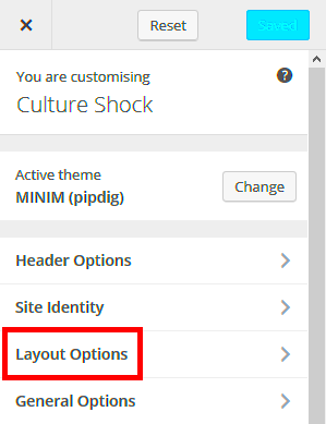
Before you dive into the mechanics of changing the width of your WordPress blog, it’s essential to understand what “blog width” actually means. In essence, the width refers to how much horizontal space your content occupies on the screen. This can significantly impact how your visitors interact with your blog, both visually and functionally.
Here are some key components to consider:
- Content Area Width: This is the width allocated for your main content, including text, images, and videos.
- Sidebar Width: If your theme includes sidebars, their width will also affect the overall appearance of your blog.
- Overall Layout: The total width of your blog also encompasses the margins and padding around your content.
To help visualize these concepts, think about the following layout options:
| Layout Style | Characteristics |
|---|---|
| Single Column | Maximized content area; ideal for blogs focused solely on writing. |
| Two Columns | Content on one side and a sidebar (for ads or links) on the other; balances aesthetics and functionality. |
| Grid Layout | A flexible option that allows multiple articles or images to be displayed side by side; suitable for portfolio blogs. |
Understanding these dimensions will help you make informed adjustments to your blog’s width, ultimately leading to a cleaner and more accessible user interface.
Choosing the Right Theme for Your Blog
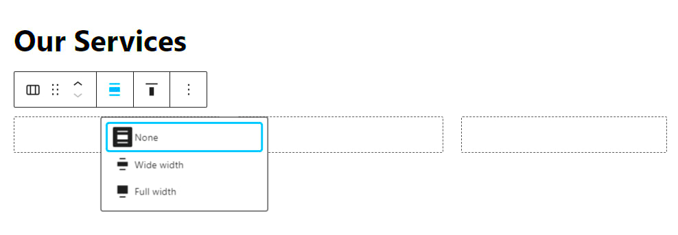
When it comes to changing the width of your WordPress blog, choosing the right theme is crucial. The theme you select not only determines the visual appearance of your website but also significantly affects its layout and functionality. Here’s what you should consider:
- Responsive Design: Ensure your theme is responsive. This means it will automatically adjust its layout according to the device being used, such as desktops, tablets, or mobile phones.
- Customization Options: Look for themes that offer flexibility in their settings. Many themes come with built-in options to adjust the width, margins, and other layout features without needing to touch any code.
- Compatible Page Builders: If you plan on using a page builder (like Elementor or Beaver Builder), make sure your theme is compatible. This compatibility often allows more straightforward adjustments to width and layout.
- Community Support: Choose a theme from a reputable provider that offers community support. A solid community can help resolve any layout issues you might face while customizing widths.
- Read Reviews: Before committing to a theme, read reviews and check the ratings. Real-user experiences can give you insights into how easy or difficult it is to customize the theme’s layout.
Remember, a theme that fits your content style and is easy to adjust will create a better overall user experience for your blog visitors. So, do your research, and don’t hesitate to reach out to further explore the theme before making a final decision!
Using Custom CSS to Adjust Width
Sometimes the best way to achieve the exact width you desire for your WordPress blog is by using Custom CSS. CSS, or Cascading Style Sheets, allows for granular control over the design of your website without the need for complex coding. Here’s how to effectively use Custom CSS:
- Identify the Elements: Inspect the elements you want to adjust using the browser’s inspector tool. Right-click on the area you wish to change and select “Inspect.” This will highlight the corresponding HTML and CSS of the element.
- Add Custom CSS: Go to your WordPress dashboard, navigate to Appearance > Customize > Additional CSS. Here, you can input your custom styles.
- Common Width Adjustments: Use these snippets to adjust the width:
| Purpose | CSS |
|---|---|
| Full Width | width: 100%; |
| Fixed Width | width: 800px; |
| Max Width | max-width: 1200px; margin: auto; |
Feeling confident? Here’s a simple example to apply a fixed width for your site content:
.container { width: 80%; /* Change this value as needed */ margin: 0 auto; /* Centers the content */}Once you make your adjustments, ensure you save and preview changes before finalizing. This way, you can fine-tune the look of your blog until it feels just right. Custom CSS is a powerful tool, so give it a try to revise your blog’s width to perfectly suit your needs!
Editing the Theme’s Style.css File
If you’re looking to make more granular adjustments to the width of your WordPress blog, editing the style.css file of your theme can be a great way to do so. This method gives you direct control over the design of your site, allowing for extensive customization. But don’t worry, even if you’re not a coding whiz, I’ll walk you through it step by step!
First, you’ll need to access your WordPress dashboard:
- Log in to your WordPress admin area.
- Navigate to Appearance > Theme Editor.
- On the right-hand side, look for style.css and click on it.
Now, onto the editing part:
To change the width, you may want to find the specific class or ID that defines the layout of your blog. Common classes include .container or .content-area. Here’s a simple CSS rule you can add or modify:
.container { width: 100%; /* or any desired percentage */ max-width: 1200px; /* adjust this value */}
Remember:
- 100% means full width.
- 1000px, for example, restricts the width to 1000 pixels.
After making your changes, make sure to click Update File to save everything. Finally, clear your browser cache and check your blog to see how it looks!
Utilizing Page Builders for Width Adjustments
If coding isn’t quite your thing or you prefer a more visual approach, then using a page builder plugin is an excellent alternative. These tools provide a user-friendly interface to customize your site without diving into any code. Popular options include Elementor, Beaver Builder, and WPBakery. Let’s explore how these tools can help you adjust your blog width seamlessly!
Here’s how it typically works:
- Install and activate your chosen page builder plugin.
- Create or edit a page using the builder interface.
- Select the section/container you want to adjust.
Most page builders allow you to set the width with simple drag-and-drop functionality. Here’s a general overview of what to expect:
- You can drag elements to adjust their sizes.
- Many builders provide options to set the entire section to full width or boxed width.
- Some may allow you to set padding and margin to fine-tune your layout.
Additionally, page builders let you preview changes in real-time, making it super easy to see how adjustments affect your design. Once you’re happy with the changes, simply publish or update the page. With these tools, finding the perfect layout for your blog is not only easy but also a lot of fun!
Responsive Design Considerations
When you’re tweaking the width of your WordPress blog, it’s essential to keep responsive design at the forefront of your thoughts. In today’s world, users access your blog from various devices—anything from desktop computers to tablets and smartphones. A responsive design ensures that your site looks great and is functional on all these devices.
So, what should you consider when adjusting your blog’s width? Here are some key factors:
- Fluid vs. Fixed Width: Fluid width layouts use percentages for width, while fixed layouts use pixel values. Fluid layouts adapt to the screen size, making them a popular choice for responsiveness.
- Breakpoints: Breakpoints are specific viewport widths at which your layout changes. Test your adjustments across common breakpoints (like 480px for mobile and 768px for tablets) to ensure everything looks as it should.
- Media Queries: These CSS techniques allow you to apply different styles based on device characteristics. They’re perfect for fine-tuning your layout adjustments for various screen sizes.
- Touch Targets: Ensure that buttons and links are appropriately sized for touch screens. The recommended size is a minimum of 44 x 44 pixels for touch-friendly areas.
- Image Scaling: Make sure your images are responsive. Use CSS properties like
max-width: 100%;to ensure images adjust according to the screen size.
By keeping these considerations in mind and implementing a responsive design, you not only enhance user experience but also boost your blog’s search engine ranking, as search engines favor mobile-friendly websites!
Testing Your Adjustments
So, you’ve changed the width of your WordPress blog, and now it’s time to see if those adjustments are working as intended. Testing is a critical step in the process that can’t be overlooked. You want to ensure that every user, regardless of their device, enjoys a smooth and visually appealing experience.
Here are some methods you can use to test your adjustments effectively:
- Browser DevTools: Use the built-in developer tools in browsers like Chrome or Firefox. You can check your site’s responsiveness in real time by resizing the window or using device simulation features.
- Responsinator: This online tool allows you to see how your blog looks on various devices. Just input your URL, and you’ll get a quick overview of different viewports.
- Cross-Browser Testing: Make sure to check your blog on multiple browsers (Chrome, Firefox, Safari, Edge, etc.). Sometimes styles render differently depending on the browser.
- User Testing: Reach out to friends or colleagues and ask them to access your blog on their devices. Their feedback can provide valuable insights that you might not have noticed.
- Analytics Tools: Finally, after making your adjustments, keep an eye on your analytics. Tools like Google Analytics can provide information on user behavior, helping you understand how well the changes are received.
By taking the time to test your adjustments thoroughly, you’ll ensure that your blog provides a seamless experience for every visitor—leading to higher bounce rates and happier readers!
Common Problems and Troubleshooting
When it comes to customizing the width of your WordPress blog, you may encounter some common problems along the way. Thankfully, these issues can usually be resolved with a bit of troubleshooting. Here’s a breakdown of the most frequent concerns and how to address them:
- Changes Don’t Reflect: If you adjust the width in your theme settings, but the changes aren’t visible on your site, try clearing your browser cache. Sometimes, your browser holds on to old data, preventing you from seeing your latest changes.
- Responsive Design Issues: After changing width settings, your blog might look great on a desktop but awkward on mobile devices. To resolve this, ensure that your CSS is responsive. You can use media queries to set width parameters that adjust based on the device’s screen size.
- Plugin Conflicts: Some plugins can interfere with your theme’s styling and cause layout issues. If you suspect a plugin is the culprit, deactivate them one at a time. Check if the problem persists after each deactivation. This method helps identify the problematic plugin.
- Custom CSS Not Applying: If you’ve added custom CSS to change the blog width but it doesn’t seem to activate, ensure that your CSS code is correctly targeting the right elements. Use developer tools in your browser to inspect the elements and make necessary adjustments.
- Theme Limitations: Sometimes, themes come with specific limitations regarding width customization. If you’re stuck, consider switching to a more flexible theme or using a custom child theme to give you more freedom.
By troubleshooting these common issues, you’ll be better equipped to achieve your desired blog width and create a visually appealing site!
Conclusion
In closing, changing the width of your WordPress blog can significantly enhance its overall appearance and user experience. While the adjustments may seem daunting at first, by following the right steps, you can customize your blog to reflect your unique style effectively. Here’s a quick recap:
- Determine your ideal blog width based on your content type and audience.
- Access your theme’s settings or custom CSS to make adjustments.
- Test your changes to ensure they are consistent across devices.
- Troubleshoot any issues that arise, from caching problems to plugin conflicts.
Ultimately, a well-designed blog not only attracts visitors but also keeps them engaged. Don’t be afraid to experiment a little! If you hit a bump in the road, just remember that the WordPress community is vast and supportive, and there are plenty of resources available to help you along your journey.
So, roll up your sleeves and get started on making those width changes. You never know how a few simple adjustments can transform your blog!


