If you’re venturing into website design, Elementor is a fantastic tool that allows you to create stunning layouts with ease. Known for its intuitive drag-and-drop interface, Elementor empowers even beginners to build professional-looking pages without writing a single line of code. One of the key aspects of customizing your layout in
Understanding Elementor’s Grid System
Before diving into cell sizing, it’s essential to grasp Elementor‘s grid system as it forms the backbone of your page layout. Here’s a breakdown of how it works:
- Column Structure: Elementor uses a column-based layout. This means you can have multiple columns within a section, and each column can hold various elements like text, images, or videos.
- Responsive Design: The grid system is responsive, meaning it automatically adjusts based on the device—desktop, tablet, or mobile. This helps maintain your design’s integrity across different screens.
- Column Width: Each column can be customized in width. Depending on your design needs, you might want to have equal-width columns or vary their sizes to create a more dynamic layout.
To help you visualize, here’s a simple representation of how columns are structured:
| Desktop | Tablet | Mobile |
|---|---|---|
| 3 Columns (33% each) | 2 Columns (50% each) | 1 Column (100%) |
Understanding how these elements interact allows you to take full advantage of Elementor’s capabilities and create layouts that truly shine!
Accessing the Elementor Editor
Before you can start customizing anything in Elementor, you first need to access the Elementor editor. This is where all the magic happens, and it’s pretty user-friendly once you get the hang of it. So, let’s break it down step by step!
First off, make sure you are logged into your WordPress admin dashboard. From there, navigate to the page or post you want to edit. You can either create a new page/post or edit an existing one by clicking on it. Once you’re on the editing screen, look for the button that says “Edit with Elementor.” It’s usually located on top of the page editor. Click it, and voila! You’re now in the Elementor interface.
The Elementor editor has a drag-and-drop feature, making it super intuitive. You’ll see a live preview of your page on the left side and a panel with a bunch of widgets on the right. If you’re new to this, take a moment to explore the panel. You’ll find sections, columns, and widgets that you can use to build your layout.
Now you’re all set to start customizing your cell sizes. If you want to change how your sections or columns look, simply hover over them in the preview area. You’ll see a few icons pop up, and that means it’s time to dive in and adjust those cell sizes!
Adjusting Cell Size Using the Layout Settings
Alright, let’s get into the rubber-meets-the-road part: adjusting cell sizes in Elementor. It’s a breeze, and once you know where to look, you’ll be tweaking your layouts in no time. Here’s how to do it!
First, select the section or column that you want to adjust. You can easily do this by clicking on it in the live preview. Once selected, the panel on the left will switch to the settings for that section or column. You’ll see several tabs, but we want to focus on the ‘Layout’ tab.
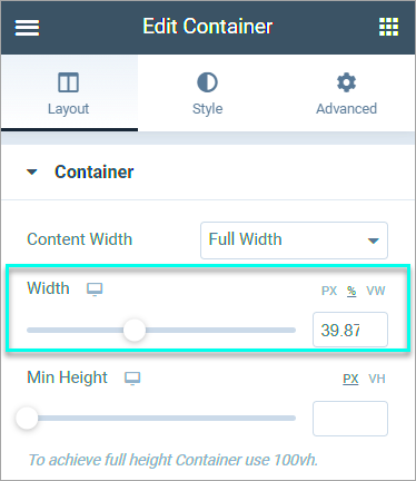
Under the Layout tab, you’ll find options to customize the width and height of your cell. Here’s what you’ll typically find:
- Width: Adjust the width by dragging the slider or entering a specific pixel value. This control lets you decide if you want a full-width section or a narrower column.
- Height: Similarly, you can set a minimum height for your cell. This ensures that even with little content, your layout maintains a consistent appearance.
- Align: The alignment settings let you adjust how your content sits within the cell. You can choose to align it to the top, middle, or bottom—perfect for creating a balanced look.
Don’t forget to hit the ‘Update’ button when you’re satisfied with the changes! This will save your adjustments and apply them to your live site. And just like that, you’ve transformed your cell sizes to match your desired layout perfectly!
Responsive Design: Setting Cell Sizes for Different Devices
When it comes to designing your website, one of the golden rules is ensuring that your layout looks fantastic across all devices. This is where responsive design steps in, and Elementor makes it a breeze to set cell sizes tailored to different devices. Whether it’s a smartphone, tablet, or desktop, your content should look sharp and professional.
To start with, you can preview how your design will look on various devices directly within the Elementor editor. Here’s how:
- Click on the responsive mode icon at the bottom of the Elementor panel.
- Select the device you want to preview (desktop, tablet, or mobile).
Once you’re in the device preview mode, you might notice that the default cell sizes might not be ideal. But don’t worry! Here’s how you can customize it:
- Adjusting the Width & Height: Simply click on the cell you want to modify, navigate to the “Advanced” tab, and you can specify different widths and heights for each device. This allows you to create a compelling layout that looks great everywhere.
- Setting Padding and Margins: The spacing around your cells can also be adjusted individually for each device. This is crucial because what works on a large screen might not translate well to a smaller one.
Lastly, it’s always a good practice to test your changes. Save your layout and preview it on actual devices to ensure everything looks polished and functional.
Using Custom CSS for Advanced Cell Sizing
If you want to take your Elementor design to the next level, using custom CSS can really help you achieve that perfect look. While Elementor offers a robust set of tools, there may be specific design quirks that require a bit more finesse. Custom CSS allows deeper control over your elements’ appearance and sizing.
Here’s how you can integrate custom CSS into your Elementor cell sizing:
- Access the Custom CSS Option: In the Elementor editor, select the cell you wish to modify. Under the “Advanced” tab, you’ll find the “Custom CSS” area. This is where the magic happens!
- Write Your CSS Code: For instance, if you want to set a specific width, you can write something like:
selector { width: 50%; } - Utilizing Media Queries: To ensure your design remains responsive, you can leverage media queries. For example:
@media (max-width: 768px) { selector { width: 100%; } }This CSS snippet ensures that on screens smaller than 768 pixels, your cell will take full width.
Remember to test your custom CSS changes to ensure everything looks impeccable across devices. Utilizing Custom CSS not only enhances your creativity but also gives you the precision needed for a truly tailored design.
7. Common Issues and Troubleshooting Tips
When working with Elementor, it’s not uncommon to encounter some hiccups while trying to change cell sizes. Don’t worry; you’re not alone! Here are some common issues users face along with handy troubleshooting tips to help you out:
- Cell Sizes Not Updating: Sometimes, even after adjusting the size in the settings, the cell might not update. This could be due to caching. Clear your site’s cache and refresh the page.
- Responsive Design Issues: You may find that your changes look great on a desktop but completely fall apart on mobile. Always check the responsive settings in Elementor and adjust sizes specifically for tablets and phones to ensure a consistent look.
- Conflict with Theme Styles: Occasionally, your WordPress theme may override Elementor’s styles. To fix this, check your theme settings for any customizations that might be affecting your layout.
- Missing Settings: If you can’t find the settings to change cell sizes, double-check that you are using the correct widget. Some widgets might have limited options compared to others.
- Global Settings Affecting Cells: If you’ve set global styles in Elementor, those might affect your cell sizes. Go to the Elementor > Global Settings and review them to ensure they align with your layout goals.
With these tips, you should be able to overcome most challenges you encounter while customizing cell sizes in Elementor. Remember, persistence is key!
8. Conclusion: Optimize Your Elementor Layout
In summary, refining your cell sizes in Elementor is a powerhouse move for optimizing your website layout. Not only does it enhance visual appeal, but it also promotes better user experience—something you should always prioritize.
As you wrap up your customization:
- Always preview your changes using the responsive mode to ensure your design scales beautifully across devices.
- Experiment with various padding, margins, and alignment settings to get that perfect fit for your cells.
- Don’t shy away from using the advanced settings for even deeper customization options.
By paying attention to these aspects, you’ll create a fluid layout that not only looks professional but also engages your audience effectively. So go ahead, make those adjustments, and watch your website transform into a stunning, functional masterpiece!


