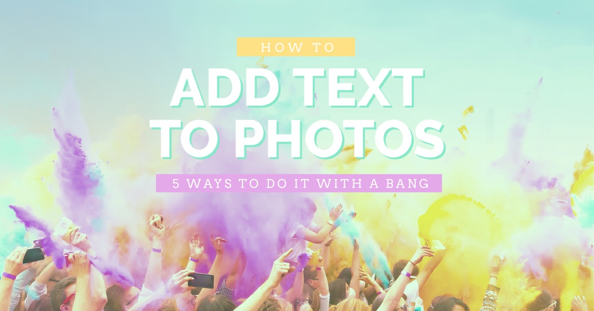
Ever wondered how to make your Shutterstock images more personalized or eye-catching? Adding text to Shutterstock photos is a fantastic way to enhance your visuals, whether it’s for social media, presentations, or marketing materials. It’s easier than you might think, and with a few simple tools and tips, you can transform a stock photo into something uniquely yours. In this guide, we’ll walk through the basics of selecting the right images and how to add text seamlessly, making your projects stand out effortlessly.
Choosing the Right Shutterstock Photo for Your Project
Picking the perfect Shutterstock photo is the first step toward creating a compelling visual with added text. Here are some tips to help you choose wisely:
- Think about your message: What do you want to communicate? Bright, lively images work well for upbeat messages, while more subdued photos suit professional or serious content.
- Consider the composition: Look for photos with ample space where you can add text without clutter. Open areas, blank backgrounds, or less busy sections are ideal.
- Match the style to your brand or theme: Ensure the photo’s mood, colors, and style align with your overall branding or project theme to maintain consistency.
- Check image quality: Always select high-resolution images so your added text remains crisp and clear, especially if you plan to print or display on large screens.
- Think about contrast: Choose images with contrasting areas where your text will stand out. Dark backgrounds with light text or vice versa are usually effective.
By keeping these points in mind, you’ll be better equipped to find the perfect Shutterstock photo that complements your message and makes adding text a breeze. Remember, the goal is to select an image that not only looks good but also enhances the readability and impact of your text.
Tools and Software Options for Adding Text
When it comes to adding text to Shutterstock photos, you’ve got a bunch of options—each with its own set of features and user experience. Whether you’re a beginner or a seasoned designer, choosing the right tool can make your editing process smoother and more enjoyable.
Here are some of the most popular tools and software options to consider:
- Adobe Photoshop: The gold standard for photo editing. It offers powerful text tools, layers, and customization options. Perfect if you want professional results.
- Canva: An easy-to-use online platform with a drag-and-drop interface. Great for quick edits and creating stylish text overlays without a steep learning curve.
- GIMP: A free, open-source alternative to Photoshop. It provides many advanced features, including text editing capabilities.
- Pixlr: A web-based editor that’s accessible directly in your browser. It offers handy text tools and is perfect for quick edits on the go.
- Figma or Adobe XD: Ideal if you’re designing for digital platforms, especially when working on prototypes or social media graphics.
While each tool has its strengths, Photoshop remains the most versatile for detailed editing and professional work. Canva and Pixlr are fantastic choices if you want something quick and user-friendly. The key is to pick a tool that matches your comfort level and the complexity of your project.
Once you choose your software, you’ll be ready to add stylish, eye-catching text to your Shutterstock images—bringing your creative vision to life!
Step-by-Step Guide to Adding Text Using Photoshop
Ready to get your hands dirty with Photoshop? Don’t worry—adding text is straightforward once you know the steps. Here’s a simple, step-by-step guide to help you add text to your Shutterstock photos like a pro:
- Open Your Image: Launch Photoshop and go to File > Open. Select the Shutterstock photo you want to edit and click Open.
- Create a Text Layer: Click on the Horizontal Type Tool (T) in the toolbar on the left. Then, click anywhere on your image where you want to add text. A blinking cursor will appear.
- Type Your Text: Enter the text you want to add. It could be a catchy phrase, a quote, or any message you want to convey.
- Customize Your Text: Highlight your text and use the options bar at the top to change the font, size, color, and style. Want a bold, fun font? Just pick one from the dropdown menu.
- Adjust Text Position: Use the Move Tool (V) to drag your text to the perfect spot on the image. You can also tweak the size or rotation if needed.
- Apply Effects (Optional): For extra flair, right-click on your text layer in the Layers panel and choose Blending Options. Here, you can add drop shadows, strokes, or glow effects to make your text pop.
- Refine Your Design: Zoom in and make sure your text looks sharp and well-placed. Use the Transform (Ctrl+T / Command+T) to resize or rotate if necessary.
- Save Your Work: Once satisfied, go to File > Save As. Save your edited image in a format suitable for your needs—JPEG for most uses or PNG if you want transparency.
And that’s it! With these simple steps, you can easily add stylish, professional-looking text to any Shutterstock photo using Photoshop. Play around with different fonts, effects, and placements to make your image truly stand out. Happy editing!
Using Free Online Tools to Add Text to Shutterstock Images
So, you’ve found the perfect Shutterstock photo, and now you want to add some text to make it uniquely yours. Luckily, you don’t need fancy software or a graphic design degree to do this. There are plenty of free online tools that make adding text super simple and quick.
One popular option is Canva. It offers a user-friendly interface with drag-and-drop features. Simply upload your Shutterstock image, click on the “Text” option, and choose from various font styles and sizes. You can position your text anywhere on the image, resize it, and even add effects like shadows or outlines for better visibility.
Another great tool is Pixlr. It’s an online photo editor similar to Photoshop but easier to navigate. Upload your Shutterstock image, then select the “Text” tool. You can customize the font, size, color, and alignment. Pixlr also allows you to add multiple text layers, giving you flexibility in designing your image.
If you prefer something straightforward, Fotor is a solid choice. It has a dedicated text editor with a variety of font styles and colors. Plus, it offers filters and other editing options to enhance your image before adding text.
Here’s a quick step-by-step for using these tools:
- Upload your Shutterstock photo to the platform.
- Select the “Add Text” feature.
- Type in your desired message.
- Customize font, size, and color.
- Position the text where it looks best.
- Save or download the edited image.
And the best part? All of these tools are free to use at a basic level, so you can experiment without any cost. They’re perfect for quick edits, social media posts, or even creating marketing graphics with your Shutterstock images.
Tips for Selecting Fonts and Colors for Your Text
Choosing the right fonts and colors might not seem like a big deal, but it can make a huge difference in how your message comes across. The goal is to make your text readable, attractive, and aligned with your overall design or branding. Here are some friendly tips to help you pick the best options:
1. Keep it Readable
First things first—your text should be easy to read. Avoid overly decorative fonts for important messages or small text sizes. Stick with clean, simple fonts like Arial, Helvetica, or Open Sans for clarity. If you want something a bit more stylish, use script fonts sparingly and for headlines or accents only.
2. Match the Mood
Your font choice sets the tone. For a fun, casual vibe, go with playful fonts like Comic Sans or Lobster. For a professional look, choose sleek, sans-serif fonts. If you’re creating something elegant or luxurious, consider serif fonts like Times New Roman or Georgia.
3. Use Contrasting Colors
Colors need to stand out against the background. If your Shutterstock photo has a busy or colorful background, pick a text color that contrasts well—white on dark areas, black on light areas, or bold colors like red or yellow for emphasis. Consider adding a subtle shadow or outline to make the text pop even more.
4. Limit Your Color Palette
Don’t go overboard with too many colors. Sticking to 2-3 complementary colors keeps your design cohesive. Use color schemes based on color theory—like analogous or complementary colors—to create harmony.
5. Test and Preview
Always preview your design before finalizing. Check how the text looks on different areas of the image and under various lighting conditions. This helps ensure your message remains clear and attractive.
6. Consider Accessibility
Make sure your text is accessible to everyone. Use high-contrast colors, avoid overly fancy fonts, and keep your message concise. This makes your image more inclusive and effective.
In summary, selecting the right fonts and colors isn’t just about aesthetics—it’s about making your message stand out and be understood. Experiment, get feedback, and don’t be afraid to try different combinations until you find what works best for your Shutterstock images!
Best Practices for Placing Text on Shutterstock Photos
Adding text to Shutterstock photos can really make your visuals pop, but to do it effectively, you need to follow some best practices. This ensures your message is clear, aesthetically pleasing, and professional-looking. Let’s dive into some tips to help you place your text just right!
Keep It Readable
First things first: your text should be easy to read. Choose fonts that are clear and legible, especially if your image has a busy background. Sans-serif fonts like Arial, Helvetica, or Open Sans often work well because they’re clean and modern.
Use Contrasting Colors
Contrast is key to making your text stand out. If your photo has a dark background, go for light-colored text, and vice versa. You can also add a subtle shadow or outline to your text to improve visibility without overwhelming the image.
Position Wisely
Where you place your text matters. Avoid placing text over busy areas of the image; instead, look for open spaces or areas with solid colors. Centered text works well for titles, but for more dynamic designs, try placing text along the edges or within a designated “safe zone”.
Maintain Consistency
If you’re working on multiple images or a series, keep your font choices, sizes, and colors consistent. This helps establish a cohesive look and makes your content instantly recognizable.
Limit Text Amount
Less is more! Keep your message concise. Long paragraphs can be hard to read on images, especially on smaller screens. Use short, impactful phrases or keywords to convey your message effectively.
Use Alignment and Spacing
Proper alignment and spacing make your text more appealing. Whether you choose left, center, or right alignment, ensure consistent margins. Also, leave enough space between lines to improve readability.
Experiment and Preview
Finally, don’t be afraid to experiment with different placements, fonts, and sizes. Use the preview feature to see how your text looks in context. Sometimes, small tweaks can make a big difference in the overall aesthetic.
Saving and Exporting Your Edited Image
Once you’re happy with your text placement and overall design, it’s time to save and export your image. Getting this right ensures your final product maintains quality and is ready for use wherever you need it.
Choose the Correct File Format
The most common formats for images are:
- JPEG: Ideal for online use, web pages, and social media. It offers good quality with manageable file sizes.
- PNG: Perfect for images requiring transparency or sharper details. Use PNG if your design has logos or text that needs to stand out against different backgrounds.
- TIFF: Best for high-quality prints, but larger in size. Use TIFF if you plan to print your images professionally.
Set the Resolution
For digital use, a resolution of 72 dpi (dots per inch) is sufficient. However, if you’re printing, aim for 300 dpi to ensure crisp, clear output. Make sure to select the appropriate resolution based on your end goal.
Save Your Work
Always save your project in the software’s native format (like PSD for Photoshop) first. This way, you can go back and make edits later if needed. Save a separate copy in your preferred export format for sharing or publishing.
Use Export Settings Wisely
When exporting, check the following:
- Quality settings: For JPEGs, choose high or maximum quality to avoid compression artifacts.
- Color profile: Embed sRGB color profile for consistent color display across devices.
- File naming: Use descriptive filenames that reflect the image’s content for easy organization.
Final Checks Before Export
Before hitting export, do a quick review:
- Zoom in to check for pixelation or blurriness.
- Ensure all text is correctly placed and spell-checked.
- Verify the overall composition and that the image looks balanced.
By following these steps, you’ll ensure your edited Shutterstock images are perfect for sharing, printing, or uploading to your website. Happy designing!
Legal Considerations When Editing Shutterstock Photos
Before you start adding text to Shutterstock photos, it’s super important to understand the legal side of things. Shutterstock provides a vast library of images, but just because you have access doesn’t mean you can do whatever you want with them. Respecting copyright laws and Shutterstock’s licensing terms ensures you stay out of trouble and use images ethically.
First off, always check the license type associated with the photo. Shutterstock offers two main licenses:
- Standard License: Suitable for most uses like websites, social media, and print materials up to a certain size and circulation. However, if your project exceeds these limits or involves merchandise, a different license might be needed.
- Enhanced License: Provides broader rights, including the ability to use images in merchandise, large-scale advertising, or products for resale.
When editing photos—like adding text—remember that the original image remains protected by copyright. Your modifications, including adding text, do not automatically grant you ownership or exclusive rights. Always adhere to the licensing terms to avoid infringing on the rights of the copyright holder.
Another key point is attributing the image if required. While Shutterstock’s license generally doesn’t require attribution, some images from contributors may have specific restrictions. Always read the license details carefully before editing and sharing the image publicly.
Finally, avoid making edits that could be misleading or defamatory. For example, altering an image to misrepresent a person or situation can lead to legal issues. Use images responsibly, and ensure your edits align with ethical standards and intended use.
In summary, always:
- Check the license type and restrictions.
- Respect copyright and attribution requirements.
- Use images ethically and avoid misleading edits.
This way, you can confidently modify Shutterstock photos with text, knowing you’re respecting legal boundaries and licensing agreements.
Conclusion and Final Tips for Customizing Shutterstock Photos with Text
You’ve now got the lowdown on how to add text to Shutterstock images and do it legally and effectively. Customizing photos with text can really elevate your projects, whether you’re creating social media posts, marketing materials, or personal designs. Here’s a quick recap of some final tips to help you nail it every time:
- Choose the right image: Pick a photo that complements your message and has enough space for your text.
- Use contrasting colors: Make sure your text stands out against the background for readability. Dark text on a light background or vice versa usually works well.
- Pick clean fonts: Opt for fonts that are easy to read. Avoid overly decorative styles unless they match your brand or style.
- Keep it simple: Limit the amount of text. Short, impactful messages are more effective and visually appealing.
- Position thoughtfully: Place your text where it won’t be obstructed by key parts of the image. Use grids or guides for alignment.
- Experiment with effects: Drop shadows, outlines, or semi-transparent backgrounds behind text can improve visibility and add style.
- Save your work: Save versions of your edited images, especially if you plan to make changes later.
Remember, practice makes perfect. Don’t be afraid to experiment with different fonts, colors, and placements to find what works best for your project. And always double-check your edits—make sure your text is clear, correctly spelled, and visually balanced with the image.
By applying these tips, you’ll be able to create stunning, personalized Shutterstock images that catch attention and communicate your message effectively. Happy editing!