If you’re diving into the world of web design, you’ve probably heard of Elementor. It’s a user-friendly page builder for WordPress that allows you to create stunning websites without any coding knowledge. One of its major strengths is the ability to manipulate HTML elements, making it easier to craft the perfect layout for your site. Whether you’re a seasoned developer or a newbie, understanding how to interact with HTML elements in Elementor can really enhance your web design skills.
With Elementor, you can easily add various elements like headings, images, or buttons to your pages. What’s even better is that you can also hide these elements for various reasons, whether for design purposes, user experience, or even A/B testing. Knowing how to manage these elements lets you take control of how your site appears to visitors, ensuring a smooth, professional-looking site every time.
Understanding the Need to Hide HTML Elements
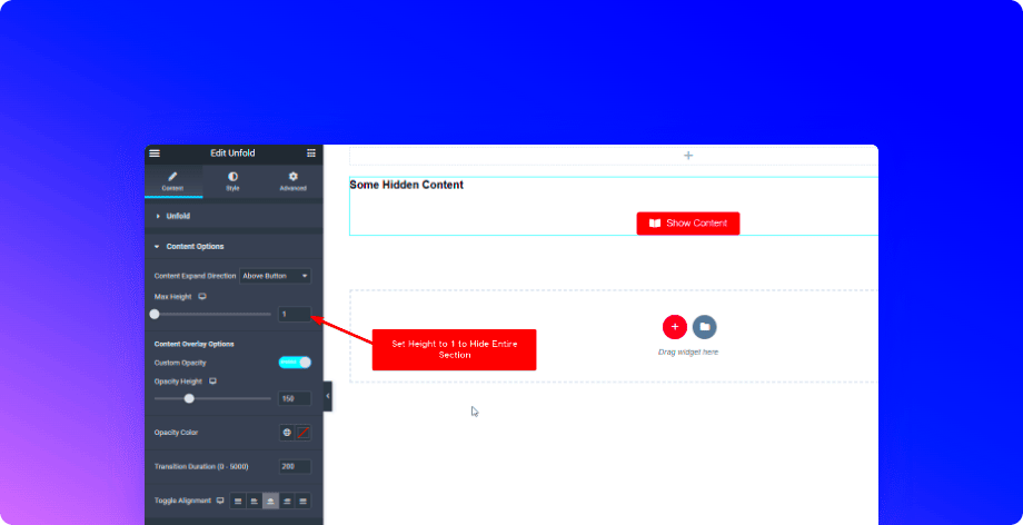
Hiding HTML elements might sound counterintuitive, but there are several practical reasons you might want to do this. Let’s explore some of the key reasons:
- Design Simplicity: Sometimes less is more. You might want to create a clean, uncluttered look, and hiding certain elements can help achieve that.
- Conditional Content: You may want to display certain information only under specific circumstances, such as different user roles or device types.
- A/B Testing: If you’re testing variations of your content to see what resonates best with your audience, hiding certain elements can help you compare performance without permanently altering your layout.
- User Experience: By hiding elements that may confuse or distract your visitors, you can enhance their overall experience on your site.
Moreover, hiding elements can also be a part of your site optimization strategy, assisting with load times and performance. It’s all about creating the best possible experience for your audience while keeping control over your content layout.
Methods to Hide HTML Elements in Elementor
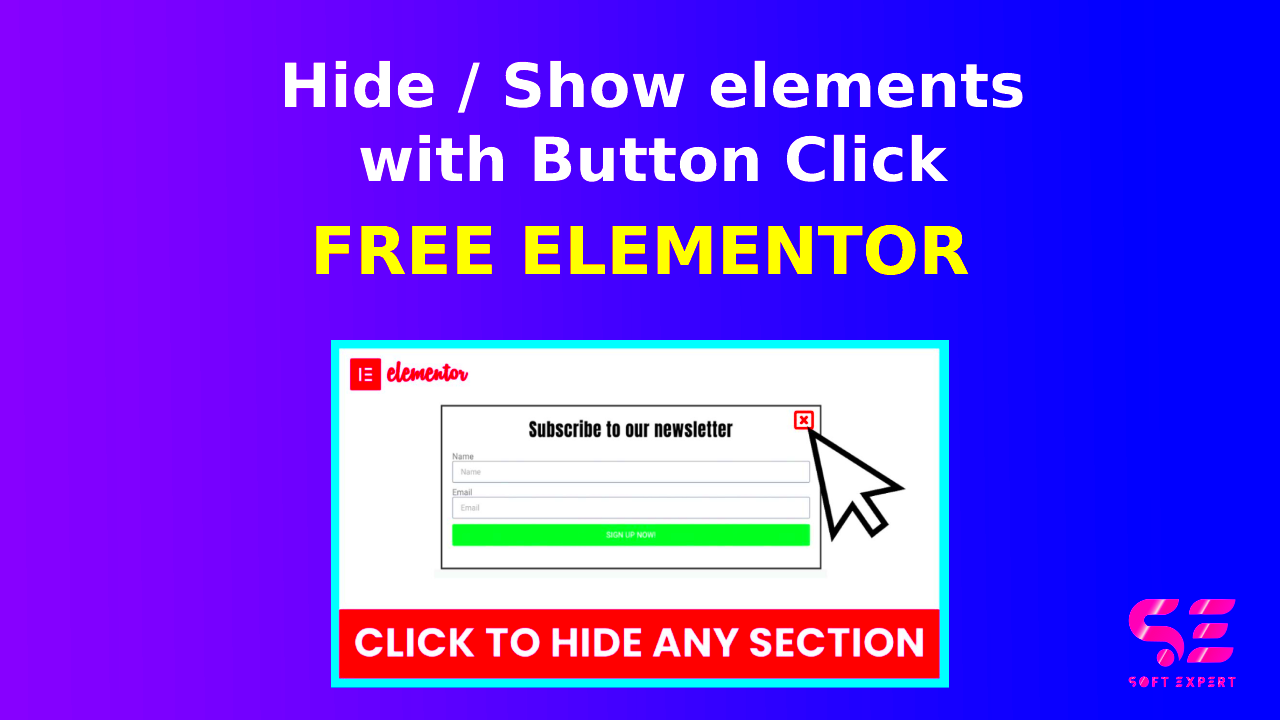
Hiding HTML elements in Elementor can be incredibly useful, whether you want to clean up your design, optimize performance, or create a more engaging user experience. Fortunately, Elementor offers various methods to achieve this! Let’s dive into some of the most effective methods to hide elements seamlessly.
1. Using the Elementor Responsive Settings
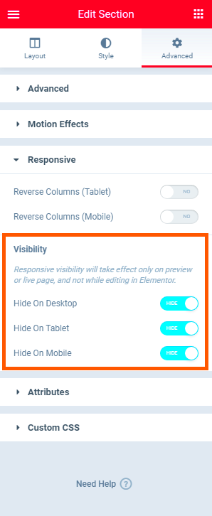
One of the easiest ways to hide elements is by using the built-in responsive settings feature. You can hide elements on different devices (desktop, tablet, mobile) with just a couple of clicks!
- Edit your page with Elementor.
- Select the element you wish to hide.
- In the Advanced tab, scroll down to the Responsive section.
- Enable the option “Hide On” and select the devices you want to hide the element from.
This method not only makes your site look clean but also ensures that the user experience is tailored to the device being used.
2. Utilizing the Elementor Advanced Tab
The Advanced tab gives you control over various settings, including visibility. Sometimes, you only need to hide an element for a specific condition or user interaction.
- Click on the element you want to edit.
- Go to the Advanced tab.
- Scroll to the Custom CSS section and add a class or ID.
3. Manual Removal of Elements
If you’re looking for a one-time solution, you might consider just not displaying an element. This can be done by:
- Simply deleting the element from your layout if you know you won’t need it in the future.
- Temporarily unpublishing the widget until you’re ready to display it again.
Choose the method that works best for your needs, and don’t hesitate to experiment until you achieve just the right look.
Using Custom CSS to Hide Elements
Sometimes, the built-in options in Elementor might not give you the exact control you need. That’s where Custom CSS comes into play! Adding your own CSS can provide a greater level of flexibility and specificity when it comes to hiding HTML elements.
1. How to Access Custom CSS in Elementor
If you’re on the Pro version of Elementor, accessing Custom CSS is straightforward:
- Navigate to the element you want to modify.
- Click on the Advanced tab.
- Scroll to find the Custom CSS section.
Here’s where you can write your own CSS code!
2. Basic CSS to Hide Elements
To hide an element using CSS, you can use the following code:
selector { display: none;}Replace “selector” with the appropriate class or ID of the element you wish to hide. For example, if you want to hide a section with a class of “my-section,” your code will look like this:
.my-section { display: none;}3. Targeting Specific Conditions
Custom CSS also lets you target specific conditions to hide elements. For instance, you can hide elements based on specific screen sizes:
@media (max-width: 768px) { .my-section { display: none; }}This code will hide the section only on devices with a maximum width of 768px, like mobile phones!
Using Custom CSS provides you with the freedom and control to tailor your website’s appearance exactly how you want. Just remember to preview your changes regularly to ensure everything looks good on different devices!
Hiding Elements with Elementor’s Built-In Options
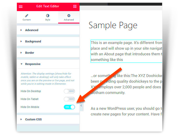
Elementor, as you might know, is an incredibly versatile page builder for WordPress. One of its standout features is the ability to hide elements quickly and easily using built-in options. It’s a game-changer when you want to clean up your layout or create a more dynamic user experience. Let’s dive into how you can do this!
First off, the process is straightforward. You can hide any widget or section on your Elementor page simply by using the settings menu. Here’s a quick rundown:
- Select the Widget: Click on the widget you want to remove from view.
- Go to Advanced Tab: In the left sidebar, navigate to the “Advanced” tab.
- Visibility Settings: Scroll down to find the “Responsive” section, and there, you can choose to hide the element on desktop, tablet, or mobile devices.
This feature is perfect for maintaining a clean look across various screen sizes. Perhaps you have an image that’s great on a desktop view but doesn’t translate well on mobile. Hiding it can enhance your site’s usability without complicating your design process.
Don’t forget, you can always take it further by utilizing custom CSS if you’re comfortable with coding. But for most users, Elementor’s built-in options provide ample functionality. So, whether it’s decluttering your page or tailoring content for different devices, know that Elementor has got your back!
Responsive Design: Hiding Elements on Different Devices
Responsive design is more than just a buzzword; it’s a necessity in today’s multi-device world. With more people accessing content through smartphones and tablets, ensuring that your Elementor pages look good on all devices is crucial. One effective way to achieve this is by hiding elements that may not serve a purpose on certain screen sizes.
Elementor makes this process incredibly user-friendly. You can seamlessly hide or show elements based on the device being used. Here’s how to do it:
- Choose the Element: Click on the section, column, or widget you want to adjust.
- Navigating to Advanced Settings: Head over to the “Advanced” tab in the left sidebar.
- Responsive Controls: Look for the “Responsive” options, where you can select whether to hide that element on desktop, tablet, or mobile.
This feature is essential for optimizing user experience. For instance, some complex features that work well on desktop may clutter the mobile view or slow down load times. By hiding these elements, you can streamline the content your visitors see on smaller screens, enhancing navigation and overall satisfaction.
Moreover, you can also use custom breakpoints for even finer control. This means you can customize the visibility of elements at various device sizes rather than just using the default settings. It’s like having your own tailor for your website—fitting everything just right!
In summary, hiding elements based on device type not only simplifies your design but also prioritizes user experience, and Elementor excels in making this happen with minimal effort!
Common Use Cases for Hiding HTML Elements
When working with Elementor, you might find yourself needing to hide certain HTML elements for various reasons. Understanding the common use cases can help you streamline your design process and improve user experience. Here are a few scenarios where hiding elements comes in handy:
- Adjusting Mobile Display: With more users accessing websites on mobile devices, you may want to hide specific elements that clutter the mobile view. For instance, large banners or sidebars might not provide an optimal user experience on smaller screens.
- Creating Exclusive Content: Sometimes, you may want to show certain elements only to specific user groups. Hiding an element at first and then making it visible to logged-in users or after a certain action can create a more personalized experience.
- Seasonal Promotions: During holidays or campaigns, you might have elements that are only relevant for a limited time. Hiding these elements until it’s time to showcase them can keep your site looking fresh and relevant.
- A/B Testing: If you’re experimenting with different layouts or content strategies, you may need to hide elements temporarily to see how well other parts of your page perform without them.
- Unwanted Advertisements: In some cases, there might be ads or promotional content that doesn’t align with your current goals or audience. Hiding these elements can help maintain focus on your core message.
By understanding these common scenarios, you can better leverage Elementor’s capabilities to enhance your website’s design and usability.
Troubleshooting: What to Do If Hidden Elements Don’t Stay Hidden
It can be frustrating to hide elements in Elementor, only to find they reappear unexpectedly. If you encounter this issue, here are some troubleshooting steps you can take to ensure your hidden elements stay hidden:
- Clear Cache: Sometimes, your browser or website cache may store old versions of your page. Clearing the cache can often resolve visibility issues. You can do this by:
| Browser | How to Clear Cache |
|---|---|
| Google Chrome | Menu > More Tools > Clear Browsing Data |
| Firefox | Menu > Preferences > Privacy & Security > Clear Data |
| Safari | Preferences > Privacy > Manage Website Data > Remove All |
Next, check:
- Settings Conflicts: Sometimes, conflicting settings in other plugins or theme options can affect visibility. Temporarily disable other plugins to see if this resolves the issue.
- Recheck Visibility Settings: Double-check your settings in Elementor. Make sure you are using the right conditions (e.g., mobile/tablet visibility).
- Custom CSS Issues: If you’ve added custom CSS, ensure it doesn’t inadvertently override your visibility settings. Take a moment to review your code.
- Update Elementor: Ensure you’re using the latest version of Elementor, as updates can resolve bugs related to hidden elements.
By following these steps, you should be able to troubleshoot and resolve any issues with hidden elements in Elementor, allowing for a streamlined and effective design process.
Hiding HTML Elements in Elementor Pages
Hiding HTML elements in Elementor can greatly enhance the visual appeal and functionality of your website. Whether you’re looking to streamline your layout, focus on specific content, or perform A/B testing, hiding elements can be a strategic decision. Below, we explore various methods to hide elements effectively in Elementor.
Here are some key techniques to consider:
- Use of Built-in Visibility Options: Elementor provides settings for visibility based on device types (desktop, tablet, mobile). You can easily configure which elements to display or hide across different devices.
- CSS Classes: Adding custom CSS classes to your elements allows you to hide them with a few lines of code. For instance, you can use
display: none;in your custom CSS to conceal unwanted elements. - Advanced Conditions: With the help of plugins like Elementor Pro, you can customize visibility based on user roles, login status, or specific conditions, allowing for a more tailored user experience.
- Interactive Toggle Elements: Use toggle buttons or tabs to hide/show elements based on user interaction. This keeps your page clean and engaging.
Implementing these techniques can help you maintain a clean design while improving the user experience on your Elementor pages. Remember to test your layout across different devices to ensure that all elements are displaying as intended and contributing to your site’s overall functionality.
Conclusion: Optimizing your Elementor pages involves strategically hiding unnecessary elements to enhance your website’s aesthetic and usability, ultimately leading to a more engaging experience for your visitors.

