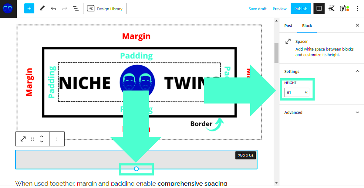
When it comes to designing a website, every little detail matters, and *padding* is one of those crucial elements that can significantly impact your site’s layout. In WordPress, padding refers to the space between your content and the edges of its container. Specifically, we’ll focus on how to adjust padding at the bottom of elements, which can enhance readability and create a more visually appealing space. This brief introduction sets the stage for understanding how to effectively handle bottom-only padding adjustments in WordPress to elevate your site’s aesthetics.
Understanding CSS Padding Properties

Cascading Style Sheets (CSS) provide a powerful way to control the appearance of web elements. When it comes to padding, CSS offers several properties, each playing a vital role in managing the space around your content. Let’s unpack these properties:
- padding: This shorthand property allows you to set padding for all sides (top, right, bottom, left) in one line. For example,
padding: 10px;applies the same padding on all sides. - padding-top: Adjusts the space above your content. For instance,
padding-top: 20px;gives 20 pixels of space at the top. - padding-right: Controls the space on the right side. You might use
padding-right: 15px;for tighter content alignment. - padding-bottom: Specifically targets the bottom space, the focus of our discussion. Setting
padding-bottom: 30px;creates a uniform gap below your content. - padding-left: Manages the padding on the left side. A value like
padding-left: 10px;can help align text neatly, especially in lists.
In addition to these properties, CSS also supports values in different units such as *pixels (px)*, *percentage (%)*, and *em*, giving you flexibility in your design.
Utilizing these CSS padding properties allows you to manipulate the visual structure of your WordPress site effectively. Understanding them enables customized designs that reflect your brand’s style while ensuring a pleasant user experience.
Why Focus on Bottom-Only Padding Adjustments?

When it comes to web design, every pixel matters. You want your website to look polished and professional, and that often means paying close attention to padding. But why should we focus specifically on bottom-only padding adjustments? Well, let’s break it down.
1. Visual Balance: The bottom padding is crucial for achieving visual balance on your pages. If you have uneven padding at the bottom, it might make your content feel cramped or misaligned. Proper bottom padding creates a comfortable amount of space that helps guide the viewer’s eye naturally, enhancing their reading experience.
2. Enhancing Readability: By providing adequate bottom padding, you give your text room to breathe. This is particularly important for paragraphs, where cramped text may cause eye strain. Bottom padding can create a clear distinction between various sections of your content, making it easier for readers to digest the information.
3. Mobile Responsiveness: With the growing prevalence of mobile devices, focusing on bottom padding adjustments is key. Bottom padding can help maintain a visually appealing layout on smaller screens, ensuring that text does not sit too close to the bottom edge and is easy to tap or read.
4. Aesthetic Appeal: A well-spaced design simply looks better. Bottom padding allows you to create a hierarchy in your content, emphasizing important sections such as headings or calls to action. By strategically adjusting bottom padding, you can craft a more inviting and cohesive website design.
Lastly, making bottom-only adjustments can often be a simpler solution when compared to addressing all sides. It minimizes the risk of unintended changes to the layout, making it easier to maintain the overall design integrity of your site.
Methods for Adjusting Bottom Padding in WordPress

Alright, let’s dive into the nitty-gritty of how you can adjust bottom padding in WordPress. There are several methods you can use, depending on your comfort level with code and the flexibility of your theme. Here’s a quick rundown:
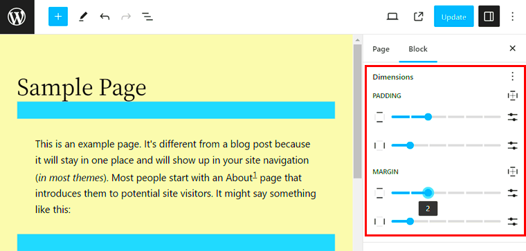
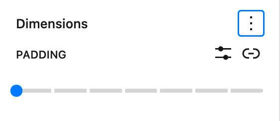
- Using the WordPress Editor: If you’re not into code, the Block Editor (Gutenberg) is your best friend! Each block has padding settings, and you can specifically adjust the bottom padding through the block settings.
- Custom CSS: This is a great option for those who don’t mind getting their hands a bit dirty. You can go to Appearance > Customize > Additional CSS and add specific rules like:
| CSS Selector | Example Code |
|---|---|
| For a specific block: | .your-block-class { padding-bottom: 20px; } |
| For all paragraphs: | p { padding-bottom: 15px; } |
- Page Builders: If you’re using a page builder like Elementor or Beaver Builder, you can easily adjust the padding in the settings panel. Just look for the styling options when you select the section or widget you want to customize.
- Theme Settings: Some themes come with their own customization options. Check your theme’s settings under Appearance > Customize to see if there are any predefined padding adjustments available.
In conclusion, whether you prefer using built-in tools or delving into CSS, adjusting bottom padding in WordPress is quite achievable. By focusing on this aspect of design, you can enhance the overall aesthetics, readability, and user experience of your website.
Using the WordPress Customizer
The WordPress Customizer is one of the simplest and most effective ways to handle padding dimensions, especially for bottom-only adjustments. If you’re looking to make changes without diving deep into the theme files, the Customizer provides an intuitive interface that makes it easy to tweak your site’s appearance.
To access the Customizer, go to your WordPress dashboard and navigate to Appearance > Customize. Here, you’ll find various options depending on your theme. Look for sections labeled Layout, Spacing, or Typography—these often lead you to padding settings.
Once you’ve located the right section, you might see sliders or input fields for padding adjustments. If your theme supports it, you can often set padding values separately for top, right, bottom, and left. For bottom-only adjustments, simply adjust the “Bottom Padding” value. Save your changes, and you’ll notice the difference on the live preview on the right side of the Customizer.
If your current theme lacks specific controls for bottom padding, there’s still hope—consider using Widgets or Page Builders. Many page builders, like Elementor or Beaver Builder, come with their own padding settings, allowing for granular control over each section of your site.
Remember, the changes you make in the Customizer are live and responsive; they affect not just desktop views but mobile displays too. So always take a moment to check on smaller screens after making adjustments!
Applying Custom CSS for Precise Control
If you’re looking for more precision and customization, applying custom CSS is the way to go. This method is especially useful if the padding options in your theme or the customizer don’t quite meet your needs. Custom CSS allows you to directly modify the appearance of your content with specific code, giving you a powerful tool in your design arsenal.
To add custom CSS in WordPress, head back to your dashboard, then navigate to Appearance > Customize and find the Additional CSS section. This is where you’ll enter your CSS code. If you’re unsure where to start, here’s a simple example:
.your-class-name { padding-bottom: 30px; /* Adjust the pixel value as needed */}Replace .your-class-name with the actual class of the element you want to target. You can find this class by inspecting elements on your website, typically by right-clicking and selecting “Inspect” in your browser. Once you find the correct class, you can define the specific padding you want.
Utilizing custom CSS gives you the freedom to create unique layouts and spacing across different devices. If you want to target specific pages, consider using page-specific classes or IDs. Just remember to clear your cache after making changes to your CSS, so you can see the updated styles immediately!
In conclusion, whether you choose the user-friendly WordPress Customizer or dive into custom CSS, there are plenty of ways to handle bottom-only padding adjustments effectively, allowing you to create the perfect look for your website.
Utilizing Page Builders for Bottom Padding Adjustments
Page builders have revolutionized the way we create and manage WordPress sites. These intuitive tools provide a visual interface that makes it easier to adjust various design elements, including padding dimensions. When it comes to bottom-only padding adjustments, page builders offer a flexible and user-friendly experience that can save you a great deal of time.
Most popular page builders like Elementor, Beaver Builder, and WPBakery allow you to easily set padding for any element directly from a user-friendly dashboard. Here’s how you can utilize these builders for bottom padding adjustments:
- Select the Element: Choose the element for which you want to adjust the bottom padding. This could be a widget, section, or column.
- Access the Padding Settings: In the settings panel, navigate to the “Advanced” tab where you’ll find padding options.
- Adjust Bottom Padding: You’ll typically see fields for adjusting padding values for all sides (top, right, bottom, left). Focus on the bottom value and either type in a number or use the slider for visual adjustments.
- Preview the Changes: Most page builders allow live previewing, so you can see how your adjustments look without refreshing the page.
Utilizing page builders not only enables bottom padding adjustments but also enhances your overall workflow when designing and maintaining your WordPress site. Remember that while tools can help, balancing aesthetics and functionality is key to effective web design!
Testing and Previewing Changes
Testing and previewing changes is a crucial step in web design, especially when making specific adjustments like bottom padding. The last thing you want is for your beautifully designed site to look unbalanced or misaligned on different devices. So, how do you ensure your bottom-only padding adjustments are spot-on? Let’s break it down!
- Live Preview: Use the live preview feature offered by your theme or page builder. This allows you to see how your bottom padding adjustments impact the overall layout in real-time.
- Device Views: Make sure to test how your adjustments look on different devices—desktop, tablet, and mobile. Most page builders provide a preview option for each device type, ensuring your site remains responsive.
- Check Browser Compatibility: Open your site in different web browsers (Chrome, Firefox, Safari) to ensure consistency across platforms. Padding might appear differently on various browsers due to rendering differences.
- A/B Testing: If you’re unsure whether your padding adjustments improve aesthetics, consider conducting A/B tests. Create two versions of the page, and analyze which one performs better based on user engagement metrics.
By taking the time to thoroughly test and preview your bottom padding adjustments, you can rest assured that your site will not only look great but also perform optimally across various platforms. After all, first impressions matter, and the right visual elements can make a world of difference!
Common Issues and Troubleshooting Tips
When working with bottom-only padding adjustments in WordPress, you might encounter a few hiccups along the way. It’s perfectly normal, so don’t stress! Below are some common issues you might face, along with troubleshooting tips to help you navigate them.
- Issue 1: Padding Not Applying as Expected
Sometimes you may notice that the bottom padding just isn’t showing up. This often happens due to CSS conflicts with other styles in your theme. To troubleshoot, try inspecting the element using your browser’s developer tools to see if any other CSS rules are interfering.
- Issue 2: Inconsistent Padding Across Devices
If your bottom padding looks great on a desktop but not on a mobile device, responsive design could be the culprit. Ensure that any CSS you’re adding has appropriate media queries to adjust for different screen sizes.
- Issue 3: Browser Caching Issues
Sometimes, changes you make might not be visible due to browser caching. Clear your browser cache or try viewing your site in incognito mode to see the most recent updates.
- Issue 4: Theme or Plugin Conflicts
If you’re still experiencing issues, it might be due to conflicting themes or plugins. Try disabling them one by one to pinpoint the source of the conflict.
By keeping these common issues in mind and following the troubleshooting tips, you can ensure your bottom-only padding adjustments go as smoothly as possible. Remember, practice makes perfect when it comes to mastering your WordPress layout!
Conclusion: Achieving the Perfect Layout
Ultimately, achieving that perfect layout in WordPress is a delightful blend of creativity and technical know-how. When it comes to bottom-only padding adjustments, the key is understanding how padding works within your theme and having the right tools at your disposal.
Here’s a quick recap of steps you can follow for those pristine bottom adjustments:
- Use Custom CSS: Leverage the Customizer or a child theme to add your custom styles safely.
- Check Responsiveness: Don’t forget to test your changes both on desktop and mobile views.
- Utilize Page Builders: Explore page builders that offer intuitive interfaces for fine-tuning padding without coding.
- Monitor Performance: Too many custom styles can slow your site. Keep it clean!
With these tips and insights, you’re well-equipped to make bottom-only padding work beautifully in your WordPress design. Happy designing, and may your layouts always be pixel-perfect!


