Flaticon is a vast icon repository that offers a wide array of icons for web designers, developers, and creative professionals. As a part of your design project, using Flaticon can enhance visual communication while ensuring brand consistency. Implementing Flaticon‘s branding guidelines helps maintain the integrity and recognition of the Flaticon brand across different platforms.
Understanding the Importance of Branding
Branding is crucial in today’s competitive market as it helps distinguish your projects from others, fosters customer loyalty, and communicates your values effectively. Here are several points highlighting its importance:
- Identity: Branding establishes a unique identity that sets you apart from competitors.
- Recognition: Consistent branding increases recognition among your target audience.
- Trust: Strong branding builds trust and credibility with consumers.
- Emotional Connection: Brands can foster emotional connections, making customers more likely to engage and remain loyal.
- Perceived Value: Better branding can increase the perceived value of your product or service.
For Flaticon, adhering to their branding guidelines when using icons ensures that you respect their intellectual property while also reinforcing Flaticon’s identity in your projects. This practice not only helps promote the Flaticon brand but also enriches your design, making it more visually appealing and cohesive. Understanding and implementing branding principles can significantly enhance the impact of your projects.
Navigating the Flaticon Platform

So, you’ve decided to dive into the world of Flaticon, and you’re probably wondering, “How do I make the most of this platform?” Don’t worry—I’ve got you covered! The Flaticon platform is user-friendly and designed to help you find your perfect icons and logos effortlessly.
When you first arrive at the homepage, you’ll notice a search bar prominently displayed. This is your best friend! You can enter keywords related to the type of logo or icon you’re looking for, whether it’s “technology,” “business,” or “creative.”
To further refine your search, Flaticon offers several filters. Here’s how you can navigate effectively:
- Categories: Browse through different categories like “Animals,” “Food,” or “Sports.” This is great when you want to explore options instead of having a specific logo in mind.
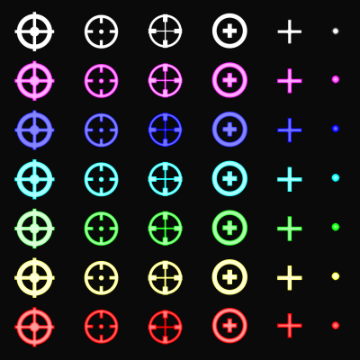
- Styles: Want something minimalistic? Or maybe something more colorful? You can filter icons based on style—such as flat, filled, or outline.
- File Type: Depending on your project needs, you can choose between SVG, PNG, and EPS formats. Each format has its own advantages, so consider what works best for your application.
Once you find an icon you like, don’t forget to check out its details page. This includes licensing information, which is crucial to ensure you’re using it correctly in your project. Happy navigating!
Choosing the Right Logo for Your Project

When it comes to choosing a logo from Flaticon, it can feel like you’re a kid in a candy store—so many options! But picking the right one for your project is vital because it represents your brand identity. Here are some tips to help you choose wisely:
- Understand Your Brand: Before you start searching, have a clear vision of your brand identity. Think about colors, themes, and messages you want to convey.
- Know Your Audience: Consider the preferences of your target audience. A professional logo might be best for a corporate client, while a fun, quirky logo could be fitting for a blog about pets.
- Stay Consistent: Choose a logo that aligns with your overall project aesthetics. Look at the other design elements you will use and ensure the logo complements them.
Also, remember to pay attention to legibility and scalability. You want a logo that looks good both in small and large sizes. After all, it might end up on a business card, website header, or even a billboard!
Finally, don’t be afraid to test out a few options! Create mockups to see how the logo will appear in real life. Get feedback from friends or colleagues—sometimes a fresh pair of eyes can make all the difference.
5. Attributing Flaticon Logos Correctly

When using Flaticon logos in your projects, it’s essential to give proper credit. Attribution not only respects the licensing terms set by Flaticon, but it also acknowledges the talent and creativity of the designers. Here’s a simple guide to help you attribute Flaticon logos correctly:
- Check the License: Before you use any icon, make sure you review its licensing agreement. Flaticon offers different licenses, including free and premium, so it’s crucial to know what is required for each icon.
- Include the Attribution Text: A typical attribution should include:
- Placement Matters: Place your attribution in a visible spot. Whether in the credits of a project or at the bottom of a webpage, ensure it’s easily accessible.
- Use HTML Links: If you’re working on a digital project, format the attribution as a clickable link. Here’s an example:
Icons made by Freepik from www.flaticon.com
Remember, correct attribution not only follows legal guidelines, but it also fosters a respectful community of designers and creators!
6. Incorporating Flaticon Logos into Your Designs
Flaticon logos can add a rich layer of visual appeal to your projects, whether you’re working on a website, app, or promotional materials. Here’s how to seamlessly incorporate these logos into your designs:
- Choose the Right Style: Flaticon offers a vast collection of logos in various styles (flat, outline, filled, etc.). Choose one that complements your overall design aesthetic. Ensure consistency across all your icons.
- Color Customization: Many logos from Flaticon can be customized. Consider adjusting the color scheme to align with your branding. Tools like Adobe Illustrator or any robust graphic design software can help you make these changes easily.
- Maintain Proportions: When sizing logos, keep the aspect ratio intact to avoid any distortion. This is especially important for professional branding, as a skewed logo might not give off the right impression.
- Use Spacing Wisely: Ensure there’s enough whitespace around your logos. It helps in avoiding a cluttered look and makes the logos stand out more effectively.
- Test in Different Contexts: Before finalizing your design, test how the logos look in various environments (desktop, mobile, print). This practice ensures your design looks great everywhere.
Incorporating Flaticon logos thoughtfully can enhance your projects and create a cohesive visual narrative that resonates with your audience!
7. Best Practices for Using Flaticon Logos
When it comes to incorporating Flaticon logos into your projects, adhering to best practices is crucial for maintaining the integrity of your design and ensuring a positive user experience. Here are some key tips to keep in mind:
- Stick to Original Colors: Whenever possible, use the logos in their original colors to preserve brand recognition. If customization is necessary, ensure any alterations stay within the brand’s color palette.
- Maintain Clarity: Ensure that logos are displayed at a size that remains clear and legible. Avoid extremely small sizes where details might be lost, as this can diminish the logo’s impact.
- Respect the Clear Space: Keep enough distance between the logo and other design elements. A good rule of thumb is to leave clear space equal to the height of the logo itself.
- Consistent Placement: Place the logo consistently across different platforms and products. This helps reinforce brand identity and recognition.
- Follow Licensing Guidelines: Always check and adhere to Flaticon’s licensing agreements. Whether you’re using free or paid resources, ensure you’re compliant with the terms of use.
By adhering to these best practices, you can utilize Flaticon logos effectively, enhancing your projects while respecting the Flaticon brand.
8. Case Studies of Successful Flaticon Usage
Let’s take a glance at some inspiring examples of how designers and brands have effectively used Flaticon logos in their projects. These case studies highlight the versatility and impact of these icons:
| Case Study | Project Type | Key Takeaway |
|---|---|---|
| Travel App – Wanderlust | Mobile Application | Utilized Flaticon logos for navigation icons, resulting in improved user engagement and ease of use. |
| E-commerce Website – ShopEasy | Web Development | Incorporated Flaticon logos in the site’s branding, enhancing visual appeal and brand consistency. |
| Educational Platform – LearnSphere | Online Learning | Leveraged Flaticon logos for course categorization, making it easier for users to navigate. |
These case studies illustrate not just the potential of Flaticon logos, but also their ability to enhance functionality, clarity, and branding across various projects. Consider your own use of Flaticon logos—how can you adapt these lessons to create a more effective design?
9. FAQs about Flaticon Logo Usage
When it comes to using the Flaticon logo in your projects, you might have a few questions. Don’t worry; you’re not alone! Here are some of the most frequently asked questions regarding Flaticon logo usage:
1. Can I use the Flaticon logo in my personal projects?
Yes! You can use the Flaticon logo in your personal projects, but you must follow their branding guidelines. It’s always good to read these guidelines to ensure you’re compliant.
2. Are there different versions of the logo available?
Absolutely! Flaticon provides several versions of their logo, including different sizes and formats (like PNG and SVG). Just visit their official website to download the version that fits your needs.
3. Do I need to give credit if I use the Flaticon logo?
While it’s a good practice to credit Flaticon, it’s not always mandatory. However, check the specific requirements for your usage to make sure you’re not missing any important details!
4. Is it okay to modify the Flaticon logo for my branding?
No, modifying the Flaticon logo is strictly prohibited. It’s crucial to use the logo as provided to maintain brand integrity and consistency.
5. Can I use the logo in promotional materials?
Yes! However, ensure that you adhere to their guidelines. Promotional materials can get tricky, so it’s best to double-check if you have the right permissions.
If you have more questions about using the Flaticon logo, it’s a good idea to refer directly to their official FAQ section for the most accurate and updated information.
10. Conclusion and Final Thoughts
Using the Flaticon logo in your projects can add professionalism and a touch of creativity to your work. By following the guidelines set by Flaticon, you’re not only respecting their brand but also enhancing your project’s credibility.
Here are some final tips as you consider incorporating the Flaticon logo:
- Stay Consistent: Use the logo wherever necessary to maintain a cohesive brand image.
- Read the Guidelines: Always check and adhere to Flaticon’s branding guidelines to avoid any misuse.
- Engage with The Community: Consider joining forums or groups where others discuss their experiences using the Flaticon logo.
In conclusion, the Flaticon logo is a valuable asset for anyone looking to enhance their projects. Whether you’re working on a website, an app, or marketing materials, utilizing the logo correctly can elevate the aesthetic and credibility of your work. Happy designing!