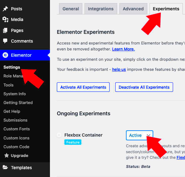
Welcome to the world of flexible web design! If you’ve been using Elementor, you might have heard of Flexbox, but do you know what it can do for your layouts? Flexbox is a powerful layout model that allows web designers to create responsive and efficient designs without breaking a sweat. In this section, we’ll take a quick look at how Flexbox works within Elementor and why it’s a game-changer for your web design efforts.
What is Flexbox?
Flexbox, or the Flexible Box Layout, is a CSS3 layout mode designed to give you control over the distribution of space and alignment of items in a container. Here’s what you need to know:
- Designed for Layouts: Flexbox simplifies the process of creating responsive layouts. No more fiddling around with floats or manual margin adjustments.
- Container and Items: A Flexbox layout consists of a container (the parent element) and items (the child elements) within that container. You can control how items are arranged and sized inside the container.
- Direction Control: You can easily change the direction of your items. Whether you want them displayed in a row or a column, Flexbox handles it without any fuss.
- Alignment Made Easy: Flexbox provides options for aligning items along the main and cross axes, meaning you can center, space, or align your elements just how you want them.
In summary, Flexbox is all about flexibility. It helps create adaptable designs that respond beautifully to various screen sizes, making your website look fantastic on any device!
Benefits of Using Flexbox in Web Design
Flexbox, or the Flexible Box Layout, is a powerful layout model in CSS that allows for more efficient and predictable arrangements of elements in web design. When it comes to using Flexbox in your projects, especially with tools like Elementor, the benefits are numerous. Let’s dive into some key advantages:
- Responsive Design Made Easy: Flexbox provides a fluid layout that adapts to different screen sizes without the need for complex media queries. This means you can create a seamless experience on mobile, tablet, and desktop devices.
- Alignment Control: One of the standout features of Flexbox is its ability to align items effortlessly. Whether you want to center an object, space elements evenly, or push items to the edges, Flexbox does it with just a few properties.
- Dynamic Layouts: If your design requires elements to grow or shrink dynamically based on the content, Flexbox has got you covered. You can easily specify how much space an item should take and how it behaves in relation to others.
- Directionality: Flexbox allows you to control the direction in which items flow, whether you want them in a row or a column. This flexibility ensures you have complete creative freedom in your layout.
- Reduced Complexity: By using Flexbox, you can achieve complex designs with less code. This not only makes your stylesheets cleaner but can also enhance website performance.
In summary, implementing Flexbox can significantly improve your web design process, making it more intuitive and efficient. So, if you’re looking to elevate your designs, consider the perks that Flexbox has to offer!
How to Enable Flexbox Container in Elementor
Getting started with Flexbox in Elementor is a breeze! This step-by-step guide will walk you through enabling Flexbox containers in your Elementor projects:
- Update Elementor: First things first, ensure that you are using the latest version of Elementor. By keeping your plugin updated, you have access to the latest features, including Flexbox.
- Create a New Section: In the Elementor editor, click on the “+” button to add a new section. You’ll see different structure options; choose one that works best for your layout.
- Access Section Settings: Once your section is created, hover over it and click on the middle icon to access the section settings. Here’s where the magic begins!
- Enable Flexbox: Head over to the “Layout” tab within the section settings. Look for the “Display” option and select “Flex” from the dropdown menu. Voila, you’ve enabled the Flexbox container!
- Customize Your Flexbox: With Flexbox enabled, you can now start aligning and positioning your widgets using the available Flexbox properties, such as justification, alignment, and direction.
- Preview and Adjust: Always preview your changes. Adjust spacing, alignment, and the direction of your content until it matches your vision. Don’t be afraid to experiment!
And there you have it! You’ve successfully enabled Flexbox in Elementor, opening up a world of possibilities for your web design projects. Now you can create responsive, dynamic layouts that adapt beautifully to any device.
Step-by-Step Guide to Configuring Flexbox Container
Setting up a Flexbox container in Elementor is easier than you might think. With just a few clicks, you can create a variety of layouts that respond beautifully to different screen sizes. Let’s walk through the process step-by-step:
- Open Elementor: Start by launching the Elementor editor for the page where you want to add your Flexbox container.
- Add a New Section: Click the “+” icon to add a new section. Choose a single column layout for simplicity.
- Select the Section: Hover over the newly created section until you see the six dots icon. Click it to access the section settings.
- Go to Layout Settings: In the left panel, navigate to the “Layout” tab. Here, you’ll find the option to enable Flexbox.
- Enable Flexbox: Toggle on the “Flexbox Container” option. This is where the magic begins! You’ll notice that you can now change the direction, alignment, and spacing of your items.
- Configure Flexbox Properties: You can adjust settings such as:
- Direction: Set your layout to row or column.
- Justify Content: Align items along the main axis (start, center, space-between).
- Align Items: Align items along the cross axis (start, center, stretch).
- Gap: Specify spacing between items.
- Preview and Adjust: After setting your configurations, preview your changes. Adjust as necessary until you achieve your desired look!
- Publish: Once satisfied, don’t forget to hit the “Update” button to save your changes.
And there you have it! Your Flexbox container is now configured and ready to bring a fresh vibe to your website’s design.
Common Use Cases for Flexbox in Elementor
Flexbox is not just another tool in Elementor; it’s a game-changer that can help you create dynamic, responsive layouts. Below are some common use cases where Flexbox shines:
- Creating Navigation Menus: Allow your menu items to adjust and align perfectly on various screen sizes. Flexbox makes it a breeze to manage spacing and alignment.
- Image Galleries: Arrange images in a grid format with uniform gaps between them. Flexbox handles the resizing and alignment automatically, keeping your visual presentation neat.
- Cards Layout: Display product or service cards in a flexible layout that adjusts based on the screen size. It’s perfect for showcasing multiple offerings without losing visual appeal.
- Responsive Footer: Organize footer elements like logos, contact information, and social media links while ensuring they’re perfectly aligned and spaced for desktop and mobile views alike.
- Hero Sections: Create stunning hero sections that position text and buttons relative to images, ensuring an eye-catching first impression for visitors.
What’s amazing about Flexbox is its flexibility in design. You can easily tweak and customize each layout according to your needs, maximizing both functionality and aesthetics. Whether you’re a seasoned Elementor user or just getting started, Flexbox is definitely a feature you should explore!
7. Best Practices for Using Flexbox in Your Designs
When it comes to using Flexbox in your designs with Elementor, there are a few best practices that can help you maximize its potential. Flexbox offers incredible flexibility and adaptability, but to get the most out of it, keep these tips in mind:
- Start Simple: Before delving into complex layouts, begin with a straightforward design. Flexbox allows you to modify the arrangement of elements easily, so don’t hesitate to experiment after you’ve set a basic framework.
- Utilize Flex Properties: Familiarize yourself with the various properties Flexbox offers, like
flex-grow,flex-shrink, andflex-basis. These can help you control how items behave within your container even when the space changes. - Maintain Consistency: Keep a consistent design language throughout your Flexbox containers. Use similar spacing, alignment, and sizing to create a harmonious look across your site.
- Optimize for Responsiveness: Utilize the power of Flexbox to create responsive designs. Ensure that your containers adapt smoothly to different screen sizes, which will enhance the user experience on mobile and desktop alike.
- Test Across Browsers: While Flexbox is widely supported, always test your designs in different browsers. Some may render slightly differently, so it’s best to ensure a consistent experience for all users.
By following these best practices, you’ll enhance your designs with Flexbox in Elementor, making them more visually appealing and user-friendly!
8. Troubleshooting Common Issues with Flexbox in Elementor
While using Flexbox in Elementor can be a breeze, sometimes you might encounter hiccups. No need to worry! Let’s address some common issues and their solutions:
| Issue | Possible Causes | Solutions |
|---|---|---|
| Items Not Aligning Correctly | Incorrect setting of alignment properties. | Check the align-items and justify-content settings to ensure they meet your design requirements. |
| Overflowing Content | Fixed widths and heights on items. | Consider using flex-wrap to allow items to move to the next line if the space is constrained. |
| Flex Items Not Resizing | Improper use of flex-grow or flex-basis. |
Make sure you have defined these properties correctly to allow proper resizing within the Flexbox context. |
| Inconsistent Element Sizes | Different default settings for child elements. | Uniform the height and width settings of your child elements to maintain consistency across the layout. |
If you find yourself facing Flexbox-related issues in Elementor, these troubleshooting tips should guide you towards a smoother design process. With a little patience and experimentation, you’ll conquer any Flexbox challenge like a pro!
Enabling Flexbox Container in Elementor
Flexbox is a powerful layout tool that allows web designers and developers to create responsive and adaptable layouts with ease. Elementor, one of the leading WordPress page builders, has incorporated Flexbox functionality to help users take advantage of this modern CSS feature. This guide will walk you through the steps to enable and utilize the Flexbox container in Elementor, enhancing your web design capabilities.
To enable the Flexbox container in Elementor, follow these simple steps:
- Ensure you have the latest version of Elementor installed. Flexbox containers are supported in Elementor 3.6 and above.
- Navigate to the Elementor dashboard.
- Create a new section or edit an existing one.
- In the layout settings, select “Flexbox” from the layout mode dropdown.
- Customize the flex properties, such as direction, alignment, and wrap options as per your design needs.
Flexbox enables several advantages, including:
- Responsiveness: Elements can adjust automatically based on screen size.
- Alignment: More predictable alignment of items within a container.
- Order Control: Easily change the visual order of elements without altering their HTML structure.
Here’s a quick comparison table of Flexbox versus traditional layout techniques:
| Aspect | Flexbox | Traditional (float/inline-block) |
|---|---|---|
| Flexibility | High | Low |
| Alignment | Easy and consistent | Complex |
| Responsiveness | Automatic adjustments | Manual adjustments required |
Incorporating Flexbox containers in your Elementor workflow not only simplifies the design process but also enhances the overall user experience by delivering more responsive and aesthetically pleasing layouts. Take advantage of this feature to create sophisticated web pages that stand out.
Conclusion: Enhancing Your Elementor Experience with Flexbox
By enabling Flexbox containers in Elementor, you unlock new design possibilities that allow for greater versatility, responsiveness, and ease of layout management, ultimately enhancing your Elementor experience and elevating your website’s visual appeal.


