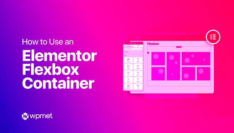
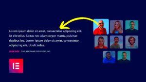
When it comes to designing websites, Elementor has revolutionized the process with its user-friendly tools. One of the most impressive features in Elementor is the Flex Container. This powerful element allows designers to create highly flexible and dynamic layouts. By using a flex container, you can arrange your content in a way that adapts seamlessly to various screen sizes, making your website look great on both desktop and mobile devices. In this post, we’ll explore how to use the Flex Container to swap placements on mobile views, enhancing user experience and making your design more effective.
Why Mobile Responsiveness is Important
Mobile responsiveness isn’t just a trendy design choice; it’s a necessity in today’s digital landscape. Here’s why:
- Increased Mobile Usage: Research shows that over half of web traffic comes from mobile devices. Having a site that looks good on small screens is crucial for reaching your audience.
- Improved User Experience: A responsive site enhances user experience by providing easy navigation and accessibility. Users are more likely to stay engaged if the content fits their screen properly.
- SEO Benefits: Search engines, like Google, prioritize mobile-friendly designs in their rankings. This means that if your site isn’t mobile-responsive, you could be missing out on valuable SEO traffic.
- Higher Conversion Rates: When your site is easy to use on mobile devices, you’re likely to see higher conversion rates as visitors can complete actions like signing up or purchasing with ease.
- Future-Proofing Your Site: As technology continues to advance, more users will turn to mobile devices for their online needs. A responsive design ensures your site stays relevant and functional.
With these factors in mind, it’s clear that ensuring your site is mobile-responsive isn’t just a good idea; it’s vital for your site’s success.
Understanding Flexbox Layouts
In the world of web design, Flexbox is a game changer! It’s a layout module that allows you to create complex layouts effortlessly. If you’ve ever found yourself tangled in the chaos of traditional CSS layouts, you’ll appreciate the simplicity of Flexbox. So, let’s break it down!
At its core, Flexbox helps you arrange items in a container. You can control the direction, alignment, and sizing of elements, all without the usual headaches. Here are some fundamental concepts:
- Flex Container: This is the parent element that holds all the items you want to arrange.
- Flex Items: These are the individual elements inside the Flex Container.
With Flexbox, you can easily switch the placement of items based on screen size or design requirements. Imagine wanting to align your navigation items horizontally on desktops but vertically on mobile – Flexbox makes this a breeze!
Here’s a little breakdown of key properties that you’ll commonly use:
| Property | Description |
|---|---|
| display: flex; | Defines a flex container. |
| justify-content | Aligns items along the main axis (e.g., left, center, right). |
| align-items | Aligns items along the cross axis (e.g., top, center, bottom). |
| flex-direction | Sets the direction in which the flex items are placed (e.g., row, column). |
Understanding Flexbox layouts paves the way for more organized and flexible web designs, making your life as a designer much easier!
Setting Up Elementor Flex Containers
Ready to bring the power of Flexbox into your Elementor designs? Setting up Flex Containers in Elementor is a seamless process; it opens up a wealth of creative possibilities. Let’s walk through the steps together!
First, ensure that you’re using the latest version of Elementor. Once you’re all set, here’s how to create a Flex Container:
- Open your Elementor editor and create a new section.
- Select the section, then in the layout settings, choose Flex as the container type.
- Adjust the flex-direction property to lay items out horizontally or vertically, based on your design needs.
Now, let’s dive into some vital settings you can tweak:
- Justify Content: Align your items to the start, center, or end.
- Align Items: Control the vertical alignment of your items.
- Gap: Set the spacing between items in your flex container.
One of the neat features in Elementor is that you can fine-tune these settings for different devices! For example, you may want to stack items vertically on mobile while keeping them side by side on desktops. Adjusting these settings is as simple as switching to mobile view in the editor!
Elementor Flex Containers offer an intuitive way to control your layout, making them perfect for responsive design. Experimenting with these options can help unlock a fresh level of creativity in your web designs.
Steps to Swap Placement on Mobile
Swapping the placement of elements on mobile using Elementor’s Flex Container feature can really enhance your site’s mobile responsiveness. It’s simple and can significantly impact your user experience. Here’s a straightforward guide to help you through this process:
- Access the Elementor Editor: Start by opening the page you want to edit with Elementor. You’ll see a live view of your page where you can make changes in real-time.
- Select Your Flex Container: Click on the section containing the elements you want to rearrange. Ensure that it is set as a Flex Container. You can find this in the ‘Advanced’ tab under ‘Layout’.
- Change Flex Direction: Navigate to the ‘Layout’ settings and find the ‘Flex Direction’ option. For mobile views, it’s generally set to ‘Column’. Switch it as needed based on how you want the elements to be arranged.
- Adjust Order: Each item within the Flex Container can have its own ordering. Click on any element inside the container, go to the ‘Advanced’ tab, and find the ‘Order’ setting. Here you can assign a number to each item. Items with lower numbers will appear first on mobile.
- Preview Your Changes: After adjusting the order and direction, click on the mobile icon at the bottom of the panel to preview how your site looks on mobile devices. Make further adjustments if necessary.
- Publish Changes: Once you’re satisfied with how everything looks, hit the ‘Update’ button to save your changes. Voila! Your mobile arrangement is now optimized.
Common Issues and Troubleshooting
While working with Elementor’s Flex Container, you might encounter some hiccups along the way. Don’t worry, though—many of these issues have simple fixes. Here are some common issues and how to troubleshoot them:
- Elements Not Aligning Properly: Sometimes, even after rearranging, elements don’t align correctly. Confirm that your Flex settings (like direction and wrap) are correctly applied. Occasionally, margin and padding settings can affect alignment.
- Changes Not Showing Up on Mobile: If you don’t see the updates on the mobile view, ensure you’re working within the mobile responsive settings in Elementor. Click the mobile icon and check if you are indeed viewing the mobile settings.
- Order Numbers Overriding Each Other: If your elements seem to behave unexpectedly, double-check the order numbers assigned to each. Ensure they follow a logical sequence.
- Responsive Controls Not Working: Ensure that the ‘Responsive’ feature is enabled for all settings. Sometimes, settings apply only to desktop view unless specified otherwise.
- Performance Issues: If your website is slow or elements aren’t displaying as they should, try clearing your cache or the browser’s cache. Sometimes a fresh view is all you need.
- Seeking Help: If you’ve tried everything but are still struggling, don’t hesitate to check Elementor’s community forums or documentation for additional support.
By keeping these troubleshooting tips in mind, you’ll be better prepared to tackle any nuisance that comes up while swapping placements on mobile with Elementor’s Flex Container feature.
7. Best Practices for Mobile Layouts
Designing for mobile can feel like a juggling act. You want your site to be visually appealing, easy to navigate, and functional. Here are some best practices to keep in mind when dealing with mobile layouts, especially when using Elementor’s Flex Container.
- Prioritize Content: Mobile screens are smaller, so it’s crucial to prioritize the most important content. Keep your layout simple and ensure that vital information is easily accessible. Consider using collapsible sections to save space.
- Use Flex Containers Wisely: Flex Containers in Elementor allow for responsive adjustments. Make use of the options to rearrange your content based on screen size. Test different placements and see what makes the most sense for your users.
- Optimize Touch Targets: Make sure buttons, links, and other interactive elements are finger-friendly. A good rule of thumb is to ensure that touch targets are at least 44px by 44px to avoid frustrating users.
- Font Size Matters: Text that’s too small can be a nightmare on mobile devices. Aim for legible font sizes (at least 16px). You can further adjust sizes for headings and body text using responsive typography options in Elementor.
- Test Across Devices: Finally, always test how your site looks on different devices. Emulators can help, but nothing beats the experience of checking it out on real phones and tablets.
By keeping these best practices in mind, you can enhance your mobile user experience, ensuring that your audience gets the best impression, no matter how they access your site!
8. Conclusion
Swapping placements in mobile layouts using Elementor’s Flex Container isn’t just a technical task; it’s a creative opportunity! With the right strategies, you can ensure that your site looks fantastic and provides an intuitive experience for users across all devices.
Remember, mobile users often seek quick information and easy navigation. With Elementor, the flexibility you have means you can cater to these needs effectively. Here’s a quick recap of what we’ve discussed:
- If you want to swap placements on mobile, utilize the responsive controls in the Flex Container settings.
- Don’t forget to preview how your changes look on various devices.
- Emphasize readability and ease of interaction for a smoother user experience.
Designing for mobile is both an art and a science. By applying best practices and leveraging Elementor’s powerful features, you can create mobile layouts that truly resonate with your audience. Happy designing!
Further Resources and Reading
As you dive deeper into the world of Elementor and Flex Containers, there are numerous resources available to enhance your understanding and mastery of these tools. Below is a curated list of links, articles, and videos that will equip you with the knowledge to effectively use Flex Containers and improve your mobile layout strategies:
- Official Elementor Documentation: Elementor Flexbox Container Documentation
- Video Tutorials:
- Community Forums:
- Blog Posts:
By utilizing these resources, you can further enhance your skills and stay updated with the latest features and techniques available in Elementor, specifically regarding Flex Containers and responsive design adjustments for mobile devices.


