Welcome to the exciting world of web design with Elementor! If you’re on a journey to enhance your website’s user experience, then the Elementor Flex Container is a game changer. With its intuitive interface and powerful layout capabilities, the Flex Container allows you to create flexible and responsive designs that look stunning on any device. Whether you’re a seasoned developer or just starting, this tool is your best friend for crafting mobile-friendly layouts.
Understanding Mobile Layouts in Web Design

In today’s digital landscape, it’s no secret that mobile usability is key. So, what exactly are mobile layouts, and why should you care? Let’s break it down!
- What is a Mobile Layout?
A mobile layout is a design specifically optimized for viewing on smartphones and tablets. It ensures that content is easily accessible and readable, engaging users effectively on smaller screens. - Why is Mobile Design Important?
With more than half of web traffic coming from mobile devices, responsive design is crucial. A well-designed mobile layout can boost engagement, reduce bounce rates, and ultimately enhance conversions. - Common Features of Responsive Mobile Layouts:
- Flexible grids and layouts
- Scalable images and media
- User-friendly navigation
- Touch-friendly buttons and links
- Key Considerations for Designing Mobile Layouts:
Aspect Consideration Screen Size Design must adapt to different screen sizes and orientations. Loading Speed Optimize images and reduce HTTP requests to improve speed. User Interaction Ensure touch targets are large enough for easy navigation.
By embracing responsive design principles, you can create mobile layouts that provide a seamless and enjoyable experience for your users. And with Elementor‘s Flex Container, you’ll have all the tools you need at your fingertips!
Benefits of Using Flex Containers for Mobile Design
When it comes to mobile web design, creating a user-friendly experience is crucial. This is where Flex Containers come into play. They offer a myriad of benefits that can significantly enhance mobile layouts. Let’s dive into some of the key advantages:
- Responsive Design: Flex Containers automatically adjust the size and alignment of your elements based on the screen size. This is particularly beneficial for mobile users, as it ensures that your content looks just as good on a small screen as it does on a large desktop.
- Enhanced Layout Control: With Flex Containers, you have fine-tuned control over how elements are displayed. You can easily position items horizontally or vertically, create wrapping designs, and control spacing between elements without needing extensive coding knowledge.
- Consistent Alignment: Implementing Flex Containers helps to maintain alignment across different devices. This consistency improves the visual flow of your site, making it easier for users to navigate your content.
- Reduced Development Time: Instead of manually adjusting your layouts for different screen sizes, Flex Containers can save you a considerable amount of time. You can easily replicate layouts while Flexbox handles the heavy lifting of adjustments.
- Improved User Experience: Ultimately, positive user experience is the goal of any design. Flex Containers facilitate intuitive navigation and interaction, making it more enjoyable for users to engage with your content on mobile devices.
All in all, Flex Containers are an essential tool in your mobile design toolkit if you want to create a compelling, user-friendly website.
Setting Up Flex Containers in Elementor
Now that you’re aware of the benefits, let’s get into the nitty-gritty of setting up Flex Containers in Elementor. The process is quite straightforward, even if you’re new to web design. Follow these easy steps to get started:
- Install and Activate Elementor: First things first, ensure that you have Elementor installed and activated on your WordPress site. If you haven’t done this yet, head over to the Plugin section in your dashboard and search for Elementor.
- Create a New Section: Go to the page or post where you want to add the Flex Container and click on ‘Edit with Elementor.’ Once in the Elementor interface, click the “+” icon to create a new section.
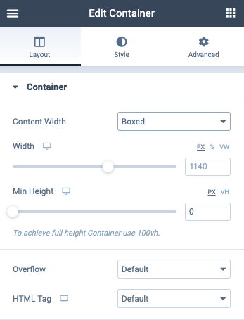
- Add a Flex Container: Select the structure of your choice—this will generate a new container. From the left panel, navigate to the settings and choose the `Flex` layout option.
- Adjustify your Flex Settings: Here, you can set parameters like direction, padding, and alignment. For example, you can set the direction to `Column` on mobile to stack your elements, creating a more user-friendly layout.
- Add Elements: Drag and drop elements like text, buttons, and images into your Flex Container. You’ll notice they automatically align according to your set flex settings.
- Preview and Tweak: Don’t forget to preview your changes by clicking on the mobile icon in the Elementor toolbar. This allows you to see how your layout will look across different devices and make any adjustments as needed.
And there you have it! Setting up Flex Containers in Elementor is as easy as 1-2-3. With just a few clicks, you can create a beautiful, flexible mobile design that enhances user experience.
Adjusting Mobile Layouts with Elementor Flex Containers
When it comes to designing for mobile, flexibility is key! Elementor‘s Flex Containers are a game-changer, allowing you to create responsive designs without breaking a sweat. With the right adjustments, you can ensure that your mobile layouts not only look great but also perform flawlessly. Here’s how to effectively utilize Flex Containers for mobile design.
First off, let’s understand what Flex Containers bring to the table:
- Responsive Nature: Flex Containers respond to the screen size, ensuring that elements align beautifully regardless of whether they’re viewed on a smartphone, tablet, or desktop.
- Alignment Options: You have various alignment options (horizontal and vertical), meaning you can achieve the perfect spacing and alignment of your content.
- Direction Control: You can easily switch between rows and columns, allowing you to stack elements vertically on mobile while keeping horizontal layouts for larger screens.
To adjust mobile layouts, start by accessing the Flex Container settings. Here, you can:
- Set Breakpoints: Use the responsive settings to create specific designs for different screen sizes.
- Control Gaps: Adjust the spacing between your elements to make sure there’s enough white space for a clean look.
- Hide Elements: If certain elements don’t translate well on mobile, use the visibility settings to hide them for mobile users.
In conclusion, utilizing Elementor’s Flex Containers effectively allows you to create user-friendly mobile experiences that adapt seamlessly to any device. Remember, it’s all about making design choices that enhance usability!
Best Practices for Mobile UX
Creating a stellar mobile user experience (UX) isn’t just about shrinking desktop designs to fit smaller screens. It’s a unique challenge that requires a thoughtful approach. Here’s a round-up of the best practices that can enhance your mobile UX, particularly when using Elementor.
| Best Practice | Description |
|---|---|
| Simplicity is Key | Keep your design simple. A cluttered interface is overwhelming on smaller screens. Use white space generously. |
| Optimize for Touch | Design for fingers, not cursors. Buttons and links should be easy to tap without needing precision. |
| Hierarchy of Information | Use size, color, and placement to guide users through the most important parts of your page. |
| Fast Loading Times | Ensure your site is optimized for speed. Compress images and minimize scripts to enhance performance. |
| Testing Across Devices | What looks good on one device may not translate to another. Test your designs across various mobile devices. |
By implementing these best practices, you can drastically improve the mobile UX of your site. Remember that every design decision you make should ultimately enhance the usability for your visitors, providing an enjoyable and seamless experience as they navigate your content!
Common Challenges and Solutions
While Elementor Flex Containers are a powerful tool for creating responsive layouts, there are a few common challenges users often encounter. Let’s dive into these issues and explore practical solutions to enhance your experience.
- Challenge 1: Overlapping Elements
One of the most frequent problems is elements overlapping or not being spaced correctly on mobile views. This can occur if your padding and margin settings are not adjusted properly for different breakpoints.
Solution: Use Elementor’s built-in responsive controls to set different margins and padding for tablet and mobile layouts. Always preview your changes and adjust as necessary.
- Challenge 2: Typography Issues
Text that looks great on desktop often appears too large or small on mobile devices, affecting readability.
Solution: Utilize Elementor’s typography settings to adjust font sizes specifically for mobile screens. Aim for a clean and legible text hierarchy that enhances user understanding.
- Challenge 3: Loading Time
Incorporating multiple elements and images can slow down your site on mobile devices, leading to a poor user experience.
Solution: Optimize your images and consider using fewer elements on mobile views. Tools like image compression can significantly enhance page speed without compromising quality.
- Challenge 4: Inconsistent Alignment
Elements may not align correctly across different devices, making your design look unprofessional.
Solution: Make use of Flexbox alignment properties to help ensure that your items are centered and spaced evenly. Regularly test your design on various screen sizes to catch any misalignments.
Conclusion: Enhancing Mobile User Experience with Flex Containers
In today’s fast-paced digital landscape, enhancing mobile user experience is more critical than ever. Elementor Flex Containers offer a flexible and adaptable way to achieve just that. By mastering the use of Flex Containers, you can create layouts that adjust beautifully across various devices, ensuring a seamless user journey.
Utilizing the features and tools available within Elementor, you can cater your designs to the unique needs of mobile users. Remember, the key aspects you should focus on include:
- Responsive Design: Tailor your layouts for different screen sizes.
- User-Centric Navigation: Simplify menus and calls-to-action, making them easily accessible.
- Visual Hierarchy: Create a clear path of information with significant emphasis on the most important elements.
- Performance Optimization: Ensure your site remains lightweight and loads quickly on all devices.
In conclusion, implementing Elementor Flex Containers allows you to not just accommodate mobile users, but truly delight them. A well-thought-out mobile layout encourages engagement, reduces bounce rates, and ultimately drives conversions. So get started today, and watch your user experience soar!


