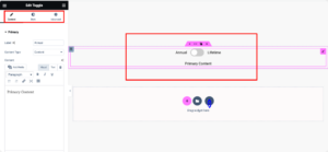
Elementor has revolutionized the way we build and design websites on WordPress. It’s a powerful page builder that allows users to create stunning layouts without any coding skills. One of the standout features of Elementor is its grid display capabilities, which help organize content appealingly and functionally. In this post, we’ll dive into how to make adjustments to grid displays, giving you the tools to enhance your website’s overall look and feel.
Understanding Grids in Elementor
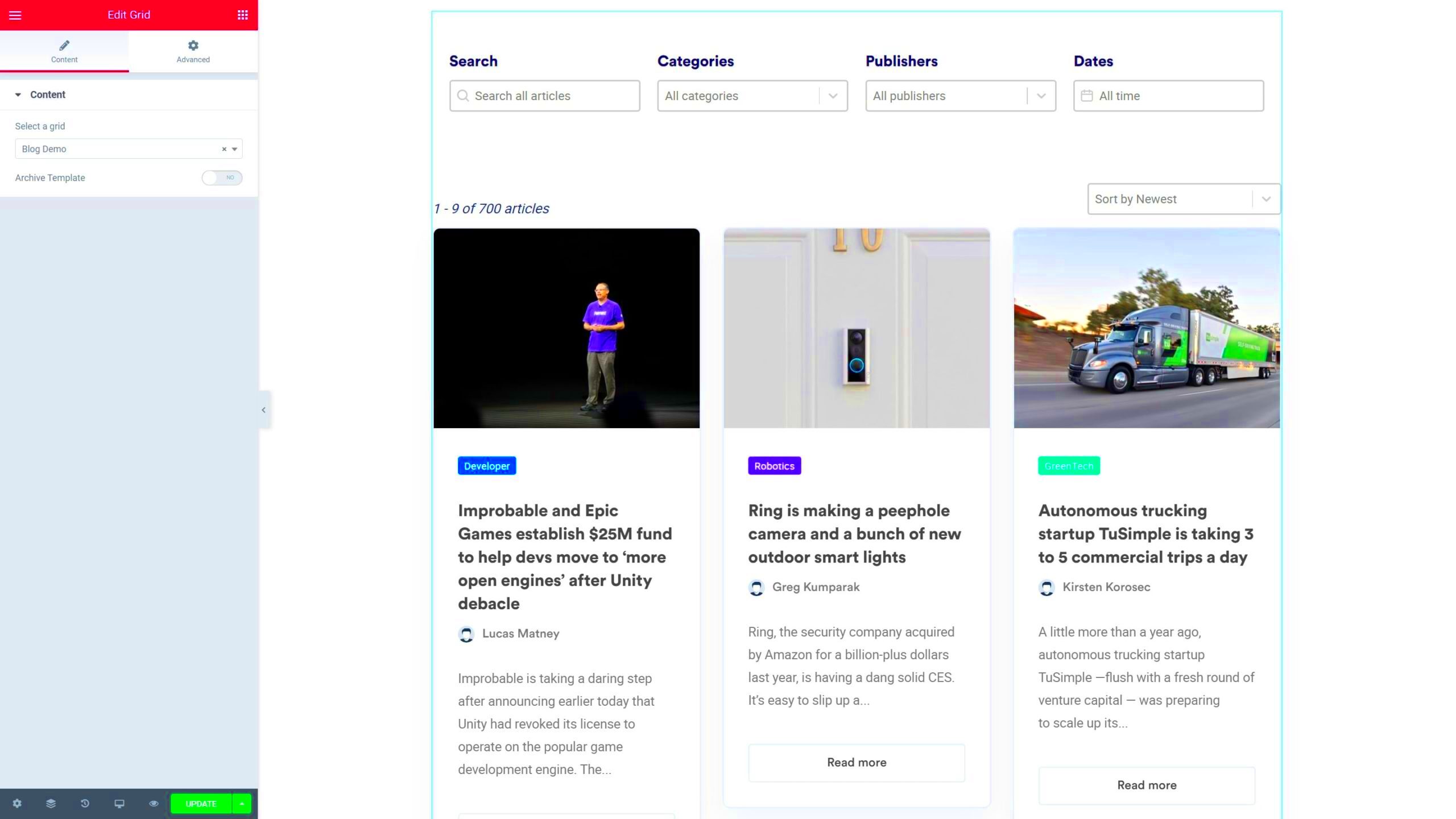
Grids in Elementor are essential for organizing content in a visually pleasing way. They help ensure that elements are aligned, spaced, and presented effectively, which is crucial for user experience and engagement. Here’s a breakdown of why grids are valuable and how they function in Elementor:
- Structure and Organization: Grids provide a structured layout, making it easier for visitors to navigate your site. When content is organized neatly, it prevents confusion and encourages users to explore further.
- Responsive Design: With grids, your layouts adapt seamlessly to different screen sizes. Elementor automatically adjusts grid elements so they look great on desktops, tablets, and mobiles.
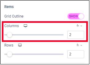
- Customizable Columns: Elementor allows you to set custom column widths, enabling you to highlight specific content. You can easily adjust the number of columns for desktop or mobile views.
- Drag-and-Drop Feature: The intuitive interface of Elementor lets you rearrange grid elements by simply dragging and dropping them, making it super easy to experiment with layouts.
Understanding how grids work within Elementor is crucial for any website designer. By leveraging these grids effectively, you can create a professional-looking site that captures attention and keeps visitors engaged. So, let’s explore how to make adjustments to optimize your grid displays even further!
Benefits of Customizing Grid Displays
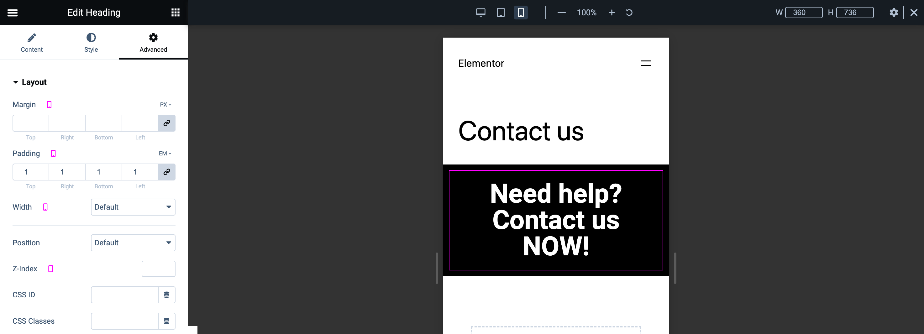
When it comes to presenting your content on a WordPress website, how you display that content can make all the difference. Customizing grid displays using Elementor can significantly enhance user experience, aesthetics, and functionality. Here are a few key benefits:
- Improved User Engagement: A well-structured grid layout makes it easier for visitors to navigate through your content. When information is organized neatly, users are more likely to engage with it, leading to lower bounce rates and higher interaction time.
- Enhanced Aesthetics: Custom grid displays allow you to maintain a consistent visual style across your website. This visual coherence not only makes your site more appealing but also reinforces your brand identity, making it more memorable for users.
- Better Content Organization: Grids help categorize content, allowing users to quickly find what they’re looking for. This is especially beneficial for sites with a lot of content, like blogs or e-commerce stores, where intuitive navigation is crucial.
- Responsive Design: With Elementor’s grid customization, you can ensure your display adapts beautifully across different devices. Mobile responsiveness is essential today, as more people are accessing websites on their phones and tablets.
- SEO Benefits: A well-customized grid can enhance your site’s SEO by improving load times and user engagement metrics. Search engines reward sites that offer good user experiences, potentially boosting your visibility in search results.
Whether you’re running a personal blog or a professional business page, customizing your grid displays can lead to a more effective and enjoyable user experience.
Step-by-Step Guide to Adjusting Grid Settings
If you’re ready to dive into customizing your grid settings with Elementor, you’re in for a treat! Follow these steps to optimize your layouts:
- Access Your Elementor Editor: Start by logging into your WordPress dashboard. Navigate to the page or post where you want to edit the grid display. Click on “Edit with Elementor” to launch the editor.
- Add a New Section: Click on the “+” button to add a new section. You can choose a single column or multiple columns depending on how many grid items you want to feature.
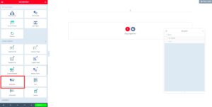
- Insert a Widget: Drag and drop the “Posts” or “Portfolio” widget from the Elementor panel into your newly created section. This will allow you to display your content in a grid format.
- Customize Layout Settings: Under the “Layout” tab in the widget settings, adjust the layout type to “Grid.” Here you can also modify the number of columns and the space between items to suit your design.
- Style Your Grid: Switch to the “Style” tab to personalize the appearance of your grid. You can change colors, typography, spacing, and even the hover effects to enhance the visual appeal.
- Responsive View: Don’t forget to check how your grid looks on different devices. Use Elementor’s responsive editing feature to ensure everything looks great on desktops, tablets, and mobiles.
- Save Changes: Once you’re satisfied with your grid display, hit the “Update” button to save your changes. Don’t forget to preview the page to see how everything looks!
With these steps, you can create an engaging and visually attractive grid layout that grabs the attention of your visitors and keeps them coming back for more!
Utilizing Elementor’s Advanced Features for Grids
Elementor is more than just a drag-and-drop page builder; it comes packed with a suite of advanced features that can really enhance the display of grids on your WordPress site. Whether you’re creating a gallery, portfolio, or a simple product display, these features can elevate your design game. Let’s dive into some of the more advanced capabilities that Elementor offers.
1. Dynamic Content: With Elementor Pro, you can utilize dynamic content to pull in data from the WordPress database. This means you can create grids that automatically populate with blog posts, products, or other content types, making your grids not only attractive but also functional.
2. Custom CSS: If you’re familiar with CSS, Elementor allows you to add custom styles directly to your grids. This means you can tweak colors, adjust margins, and even implement hover effects that go beyond the default settings.
3. Responsive Controls: One of the best things about Elementor is its responsive design options. You can customize how your grids look on different devices, ensuring they look great whether viewed on a desktop, tablet, or mobile phone. Adjust column widths, set breakpoints for layouts, and adjust image sizes so nothing is left to chance.
4. Advanced Background Options: Make your grids stand out with Elementor’s background settings. You can add overlays, gradients, and even videos as backgrounds for your grid items, offering a more engaging visual experience.
5. Animation Effects: To add a little flair, Elementor allows you to apply animation effects to your grid items. You can choose from entrance effects, hover animations, or even scrolling effects, enhancing user engagement.
By utilizing these advanced features, not only can you create visually stunning grids, but you can also enhance their functionality and user experience.
Common Issues and Troubleshooting Tips
Using Elementor to create beautiful grids is generally straightforward, but like any tool, you might run into a few snags along the way. Here’s a rundown of common issues you might face and some handy troubleshooting tips to help you resolve them quickly.
1. Grids Not Displaying Correctly: One frequent issue users encounter is grids not displaying as intended. This can happen due to conflicts with other plugins or themes. Solution: Try disabling other plugins one by one to see if that resolves the issue. If you’re using a complex theme, consider switching to a simpler one temporarily to identify the culprit.
2. Responsive Issues: Sometimes, grids look great on desktop but break on mobile or tablet. Solution: Always use Elementor’s responsive editing tools. Ensure you check each device’s preview and adjust column widths or stack settings accordingly.
3. Slow Loading Grids: If your grids are slow to load, it might be due to large image sizes. Solution: Make sure your images are optimized for web use. Use tools like TinyPNG or JPEGmini to compress images without losing quality.
4. Custom CSS Not Working: If you apply custom CSS and it doesn’t affect your grid, it might be overridden by other styles. Solution: Use the browser’s developer tools to inspect elements. Make sure your CSS is loaded after other styles or use more specific selectors to ensure it takes precedence.
5. Browser Compatibility Issues: Occasionally, you might notice elements display differently across browsers. Solution: Test your page in different browsers like Chrome, Firefox, and Safari. If you spot inconsistencies, consider adding browser-specific CSS or using a fallback option for unsupported features.
Don’t let these common issues deter you! With a bit of patience and these troubleshooting tips, you can keep your WordPress grids looking fantastic with Elementor.
7. Best Practices for Grid Layouts
When it comes to designing grid layouts with Elementor in WordPress, following some best practices can make all the difference. A well-structured grid not only enhances the visual appeal of your site but also improves usability and engagement. Here are some key considerations:
- Keep it Simple: Avoid overcrowding your grid with too many elements. A clean layout helps guide the viewer’s attention to what matters most.
- Consistent Sizing: Ensure that all your grid items maintain uniform dimensions. This creates a cohesive look and feels less chaotic. Using the same height for all blocks is often beneficial.
- Responsive Design: Remember that users access websites from various devices. Choose a responsive grid layout that adapts to different screen sizes automatically.
- Hierarchy Matters: Establish visual hierarchy through font sizes, colors, and spacing. Important elements should stand out while complementary ones blend into the layout.
- White Space is Your Friend: Don’t underestimate the power of white space. Adequate padding around elements can improve readability and reduce clutter.
Additionally, consider using a grid preview feature to assess how your layout looks before going live. Implementing these best practices helps to create an engaging and user-friendly grid layout that enhances both aesthetics and functionality.
8. Conclusion: Enhancing Your WordPress Site with Custom Grids
In conclusion, leveraging custom grids in Elementor can significantly enhance your WordPress site. By experimenting with grid layouts, you’ll not only improve the visual appeal but also contribute to a more engaging user experience.
Here’s why you should start using custom grids:
- Increased Organization: Custom grids allow you to present content in a well-structured way, making it easier for visitors to find what they’re looking for.
- Creative Freedom: With a myriad of design options at your disposal, you can truly express your brand’s personality. Whether you prefer minimalistic designs or vibrant aesthetics, the choice is yours.
- Enhanced Responsiveness: By understanding how your grid adapts to different screens, you can provide a seamless experience for all users, regardless of device.
- Improved SEO: A well-organized grid layout can positively impact your site’s SEO. By improving user engagement, you decrease bounce rates and increase the likelihood of conversions.
Overall, customizing grids in Elementor is a game changer for your WordPress site. With some patience and practice, you can transform your grid displays into stunning and functional masterpieces that leave a lasting impression on your audience.

