Elementor Pro is a powerful WordPress page builder that empowers users to create stunning websites without needing to know a single line of code. One of its standout features is its ability to beautifully display various content types, and post categories are no exception. Organizing your blog posts into categories not only helps enhance user experience but also boosts SEO by providing clear pathways for search engines.
In this blog post, we’ll explore how to effectively display horizontal post categories using Elementor Pro. Whether you’re a seasoned WordPress developer or a newbie, you’ll find it easy to segment and showcase your content in a way that’s engaging and visually appealing.
Why Use Horizontal Post Categories?

Displaying post categories horizontally can significantly improve the navigability of your website. Let’s dive into some compelling reasons why you should consider this layout:
- Enhanced User Experience: A horizontal layout allows users to quickly scan and identify topics of interest, making it easier for them to navigate your site.
- Visual Appeal: Lots of websites use vertical lists, so a horizontal display can set your site apart. It adds a modern touch that can make your content more attractive.
- Space Optimization: Horizontal categories can fit better in the available space, especially for websites with limited vertical room. You can display more categories without making the design feel crowded.
- Improved Engagement: Easy navigation encourages users to explore more of your content. This can lead to increased page views and a lower bounce rate.
In conclusion, adopting a horizontal post categories layout not only makes your website more user-friendly but also enhances its overall design. Let’s move forward and see how you can implement this using Elementor Pro!
Setting Up Your Elementor Environment

Before diving into the heart of displaying horizontal post categories using Elementor Pro, it’s essential to ensure that your Elementor environment is properly set up. This not only enhances your workflow but also guarantees that you can take advantage of all the powerful features that
First things first, make sure you have both the free version of Elementor and Elementor Pro installed on your WordPress website. The Pro version is crucial as it provides advanced widgets and functionalities that the free version lacks. Here’s a quick checklist to help you set things up:
- Update WordPress: Ensure your WordPress installation is up to date for the best compatibility.
- Install Elementor and Elementor Pro: You can find Elementor in the Plugins section of your WordPress admin. For Pro, you’ll need to upload it manually after purchasing.
- Activate Your License: After installing Elementor Pro, don’t forget to activate your license key to enjoy all premium features.
- Choose a Compatible Theme: Select a WordPress theme that works well with Elementor. Themes like Hello Elementor are specifically designed for this plugin.
Once you’ve set up your environment, take a moment to explore Elementor’s dashboard. Familiarize yourself with the various widgets, templates, and settings. This foundational step will make it much easier to create beautiful layouts, including those horizontal post categories!
Creating a New Section for Categories
Now that your Elementor environment is ready to rock, it’s time to create a new section where you’ll display your post categories horizontally. Creating a dedicated section will help in organizing your layout and ensure that your categories easily catch the eye of your visitors.
Here’s how to create a new section effectively:
- Open Elementor: Navigate to the page where you want to add the category section and click on “Edit with Elementor.”
- Add a New Section: Click on the ‘+’ icon to create a new section. You can choose between a single-column or multi-column layout depending on your design preference.
- Adjust Section Settings: Once the section is created, adjust the section settings. Click the gear icon in the lower left corner to set your section’s width, height, and background color.
- Insert a Widget: After your section is ready, locate the “Post Categories” widget in the Elementor panel. Drag and drop it into your new section.
- Style your Categories: With the widget selected, navigate to the ‘Style’ tab. Here, you can customize colors, typography, and spacing to match your site’s aesthetic.
By following these steps, you’ll be well on your way to creating an inviting section that showcases your post categories beautifully. Feel free to experiment with different layouts and styles to make this section uniquely yours!
5. Using the Posts Widget in Elementor Pro
When it comes to displaying posts in Elementor Pro, the Posts Widget is your best friend! This powerful feature allows you to showcase your blog posts in a variety of layouts, making it an essential element for any website that prioritizes content. Whether you want a simple grid, a more elaborate masonry layout, or a traditional list view, this widget has got you covered.
To get started, simply drag and drop the Posts Widget onto your desired section in Elementor. After that, you’ll see a plethora of options available in the left panel. Here’s a quick rundown of what you can customize:
- Query Settings: Choose which posts to display based on category, tag, or even custom taxonomy.
- Layout Options: Select from multiple layouts like Classic, Cards, or Masonry.
- Pagination: Decide how many posts to show per page and include pagination if necessary.
- Post Excerpt: Control whether to display an excerpt, the full content, or just the title.
- Order Posts: Arrange your posts by date, title, or most popular.
Using the Posts Widget effectively can help draw attention to your blog content, enhance user experience, and optimize your site for better engagement. It’s undoubtedly one of the most versatile tools within Elementor Pro, making post display a breeze!
6. Customizing the Display of Post Categories
Customizing the display of post categories in Elementor Pro is not only about aesthetics but also about improving navigation for your visitors. When you enable users to effortlessly find content that interests them, you enhance their overall experience on your site. Here are some nifty ways to make your post categories shine!
First off, you can utilize the Posts Widget’s settings to filter which categories to show. This is particularly useful if you have a blog with diverse topics and want to highlight specific categories. Here’s how to do it:
- Open the Posts Widget in Elementor.
- Narrow down your selection by adjusting the Categories filter.
- Opt for displaying categories with a specific number of posts using Post Count.
Moreover, don’t forget about styling! You can easily change the layout, colors, and typography to match your site’s branding. Here’s a quick table of customization options:
| Customization Type | Options |
|---|---|
| Layouts | Grid, List, Masonry |
| Text Color | Primary, Secondary, Custom |
| Hover Effects | Zoom, Fade, Lift |
| Buttons | Customize shape, size, and color |
Remember, the key to effective customization is understanding your audience. Play around with different styles until you find what resonates best with your visitors. Once you master these customizations, your post categories will stand out and be both functional and eye-catching!
Styling Horizontal Categories with Custom CSS
When it comes to styling your horizontal post categories in Elementor Pro, custom CSS can play a pivotal role in making your website not just functional, but visually appealing too. You have already laid the groundwork by creating your horizontal categories. Now, let’s delve into the exciting world of CSS to give those categories a unique flair!
First off, it’s essential to understand that CSS (Cascading Style Sheets) allows you to customize the look of HTML elements. Here are some areas where you can apply your CSS magic:
- Font Style: Change the font, size, and weight of your category text to align with your branding.
- Colors: Set the background, hover effects, and text colors to ensure your categories stand out.
- Paddings and Margins: Adjust these to create ample space between your categories for a cleaner presentation.
- Borders and Shadows: Adding borders or shadows can help elevate the visual hierarchy of your categories.
Here’s an example of some custom CSS to get you started:
.category-title { font-family: 'Arial', sans-serif; font-size: 18px; color: #333; padding: 10px 15px; margin: 5px; background-color: #f5f5f5; border-radius: 5px; transition: background-color 0.3s;}.category-title:hover { background-color: #e0e0e0;}
Simply copy-paste this into the custom CSS section in Elementor, and you’ll see immediate changes! Remember, styling isn’t just about aesthetics; it’s key to improving the user experience. Don’t hesitate to experiment and create a layout that truly represents your style!
Implementing Dynamic Tags for Post Categories
Dynamic tags are a fantastic feature within Elementor Pro that can significantly enhance the functionality of your post categories. What are dynamic tags, you ask? To put it simply, they allow you to pull specific data from your WordPress site dynamically. For instance, you can automatically display post categories, titles, author names, and even publish dates without having to do it manually every time!
So, how do you implement dynamic tags for your post categories? Let’s break it down step-by-step:
- Edit Your Section: Begin by clicking on the section or widget where you want to display your post categories.
- Add Dynamic Tag: Look for the ‘Dynamic’ icon next to the option you’re editing. Click it, then select ‘Post Terms’, and choose ‘Categories’ to connect your tags.
- Customize Your Display: Once you’ve added the dynamic tag, use the styling options to customize how it looks. This can include changing its color, size, and even adding icons if you like!
- Preview Changes: Always preview your changes to ensure everything looks good and functions correctly.
With dynamic tags, you’ll not only save time, but you’ll also create a more interactive and engaging experience for your users. Rather than hardcoding each category, you’re allowing your design to showcase real-time data, making it a breeze to manage your content!
9. Responsive Design Considerations
When creating a website, ensuring that your content is optimized for various devices is crucial. Responsive design is all about creating a consistent experience for users, be it on a desktop, tablet, or smartphone. With Elementor Pro, implementing responsive design elements while displaying horizontal post categories becomes a smooth process.
Here are some essential considerations to keep in mind:
- Breakpoints: Elementor allows you to set specific breakpoints for different devices. Make sure to adjust your post categories’ layout for mobile, tablet, and desktop views. This ensures that your design adapts smoothly at various screen sizes.
- Content Size: As you display horizontal post categories, consider the width of your content. Use percentages rather than fixed pixel sizes to let your layout be flexible across different devices.
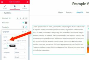
- Font Sizes: Keep an eye on font sizes. What looks good on a desktop might be too small or too large on mobile. Use Elementor’s responsive typography settings to adjust sizes appropriately.
- Padding and Margins: Space matters! Check that the padding and margins of your categories are consistent on all devices. This helps maintain a clean look, even when viewed on smaller screens.
- Touch-Friendly Elements: Ensure that your buttons and links are large enough to be tapped comfortably on mobile devices. This enhances user experience significantly.
By considering these points, you’ll create a compelling and user-friendly interface for anyone accessing your site, no matter their device.
10. Finalizing and Previewing Your Layout
So, you’ve crafted your horizontal post categories in Elementor Pro, and now you’re at the exciting stage of finalizing and previewing your layout! This is where you get to see how all your hard work comes together. Here are some steps to ensure everything is just right:
- Save Your Changes: Before you dive into the preview, always save your changes. It might sound basic, but it’s essential to prevent losing any modifications you’ve made.
- Preview in Elementor: Use the preview feature in Elementor to view how the layout looks live. Just click on the eye icon in the bottom left corner, and enjoy a sneak peek of your design.
- Check Responsiveness: After your initial preview, make sure to toggle between different device views (desktop, tablet, mobile). Confirm that your horizontal categories look great on all devices and that no elements are misaligned or overflowing.
- Make Adjustments: If you notice any issues, go back to your design and tweak settings as needed. Element adjustments may include shifting margins, fonts, or visibility options to tailor the user experience further.
- Final Review: Lastly, before going live, do a thorough review of the entire page. Check for any typos, broken links, or design flaws—little details make a big difference!
Once you’re satisfied, hit that publish button, and let your beautifully arranged horizontal post categories shine! You’ve worked hard, and now it’s time for the world to see your creative flair.
Troubleshooting Common Issues
When you’re trying to display horizontal post categories in Elementor Pro, you might encounter a few hiccups along the way. Don’t worry; most of these issues are pretty common and can be resolved with a little know-how. Below, we’ll walk through some of the frequent problems and how to troubleshoot them.
- Categories Not Appearing: If your categories are not showing up as intended, the first thing you want to check is whether the categories are assigned to your posts. Go to the post editing screen and ensure that your desired categories are checked.
- Styling Issues: Sometimes, the horizontal layout might not look right due to conflicting CSS with your theme. Ensure you’re not using custom CSS that can affect your Elementor settings. Clear the cache after making changes to see if it resolves the issue.
- Responsive Design Problems: If your categories look great on desktop but fall apart on mobile, check the responsive settings in Elementor. Go to the ‘Advanced’ tab and adjust the margin, padding, or font sizes specifically for mobile viewing.
- Performance Issues: If your website is running slowly when displaying categories, ensure you’re optimizing images and using a good caching solution. This can help improve load times significantly.
- Element Not Rendering: Sometimes, an Elementor widget may not render properly due to plugin conflicts. Deactivate other plugins one by one to find out if any might be causing the issue.
By understanding these troubleshooting steps, you can manage any problems with displaying horizontal post categories seamlessly. And remember, forums and community support are always there to lend a helping hand!
Conclusion
So, there you have it! Displaying horizontal post categories in Elementor Pro can elevate your website’s design and functionality, making it more engaging for your visitors. With the right tools and techniques, you can set this up easily and enhance your site’s overall user experience.
As we’ve explored, the key components include:
- Utilizing the Elementor Pro widgets effectively
- Customizing styles to match your brand
- Ensuring that your categories are well structured
- Knowing how to troubleshoot common issues
Implementing these strategies not only enhances visual appeal but also improves site navigation, helping your users find what they are looking for quickly. Don’t hesitate to get creative and experiment with the designs that cater best to your audience.
In conclusion, whether you’re a beginner or an experienced developer, mastering the display of horizontal post categories can make a significant difference in your site’s functionality and aesthetics. Happy designing!


