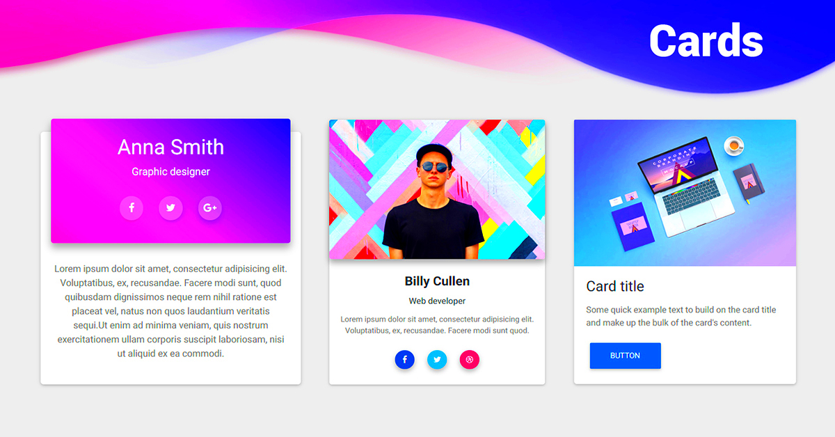
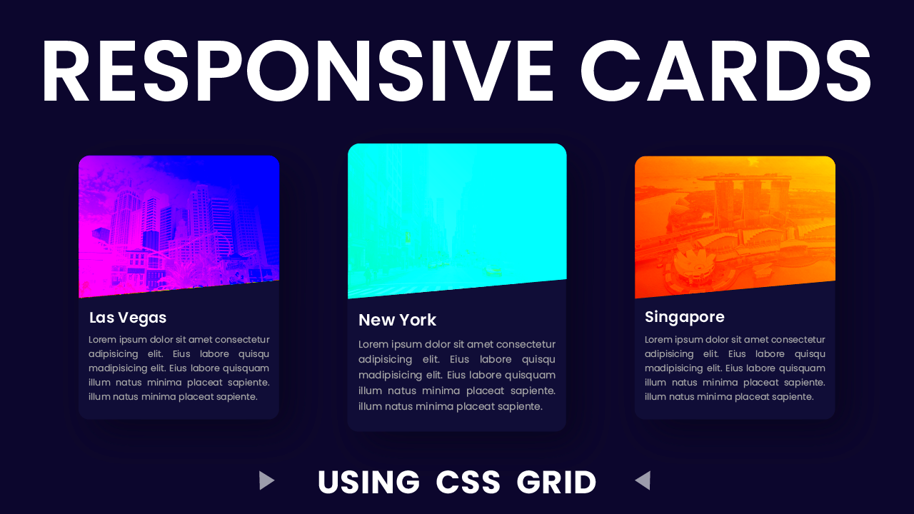
Half-size cards are a popular layout feature used to present content in a clean, organized, and visually appealing way. These cards are typically smaller than full-size cards but still offer enough space to display important information. They can be used for anything from product features to blog highlights or even team profiles. In WordPress, creating custom layouts with half-size cards is a great way to enhance your site’s design while keeping things simple and user-friendly. Let’s dive into how you can add these cards to your WordPress site and make your content stand out.
Why Use Half-Size Cards for Custom Layouts

Half-size cards offer several benefits when it comes to customizing layouts on WordPress. Here are some reasons why they are a great choice:
- Space Efficiency: These cards take up less space, making them ideal for websites with limited real estate. You can fit more content in a smaller area without overwhelming the user.
- Improved Visual Appeal: With their clean and modern look, half-size cards enhance the aesthetic of your website, making it more visually appealing to visitors.
- Better User Experience: By breaking up content into digestible pieces, half-size cards make it easier for users to browse your site and find the information they need quickly.
- Mobile Responsiveness: They are particularly beneficial for mobile-friendly websites. The compact design ensures that content is displayed effectively on all screen sizes.
Steps to Create Half-Size Cards in WordPress

Creating half-size cards in WordPress is a straightforward process, and with the right approach, you can have them set up in no time. Here’s how:
- Step 1: Choose a WordPress Theme
Start by selecting a theme that supports custom layouts or has a flexible page builder. Some themes come with pre-built card layouts, but others may require a bit of custom CSS to create half-size cards.
- Step 2: Use a Page Builder Plugin
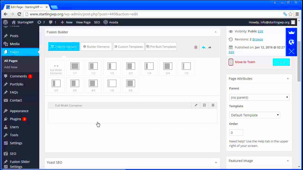
If your theme doesn’t have built-in support for custom layouts, consider using a page builder plugin like Elementor or WPBakery. These tools let you create custom layouts using drag-and-drop functionality.
- Step 3: Add Custom CSS
To create half-size cards, you may need to tweak the card’s size using CSS. Here’s a simple example of how to modify the width of the cards:
.half-size-card {
      width: 48%;
      margin: 1%;
      display: inline-block;
    }
This CSS will create cards that are half the width of their container, leaving some space between them.
- Step 4: Add Content
Once your cards are sized, you can begin adding your content. This could be anything from images and text to buttons or icons. Make sure to keep the content simple and focused to make the most out of the limited space.
- Step 5: Customize and Test
Adjust the look and feel of the cards to match your website’s design. Test the layout across different devices to ensure the cards are responsive and look good on mobile and desktop screens.
Choosing the Right Theme for Custom Layouts
When it comes to designing your WordPress website, choosing the right theme is crucial. A theme sets the foundation for how your site looks and functions, especially when you’re aiming for custom layouts like half-size cards. Some themes come with built-in options for custom grids, card layouts, and responsive design, making your job much easier. Here’s what to look for when selecting a theme for custom layouts:
- Responsive Design: Ensure the theme is fully responsive, meaning it will adapt to all screen sizes, from mobile phones to large desktop monitors.
- Customization Options: Choose a theme that offers flexibility in customization. Look for themes with easy-to-use options for adjusting layout, typography, and color schemes without needing to write too much custom code.
- Page Builder Compatibility: If you want to drag and drop elements to create custom layouts, make sure the theme is compatible with popular page builders like Elementor, WPBakery, or Gutenberg.
- Built-in Grid Layouts: Some themes come with built-in grid layouts that make creating custom card layouts easier. These can save you time and effort in coding.
- Regular Updates and Support: Opt for themes that are regularly updated and come with solid customer support. This ensures that your site remains secure and compatible with the latest WordPress updates.
Taking the time to pick the right theme will make your job much easier as you create beautiful, customized half-size card layouts. Don’t forget to check the theme’s demo before making your final decision to see how it handles custom designs.
Customizing Half-Size Cards with CSS
Customizing half-size cards using CSS allows you to fine-tune the design to fit your website’s unique style. Whether you’re adjusting the card’s size, adding hover effects, or styling the content inside, CSS offers powerful control over every element. Let’s look at how you can customize half-size cards:
- Adjusting Card Width: The most basic customization involves changing the width of the cards. Here’s a simple example to set the cards to half the container width:
.half-size-card {
    width: 48%;
    margin: 1%;
    display: inline-block;
  }
This makes the cards fit neatly next to each other in a grid format.
.half-size-card:hover {
    transform: scale(1.05);
    transition: transform 0.3s ease;
  }
This gives a subtle animation effect when users move their cursor over the card.
.half-size-card .card-content {
    padding: 15px;
    text-align: center;
  }
This simple rule adds padding inside the card and centers the text, making it look more polished.
@media (max-width: 768px) {
    .half-size-card {
      width: 100%;
    }
  }
This will stack the cards vertically on smaller screens, ensuring that the layout remains user-friendly on mobile devices.
With just a few lines of CSS, you can create a truly customized look for your half-size cards that fits seamlessly with your overall site design.
Best Plugins to Enhance Card Layouts
Plugins are a great way to extend the functionality of your WordPress website without the need for custom coding. When it comes to enhancing card layouts, there are several plugins that can help you create beautiful, interactive, and fully customizable cards. Here are some of the best plugins to enhance your card layouts:
- Elementor: This popular page builder plugin is perfect for designing custom card layouts. With Elementor’s drag-and-drop editor, you can easily create half-size cards and customize their design without writing any code. It also offers a variety of widgets like image galleries, buttons, and text boxes that can be added to the cards.
- WPBakery Page Builder: Another popular page builder, WPBakery allows you to build custom grid layouts with ease. It has built-in elements like images, text, and buttons that can be used to create professional-looking half-size cards.
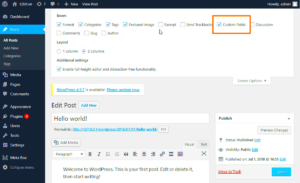
- Advanced Custom Fields: If you need more flexibility, the Advanced Custom Fields plugin allows you to create custom fields for your cards. You can add unique content and design elements for each card, making them more dynamic and tailored to your needs.
- Card Layout for Gutenberg: For those using the Gutenberg editor, this plugin allows you to easily create beautiful card layouts within posts and pages. It’s ideal if you want to avoid third-party page builders and prefer staying within WordPress’ native editor.
- WP Card Slider: If you want to create card carousels or sliders, this plugin offers a simple way to display your cards in a slideshow format. It’s perfect for displaying multiple products, blog posts, or team members in a dynamic, engaging way.
Using these plugins, you can enhance your card layouts, making them more interactive and visually appealing while ensuring they fit perfectly into your WordPress website’s design.
Testing and Optimizing Your Layout
Once you’ve created your half-size card layout in WordPress, the next crucial step is testing and optimization. This ensures that your design not only looks great but also performs well across different devices and screen sizes. Proper testing helps you identify potential issues before they impact your users’ experience. Here’s how you can optimize and test your layout:
- Test for Mobile Responsiveness: Use tools like Google’s Mobile-Friendly Test or simply resize your browser window to see how the layout adapts on smaller screens. Make sure that the cards stack properly on mobile devices and maintain readability.
- Check Cross-Browser Compatibility: Different browsers may render your design slightly differently. Test your layout on popular browsers like Chrome, Firefox, Safari, and Edge to ensure a consistent experience across all platforms.
- Optimize Loading Speed: Half-size cards often contain images or multimedia, so it’s important to optimize them for faster loading. Use plugins like WP Smush to compress images or enable lazy loading to improve site performance.
- Use Caching: Implement caching plugins such as W3 Total Cache to ensure your site loads faster, especially on repeat visits. This will help with the overall user experience, reducing load times for visitors.
- Test User Interaction: Make sure that interactive elements like buttons, links, and hover effects work as expected. Test the functionality on different devices to ensure they are responsive and trigger the desired action.
By following these steps, you can optimize your half-size card layout for performance, speed, and usability, ensuring a smooth experience for your visitors.
FAQ
Here are some frequently asked questions about creating and optimizing half-size card layouts in WordPress:
- What is the best way to display half-size cards on mobile?
Use responsive design techniques like media queries to adjust the card layout for smaller screens. You can stack the cards vertically or adjust their size to ensure they display well on mobile devices.
- Can I use any theme for custom layouts?
While most themes can be used for custom layouts, it’s best to choose a theme that offers flexibility or integrates well with page builder plugins. This allows you to easily create and adjust card layouts without needing custom code.
- Do I need coding knowledge to create half-size cards?
Not necessarily. With plugins like Elementor or WPBakery, you can create half-size cards without writing code. However, some basic CSS can help you achieve more control over the layout and design.
- How can I improve the visual appeal of my half-size cards?
Focus on clean design, ample white space, and high-quality images. You can also add hover effects, smooth transitions, and use colors and typography that align with your brand for better aesthetics.
- What plugins help in customizing card layouts?
Plugins like Elementor, WPBakery Page Builder, and Advanced Custom Fields are excellent for customizing and creating card layouts. They provide you with powerful tools and flexibility for building visually appealing cards.
Conclusion
Creating half-size cards in WordPress is an excellent way to improve the design and functionality of your site. They provide a visually appealing way to showcase content without overwhelming your visitors. With the right theme, customization tools, and testing strategies, you can ensure that your card layouts are not only attractive but also fully optimized for user experience and performance.
Remember, the key is to keep things simple, maintain consistency, and test your layout across different devices and browsers. Whether you’re showcasing products, blog posts, or team members, half-size cards are a versatile design choice that can enhance your site’s overall look and feel.
By following the steps outlined in this guide, you’ll be able to create engaging, responsive, and visually stunning half-size cards that will impress your visitors and boost user interaction.


