Introduction to Imgflip Pie Chart Maker

The Imgflip Pie Chart Maker is a user-friendly online tool that enables you to create custom pie charts quickly and share them easily. With a simple interface, you can input data, customize colors, and even add labels to ensure your charts convey the right message. Ideal for presentations, reports, or social media, this tool makes data visualization accessible to everyone, regardless of technical skill. Whether you’re a student, teacher, or professional, you can turn numbers into captivating visuals in no time.
Why Use Pie Charts for Data Presentation

Pie charts are a popular method for displaying data because they provide a clear and visual representation of how parts contribute to a whole. Here are some reasons to consider using pie charts:
- Easy to Understand: Pie charts simplify complex data, making it easy for viewers to grasp proportions at a glance.
- Visual Appeal: With vibrant colors and distinct sections, pie charts capture attention, making your data presentation more engaging.
- Effective for Comparisons: They allow for quick comparisons of different categories within a dataset, helping audiences quickly discern differences.
- Encourages Interactivity: Utilizing tools like Imgflip allows you to share charts that are interactive, enabling users to hover or click for more details.
- Versatile Application: Pie charts can be used across various fields, including business, education, and social media to illustrate everything from sales data to survey results.
In summary, pie charts not only enhance data clarity and engagement but also help audiences to remember and understand key information more effectively.
Step-by-Step Guide to Creating a Pie Chart
Creating a pie chart can seem daunting at first, but with the Imgflip Pie Chart Maker, it’s a breeze! Follow this simple step-by-step guide to make your own pie chart in no time:
- Visit the Imgflip Pie Chart Maker: Start by going to the Imgflip website. Look for the Pie Chart Maker tool; it’s usually easy to locate from the homepage.
- Input Your Data: In the provided fields, enter the categories and their respective values. For example, if you want to represent favorite fruits, you might input:
- Apples – 30
- Bananas – 45
- Oranges – 25
- Adjust the Colors: Choose different colors for each segment of your pie chart. This personalization helps to make your chart visually appealing and easier to read!
- Preview Your Chart: Hit the preview button to see how your pie chart looks. This is your chance to make any changes before finalizing.
- Generate the Chart: Once you’re happy with the design, click the create button. Your pie chart will be generated instantly!
- Download or Share: You can now download your pie chart image or share it directly to social media platforms. Imgflip makes it easy for you to spread the fun!
And voila! You’ve created a pie chart that’s ready to impress. Now let’s move on to how you can customize it further.
Customizing Your Pie Chart
One of the best features of the Imgflip Pie Chart Maker is its customization options. Tailoring your pie chart not only enhances its aesthetic appeal but also helps convey your message more effectively. Here’s how you can make it uniquely yours:
- Color Selection: Play around with the colors of each pie section. Use contrasting colors for better visibility, or stick to a palette that matches your brand or event theme.
- Labels and Percentages: Choose whether you want to display labels on your chart. You can add the percentage of each section to make it easier for viewers to understand the data at a glance.
- Background Options: Imgflip allows you to customize the background of your pie chart. A subtle gradient or solid color can make your chart stand out, especially in presentations or on social media.
- Fonts and Styles: Customize your font types and sizes for any labels. Different fonts can convey different vibes—friendly, formal, playful, or serious!
- Export Formats: When your customization is finished, choose how you want to save your pie chart. Imgflip supports various formats, including PNG and JPEG, allowing flexibility depending on your use case.
By taking advantage of these customization features, you can create pie charts that not only inform but also catch the eye. Have fun experimenting with different styles and make your data pop!
How to Share Your Pie Chart
Once you’ve created a fun and engaging pie chart using Imgflip, you’ll likely want to share it with friends, colleagues, or your audience. Luckily, Imgflip makes it super easy to share your creations! Here are a few effective ways to get your pie chart out there:
- Direct Link: After you finish customizing your pie chart, you’ll see an option to get a direct link. Simply copy this URL and paste it wherever you’d like to share it, whether in an email, social media post, or text message.
- Download and Share: Imgflip allows you to download your pie chart as a PNG or GIF file. You can save it directly to your device and share it like any other image through social platforms or upload it to forums.
- Social Media: Use the built-in sharing buttons to post your pie chart directly to platforms like Facebook, Twitter, or Instagram. This is a great way to engage your followers and promote fun interactions.
- Collaborate: If you’re working on a project or with a group, you can share your pie chart via platforms like Google Drive or Dropbox. This way, everyone involved can view or even edit the chart if you give them access!
Regardless of how you choose to share it, don’t forget to ask for feedback! It’s always fun to see how others interpret your data and to initiate discussions about the insights you’ve shared.
Embedding Pie Charts in Blogs and Websites
Embedding your pie charts directly into your blog or website is a fantastic way to enhance your content and provide visual data for your viewers. Plus, it adds an interactive element that can keep readers engaged. Here’s how to do it seamlessly:
- Get the Embed Code: After creating your pie chart in Imgflip, navigate to the section where you can find the embed code. This is usually an HTML snippet that you’ll copy to your clipboard.
- Paste in Your HTML: Access the HTML editor of your blog or website. Depending on the platform you’re using (like WordPress, Blogger, etc.), you can usually find a section for HTML or “Text” mode. Paste your code where you want the pie chart to appear.
- Adjust Size and Alignment: You may want to tweak the width and height attributes in your embed code to fit the design of your site. Also, consider setting the alignment so it looks cohesive with your text.
- Test Before Publishing: Always preview your post or page before making it live. Ensure the pie chart appears correctly and that it’s visually appealing alongside your other content.
By embedding your pie charts, you can statistically tell stories that are both compelling and easy to understand, helping your audience grasp key insights at a glance!
Examples of Creative Pie Charts
When it comes to pie charts, creativity can really make your data pop! Here are some fun and imaginative examples that can inspire your next project:
- Themed Pie Charts: Consider using themes that resonate with your audience. For instance, a pie chart showcasing the distribution of your time on various hobbies can be styled to look like a colorful cake, with each slice representing a different activity!
- Visual Metaphors: Instead of regular slices, use visuals that correspond to the data. For example, if you’re illustrating survey results about favorite fruits, why not make the pie chart look like an actual pie filled with fruit slices?
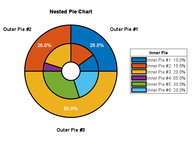
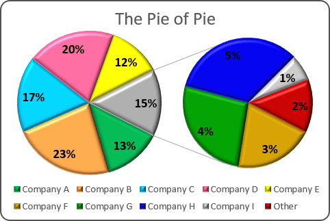
- Interactive Pie Charts: Platforms like Imgflip allow you to create interactive pie charts. Users can hover over sections to reveal more information, making data exploration engaging and fun!
- Textured Backgrounds: A plain white background can be boring. Why not add some texture or a soft gradient? This can add depth and make your pie chart stand out on a page filled with text!
- Color-Coded Separations: Use contrasting colors for your slices, but also consider using patterns or gradients within the slices to add a visual appeal. This not only looks cool but can help differentiate between segments more clearly.
Don’t be afraid to experiment! A well-designed pie chart can be both beautiful and informative, leaving a lasting impression on your audience.
Tips for Making Engaging Pie Charts
Creating a pie chart that grabs attention is easier than you might think. Here are some handy tips to ensure your pie charts are not only informative but also visually appealing:
- Keep It Simple: Avoid clutter. Your pie chart should clearly convey the data without overwhelming viewers. Stick to 3-5 segments for clarity.
- Use Contrasting Colors: Choose colors that stand out from one another. This will make it easier for your audience to distinguish between different sections of the pie chart.
- Label Wisely: Use short and clear labels to describe what each slice represents. If necessary, include a legend, but avoid overcrowding the chart with text!
- Think About Aspect Ratio: Make sure your chart isn’t too tall or too flat. A balanced pie chart is easier to read and looks more professional.
- Incorporate Data Visuals: Add data visuals such as percentages or icons that represent the data theme. Visuals can help viewers grasp the information quicker.
Lastly, always keep your audience in mind. Understanding what resonates with them will help you create engaging pie charts that effectively communicate your message!
Create and Share Fun Pie Charts with Imgflip Pie Chart Maker
Creating engaging visual content is essential in today’s digital landscape, and pie charts offer a fun and informative way to present data. With the Imgflip Pie Chart Maker, you can easily design, customize, and share pie charts that capture your audience’s attention.
The Imgflip Pie Chart Maker is user-friendly and allows anyone to produce charming pie charts in just a few steps. Here’s how you can get started:
- Access the Tool: Visit the Imgflip website and navigate to the Pie Chart Maker section.
- Input Data: Enter the data you want to visualize. This can be anything from survey results to favorite foods.
- Customize Your Chart: Choose colors, labels, and sizes. The maker allows you to personalize the aesthetics of your pie chart.
- Preview and Adjust: Review your chart in real-time. Make any necessary adjustments to ensure it looks perfect.
- Share or Download: Once satisfied, you can download your pie chart or share it directly to social media platforms.
Features of Imgflip Pie Chart Maker:
| Feature | Description |
|---|---|
| Customizable Colors | Select from a range of colors to suit your theme. |
| Label Options | Add labels to make your chart informative and clear. |
| Real-Time Preview | See changes instantly as you customize your chart. |
| Easy Sharing | Share your charts easily on social media or download them. |
In conclusion, the Imgflip Pie Chart Maker is an excellent tool for anyone looking to create and share visually appealing charts effortlessly. From generating insightful graphics for presentations to crafting fun visuals for social media, this tool caters to diverse needs while ensuring creativity is at the forefront. Unleash your creativity today and start making pie charts that stand out!


