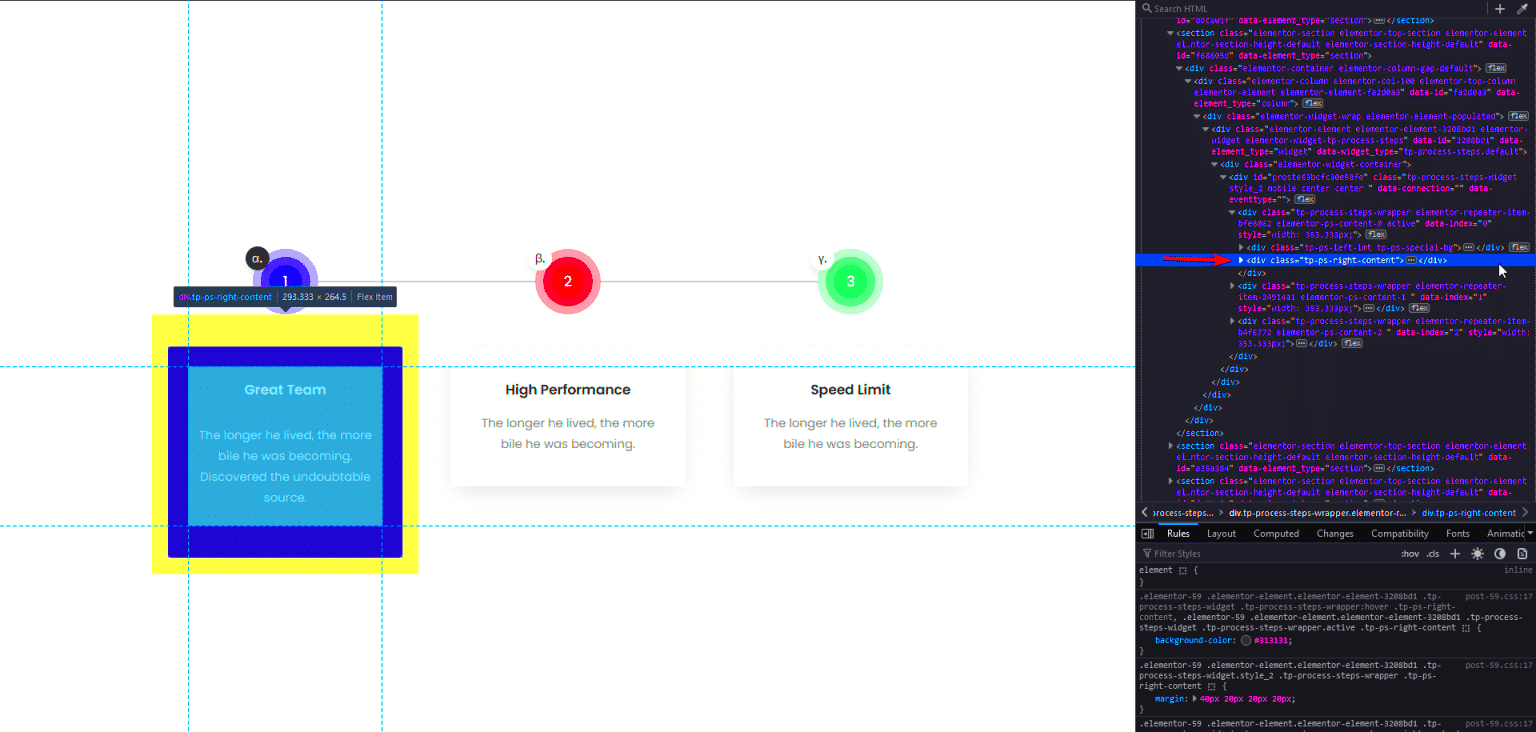
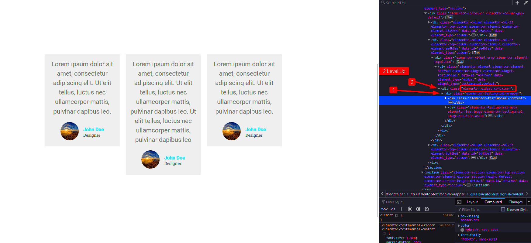
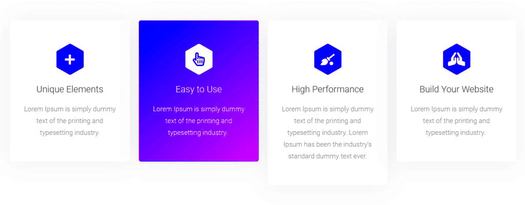
If you’re using Elementor for your web design, you might have come across some frustrating container height issues. You know, those moments when your content feels cramped or overly stretched? Don’t worry; you’re not alone! Many users find themselves battling with this aspect of Elementor, especially when it comes to maintaining a consistent look across different devices. In this post, we’ll dive deeper into the complexity of container heights and how to effectively manage them for a seamless design experience.
Understanding Elementor Widgets and Their Container Height

Elementor is a powerful page builder that allows you to create stunning websites with ease. However, one of the most critical aspects of working with Elementor is understanding how widgets function, especially regarding their container heights. Here’s what you need to know:
- What are Elementor Widgets?
Widgets in Elementor are individual components that make up your web page. They can include things like text blocks, images, buttons, and other elements.
- What is Container Height?
Container height refers to the vertical space that a widget occupies within its parent container. It’s crucial for creating a visually appealing layout that draws the reader’s eye.
- How Container Heights Work:
Elementor automatically adjusts container heights based on the content inside. However, this can sometimes lead to unexpected behaviors, such as:
- Widgets appearing too small or too large.
- Inconsistent spacing between elements.
- Content that spills over or gets cut off.
Understanding how Elementor manages these heights enables you to create responsive designs that look great on all devices. By paying close attention to your widget settings, margins, padding, and overall layout, you’ll be better equipped to tackle any container height issues that come your way.
3. Common Reasons for Container Height Problems

When working with Elementor, it’s not uncommon to experience container height issues. These problems can throw a wrench in the design process and lead to layout headaches. Let’s explore some of the most common culprits behind these pesky height problems.
- Content Overflow: Sometimes, the content inside your container may exceed the set height. This can happen due to larger images, lengthy text, or other dynamic elements that push the boundaries of your container.
- Padding and Margins: Excessive padding or margins can lead to unexpected height changes. If you’re adding too much space around your widgets, it can inflate the height of your container.
- Column Widths: If you’re using multiple columns, they might not be properly aligned. Mismatched heights in neighboring columns can cause the overall container height to appear inconsistent.
- Flexbox Settings: Elementor uses Flexbox to manage layout. If your container settings for Flexbox are misconfigured, it could result in unwanted height variations. Pay special attention to the “Align Items” and “Justify Content” settings.
- Custom CSS: If you’ve added any custom CSS to modify design elements, it might inadvertently impact container heights. A small typo could cascade into larger design flaws.
- Responsive Settings: Sometimes, settings adjusted for mobile or tablet views can affect the container height. Ensure that you check responsiveness settings to see if elements are stacking differently than intended.
Being aware of these common reasons can help you diagnose and fix container height problems swiftly, making your Elementor editing experience much smoother.
4. Checking Your Elementor Settings

To ensure that your containers look just right, it’s crucial to take a moment to check your Elementor settings. Ignoring these configurations might lead to unexpected layout issues.
Here’s a step-by-step guide to reviewing your settings:
- Access Section and Column Settings: Click on the section or column you want to inspect. Use the navigator if you have difficulty selecting elements directly.
- Check Layout Options: Go to the Layout tab. Here you can adjust the Height settings. Common options include:
- Default: Let the content dictate the height.
- Min Height: Set a minimum height to ensure container visibility.
- Fit to Screen: Make your container full-screen.
By meticulously reviewing your Elementor settings, you can pinpoint issues leading to container height problems and make necessary adjustments that enhance your page’s aesthetics.
Using Custom CSS to Set Container Height
When it comes to fine-tuning the height of containers in Elementor, custom CSS can be a powerful ally. By leveraging this feature, you can have full control over the appearance of your widgets, ensuring a seamless look that aligns perfectly with your design vision. Let’s break down how to effectively use custom CSS for setting container height.
First off, you’ll need to access the Elementor editor. Locate the widget whose container height you want to modify and click on it. Once you’re in the widget’s settings, go to the “Advanced” tab, where you’ll find the “Custom CSS” option (note that this is only available with Elementor Pro).
Here’s a simple example of how you can set a fixed height:
selector { height: 300px; /* Set the height you desire */}This snippet sets the height of the widget’s container to 300 pixels. You can adjust the value to suit your needs. But why stop there? You can also use percentages:
selector { height: 50%; /* Adjust height relative to the parent container */}Custom CSS also allows for advanced styling options, like setting a minimum height:
selector { min-height: 400px; /* Ensures the container has at least this height */}By using custom CSS effectively, you can ensure that your containers look just right across different devices and screen sizes. Just remember that testing is key—be sure to preview your changes to see how they affect the layout!
Utilizing Elementor’s Built-in Responsive Settings
One of the standout features of Elementor is its robust built-in responsive settings. This functionality allows you to customize the layout according to the device being used. Whether it’s a desktop, tablet, or mobile phone, you can ensure that your containers look fantastic on every screen.
To take advantage of this, head back to the Elementor editor and select the widget you want to customize. Under the “Layout” tab, you’ll find settings specifically designed to adjust the height of your containers responsively. For example, you can adjust the height for different devices like so:
- Desktop: Set a specific height or use padding to control the spacing.
- Tablet: Adjust the height, which might be different from the desktop version.
- Mobile: Set a height that works best for smaller screens to maintain usability.
To switch between devices, simply click on the responsive icons at the bottom of the Elementor panel. This allows you to preview how your adjustments look in real-time, which is incredibly helpful for ensuring a smooth user experience.
You can also use Elementor’s padding and margin settings to further adjust container heights. Just remember to test on multiple screen sizes to see how everything looks and behaves. With these tools, you can easily fine-tune your design and ensure that your widgets shine, no matter where they are viewed!
Applying Spacer Widgets for Height Adjustments
When it comes to creating the perfect layout in Elementor, achieving the right height for your containers can be a bit tricky. One of the most straightforward solutions to this common problem is using Spacer Widgets. This nifty little tool allows you to add empty space within your layout, which can effectively control the height of sections or containers without compromising the overall design.
So, how do you go about it? Here’s a quick guide:
- Drag and Drop: Start by dragging the Spacer Widget from the Elementor panel into your desired location.
- Adjust Height: Once it’s in place, you can easily set the height by adjusting the ‘Height’ field in the widget settings. This can be defined in pixels, percentage, or even VH (viewport height).
- Responsive Control: Another great feature is the ability to set different heights for mobile, tablet, and desktop views. Just click on the device icon next to the height option to tweak it as per your requirements.
Using Spacer Widgets not only aids in achieving the desired heights but also enhances the visual appeal of your design by ensuring that elements are well-distanced from one another. Just remember not to overdo it; too much spacing can create a disengaging experience for users. Keep it minimal and purposeful!
Advanced Techniques for Container Height Fixes
If you’ve mastered the basics of Elementor and are looking for more advanced techniques to fix container heights, you’re in luck! Here, we’ll explore a few strategies that can help you achieve that perfect look without sacrificing flexibility.
Custom CSS: If you’re comfortable with a little coding, adding some custom CSS can give you better control over your container heights. For instance:
.container-class { height: 500px; /* Fixed height */}
Remember, utilizing custom CSS allows you to apply more specific styles, and can be particularly helpful for unique design requirements across different screen sizes.
Using Flexbox: Elementor containers are inherently flexible, allowing you to use Flexbox settings for height adjustments. By setting a container to display: flex;, you can easily manipulate how child elements grow or shrink. Here’s how:
- Align Items: Use ‘Align Items’ to control how items are positioned along the cross axis.
- Justify Content: This setting allows you to distribute space between items effectively.
Minimum and Maximum Heights: Another often-overlooked option is controlling minimum and maximum heights within the advanced tab of your container settings. This lets you set boundaries for how tall or short the container can become as content changes.
By integrating these advanced techniques, you will not only make your layouts look polished and professional but also ensure optimal usability for visitors. So go ahead, get creative, and tailor your design to perfection!
9. Testing and Previewing Your Changes
When working with container heights in Elementor, one of the most crucial steps is testing and previewing your changes. This ensures that your adjustments are not only visually appealing but also functional across different devices. You might have the perfect height on a desktop, but what about the mobile or tablet views?
Here are essential tips for testing and previewing your changes:
- Use Preview Mode: Before publishing your changes, take advantage of Elementor’s preview mode. This allows you to see your modifications in action without them going live. Simply click the eye icon on the bottom left of the panel.
- Check Responsiveness: Elementor offers responsive editing tools. Switch between desktop, tablet, and mobile views to ensure that your container heights look great on all devices. Adjust heights as needed for each view.
- Test Different browsers: Not all browsers render HTML the same way. It’s a good practice to test on major ones like Chrome, Firefox, and Safari to check for inconsistencies.
- Real Devices Testing: Whenever possible, open your site on actual devices. Desktop emulators and mobile preview modes are helpful, but real-world testing can reveal subtle issues.
Lastly, after making changes, allow some time before finalizing everything. Sometimes, what looks good at first may require an additional tweak after refreshing your eyes on it. Remember, every detail matters!
10. Conclusion and Best Practices for Elementor Container Height Management
In conclusion, mastering container height management in Elementor can drastically enhance your website’s aesthetic and functionality. With containers serving as the foundation for your content, getting their height right is crucial for a balanced design.
Here are some best practices to keep in mind:
- Plan Your Layout: Before diving into adjustments, sketch out or plan how you want your layout to appear. A visual guide can streamline your work and help you maintain consistency.
- Utilize Global Styles: If you find yourself applying similar heights across various containers, consider using Elementor’s global styles. This reduces the repetitive strain of adjusting each widget individually.
- Keep Accessibility in Mind: Ensure that the height adjustments do not hinder the visibility and accessibility of your content. Give your users enough space to engage with your materials comfortably.
- Regular Updates: Elementor is consistently improving, and so is best practice in web design. Stay updated with the latest features and trends to refine your approach.
- Iterate Based on Feedback: Gather feedback from users or peers. Often, external perspectives can provide insights that you’ll miss when looking at your own work.
By following these practices, you not only improve the look of your site but also contribute to enhanced user experience and satisfaction. Remember, a well-managed design leads to a more engaging web presence!


