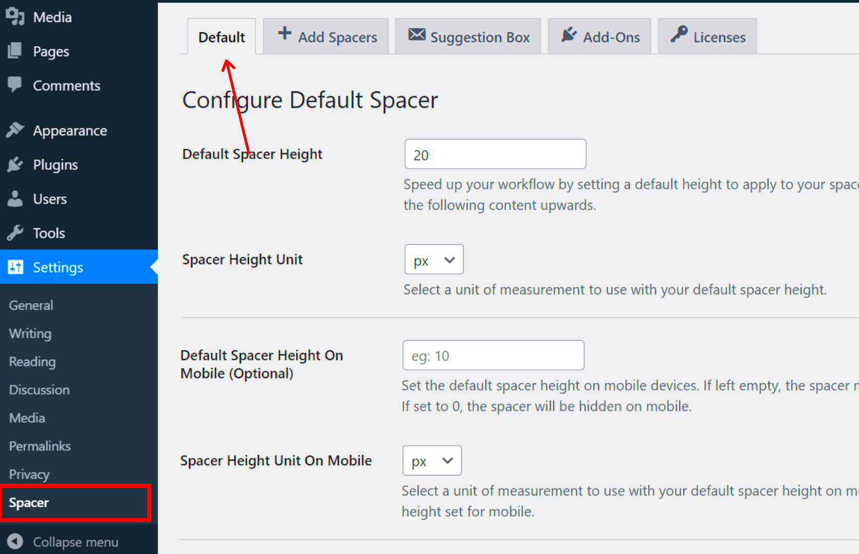
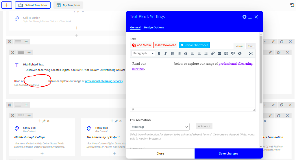
Line spacing, often referred to as leading, is a crucial aspect of typography that defines the vertical space between lines of text. In WP Bakery, a popular page builder for WordPress, adjusting line spacing can significantly enhance the visual appeal and readability of your content.
WP Bakery makes it easy to customize the line spacing in your text blocks. Here’s what you need to know:
- Default Settings: The standard line spacing in WP Bakery is usually set to a default value, which may not suit every design or layout.
- Customization Options: You can modify the line height through the design options for each text block. This allows for tailored spacing that fits your overall aesthetic.
- Effects on Content: Adjusting line spacing can help to emphasize certain sections of your text and create a more inviting atmosphere for readers.
To change line spacing in WP Bakery, you can follow these simple steps:
- Edit the text block where you want to adjust the spacing.
- Navigate to the design options.
- Look for the line height settings and adjust the value as needed.
Experimenting with different line heights can lead to delightful improvements in your design, making it visually appealing and easier to digest for your audience.
Why Line Spacing Matters for Readability

Have you ever struggled to focus on a block of text because it felt cramped or too spaced out? That’s where line spacing plays a vital role. Correct line spacing enhances readability and helps convey your message effectively.
Here are some key reasons why line spacing is important:
- Improves Comprehension: Adequate spacing between lines allows readers to easily track their eyes across the page, making the content more approachable.
- Reduces Fatigue: Well-spaced text prevents eye strain, particularly on longer articles or blogs. This is crucial for keeping your readers engaged.
- Enhances Aesthetics: It contributes significantly to the overall design. Proper spacing creates a clean and tidy layout that attracts readers.
- Organizes Information: Varied line heights can help separate ideas and guide the reader’s focus, making it easier to digest complex information.
To find the right line spacing for your content, consider these tips:
- Aim for a line height that is 1.5 to 1.8 times the font size for body text.
- Use larger line heights for headings or quotes to create emphasis.
- Test different settings to see what feels right for your specific font and layout.
Ultimately, choosing the right line spacing nurtures a pleasant reading experience, encouraging your audience to stick around and fostering deeper connections with your content.
Accessing Text Settings in WP Bakery
So, you’re eager to tweak your text spacing in WP Bakery? Great choice! The first step on this journey is accessing the text settings where all the magic happens. If you’re new to WP Bakery, don’t worry; it’s pretty straightforward!
Here’s how you can easily access text settings:
- Open Your Page: Start by logging into your WordPress dashboard. Navigate to the page where you want to edit the text.
- Enter WP Bakery Page Builder: Click on the “Edit with WP Bakery Page Builder” button. You’ll see your layout change to a more visual interface.
- Edit Text Element: Locate the text element you want to modify. Hover over it, and you should see an “Edit” option appear. Click on it.
- Access Element Settings: Once the settings window pops up, disregard the general layout for a moment. You want to focus on the settings that pertain specifically to the text.
Within this settings window, you’ll find multiple tabs, usually labeled as General, Design Options, and Extra Class Name. The Design Options tab is where you can adjust line height, so make sure to take a good look at this section!
And just like that, you’re on your way to mastering text settings in WP Bakery! Keep this simple process in mind, and you’ll find yourself making adjustments in no time. Ready to adjust your line height? Let’s move on!
Adjusting Line Height Using WP Bakery’s Design Options
Now that you have access to the text settings in WP Bakery, it’s time to dive into adjusting line height. This part can really enhance the readability and overall aesthetic of your text! So let’s break down how to get it just right.
In the Design Options tab of your text element settings, look to find a section dedicated specifically to line height. Here’s a straightforward way to make those adjustments:
- Locate Line Height Setting: In the Design Options tab, you might see an option labeled “Line Height.” It’s typically a box where you can input or select a value.
- Choose Your Value: Line height is generally expressed as a unitless ratio (like 1.5) or in pixels (like 20px). Experiment a bit; for instance, a value of 1.5 often gives a nice, airy feeling to the text.
- Preview Your Changes: After adjusting the line height, don’t forget to preview your work. Click the preview or save button to see how your text looks on the front end.
- Fine-Tune as Necessary: If you feel the line height isn’t quite right, go back and tweak it. It’s all about striking the perfect balance!
Table of Recommended Line Heights:
| Font Size | Recommended Line Height |
|---|---|
| 12px | 1.5 (18px) |
| 16px | 1.6 (25.6px) |
| 20px | 1.5 (30px) |
Finding the right line height can significantly improve the readability of your content, making it more inviting for your readers. So go ahead, have fun with it, and remember that a little tweak can go a long way in enhancing your page’s design!
Utilizing Custom CSS for More Precise Control
If you’re looking for more than just basic adjustments in your line spacing within WP Bakery, you might want to delve into the world of Custom CSS. It’s like having a magic wand at your disposal, providing you with detailed control over how your text appears. With just a few snippets of code, you can create the exact look and feel you want for your website.
To start, let’s understand where to input your custom CSS for line spacing. Navigate to the WP Bakery Page Builder settings and locate the section for adding custom CSS. Alternatively, if your theme supports it, you can head to the WordPress Customizer under Appearance → Customize → Additional CSS.
Here’s a simple example of CSS that targets paragraph line spacing:
p { line-height: 1.6; /* Adjust this value to increase or decrease spacing */}This code snippet sets your paragraph line height to 1.6 times the font size, offering a more open feel. You can tweak the number to whatever suits your design best. Let’s look at a few other CSS options:
- For headings: You might want to differentiate spacing for your headers.
- For lists: Lists can be adjusted for better readability.
- For specific sections: Specify line height for certain classes or IDs to apply changes only where needed.
Adding Custom CSS not only enhances readability but also allows you to maintain a consistent aesthetic across your site. Just remember to clear your cache after making these changes to see the results in real-time!
Common Issues and Troubleshooting Tips
1. Changes Not Displaying
Sometimes, you make adjustments but don’t see any visible changes on your page. This can be due to caching issues. Make sure to:
- Clear your browser’s cache.
- Flush any caching plugins you have installed on your WordPress site.
2. Conflicting CSS
If your custom CSS seems to be ignored, there might be a conflict with existing styles. To solve this:
- Inspect the element using your browser’s developer tools and find overriding styles.
- Use the !important declaration cautiously to give your styles priority.
p { line-height: 1.6 !important;}3. Inconsistent Spacing Across Devices
It’s crucial that your adjustments look good on all devices. Always check your line spacing on mobile and tablet views. You might need to use media queries in your CSS:
@media (max-width: 768px) { p { line-height: 1.4; /* Adjust for mobile */ }}By addressing these common issues with a little troubleshooting know-how, you can enjoy a beautifully formatted site that enhances readability and overall user experience!
Best Practices for Line Spacing in Web Design
When it comes to web design, line spacing is one of those often-overlooked aspects that can significantly impact readability and overall user experience. So, let’s dive into some best practices that can help you strike the perfect balance!
- Use a Base Line Height: A good rule of thumb is to set your line height to 1.5 times the font size. This makes the text easier to read without overwhelming the user.
- Consistency is Key: Maintain consistent line spacing throughout your web pages. This will help create a streamlined look and feel, making it easier for users to navigate and absorb the information.
- Consider Font Choice: Some fonts naturally require more or less spacing. For instance, serif fonts often need a tad more line height compared to sans-serif types. Always test your chosen font with different line spacings.
- Adjusting for Audience: Think about your audience when determining line spacing. For instance, websites aimed at elderly users may benefit from greater line spacing to enhance readability.
- Whitespace Importance: Don’t underestimate the power of whitespace! A well-spaced design can make the content feel less cluttered and easier on the eyes.
- Test Across Devices: Ensure that your line spacing looks great on both desktop and mobile devices. Responsive design is essential in today’s multi-device world.
In conclusion, fine-tuning the spacing between text lines can genuinely enhance the readability of your web content. So, take the time to experiment and find what works best for your audience!
Conclusion: Enhancing User Experience with Proper Line Spacing
Proper line spacing is more than just a stylistic choice; it’s a crucial factor that can either facilitate or hinder the user experience on your website. When line spacing is too tight, it can create a cramped feeling, making it hard for readers to focus on the content. Conversely, spacing that is too wide can disrupt the flow and make it feel disjointed. Striking the right balance is essential!
Here are a few final thoughts to consider:
| Aspect | Impact |
|---|---|
| Readability | Proper line spacing improves the flow and comfort of reading text. |
| Engagement | Well-structured text keeps visitors engaged and encourages them to stay longer. |
| Accessibility | Thoughtful line spacing makes content accessible to all users, including those with visual impairments. |
In the end, taking proper care of line spacing can lead to a more enjoyable browsing experience for your visitors. Users will feel more at ease, and you’ll likely see an increase in engagement and time spent on your site. So, don’t overlook this simple yet powerful design element!


