Cover images are crucial for making a strong first impression on your Behance portfolio. They serve as the visual entry point for potential clients, collaborators, and viewers. A well-optimized cover image not only enhances the aesthetic value of your portfolio but also plays a vital role in attracting and engaging your audience. This guide will help you understand the importance of these images and provide insights into ideal sizes and optimization techniques.
Understanding the Importance of Cover Images on Behance

Cover images function as the face of your portfolio on Behance, making their quality and size pivotal for engagement. A striking cover image can draw in viewers, encourage them to explore your work further, and ultimately lead to more opportunities. It represents your brand and style and can communicate the essence of your projects even before viewers delve into the details.
Moreover, in a platform crowded with creative talent, a unique and high-quality cover image can set you apart from the competition. It not only showcases your design skills but also acts as a marketing tool for your work. The emotional response people have to visual content is powerful, and investing time in crafting the perfect cover image can lead to increased visibility and recognition on the platform.
Additionally, optimized cover images can improve loading times and user experience. Large, unoptimized images might slow down page loads, potentially driving away interested viewers. Instead, using appropriately sized and compressed images ensures your portfolio remains inviting and user-friendly. Ultimately, understanding the importance of cover images is vital for any creative looking to make an impact on Behance.
Ideal Cover Image Sizes for Behance Portfolios

When it comes to ideal cover image sizes for your Behance portfolio, there are specific recommendations to follow to ensure your work is best presented:
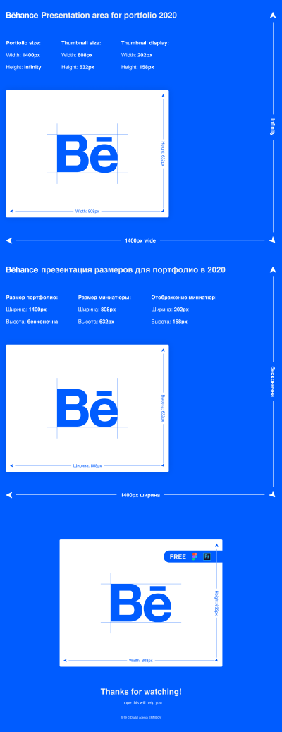
- Recommended Size: The ideal dimensions for a cover image on Behance are 1400 pixels wide by 810 pixels tall.
- Aspect Ratio: Aim for an aspect ratio of 16:9 for the best visual outcome.
- File Format: Use high-quality JPEG or PNG formats for better color reproduction.
- Compression: Optimize your images so that they load quickly without sacrificing quality. Tools like TinyPNG or ImageOptim can help.
By adhering to these dimensions and optimization tips, you can create cover images that not only look great but also enhance the user experience on your portfolio. A well-crafted cover image will speak volumes about your professionalism and attention to detail.
Choosing the Right Format and Resolution for Your Cover Image

When it comes to selecting the right format and resolution for your Behance cover image, a few key factors come into play. First, let’s talk about image formats. The most commonly recommended formats for cover images are:
- JPEG: Great for photographs or images with gradients. It offers a good balance between quality and file size.
- PNG: Ideal for images that contain text, logos, or require transparency. PNGs are lossless, meaning they don’t lose quality when saved.
- GIF: Best used for simple graphics with fewer colors, but not commonly used for cover images unless you want animation.
Next up is resolution. The general recommendation for Behance cover images is to aim for the following:
- Size: 1400 x 800 pixels is a good standard to ensure your image looks crisp and does not pixelate.
- Aspect Ratio: A 16:9 ratio will ensure your image displays well across different devices.
Also, consider the file size. While high-resolution images are important for clarity, overly large files can affect loading times. Aim for a balance, generally keeping your cover image under 1-2 MB. This way, it will load quickly while still looking fantastic!
Tips for Designing Eye-Catching Cover Images
Your Behance cover image is often the first impression potential clients or employers have of your work. Here are some strategic tips to help you create an eye-catching cover image:
- Keep It Simple: Avoid clutter. A clean and focused design can communicate your brand more effectively than a busy one.
- Use Strong Visuals: Incorporate high-quality images or graphics that reflect your style. Invest in good photography or unique illustrations that represent your work.
- Incorporate Your Branding: Use colors and fonts that match your personal or company branding to create a cohesive look across your portfolio.
- Contrasting Colors: Use contrasting colors to make essential elements pop. This can draw attention to your work and increase engagement.
- Text Overlay: If you choose to include text, make sure it is legible. Use bold fonts, and consider positioning your text in a way that it doesn’t detract from the visuals.
- A/B Testing: Try different designs and see which one garners more views or positive feedback. Use multiple cover images over time to keep your portfolio fresh.
Remember, your cover image is your digital handshake. Make it warm, inviting, and representative of your unique style! With these tips, you’re well on your way to designing a stunning and effective cover image for your Behance portfolio.
Step-by-Step Guide to Uploading and Optimizing Your Cover Image
Ready to showcase your work on Behance? Let’s walk through a simple, step-by-step process to upload and optimize your cover image. Follow these tips to ensure your portfolio stands out!
- Choose the Right Image: Start by selecting a high-quality image that represents your work best. This could be a project thumbnail or a standout piece from your portfolio. Make sure it’s visually appealing!
- Optimize Dimensions: Behance recommends a cover image size of 4048 x 2308 pixels for best results. You can create images in different sizes, but this is the optimal size for clarity on all devices.
- Save in the Right Format: Save your image in a web-friendly format, such as JPEG or PNG. JPEGs are great for photos, while PNGs work well for images with text or graphics.
- Edit and Adjust: Use editing software like Canva or Photoshop to enhance your image. Consider adjusting brightness, contrast, and saturation to make sure your colors pop!
- Upload to Behance: Go to your Behance profile and click on the “Edit Profile” button. Scroll to the cover image section and upload your optimized image. Make sure to preview it to ensure it looks great.
- Check Responsiveness: After uploading, preview your profile across different devices (laptop, tablet, smartphone) to see how the image appears. It should look good on all screens!
Finally, don’t forget to update your cover image periodically to reflect your latest work or style changes. A fresh cover image can entice visitors to explore your portfolio!
Common Mistakes to Avoid with Behance Cover Images
When it comes to creating a stunning Behance cover image, avoiding common pitfalls can greatly enhance your portfolio’s appeal. Here are some mistakes to watch out for:
- Using Low-Quality Images: Ensure your cover image is high-resolution. Pixelated images can turn viewers away. Always opt for clarity and sharpness.
- Ignoring Dimensions: Many users publish images without adhering to the recommended size. Remember, inconsistent dimensions can lead to awkward cropping on different devices!
- Cluttered Designs: Keep your cover image clean and uncluttered. Too much text or busy graphics can distract from your work. Less is often more!
- Inconsistent Branding: Ensure your cover image aligns with your personal branding. Use colors, fonts, and styles that are consistent with your overall portfolio to create a cohesive look.
- Neglecting Updates: An outdated cover image can reflect poorly on your current work ethic. Regularly refresh it to make sure visitors see your best and most recent projects.
- Not Testing Across Devices: Always test how your cover image looks on mobile, tablet, and desktop versions. Different devices can render images differently, so double-checking is key!
Avoiding these mistakes can elevate your portfolio and make a strong impression on potential clients and collaborators. Remember, your Behance cover image is the first thing people see—make it count!
Examples of Great Behance Cover Images for Inspiration
Looking for some inspiration to elevate your Behance cover image? You’re in luck! There are countless creatives showcasing stunning cover designs that can spark your creativity. Here are a few examples to guide you:
- Clean Minimalism: Many successful portfolios utilize a minimalist approach, focusing on simple graphics or a singular striking image. These designs ensure that your work stands out without unnecessary distractions.
- Bold Color Schemes: Vibrant colors can capture attention instantly. Consider designing a cover with complementary colors that resonate with your style and make your brand pop.
- Typography as Art: Some artists use creativity through typography. A well-placed quote or your name in an eye-catching font can create a memorable impression.
- Photo Collages: If you have multiple pieces to showcase, a collage can be an engaging choice. Choose a layout that best displays your work while maintaining clarity.
- Illustrative Elements: Incorporate your unique illustrations or graphics into the cover image for a personalized touch that reflects your artistic identity.
By exploring these examples, you can discover the elements that resonate with your vision and find a style that speaks to your audience. The key is to make your cover image a true reflection of your portfolio while keeping it visually engaging!
How to Maintain Brand Consistency with Your Cover Image
Brand consistency is crucial when it comes to your Behance portfolio. Your cover image is often the first impression potential clients or collaborators will have of your work, so it should perfectly align with your overall brand identity. Here are some tips to ensure consistency:
- Use a Cohesive Color Palette: Stick to a specific set of colors that define your brand. This helps in creating a recognizable look across all your designs.
- Incorporate Your Logo: If you have a logo, include it in your cover image. This reinforces your brand and makes it easier for viewers to connect your work with your identity.
- Consistent Style: Whether you favor modern, vintage, or whimsical styles, your cover image should match the overall aesthetic of your portfolio. This coherence helps in establishing your unique voice.
- Unified Fonts: Choose fonts that complement your work and use them consistently in your cover image and project descriptions. This not only enhances readability but also strengthens your brand’s personality.
- Regular Updates: As your work evolves, periodically refresh your cover image to reflect your current style and projects while maintaining your brand elements.
By following these strategies, you’ll create a cohesive and striking presentation that not only grabs attention but also reinforces your brand identity, making it easier for viewers to recognize and remember your work.
Tools and Resources for Creating High-Quality Cover Images
Creating stunning cover images for your Behance portfolio is all about the tools you use and the resources at your disposal. Fortunately, there are plenty of options out there to help you design high-quality visuals that stand out!
Here’s a list of some of the most popular tools:
- Adobe Creative Cloud: If you’re serious about design, Adobe Photoshop and Illustrator are industry standards. They offer extensive features for creating and editing images, and their vast library of tutorials can help you master them quickly.
- Canva: Perfect for beginners or those looking for a quick design solution, Canva provides user-friendly templates and drag-and-drop functionality. You can create professional-looking cover images in just minutes!
- Figma: This collaborative design tool is great for teams and individual designers. You can create stunning graphics with ease and share your designs for feedback in real time.
- Sketch: If you’re on a Mac, Sketch is a potent tool for creating slick designs. It’s particularly popular among UI/UX designers but is versatile enough for a range of graphics.
- Unsplash and Pexels: These platforms provide high-quality, royalty-free images that can elevate your cover designs. Just be sure to choose images that align with your personal brand and the projects you’re showcasing.
Don’t forget about color palettes and typography! Websites like Adobe Color and Google Fonts offer excellent resources for selecting harmonious color schemes and appealing fonts to complement your designs.
Conclusion and Final Tips for Optimizing Your Behance Portfolio
In conclusion, your Behance cover image is more than just a pretty picture; it’s your first chance to make a lasting impression on potential clients and collaborators. Here are some final tips to ensure your portfolio shines:
- Keep it Relevant: Choose cover images that reflect the work inside your portfolio. They should give a clear idea of your style and expertise.
- Stick to the Right Dimensions: Always stick to the recommended size of 4048 x 2308 pixels to ensure your cover looks great on all devices.
- Experiment with Layouts: Don’t be afraid to try different layouts and designs. What works for one project might not suit another.
- Test and Iterate: Get feedback on your images from peers or mentors, and don’t hesitate to make adjustments based on constructive criticism.
- Stay Updated: Keep an eye on trends in design and Behance portfolios. Updating your cover images regularly can keep your portfolio fresh and engaging.
By utilizing the right tools and following these tips, you’ll not only enhance your cover images but also increase the chances of your portfolio making a significant impact in the creative community. Happy designing!