Welcome to the fascinating world of Elementor! If you’re looking to create stunning websites with ease, you’ve stumbled upon the right tool. Elementor is a popular drag-and-drop page builder for WordPress that empowers users to craft beautiful web pages without the need for coding skills. Whether you’re a seasoned developer or a complete beginner,
Exploring the Elementor Interface
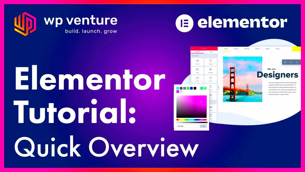
Getting to know the Elementor interface is crucial for building effective and appealing websites. Once you dive into Elementor, you’ll notice it’s designed to make your design process as smooth as possible. Here’s a breakdown of its main components:
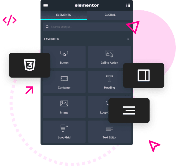
- Editor Sidebar: This is where the magic happens. The sidebar contains all the widgets you can use to create your layout. You’ll find elements like headings, images, text editors, and more, all neatly organized into categories.
- Canvas Area: The canvas area is your live preview zone. Here, you can drag and drop elements from the sidebar to build your page in real time. You can click on any element to customize its settings or style.
- Global Settings: This feature allows you to apply consistent styles throughout your website. You can set global colors, fonts, and other parameters to ensure your branding remains cohesive.
- Responsive Mode: Elementor lets you preview how your site will look on different devices like desktops, tablets, and smartphones. This feature is essential for creating responsive designs that look great everywhere.
By familiarizing yourself with these components, you’ll be much more comfortable navigating Elementor and utilizing its features to their fullest. So, what are you waiting for? Let’s get building!
Creating Custom Layouts with Elementor
Designing a website that stands out from the crowd is all about having a custom layout that truly reflects your brand. With Elementor, creating unique layouts is as easy as pie! Whether you’re a beginner or an experienced web designer, this powerful tool allows you to drag and drop various elements to craft a layout that feels just right.
First off, let’s talk about the Section structure. Elementor uses a three-tier structure: Sections, Columns, and Widgets. This flexibility enables you to craft a layout tailored to your needs. Start by adding a new section. You can choose from different column structures – single, double, triple, or even custom. This allows you to create a visually appealing grid without any coding required.
To kick off your design, you might want to consider these layout tips:
- Utilize Full-Width Sections: Opting for full-width sections can give your page a more modern look.
- Create Asymmetric Layouts: Don’t be afraid to play with asymmetrical designs to catch visitors’ attention.
- Add Backgrounds: Incorporate images, videos, or colors to your sections to make your layout dynamic.
And here’s where the magic of the Navigator tool comes in. It allows you to visually manage your sections and widgets all in one place, enabling easy modifications. Quick tip: Always preview your work to see how your custom layout looks on various devices. Elementor’s responsive editing features ensure your site remains attractive on desktops, tablets, and smartphones!
Advanced Widgets and Their Applications
One of the main reasons Elementor rises above its competition is its extensive range of advanced widgets. These widgets not only enhance the aesthetics of your site but also add functionality. From heading to image galleries, the possibilities are endless.
So, what are these advanced widgets, and how can you use them? Here’s a quick rundown:
| Widget | Description | Application |
|---|---|---|
| Posts Widget | Displays your blog posts in varied layouts. | Use it to highlight your latest articles and keep your content fresh! |
| Form Widget | Creates custom forms for lead generation. | Perfect for capturing visitor information and increasing engagement. |
| Carousel Widget | Showcases images or text in a rotating slider. | Great for displaying testimonials or product features fluidly. |
| Countdown Timer | Displays a countdown clock for promotions or events. | Creates urgency and prompts visitors to take action. |
When using advanced widgets, don’t forget about custom CSS. If you want to take your designs even further, you can add a personal touch by writing your own styles. Overall, Elementor’s advanced widgets make it easier to build engaging, interactive websites that wow your visitors!
Using Dynamic Content in Elementor
Dynamic content in Elementor allows you to create highly personalized and interactive designs, making your website feel more alive and tailored to your visitors. With dynamic content, you can pull data from your WordPress website effortlessly, which can enhance user experience and engagement.
So, what exactly is dynamic content? Simply put, it refers to content that changes based on specific criteria or user interactions. For example, you might want to display the author’s name on a blog post, automatically pulling it from your database. This saves time and ensures the information is always relevant and updated!
Here’s how you can effectively use dynamic content:
- Post Title & Content: Use dynamic tags to showcase your post titles and content without manual input.
- Custom Fields: Leverage custom fields created with plugins like Advanced Custom Fields (ACF) to display tailored content.
- User Data: Personalize experiences by displaying user names, roles, or other attributes after they log in.
In Elementor, simply drag and drop the widget you want to use, then click on the dynamic tags icon to choose the content you wish to display dynamically. Ensure you experiment with various dynamic tags to find the best fit for your website’s design and functionality.
The beauty of dynamic content is in its ability to create a seamless experience for your user while saving you from repetitive tasks. So, why not give it a try?
Integrating Third-Party Plugins with Elementor
Elementor is a powerful website builder, but its real magic often comes from integrating third-party plugins that enhance its functionality. Whether you want to improve SEO, add email marketing capabilities, or enhance design flexibility, there are countless plugins that can complement Elementor beautifully.
Here’s the lowdown on how to integrate these plugins:
- Choose the Right Plugin: Not all plugins work well with Elementor. Look for plugins specifically designed for compatibility. For instance, you can consider popular plugins like Yoast SEO for Search Engine Optimization or WooCommerce for eCommerce functionality.
- Installing the Plugin: Once you find a plugin that fits your needs, simply head over to your WordPress admin panel, go to Plugins > Add New, search for your desired plugin, and hit install!
- Using Elementor Widgets: After installation, check if the plugin offers Elementor-specific widgets. For instance, WooCommerce provides product widgets, allowing you to showcase your products seamlessly on your Elementor-built pages.
Beyond just functionality, integration can greatly enhance user experience. For example, using a social media feed plugin, you can display your latest Instagram posts directly on your site, creating an engaging and interactive experience for your visitors.
In conclusion, integrating third-party plugins with Elementor is about enhancing your website’s capabilities and creating a more dynamic experience for your users. Think of it as adding magical tools to your toolbox—each plugin adds a spark that can set your site apart!
7. Responsive Design Techniques for Elementor
When it comes to web design, ensuring your site looks great on all devices is key. In this section, we’ll explore some advanced responsive design techniques specifically tailored for Elementor. Whether you’re a beginner or a seasoned pro, understanding these techniques can elevate your web design game tremendously.
First off, let’s talk about responsive settings. Elementor offers specific tools to preview how your design looks on different devices, such as desktops, tablets, and mobile phones. Here’s how you can use it:
- While editing, click on the device icon at the bottom of the panel to switch views.
- Adjust the padding, margins, and alignment specifically for each device.
- Use the visibility options to show or hide certain elements depending on the device.
Next, consider using flexbox and grids within Elementor. These layout techniques allow you to create adaptable designs that automatically adjust as screen sizes change. By utilizing the inline or column alignment settings, you can easily stack content, making it accessible and visually appealing on any device.
Another technique worth mentioning is the Mobile Editing Menu. This tool gives you the ability to tweak individual elements, such as fonts and spacings, for different screens. It’s a game-changer when you want to ensure that your website maintains its aesthetic on smaller screens without losing functionality.
Finally, always remember to test your designs. Tools like Google Mobile-Friendly Test can provide valuable feedback, ensuring your hard work pays off in terms of usability.
8. Custom CSS and Styling with Elementor
If you’re looking to go beyond the usual design options in Elementor, diving into Custom CSS can be a fantastic way to personalize your site. This feature allows you to write your own CSS code, giving you ultimate control over every aspect of your design.
To start, here’s how you can add custom CSS in Elementor:
- Edit the section, column, or widget where you’d like to apply the CSS.
- Scroll down to the Advanced tab.
- Locate the Custom CSS field and start adding your CSS code!
It’s within this space that your creativity can shine. You can manipulate anything from hover effects to custom animations. For example, if you want to change the button color on hover, you could use the following CSS:
selector:hover { background-color: #ff5733; /* Change to your preferred color */ color: #fff; /* Change button text color */ }
Moreover, to enhance the aesthetics of your site, utilizing CSS pseudo-classes like `:hover`, `:focus`, and `:active` can make your designs feel more dynamic and engaging to visitors.
One of the greatest benefits of incorporating Custom CSS is the ability to address responsive concerns at a deeper level. You can target specific devices or screen sizes using media queries. This way, you can make sure those added styles only appear on particular devices, ensuring seamless aesthetics across all platforms.
In conclusion, Custom CSS isn’t just for the tech-savvy; it’s for anyone willing to invest a bit of time into crafting a truly unique web experience!
9. Building and Saving Templates
Building and saving templates in Elementor is not just a great way to streamline your workflow; it’s almost like creating a toolbox filled with your favorite design tools! When you want to maintain a consistent aesthetic across your web pages, templates allow you to save sections, pages, or even entire layouts for reuse. This can significantly save you time and help you maintain a cohesive look throughout your website.
Here’s a simple guide to get you started:
- Create Your Design: Use Elementor to design your section or page just the way you want it. Use all the widgets and settings available to ensure it looks exactly how you envision.
- Save as Template: Once you’re satisfied with your work, click the arrow next to the ‘Update’ button. From the dropdown, choose ‘Save as Template.’ Give it a memorable name so you can find it easily later!
- Accessing Your Templates: Go to the ‘Templates’ section in Elementor. Here, you can see all your saved templates, modify them, or delete ones you no longer need.
- Using Your Templates: To use a saved template in a new page, simply access it from the ‘Templates’ panel when you’re editing in Elementor and insert it into your current layout.
This feature is especially useful for creating landing pages or content sections that you frequently use. By keeping your designs organized and easy to access, you’ll find that your productivity and creativity get a nice boost!
10. Best Practices for SEO with Elementor
Optimizing your website for search engines is crucial, and Elementor makes the process easier than ever! If you want your beautifully designed pages to rank highly on Google, here are some of the best practices you should follow:
- Use Meaningful Headlines: Organize your content with proper heading tags (H1, H2, H3). Make sure your primary keyword appears in your H1 tag to signal to search engines what the page is about.
- Optimize Images: Always use high-quality images but make sure to compress them for faster loading times. Additionally, add ALT text to your images that describes what they are, including your target keywords when it makes sense.
- Implement On-Page SEO: Use the SEO settings in Elementor or any compatible plugins like Yoast or Rank Math. They’ll guide you in filling out meta descriptions, SEO titles, and providing readability suggestions.
- Mobile Optimization: A significant chunk of web traffic comes from mobile devices. Ensure that your Elementor designs are responsive and look fantastic on all screen sizes.
- Structured Data Markup: Consider implementing schema markup to help search engines understand your content better. This can lead to rich snippets that catch the eye of potential visitors.
Incorporating these practices into your Elementor design process will not only enhance the visibility of your site but also provide a richer experience for your visitors. Remember, great design paired with good SEO strategies is a powerful combination!
Performance Optimization for Elementor Sites
When it comes to building stunning websites with Elementor, performance optimization is a crucial consideration. A visually appealing site is great, but if it takes too long to load, users will bounce off faster than you can say “optimized.” Here are some tips to ensure your Elementor site runs smoothly:
- Utilize Caching Plugins: Implement caching plugins like WP Rocket or W3 Total Cache. These tools can significantly improve your site’s loading speed by serving static files to visitors instead of querying the database every time.
- Optimize Images: Large images can weigh down your site considerably. Use image optimization tools such as Smush or ShortPixel to compress images without losing quality. This will help reduce load times and improve performance.
- Minimize CSS and JavaScript: Elementor tends to generate a fair amount of CSS and JavaScript. Consider using plugins like Autoptimize or Asset CleanUp to minimize and combine scripts, reducing server requests.
- Choose Lightweight Themes: Select themes that are lightweight and well-coded. Some Elementor-compatible themes, such as Astra and GeneratePress, are designed specifically for speed.
- Regularly Update Plugins and Elementor: Keeping your Elementor plugin and any other related plugins up to date ensures you have the latest performance improvements and bug fixes.
- Load Fonts Efficiently: Use custom fonts wisely. Load only the weights and styles you need, and consider using system fonts for faster loading times.
By integrating these performance optimization strategies, you’re not just enhancing your website’s speed but also improving user experience, which can lead to better engagement and conversions. So, roll up your sleeves and get to work!
Conclusion
In the realm of web design, mastering Elementor isn’t just about knowing how to use the tools; it’s about understanding how to create high-quality, functional, and optimized websites. As we wrap up this guide on advanced tutorials for Elementor, here’s a quick recap of what we’ve covered:
- Advanced Widgets: Leveraging unique widgets to enhance the functionality of your website.
- Custom Templates: Creating reusable templates for efficiency and consistency.
- Responsive Design: Ensuring that your site looks great on all devices.
- Performance Optimization: Techniques to ensure your site operates seamlessly.
As you dive into your next Elementor project, remember that your only limit is your creativity. Experiment with different layouts, designs, and features. Don’t shy away from testing and tweaking. The digital landscape is ever-evolving, and so should your skills.
In the end, an optimized and visually impactful Elementor site not only establishes your online presence but also resonates with your audience, thereby opening doors to new opportunities. Happy designing!

