Have you ever found yourself wrestling with the mobile header text on your website while using Elementor? You’re not alone! Many users encounter the challenge of getting their headers to look just right, especially on mobile devices where screen size is limited. Fear not, in this guide, we’re going to walk through how to adjust the mobile header text position in Elementor, so you can create a seamless and visually appealing user experience across all devices. Let’s dive in and get those headers looking sharp!
Understanding Elementor’s Header Settings
Before you can adjust the mobile header text position, it’s essential to grasp the fundamentals of Elementor’s header settings. Elementor is a powerful page builder that enables you to design headers with ease, but you’ll need to know where to make changes. Let’s break down the header settings:
- Site Settings: This is where you can configure site-wide settings affecting your mobile headers.
- Theme Builder: Access the Theme Builder to create and customize your header templates specific to your mobile layout.
- Responsive Settings: Elementor provides responsive editing options that allow you to adjust styles for desktop, tablet, and mobile devices separately.
Once you’re familiar with these settings, here’s how they work together:
| Feature | Functionality |
|---|---|
| Mobile Editing | Change text size, margins, and padding specifically for mobile views. |
| Breakpoints | Customize how and when the mobile layout kicks in based on screen sizes. |
| Visibility | Control which elements are visible or hidden on mobile devices. |
Understanding these settings will give you a firm foundation for adjusting the mobile header text position effectively. Ready to make your headers stand out on mobile? Let’s explore how to do just that!
Why Adjust Mobile Header Text Position?
When it comes to crafting a website that looks great on all devices, especially mobile, the position of your header text plays a crucial role. You might wonder, why should you bother adjusting the mobile header text position? Well, let’s chat about it!
Firstly, mobile screens are much smaller than desktops. This means that what might look amazing on a large screen can easily become cluttered or difficult to read on a phone. By adjusting the header text position, you ensure that your visitors can quickly and easily understand your brand or get the information they need without pinching and zooming.
Consider the following reasons to tweak your mobile header text position:
- User Experience: A well-positioned header enhances readability. When your header text is legible, visitors spend less time guessing what it says and more time enjoying your content.
- Brand Recognition: Your header is often the first thing users see. Keeping it at a strategic location helps establish and reinforce your brand identity effectively.
- Visual Appeal: Aesthetics matter! An aligned and harmonized header can make your site look professional and trustworthy, thus boosting user confidence.
- Responsive Design: Adjusting text position is fundamental in responsive web design. With more users browsing on mobile devices, ensuring a polished look is essential.
In short, adjusting your mobile header text position is all about creating a seamless, enjoyable experience for your visitors. It’s that little extra touch that can make a big difference!
Accessing the Mobile Header Settings in Elementor
Alright, let’s dive into the nuts and bolts of Elementor. It’s not just about the design; knowing how to access and tweak settings is key to creating a fantastic site. So, how do you access the mobile header settings in Elementor? It’s easier than you might think!
First off, make sure you’re working on the right canvas. Here’s how to find your way:
- Open Elementor: Start by navigating to the page where you want to adjust your header. Click on “Edit with Elementor.”
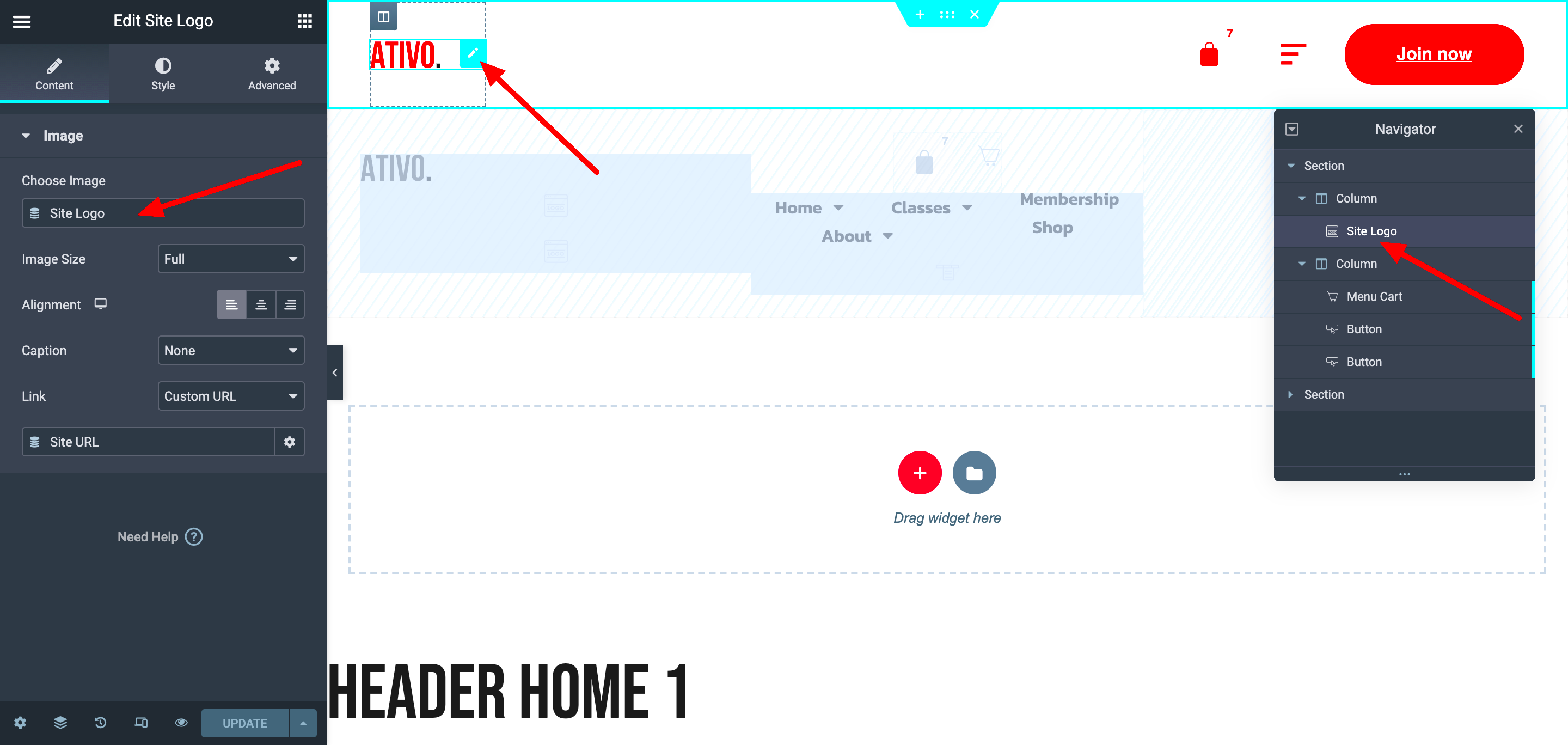
- Select the Header Section: Find your header section within the layout. This can usually be at the top, and you might see it labeled as “Header.” Click on it to bring up the settings.
- Responsive Mode: Look at the bottom left corner of your screen. You’ll see a little icon that looks like a computer and mobile. Click on it, and choose the mobile view.
- Adjust Settings: With mobile view activated, navigate to the settings panel for your header. Here, you can manipulate padding, margin, alignment, and more!
By following these steps, you can effortlessly customize your mobile header. Remember, it’s all about giving your users the best experience while showcasing your brand beautifully. Don’t hesitate to experiment a bit; after all, this is your canvas!
5. Step-by-Step Guide to Adjusting Text Position
Alright, let’s dive right into how you can tweak your mobile header text position in Elementor. It’s easier than you might think! Just follow these simple steps, and you’ll have your text looking just the way you want it in no time.
- Open Your Elementor Editor:
First, you’ll need to log into your WordPress dashboard and navigate to the page you want to edit. Click on “Edit with Elementor” to open the Elementor editor.
- Select the Header Section:
Once you’re in the editor, locate your header section. This could be a part of your theme’s header template or a section you’ve added yourself. Click on it to select.
- Access the Advanced Settings:
With the header section selected, head to the left-side panel and click on the “Advanced” tab. This section provides various options for margins, padding, and positioning.
- Adjust the Responsive Settings:
In the advanced settings, look for the “Responsive” options. Click on it and select “Mobile” to customize the text specifically for mobile devices.
- Positioning and Alignment:
Here, you can set the positioning to center, left, or right. Use the “Padding” settings to add space around your text. This makes it easier to position where you want it.
- Preview Your Changes:
Once you’ve made your adjustments, don’t forget to hit the “Preview” button. This allows you to see how your changes will look on a mobile device.
- Publish and Save:
If you’re satisfied with how everything looks, hit that “Update” button to save your changes for the world to see!
And just like that, you’re done! Adjusting text position in your Elementor mobile header can significantly enhance your site’s mobile usability.
6. Using Custom CSS for Precise Adjustments
If you’re looking for a way to make super fine adjustments to your mobile header text position, you might want to dip your toes into Custom CSS. Don’t worry, you don’t have to be a coding guru for this! I’ll break it down for you.
Custom CSS can help you achieve precise alignment and positioning that might not be available through standard Elementor options. Here’s how to go about it:
- Navigate to Custom CSS Section:
With your header section selected in Elementor, look in the left panel for the “Advanced” tab. Scroll down to find the “Custom CSS” option.
- Write Your CSS Code:
Now it’s time to input your CSS! Here’s a simple example:
/* Example CSS for mobile header text */@media only screen and (max-width: 768px) { .your-header-class { text-align: center; /* Centers the text */ padding-top: 20px; /* Adds top padding */ }} - Adjust Your Code as Needed:
You can modify the padding values, text alignment, or any other properties to get exactly the look you want. Don’t forget to replace `.your-header-class` with the actual class name of your header.
- Test Your Changes:
Once you’ve entered your Custom CSS, save your changes and preview the page on your mobile device to see how it turned out. You might need to tweak it a bit more!
Using Custom CSS can open up a world of possibilities for customizing your site. Just remember, a little goes a long way, so make sure to preview often! With these techniques, you’ll have full control over that mobile header text positioning.
Previewing Changes in Mobile View
When you’re designing a website, ensuring that it looks good on all devices is crucial, especially on mobile as more users browse the internet on their phones than ever before. Elementor has made it easy to preview how your adjustments will appear on mobile screens. Here’s how you can see your changes in real-time:
- Switch to Mobile Editing Mode: Within the Elementor editor, look for the responsive mode icon at the bottom left of your screen. Clicking on it will allow you to switch between desktop, tablet, and mobile views.
- Check Your Adjustments: Once you’re in mobile view, you can see all the elements you’ve adjusted, such as text position or padding. Make sure to check everything to confirm it looks great!
- Utilize Preview Changes: Always use the ‘Preview’ button before making your changes live. This gives you a clear idea of how users will experience your site on their devices.
- Test Across Different Devices: Sometimes, seeing the design on a simulator isn’t enough. If possible, test your site on actual mobile devices. Each device may render fonts and layouts slightly differently.
By utilizing these simple steps, you can ensure your mobile header text and overall design tweaks look professional and user-friendly on mobile screens. Don’t skip this step; it could make a significant difference in the user experience!
Common Issues and Troubleshooting
As much as Elementor simplifies web design, you may run into a few hiccups while adjusting your mobile header text position. Here are some common issues users face, along with handy troubleshooting tips to help you out:
| Issue | Potential Solution |
|---|---|
| Text Overlapping | Check margins and padding settings. Adjust the spacing to ensure clear visibility. |
| Text Not Centered | Use the ‘Align’ settings in the mobile column options to center or adjust text direction. |
| Font Size Too Small or Large | Adjust font size under the ‘Typography’ settings specifically for mobile devices. |
| Changes Not Appearing | Clear your browser cache and refresh the page. Additionally, check if you updated the mobile settings. |
These troubleshooting steps can save you a lot of time and ensure your header text looks stunning. Remember, the best approach is to test extensively. If you encounter an issue not covered here, the Elementor community is always a great resource for support!
Best Practices for Mobile Header Design
When it comes to designing mobile headers in Elementor, there are several best practices that can significantly enhance the user experience. A well-designed mobile header isn’t just about aesthetics; it also plays a crucial role in usability and accessibility. Here are some things to keep in mind:
- Prioritize Clarity: Make sure your header text is legible with a clear font. Smaller screens can make fonts harder to read, so opt for sizes that maintain readability.
- Keep it Simple: Avoid cluttering the header with too many elements. Stick to essential information, like your logo, navigation links, and possibly a search icon.
- Responsive Design: Test how your header looks on different devices and screen sizes. A header that looks great on a desktop may not translate well to mobile. Elementor’s responsive settings allow you to adjust elements accordingly.
- Utilize Icons: Icons can replace text for common actions like a menu or search. They take up less space and can often enhance user understanding when designed correctly.
- Sticky Headers: Implementing sticky headers allows for easier navigation as the user scrolls down the page. Just be cautious not to cover too much screen space.
- Test with Users: Whenever possible, gather feedback from actual users. Real-world testing often reveals usability issues you might not have noticed.
Adhering to these best practices ensures your mobile headers not only look great but also function seamlessly. Remember, the goal is to enhance the user experience, making it easier for visitors to navigate and find what they need on your site.
Conclusion
In summary, adjusting the mobile header text position in Elementor can seem like a small detail, but it significantly impacts your website’s overall usability and aesthetic appeal. By following best practices for mobile header design, you create a smoother experience for your users, which can lead to increased engagement and lower bounce rates.
Remember, your mobile header is the first thing users see when they visit your site on their phones. Make it count!
Ultimately, don’t hesitate to experiment with different adjustments until you find what works best for your design. Elementor provides a fantastic variety of customization options, so leverage them! Whether you’re a newbie or an experienced designer, customizing your headers in a way that resonates with your audience can create a lasting impression.
So, what are you waiting for? Dive into Elementor and start making those mobile headers shine!


