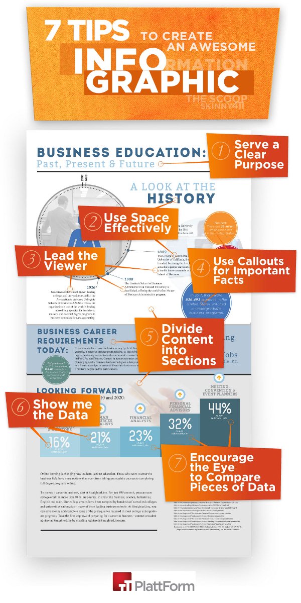
Hey there! If you’re looking to spice up your department’s communication or just want to make data more engaging, creating an infographic might be the perfect solution. Infographics are visual tools that help simplify complex information, making it easier for everyone to understand and remember. With Shutterstock’s vast library of images, illustrations, and templates, you can craft eye-catching graphics that represent your department’s work, goals, or achievements. Whether you’re sharing quarterly results or explaining a new process, a well-designed infographic can make your message stand out and resonate with your team and stakeholders alike.
Understanding the Benefits of Using Infographics in Your Department
Using infographics in your department isn’t just about making things look pretty—it’s about boosting communication and understanding. Here are some key benefits:
- Enhanced Clarity: Visuals help simplify complex ideas, making information more digestible at a glance.
- Increased Engagement: People are naturally drawn to visuals, so your message is more likely to catch their attention.
- Better Retention: Information presented visually tends to stick in people’s minds longer than plain text.
- Efficient Communication: Infographics can quickly convey key points, saving time during meetings or reports.
- Professional Image: Well-designed graphics reflect positively on your department, showcasing professionalism and creativity.
Imagine sharing quarterly performance stats with your team—an infographic can turn a dull spreadsheet into an engaging story. Or, explaining a new policy? A visual guide can make the process clearer and reduce misunderstandings. Plus, with tools like Shutterstock, you have access to high-quality images and templates that make creating these visuals easier than ever. Overall, integrating infographics into your department’s communication toolkit can foster better understanding, collaboration, and even boost morale—because who doesn’t love a good visual?
Step-by-Step Guide to Designing an Infographic with Shutterstock
Creating an eye-catching infographic might seem daunting at first, but with Shutterstock’s vast library of visuals and easy-to-use tools, it becomes much more manageable. Here’s a simple step-by-step guide to help you craft an engaging infographic for your department:
Step 1: Define Your Goal and Audience
Before diving into design, clarify what you want to communicate and who your audience is. Is it to showcase quarterly results, explain a new process, or highlight team achievements? Knowing your goal helps tailor the content and visuals effectively.
Step 2: Gather Your Data and Content
Collect all the information you want to include. Keep it concise—infographics are visual summaries, so avoid overwhelming your viewers. Organize your data into key points, statistics, or steps you want to highlight.
Step 3: Log into Shutterstock and Choose a Template
Head over to Shutterstock’s design platform, where you can browse a variety of professionally designed templates. Pick one that aligns with your message and style preferences. Don’t worry—templates are customizable, so you can tweak colors, fonts, and layouts.
Step 4: Customize Your Visuals
Replace placeholder content with your data. Use Shutterstock’s extensive library of images, icons, and illustrations to enhance your message. Remember, clarity is key—use visuals to clarify, not clutter.
Step 5: Fine-tune Layout and Design
Adjust the placement of elements for balance and flow. Use consistent fonts and colors that match your department’s branding. Add headings, subheadings, and callouts to guide viewers through the information smoothly.
Step 6: Review and Finalize
Take a step back and review your infographic. Check for typos, ensure visuals support the message, and make sure it looks professional. Once satisfied, export your infographic in the desired format—PNG, JPEG, or PDF.
Step 7: Share and Get Feedback
Share your infographic with colleagues or your department for feedback. Final tweaks might be needed, but with Shutterstock’s easy editing tools, updates are quick and simple. Then, proudly present your visual masterpiece!
Selecting the Right Visuals and Templates on Shutterstock
Choosing the perfect visuals and templates is crucial to making your infographic stand out and effectively communicate your message. Shutterstock offers a treasure trove of options, but knowing how to pick the right ones makes all the difference.
Understanding Your Content and Audience
Start by thinking about what you’re trying to convey. Are you showcasing data? Telling a story? Explaining a process? Your visuals should align with your content. For instance:
- Data-heavy content: Use charts, graphs, and icons that simplify complex numbers.
- Storytelling or process: Incorporate illustrations or step-by-step visuals.
- Achievements or highlights: Use celebratory icons or images that evoke positivity.
Browsing Templates on Shutterstock
Shutterstock’s platform categorizes templates based on themes like business, education, marketing, and more. When browsing:
- Pick templates with a layout that matches your content flow—vertical, horizontal, or modular styles.
- Look for designs that are clean and uncluttered, ensuring your information remains the focus.
- Consider the color scheme—choose templates that can be easily customized to your department’s branding colors.
Selecting Visual Elements
Shutterstock provides a vast library of stock photos, icons, illustrations, and vectors. When selecting visuals:
- Use high-quality images: Crisp, clear visuals look professional and trustworthy.
- Icons and illustrations: Perfect for representing concepts, steps, or data points quickly.
- Consistency is key: Stick to a visual style—avoid mixing cartoonish icons with realistic photos unless it fits a specific theme.
Matching Visuals to Your Brand
Make sure your chosen visuals align with your department’s branding guidelines. Shutterstock allows you to filter images by color, style, and orientation, helping you find visuals that seamlessly integrate with your existing brand identity.
Final Tips
- Preview your chosen visuals within the template to see how they work together.
- Don’t overload your infographic—use visuals to complement, not overshadow, your message.
- Keep accessibility in mind—select visuals that are clear and easy to interpret for all viewers.
By thoughtfully selecting the right templates and visuals on Shutterstock, you’re well on your way to creating an infographic that’s not only informative but also visually compelling. Remember, the goal is to communicate clearly and engage your audience—so choose visuals that support that mission!
Creating a Compelling and Informative Layout
Alright, now that you’ve gathered your visuals and data, it’s time to focus on how everything comes together visually. Think of your infographic as a story you’re telling—each element should guide the viewer smoothly from start to finish. The key here is creating a layout that’s both eye-catching and easy to understand.
Start by sketching out a rough plan. Ask yourself: What’s the main message? How do I want viewers to navigate through the information? You can use simple tools like pen and paper or digital design apps to experiment with placement.
Here are some tips to keep in mind:
- Hierarchy matters: Make the most important info stand out with larger fonts, bold colors, or central placement.
- Use a logical flow: Arrange your content in a way that naturally guides the eye—top to bottom, or left to right.
- Balance visuals and whitespace: Don’t overcrowd. Leave some breathing room so each element can breathe.
- Consistent style: Stick to a color palette and font choices to maintain a cohesive look throughout.
If you’re using Shutterstock, you can find a variety of pre-designed templates that serve as great starting points. These templates often come with well-organized layouts that you can customize to fit your content. Just swap out images, adjust text, and tweak colors—making the design process smoother and faster.
Remember, clarity is king. Avoid cluttered designs or overly complex graphics. The goal is to communicate your message efficiently, not to impress with complexity. Keep it simple, clean, and engaging.
Adding Data and Text to Enhance Your Infographic
Now that your layout is set, it’s time to add the meat—your data and text. This is the core of your infographic, so make sure it’s both accurate and compelling.
Start with your data. Use Shutterstock’s library to find relevant icons, charts, and illustrations that can visually represent your numbers and facts. Visual representations like pie charts, bar graphs, or timelines make data much easier to digest than plain text.
When adding data:
- Be selective: Only include the most relevant data points—less is more.
- Use visuals: Convert data into charts or icons to save space and improve readability.
- Label clearly: Make sure each visual element has a descriptive label or caption.
For the accompanying text, aim for clarity and brevity. Use concise sentences, bullet points, or short paragraphs. Bold key terms or figures to draw attention. Remember, the goal is to complement your visuals, not to overwhelm them with text.
Here’s a quick checklist:
| Step | Tip |
|---|---|
| Add Data | Use Shutterstock charts and icons to visualize key points |
| Write Text | Keep it short, impactful, and easy to scan |
| Highlight Important Info | Use bold text or contrasting colors to emphasize critical data or messages |
Finally, don’t forget to review your infographic. Step back and look at the overall flow. Is it visually appealing? Does it clearly communicate your message? Make adjustments as needed—sometimes a fresh pair of eyes helps spot areas for improvement. Once you’re satisfied, you’ll have a polished, professional-looking infographic ready to impress your department and beyond!
Finalizing and Exporting Your Department Infographic
Congratulations! You’ve put in the effort to gather all your data, design your visuals, and put everything together. Now, it’s time to give your infographic a final polish and prepare it for sharing with your team or wider audience. This step might seem straightforward, but paying attention to detail here ensures your infographic looks professional and is easy to share.
First, review your entire infographic carefully. Check for any typos, grammatical errors, or inconsistencies in fonts and colors. Make sure all your data is accurate and up-to-date. It’s helpful to have someone else look it over too – a fresh pair of eyes can catch issues you might have missed.
Next, consider the layout and visual flow. Is it easy to follow from top to bottom? Do the visuals support the message clearly? Sometimes, stepping back and looking at your work after a break helps you see it with fresh eyes.
Adjust Your Design
- Consistency: Ensure fonts, colors, and icon styles are uniform throughout.
- Spacing: Check that there’s enough white space so the infographic doesn’t look cluttered.
- Alignment: Make sure all elements are aligned correctly for a neat appearance.
- Readability: Use contrasting colors for text and background to improve visibility.
Export Your Infographic
Once everything looks perfect, it’s time to export your infographic. Shutterstock’s design tools generally allow you to download your project in various formats. Here’s what to consider:
| Format | Best For |
|---|---|
| PNG | High-quality images for presentations or web sharing |
| JPEG | Web use, smaller file size |
| Printing or sharing in a document format | |
| SVG | Scalable graphics, ideal for resizing without quality loss |
Choose the format based on your intended use. For most online sharing, PNG or JPEG works well. If you want to print or share a high-quality version, PDF is a good choice.
Before finalizing, double-check the resolution. For digital sharing, 72-150 dpi is sufficient. For printing, aim for 300 dpi to ensure crisp quality.
Save a Copy
Always save a master copy in the original project format, so you can make edits later if needed. Export a copy in your chosen format and store it in a clearly labeled folder on your computer or cloud storage.
Tips for Sharing and Distributing Your Infographic Effectively
Creating a stunning infographic is just half the battle; sharing it effectively makes all the difference. Whether you want your department to be informed, or you aim to showcase your work to a broader audience, strategic distribution is key.
Here are some top tips to maximize your infographic’s reach and impact:
Know Your Audience
Before sharing, think about who needs to see this infographic. Is it for internal team members, senior management, or external stakeholders? Tailoring your message and choosing the right channels will boost engagement.
Choose the Right Platforms
- Internal Communication Tools: Use your company’s intranet, Slack channels, or email newsletters for quick distribution within your department.
- Social Media: Platforms like LinkedIn, Twitter, or Facebook are great for reaching a wider audience. Consider the platform that best matches your target viewers.
- Company Website or Blog: Embed the infographic in related blog posts or news updates to provide context.
Optimize for Sharing
Make it easy for people to share your infographic:
- Use Clear, Descriptive File Names: e.g., “Department-Performance-Q3-2023.png”
- Add Share Buttons: If embedding on a website, include social sharing buttons.
- Include a Call-to-Action: Encourage viewers to comment, share, or provide feedback.
Leverage Visuals and Context
When sharing, accompany your infographic with a brief explanation or key takeaways. This helps viewers understand the significance quickly and increases the likelihood they’ll engage with the content.
Monitor and Engage
Keep an eye on how your infographic is performing. Are people sharing it? Are there comments or questions? Respond promptly to foster engagement and demonstrate your openness to feedback.
Repurpose Content
Don’t limit your infographic to a single format. Consider creating snippets, social media posts, or slideshows from it to reach different audiences and extend its lifespan.
Remember, the goal is to make your infographic as accessible and engaging as possible. Thoughtful sharing not only spreads information but also showcases your department’s achievements and insights effectively.
Conclusion and Best Practices for Infographic Creation
Creating an effective infographic for your department involves a blend of strategic planning, clear design, and attention to detail. To ensure your infographic communicates your message effectively, start by defining your goal and understanding your target audience. Use high-quality images and icons from Shutterstock to enhance visual appeal and clarity. Remember to maintain consistency in color schemes, fonts, and layout to create a cohesive look.
Here are some best practices to keep in mind:
- Keep it simple: Focus on key information and avoid clutter. A clear, concise message is more impactful.
- Use visual hierarchy: Highlight important data with larger fonts or bold colors to guide viewers through the information naturally.
- Choose the right format: Consider the platform where the infographic will be shared—vertical for social media, horizontal for presentations, etc.
- Incorporate branding: Add your department’s logo or color palette to reinforce brand identity.
- Verify data accuracy: Ensure all facts and figures are correct and sourced properly to maintain credibility.
Finally, utilize Shutterstock’s extensive library of images and graphics to enhance your design and make your infographic visually compelling. Regularly review and refine your work before publishing to achieve the best results. By following these best practices, you’ll create engaging, informative infographics that effectively communicate your department’s message and resonate with your audience.