If you’re diving into the world of digital design, Shutterstock Editor is a fantastic tool to bring your creative ideas to life. It’s user-friendly, versatile, and packed with features that make editing images and adding text a breeze. One of the coolest features? The ability to curve your text, giving your designs a dynamic and professional look. Whether you’re creating social media graphics, invitations, or logos, understanding how to manipulate text is essential. So, let’s explore what makes Shutterstock Editor stand out and how you can make your text truly pop!
Steps to Curve Text in Shutterstock Editor
Curving text in Shutterstock Editor is easier than you might think! Just follow these simple steps to add that perfect curved effect to your design:
- Open Shutterstock Editor and select your project or start a new one by uploading your image or choosing a template.
- Add Text by clicking on the Text tool in the toolbar. Type in your desired phrase or word.
- Select your text box so that the editing options appear.
- Click on the ‘Effects’ or ‘Text Effects’ option in the toolbar. This is where the magic begins.
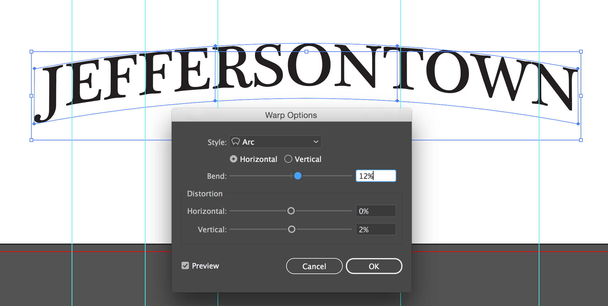
- Look for the ‘Curved Text’ feature. Depending on the version, it might be a toggle or a slider.
- Adjust the curve by moving the slider left or right. This will bend your text into a smile, arch, or even a full circle. Experiment with the curve until it looks just right.
- Customize further by changing the font, size, color, or adding effects like shadows and outlines to enhance your curved text.
- Preview your design to see how the curved text integrates with the rest of your project.
- Save or export your masterpiece once you’re happy with the result!
And that’s it! With these steps, you can easily add eye-catching curved text to any project in Shutterstock Editor, making your designs stand out with a professional touch. Happy designing!
Tips for Customizing Curved Text for Better Visual Impact
Curving text can instantly make your designs more dynamic and eye-catching, but to really make it pop, you’ll want to pay attention to some helpful customization tips. Here are a few ideas to elevate your curved text game in Shutterstock Editor:
Adjust the Curve Degree
Don’t be afraid to experiment with the curve degree slider. A subtle curve can add elegance, while a more pronounced curve creates boldness. Think about the message and the overall vibe of your design—sometimes less is more, and other times, a dramatic curve makes the text stand out.
Choose the Right Font and Size
The font you pick can dramatically change how your curved text looks. Sans-serif fonts tend to look modern and clean, while script fonts can add a touch of elegance or playfulness. Also, adjust the font size to ensure the text fits well along the curve without overlapping or leaving too much empty space.
Play with Spacing and Alignment
Use letter spacing (tracking) and line spacing wisely. Slight tweaks can make your text more balanced and easier to read. Align your text along the curve so it follows the shape naturally; most editors allow you to drag or adjust the placement for perfect positioning.
Color and Effects
Adding a contrasting color or a subtle gradient can make your curved text stand out. Consider adding shadows, outlines, or glow effects to give your text more depth and dimension. Just make sure these effects complement your overall design rather than overpowering it.
Experiment and Preview
The best way to learn is by trying different combinations. Use the preview feature to see how your curved text looks in context. Don’t hesitate to make multiple versions—you might discover a combination you hadn’t thought of that really enhances your design.
Common Issues and Troubleshooting When Curving Text
While curving text is a fantastic way to add flair, it can sometimes come with a few hiccups. Here are some common issues you might encounter and how to troubleshoot them:
Text Overlapping or Clipping
Problem: When you curve the text too sharply, the characters can overlap or get cut off, making it hard to read.
Solution: Try reducing the curve degree or increasing the size of your text. Also, adjust the letter spacing to give each character more room. Sometimes, breaking the text into smaller segments and curving each separately helps improve clarity.
Uneven Distribution of Text
Problem: The text appears uneven or unevenly spaced along the curve, which can look unprofessional.
Solution: Use alignment tools to center or distribute your text evenly. Some editors allow you to adjust the anchor point or baseline to better match the curve’s shape.
Difficulty Reading Small or Decorative Fonts
Problem: Small fonts or decorative fonts can become hard to read when curved, especially on complex backgrounds.
Solution: Increase the font size, choose cleaner fonts, or add effects like shadows or outlines to improve readability. Also, consider simplifying your background or adding a contrasting shape behind the text.
Inconsistent Curves or Warping
Problem: The text doesn’t follow the curve smoothly, appearing warped or distorted.
Solution: Reset the curve and try applying it gradually instead of all at once. Sometimes, adjusting the anchor points or the direction of the curve helps create a more natural flow.
Final Tips
- Always preview your design on different screens or print samples if possible.
- Save multiple versions so you can compare and choose the best look.
- Don’t rush—sometimes taking a break and coming back with fresh eyes helps spot issues you might have missed.
With these tips and troubleshooting strategies, you’ll be able to create stunning curved text that enhances your designs and grabs attention. Remember, practice makes perfect—so keep experimenting and enjoy the creative process!
Examples of Creative Uses of Curved Text in Designs
Curved text is such a versatile tool that it can elevate your design from ordinary to eye-catching with just a few tweaks. Let’s explore some fun and inspiring ways artists and designers are using curved text to make their creations stand out.
First up, consider logos. Many brands incorporate curved text to follow the shape of a badge or circular emblem, creating a balanced and professional look. Think about sports teams or coffee brands — the curved text wraps around icons or images perfectly, giving that polished finished feel.
Next, think about event posters and invitations. Curved text is fantastic for highlighting event names or dates, especially when placed around a central graphic or photo. For example, a wedding invitation might feature the couple’s names arched over a floral illustration, adding a romantic touch.
Another creative use is in badges or seals. Curved text can form a border around a symbol or logo, giving it a badge-like appearance that’s perfect for branding or awards. This style is commonly seen on certificates, medals, or product labels.
Then, there’s the fun world of typography art — where artists stretch, bend, and twist letters into unique shapes. For instance, making the word “Adventure” curve along a mountain outline, or turning “Dream” into a wave that flows across the design. This technique adds a dynamic and energetic vibe to your work.
Finally, consider social media graphics and banners. Curved text can frame an image or message, drawing attention and guiding the viewer’s eye. It’s especially useful when you want your message to feel integrated into the overall design rather than just placed on top.
In all these examples, the key is to experiment with the curvature and placement until it feels just right. With a little creativity, curved text can transform simple designs into something memorable and visually appealing.
Conclusion and Final Tips for Using Curved Text Effectively
And there you have it — a comprehensive look at how you can incorporate curved text into your designs using Shutterstock Editor. Whether you’re creating a logo, a poster, or a social media graphic, mastering this technique can truly elevate your work.
To wrap things up, here are some final tips to help you use curved text effectively:
- Balance is key: Make sure your curved text doesn’t overpower the main elements. It should complement, not overshadow, your design.
- Adjust the curvature: Don’t be afraid to experiment with different radii. Sometimes a subtle curve works better than a dramatic one, depending on your project.
- Consider readability: Keep your font size and style legible. Curved text can distort letters if overdone, so choose fonts that still read well when bent.
- Align with your message: Use curved text to enhance your message’s tone. A playful curve might suit a fun event, while a sleek, gentle curve fits a sophisticated brand.
- Use contrasting colors: Make sure your text stands out against the background. Good contrast ensures your message is clear and eye-catching.
Remember, practice makes perfect. Don’t hesitate to play around with different curves, fonts, and placements until you find what works best. With patience and a little creativity, you’ll be creating stunning designs that grab attention and leave a lasting impression.
Happy designing!