Shutterstock offers a vast library of high-quality images that are perfect for your projects, whether it’s for a website, presentation, or marketing material. Sometimes, though, the images include text that doesn’t quite fit your needs—maybe it’s in the wrong language, style, or just not relevant anymore. That’s when editing text in Shutterstock images becomes essential. Luckily, with the right tools and a bit of know-how, you can easily customize these images to match your vision. In this guide, we’ll walk you through the basics of editing text in
Tools and Software Needed for Text Editing
Before you start editing text in Shutterstock images, it’s important to have the right tools at your fingertips. Here’s a quick rundown of the most popular options:
- Adobe Photoshop – The gold standard for image editing. It offers powerful tools to remove, add, and style text seamlessly. If you’re familiar with Photoshop, you’ll find it straightforward to edit Shutterstock images.
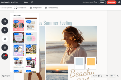
- Canva – Great for beginners and quick edits. Canva allows you to upload Shutterstock images and add or modify text with an intuitive drag-and-drop interface. Plus, it offers a wide range of fonts and styles.
- GIMP (GNU Image Manipulation Program) – A free alternative to Photoshop. It might have a steeper learning curve but is quite capable of editing text in images.
- Pixlr – An online photo editor that works directly in your browser. It’s perfect if you want to make quick edits without installing software.
In addition to these tools, you might also need basic image editing skills, such as understanding layers, selection tools, and text formatting. Most of these programs also support working with transparent backgrounds and exporting images in various formats, which is handy when customizing Shutterstock images for different purposes.
Choose the tool that best fits your comfort level and project needs. Whether you prefer a professional-grade software like Photoshop or a user-friendly online editor like Canva, having the right software will make editing text in Shutterstock images a breeze.
Step-by-Step Process to Edit Text in Shutterstock Images
Editing text in Shutterstock images might sound a bit intimidating at first, but with the right tools and a simple process, you can do it smoothly and efficiently. Let’s walk through the steps together so you can confidently customize images for your projects.
Step 1: Choose Your Image
Start by selecting an image from Shutterstock that has the text you want to change. Download the high-resolution version to ensure the best quality for editing and final use.
Step 2: Open the Image in an Editing Program
Use a photo editing tool like Adobe Photoshop, GIMP, or Canva. Photoshop is the most powerful option, but Canva is more user-friendly for beginners. Open your downloaded image in your chosen software.
Step 3: Remove or Cover the Existing Text
To replace the text, you first need to hide or erase the original. You can do this by:
- Using the clone stamp or healing brush to blend the background over the text
- Adding a solid color rectangle over the text area to cover it up
Make sure the background looks seamless so your new text will stand out naturally.
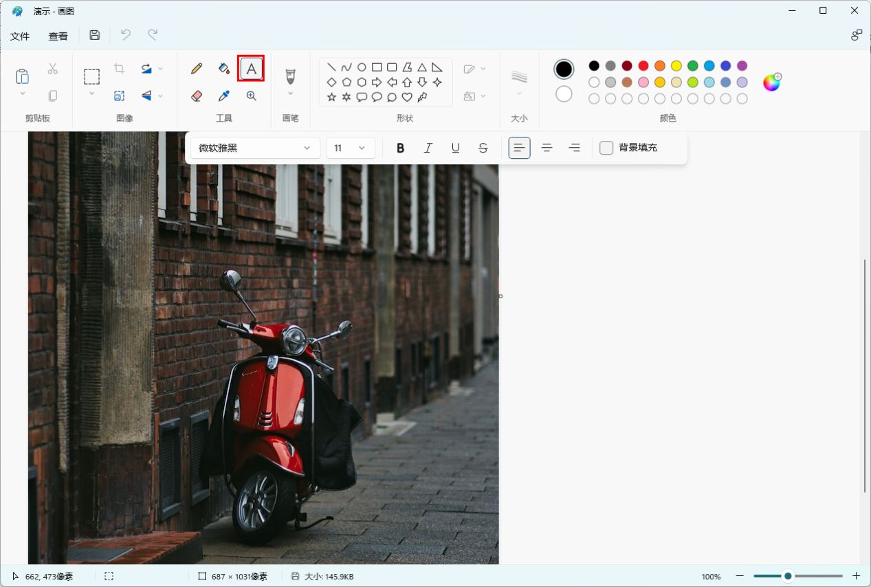
Step 4: Add Your New Text
Select the text tool in your editing program, click on the area where you want to add new text, and type your message. Choose a font style and size that match the mood and design of your image.
Step 5: Fine-tune the Text Appearance
Adjust the color, size, and placement of your new text to ensure it integrates well with the background. Use tools like shadows, outlines, or blending modes to make the text pop and look professional.
Step 6: Save Your Edited Image
Once you’re happy with the result, save your image in the appropriate format (JPEG or PNG). Keep a copy of the editable file in case you want to make further changes later.
And that’s it! With these simple steps, you can customize Shutterstock images to better fit your branding or message, making your visuals more personalized and engaging.
Tips for Making Text Look Natural and Professional
Adding text to an image isn’t just about putting words on a picture; it’s about making sure those words look integrated and polished. Here are some practical tips to help your text look both natural and professional:
Choose the Right Font
Fonts convey mood and tone, so pick one that matches your message. For a clean, modern look, go for sans-serif fonts like Helvetica or Arial. For a more elegant or classic vibe, serif fonts like Times New Roman or Georgia work well. Avoid using too many different fonts—stick to 1-2 max for a cohesive look.
Match Text Color to the Background
Ensure your text color contrasts well with the background for readability. Use color pickers within your editing software to select hues that complement the image. Sometimes, adding a subtle shadow or outline can help the text stand out even more.
Maintain Consistent Text Size and Spacing
Use consistent font sizes and line spacing to keep the text neat. Avoid overly large or tiny fonts unless it’s for a specific design purpose. Proper line spacing (leading) makes the text easier to read and looks more professional.
Use Text Effects Sparingly
Effects like shadows, embossing, or glow can enhance your text, but don’t overdo it. Subtle effects tend to look more natural. For example, a soft drop shadow can add depth without making the text look artificial.
Align Text Properly
Align your text to the left, center, or right, depending on your design. Keep alignment consistent across the image to avoid a cluttered or unbalanced appearance.
Preview and Adjust
Always zoom out or view your image at different sizes to see how the text looks in context. Make adjustments as needed to improve legibility and visual harmony.
Remember, the goal is for your text to enhance the image without overpowering it. With a little practice and attention to detail, your edited Shutterstock images will look polished, professional, and just right for your project!
Common Challenges and How to Overcome Them
Editing text on Shutterstock images can sometimes feel a bit tricky, especially if you’re new to graphic editing or working with complex images. Let’s go over some of the common challenges you might face and practical ways to tackle them.
1. Blending Text Seamlessly
One of the biggest hurdles is making the added text look like it belongs naturally within the image. Sometimes, the font or color can stand out too much or look out of place. To overcome this, consider:
- Matching Colors: Use the eye-dropper tool to pick colors from the image itself for your text.
- Adjusting Opacity: Lower the opacity of your text or add a subtle shadow to help it blend better.
- Choosing the Right Font: Pick fonts that match the mood or style of the image. For a natural look, avoid overly decorative fonts unless they suit your purpose.
2. Dealing with Complex Backgrounds
Images with busy or textured backgrounds can make it tough to read the text. To fix this:
- Add a Text Background or Highlight: Use a semi-transparent rectangle or shape behind your text to improve contrast.
- Use Drop Shadows or Outlines: Adding shadows or strokes to your text can help it stand out against cluttered backgrounds.
- Opt for Bold or Larger Fonts: Increasing font size or weight can enhance readability.
3. Maintaining Readability at Different Sizes
If your image will be viewed in various sizes, ensure your text remains clear and legible. Test your design by zooming in and out, and consider:
- Choosing Clear Fonts: Sans-serif fonts like Helvetica or Arial tend to be more readable at smaller sizes.
- Adjusting Line Spacing: Proper spacing between lines improves readability, especially for longer text blocks.
- Limiting Text Length: Keep your message concise to prevent clutter and maintain clarity.
4. Preserving Image Quality During Editing
Sometimes, editing can cause the image to lose quality, especially if you’re working with low-resolution images. To avoid this:
- Work with the Highest Resolution Available: Always use the highest quality Shutterstock image you can find.
- Save in Lossless Formats: When exporting, choose formats like PNG for sharpness.
- Avoid Over-Editing: Excessive modifications can degrade image quality, so aim for subtle adjustments.
Final Tips for Successful Text Editing in Shutterstock Images
Ready to wrap up your editing process with some pro tips? Here are some final pointers to make your text look polished and professional:
1. Keep It Simple and Clear
Less is often more. Use straightforward language and clean fonts to ensure your message is easily understood. Remember, the main goal is clarity.
2. Use Consistent Style and Colors
Maintain a cohesive look by sticking to a color palette and font choices that match your overall design theme. This consistency makes your image look more professional.
3. Preview Before Finalizing
Always zoom out or view your image on different screens to see how it appears in various contexts. Sometimes, what looks good on your screen might need tweaks for different devices or sizes.
4. Save Multiple Versions
Experiment with different fonts, colors, or layouts and save each version. This gives you options to choose from and helps you compare what works best.
5. Use Keyboard Shortcuts and Tools
Familiarize yourself with your editing software’s shortcuts. They can speed up your workflow and help you make precise adjustments quickly.
6. Keep Learning and Practicing
The more you practice editing text on Shutterstock images, the better you’ll get. Explore tutorials, join design communities, and don’t be afraid to experiment with new styles and techniques.
Remember, the key to successful text editing is patience and attention to detail. With these tips in mind, you’ll be creating stunning images that communicate your message effectively in no time!