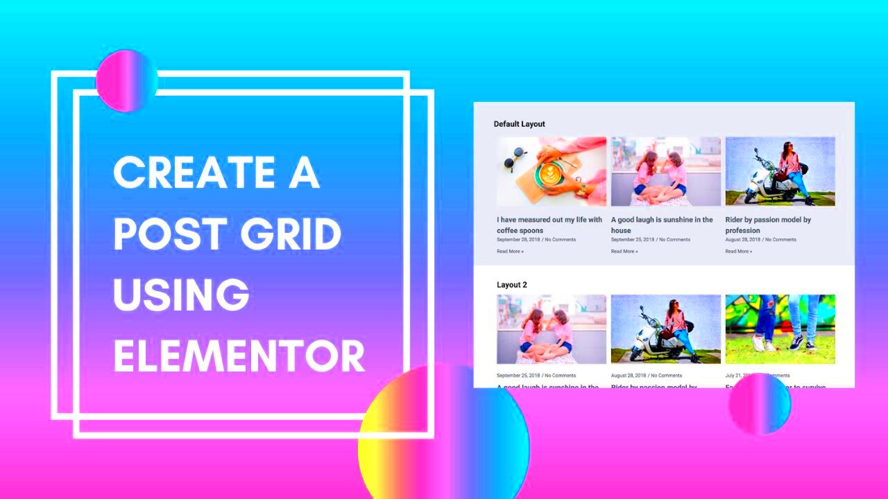
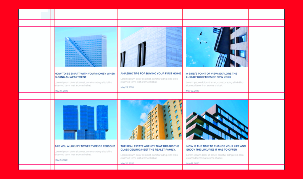
Grid designs have become a cornerstone of modern web aesthetics, particularly in the realm of WordPress. With an engaging grid layout, you can transform your website into a visually stunning experience. Grids organize content in a way that’s easy for visitors to navigate and digest, making them an excellent choice for blogs, portfolios, and eCommerce sites alike.
Whether you’re a seasoned designer or just getting started, understanding how to effectively implement grid designs can significantly enhance user experience. As visitors scroll through your site, an appealing grid can catch their attention, encouraging them to explore further.
Why Use Elementor for Grid Layouts?
Elementor has skyrocketed in popularity among WordPress users, and for good reason. Here’s why you should consider using Elementor for your grid layouts:
- Intuitive Drag-and-Drop Interface: Elementor’s easy-to-use interface invites everyone, regardless of skill level, to create stunning layouts. You can simply drag elements into place without any coding knowledge.
- Pre-Designed Templates: Elementor offers an array of grid templates pre-designed by professionals. This saves time and provides inspiration, allowing you to quickly customize designs that suit your brand.
- Responsive Design Options: With mobile-friendliness being paramount, Elementor automatically adjusts grids for different screen sizes. You can also manually tweak styles to ensure perfection on all devices.
- Dynamic Content Capabilities: Want to display blog posts, portfolios, or product grids? Elementor makes it simple to showcase dynamic content through its Post and Archive widgets.
- Advanced Styling Options: Control every aspect of your grid design, from spacing and colors to hover effects and animations, enhancing the overall visual appeal.
In conclusion, Elementor streamlines the process of creating captivating grid designs, making it a top choice for WordPress users looking to enhance their site’s aesthetics and functionality.
3. Setting Up Your WordPress Environment
Before diving into creating stunning grid designs with Elementor, it’s crucial to set up your WordPress environment correctly. A solid foundation ensures that your designs run smoothly and looks polished. Let’s break it down step-by-step.
Step 1: Hosting & Domain Name
First things first, you need a reliable hosting provider that fits your needs. You can choose from options like:
- Bluehost: Ideal for beginners with easy WordPress installation.
- SiteGround: Known for exceptional customer service and speed.
- WP Engine: Perfect for those looking for managed WordPress hosting.
Once you’ve picked your host, register a domain name that reflects your website’s purpose. Choose something catchy and easy to remember!
Step 2: Installing WordPress
Most hosting providers offer one-click installations for WordPress, making this step a breeze. Once installed, you’ll access your WordPress dashboard, where all the magic happens.
Step 3: Choosing and Installing a Theme
WordPress has thousands of themes, but for seamless integration with Elementor, choose a theme that is:
- Lightweight and fast
- Compatible with Elementor (like “Hello Elementor”)
- Customizable to suit your needs
Install your chosen theme and customize it to create a stunning backdrop for your grid designs. Don’t be afraid to experiment!
With your WordPress environment set up, you’re ready to integrate Elementor and unleash your creativity with grid designs. Let’s explore those features next!
4. Exploring Elementor’s Features for Grid Designs

Elementor is a game-changer when it comes to designing web pages, especially with grids. With a plethora of features at your disposal, you can create layouts that stand out and captivate your audience. Let’s explore them!
1. Drag-and-Drop Editor
Elementor’s intuitive drag-and-drop interface allows anyone, regardless of skill level, to mold their website just the way they envision. You simply select a widget, drag it into your workspace, and start customizing!
2. Customizable Grid Layouts
One of the standout features of Elementor is its capability to create responsive grid layouts. You can set up:
- Columns and rows easily
- Spacing and alignment according to your design
- Advanced options like equal height columns
3. Pre-built Templates
If you’re short on time, Elementor offers a library of pre-designed templates. These templates are:
- User-friendly
- Easily customizable to fit your brand
- A great starting point for creating your grids
4. Advanced Style Options
Elementor gives you full control over the style of your grid. You can manipulate:
| Style Option | Description |
|---|---|
| Typography | Change font styles, sizes, and colors to align with your brand. |
| Backgrounds | Add color, images, or gradients to make your grid stand out. |
| Hover Effects | Engage users with interesting hover animations and transitions. |
5. Responsive Design Controls
Today, it’s vital that your grid layouts look stunning on all devices. Elementor allows you to tailor your designs for desktop, tablet, and mobile views, ensuring your site is accessible everywhere.
With these features in hand, you’re ready to unlock limitless possibilities for creating visually stunning and functional grid designs using Elementor. Let your imagination run wild!
Step-by-Step Guide to Creating Your First Grid Layout
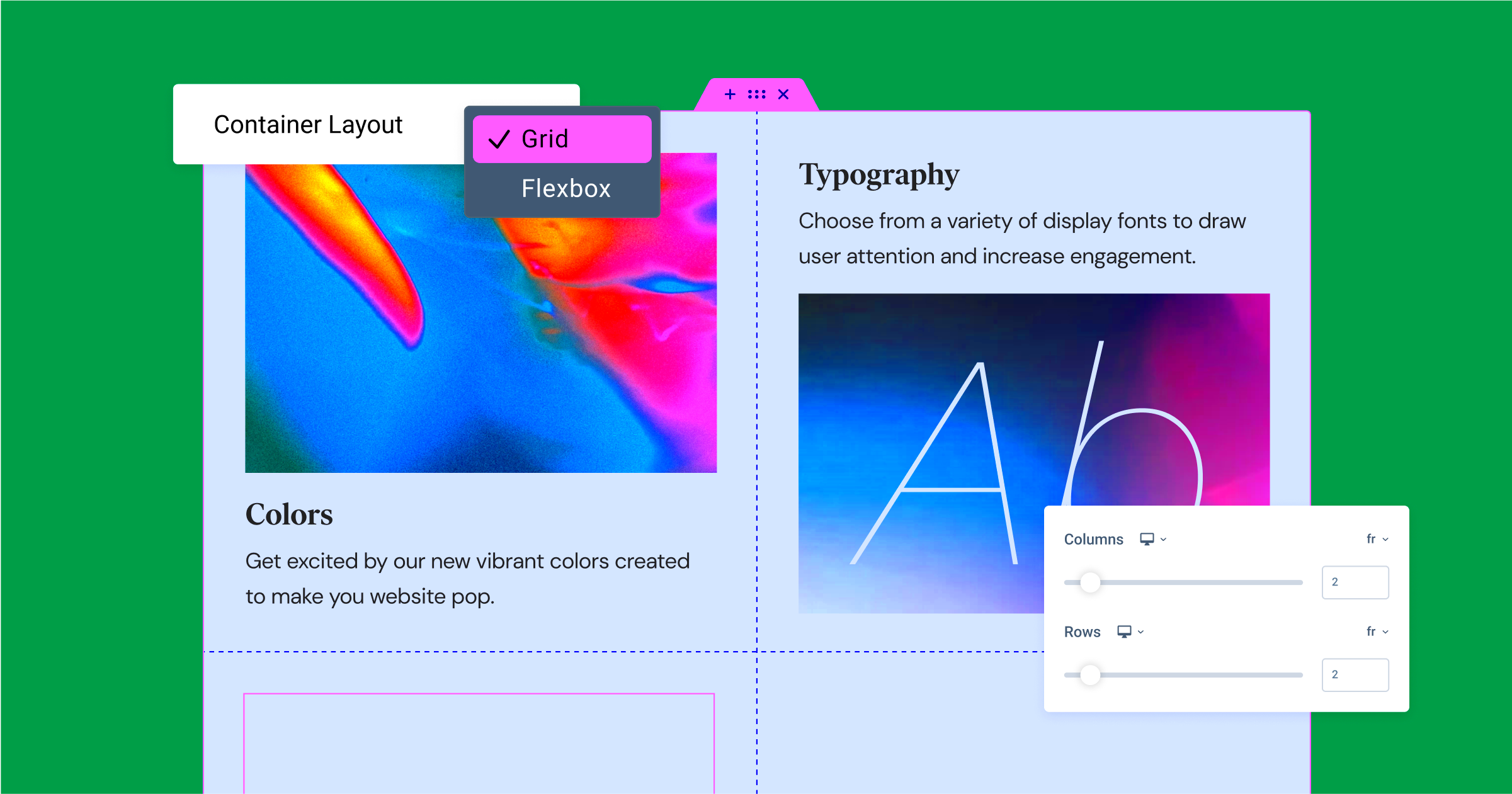
Creating your first grid layout in WordPress using Elementor can be an exciting journey! Don’t worry if you’re new to this; I’ll walk you through it step by step. It’s easier than you think! Here’s how to do it:
- Install Elementor: First things first, make sure you have the Elementor plugin installed and activated on your WordPress site. If you haven’t downloaded it yet, go to your WordPress dashboard, navigate to “Plugins,” and click on “Add New.” Search for “Elementor,” then install and activate it.
- Create or Edit a Page: Next, either create a new page by going to “Pages” > “Add New” or edit an existing one. Click on the “Edit with Elementor” button at the top of your page editor.
- Add a New Section: Once you’re inside the Elementor editor, click the “+” button to add a new section. You can choose the structure of your grid—one column, two columns, or more depending on how you envision your layout.
- Insert the Posts Widget: Drag the “Posts” or “Portfolio” widget from the Elementor sidebar into your section. This will be the backbone of your grid layout, displaying your content in a stylish format.
- Set Up Your Layout: In the widget settings, look for the layout options. You can adjust the number of columns, the spacing between items, and how many posts to display. This is where you can make your grid look just right!
- Style Your Grid: Click on the “Style” tab to customize further. Change the colors, typography, and hover effects to match your website’s aesthetic. Play around with the settings until you love how it looks!
- Preview and Publish: Once you’re satisfied with the grid, click the eye icon to preview it. If everything looks good, hit the “Publish” button. Congratulations! You’ve just created your first grid layout!
And there you have it! You’re now on your way to creating stunning grid layouts that enhance your website’s visual appeal. Happy designing!
Customizing Your Grid: Tips and Tricks
Now that you’ve created your first grid layout with Elementor, let’s dive into customizing it! Enhancing your grid layout not only makes it visually appealing but also ensures that it functions as effectively as possible for your audience. Here are some tips and tricks to make your grid stand out:
- Use Custom Breakpoints: Since many users now access websites via smartphones, ensure your grid is responsive. Use custom breakpoints in Elementor to adjust the layout for different devices. This ensures your grid looks great on desktops, tablets, and mobile phones!
- Play with Hover Effects: Add hover effects to your grid items. Elementor allows you to change colors, add shadows, or even scale images when a user hovers over them. This adds an interactive element that can engage visitors.
- Integrate Load More Buttons: For content-heavy sites, a “Load More” button can enhance user experience. Instead of overwhelming your visitors with too many posts at once, let them load additional content at their own pace.
- Experiment with Different Content Types: Your grid can display more than just posts. Consider adding a mix of images, videos, or testimonials. Elementor lets you insert various content types to keep your grid diverse and engaging.
- Utilize Custom CSS: If you’re comfortable with coding, add custom CSS for even more personalized styles. This gives you deeper control over how your grid appears, allowing you to achieve unique designs that align with your brand.
- Regularly Update Content: A grid doesn’t have to be static. Keep it fresh by regularly updating the content, adding new posts, or rotating featured items. This not only draws return visitors but also helps with SEO.
By applying these tips and tricks, you can transform a basic grid into a stunning showcase of your content. Remember, the ultimate goal is to create a user-friendly experience while presenting your information beautifully. Happy customizing!
Responsive Design Considerations
When it comes to WordPress grid designs, particularly those crafted with Elementor, responsiveness is key. In today’s world, users access websites from a myriad of devices—smartphones, tablets, laptops, and desktops. If your grid design doesn’t look great on all screen sizes, you risk losing potential visitors. Here are some key considerations for ensuring your grid designs are responsive:
- Fluid Grid Layouts: Instead of fixed widths, use percentages for grid items. This method allows elements to resize proportionally based on the viewport size.
- Breakpoint Settings: Utilize Elementor’s built-in responsive editing tools to adjust settings for different devices. Adjust padding, margins, or even font sizes specifically for mobile and tablet views.
- Custom CSS: If you’re familiar with CSS, adding media queries can further enhance responsiveness, allowing for custom styling adjustments based on screen size.
- Image Responsiveness: Make sure your images within the grid are set to max-width: 100%. This ensures they shrink appropriately without losing aspect ratio.
- Test Across Devices: Use browser developer tools or real devices to preview your designs. Testing on multiple devices will help you catch any issues that could arise.
In conclusion, ensuring your grid designs are fully responsive means considering every aspect that contributes to user experience. By taking these steps, you’ll provide a seamless browsing experience for all users, regardless of the device they’re using.
Showcasing Examples of Stunning Grid Designs
Now that we’ve covered the technical side of grid designs, let’s dive into some real-world examples that inspire creativity and show off what Elementor can do. Here are a few stunning grid design examples that effectively showcase content while appealing to the eyes:
| Grid Design Example | Description | Why It Works |
|---|---|---|
| Blogger Portfolio | A sleek grid layout showcasing article thumbnails with hover effects that reveal the post title and excerpt. | Engaging hover effects draw users in while the grid structure keeps everything organized and visually appealing. |
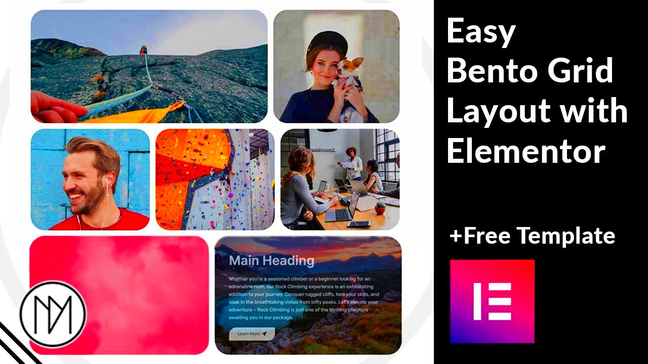
| Image Gallery | A masonry-style grid displaying images of various sizes, creating a dynamic visual flow. | The varied image sizes enhance visual interest, and the masonry layout keeps users scrolling to see more. |
| Product Showcase | A clean grid featuring product images and pricing, with a ‘quick view’ functionality. | This design makes shopping easy and efficient, enticing users to explore products without clutter. |
These examples demonstrate that grid designs can be both functional and aesthetically pleasing. Experimenting with layouts, colors, and styles can help you create a stunning site that stands out and captivates your audience. So, get creative and let your grid do the talking!
9. Common Issues and Troubleshooting
When it comes to designing creative grid layouts in WordPress using Elementor, you might run into a few bumps along the way. Don’t worry, though! Many users experience similar issues, and most of them are easy to fix. Here’s a quick rundown of the common problems you might encounter:
- Element Not Showing Up: If a widget or section doesn’t appear as expected, try refreshing the page or clearing your browser cache. Sometimes, a simple reload can fix the glitch.
- Responsive Design Issues: Your grid may look perfect on a desktop but not on mobile or tablet views. Use Elementor’s responsive editing features. Ensure you check and adjust settings for each device size.
- Slow Load Times: Grids can become heavy, especially when images aren’t optimized. Always compress images before uploading and consider lazy loading them to improve speed.
- Compatibility Problems: Issues with themes or other plugins can cause conflicts. Make sure you keep both Elementor and your theme up to date, and test for compatibility regularly.
- Custom CSS Problems: If you’re using custom CSS and something’s going awry, revisit your code for syntax errors. Even a small mistake can break the entire layout.
In case you still find yourself stuck, visit the Elementor Help Center or community forums; they’re like a treasure trove of helpful tips and solutions!
10. Conclusion: Unleashing Your Creativity with Elementor
In a world where first impressions matter, having a captivating website can set you apart from the competition. Elementor empowers you to create stunning WordPress grid designs without requiring extensive coding knowledge. The flexibility and user-friendly interface allow you to express your creativity while ensuring your site remains functional.
Remember, the magic happens when you blend creativity with practicality. Here are a few takeaways to keep in mind:
- Experiment: Don’t be afraid to try different layouts, colors, and styles. Elementor’s drag-and-drop functionality allows you to customize freely!
- Utilize Templates: Use pre-designed templates as a starting point. They can inspire your creativity and save you time.
- Stay Updated: Always keep track of the latest updates offered by Elementor. New features can unlock even more possibilities for your grid designs.
- Community Engagement: Join Elementor communities to share ideas, get feedback, and discover new trends in web design.
So, go ahead and unleash your creativity! With Elementor, the possibilities are endless, and your dream website is just a few clicks away.

