Bootstrap and WordPress are two powerful tools often used together to create stunning, responsive websites. Bootstrap is a popular front-end framework that simplifies web design with its pre-built components and grid system. On the other hand, WordPress is a flexible content management system that powers more than 40% of the web. When combined, these two technologies provide a seamless way to design visually appealing and user-friendly sites.
Using Bootstrap in WordPress allows developers to leverage the framework’s styling and layout capabilities while benefiting from WordPress‘s powerful content management features. Whether you’re a seasoned developer or just starting out, understanding how to integrate Bootstrap into your
Understanding Bootstrap Framework Basics
Before diving into how to use Bootstrap with WordPress, it’s essential to understand the framework’s core concepts. Bootstrap is built on HTML, CSS, and JavaScript, providing a responsive grid system and various UI components to help speed up the design process. Here are some key elements of Bootstrap:
- Grid System: Bootstrap’s grid system allows you to create complex layouts with ease. It uses a series of containers, rows, and columns to organize content on your website.
- Components: Bootstrap offers numerous pre-designed components, such as buttons, navigation bars, and modals. These can be easily customized, saving you time on design.
- JavaScript Plugins: Bootstrap comes with built-in JavaScript plugins for enhancing user experience, such as carousels, tooltips, and modals. You can easily integrate these features into your WordPress site.
- Responsive Design: One of the standout features of Bootstrap is its mobile-first approach, ensuring your website looks great on all devices.
By grasping these fundamental aspects of Bootstrap, you can start exploring how to effectively incorporate it into your WordPress designs, leading to more dynamic and visually appealing websites.
3. Setting Up Bootstrap in Your WordPress Theme
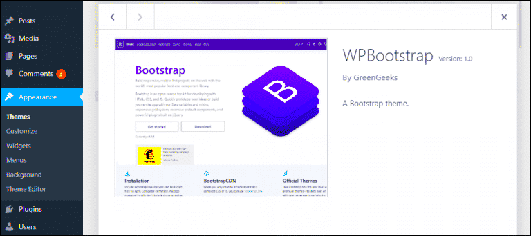
Setting up Bootstrap in your WordPress theme might seem a bit daunting at first, but once you understand the process, it can be a breeze! Bootstrap is a powerful front-end framework that can give your WordPress site a professional look and feel. Let’s break it down into simple steps.
First off, you need to determine where you want to integrate Bootstrap. Ideally, loading it in your theme’s functions.php file is the best practice. Here are the steps to follow:
- Download Bootstrap: Head over to the Bootstrap website and download the compiled version of Bootstrap, or you can use a CDN instead.
- Add Bootstrap Files: If you downloaded Bootstrap, unzip the files and place the CSS and JS files in your theme’s folder. Typically, you’ll want them in a subfolder like css and js.
- Enqueue the Styles and Scripts: Open your functions.php file and add the following code to enqueue Bootstrap:
function load_bootstrap() { wp_enqueue_style('bootstrap-css', get_template_directory_uri() . '/css/bootstrap.min.css'); wp_enqueue_script('bootstrap-js', get_template_directory_uri() . '/js/bootstrap.bundle.min.js', array('jquery'), null, true);}add_action('wp_enqueue_scripts', 'load_bootstrap');And voila! You are set up to start using Bootstrap in your WordPress theme. The real magic comes once you start implementing Bootstrap’s components into your designs. Remember, testing your site on different devices is vital for ensuring a smooth user experience!
4. Customizing Bootstrap Styles for WordPress
Once you have Bootstrap integrated into your WordPress theme, the next step is customizing the styles to make it your own. While Bootstrap provides a unified look, tweaking it to fit your design needs will help create a unique user experience. Here’s how to go about it:
Customizing Bootstrap can typically be done in two main ways:
- Overriding Default Styles: You can create a custom stylesheet (e.g., custom.css) and load it after the Bootstrap CSS file. This will allow you to overwrite any Bootstrap styles:
/* In custom.css */.btn { background-color: #FF5733; /* Your custom color */ color: white;}Here’s a quick table comparing the two customization approaches:
| Method | Pros | Cons |
|---|---|---|
| Overriding Styles | Simple, no extra setup needed | Can get messy if not organized |
| SCSS Variables | Granular control over styles | Need to set up Sass compiler |
Finally, keep testing your changes across different devices and browsers. Customizing Bootstrap styles can significantly enhance the visual appeal of your site, making it a standout in the crowded world of websites!
5. Leveraging Bootstrap Components in WordPress
When it comes to WordPress design, Bootstrap components offer a treasure trove of functionality and visual appeal. By incorporating these pre-designed elements, you can speed up your development process and enhance the user experience on your site. Here’s how to make the most of Bootstrap components within your WordPress environment:
- Navigation Bars: Bootstrap’s navigation bars can help create smooth, functional menus that are visually pleasing. Incorporate dropdowns and multi-level structures to organize your content effectively.
- Buttons: Use Bootstrap’s button styles to make your CTAs stand out. You can easily customize colors and sizes to align with your brand.
- Card Layouts: Cards are a great way to display information in an organized manner. Use them for blog post previews, team members, or services offered.
- Modals: Want to include pop-ups or alerts without redirecting users? Modals give you that flexibility and can easily be integrated into various WordPress actions.
- Forms: Bootstrap’s form components simplify data handling. You can create responsive forms that are user-friendly and mobile-compatible, ensuring potential customers engage with your offerings.
To leverage these components efficiently, you can either use them directly in your theme files or through custom shortcodes. Additionally, incorporating them via a child theme allows for seamless updates to your main theme while keeping your customization intact.
6. Ensuring Responsiveness with Bootstrap
In today’s mobile-first world, ensuring your WordPress design is responsive is crucial. Thankfully, Bootstrap is built with responsiveness at its core. Here’s how to make sure your site looks great on all devices:
- Grid System: Bootstrap’s 12-column grid system lets you design layouts that adapt to various screen sizes. It allows for fluid adjustments of content width and order based on the device.
- Media Queries: While Bootstrap’s default styles are generally responsive, customizing media queries gives you finer control over how elements behave on different devices.
- Responsive Utilities: Bootstrap provides classes for hiding or showing elements based on the screen size. You can manage visibility efficiently without cluttering your design.
- Viewport Meta Tag: Always ensure that your WordPress site includes the viewport meta tag. This guarantees proper scaling on mobile devices.
- Testing: Regularly test your site across various devices and screen sizes. Utilize browser developer tools to simulate different environments and identify any issues.
With these strategies, you can fully harness Bootstrap’s responsive capabilities, ensuring your WordPress site delivers an exceptional user experience, whether visitors are on a desktop, tablet, or smartphone.
7. Best Practices for Enqueuing Scripts and Styles
Enqueuing scripts and styles the right way in your WordPress Bootstrap theme is crucial for ensuring that your site loads correctly and efficiently. Here’s why it’s important and how you can do it right:
- Use wp_enqueue_style() and wp_enqueue_script(): Rather than directly linking to CSS and JavaScript files in your theme’s header or footer, make use of WordPress’s built-in functions –
wp_enqueue_style()for CSS andwp_enqueue_script()for JavaScript. This allows WordPress to handle dependencies and avoid conflicts. - Load Bootstrap Correctly: When adding Bootstrap, ensure you load the CSS before your theme’s custom styles so that your styles can override Bootstrap’s defaults. Enqueue the Bootstrap JavaScript file before your scripts that depend on it.
- Conditional Loading: If certain scripts or styles are only needed on specific pages, load them conditionally. This not only improves performance but also reduces unnecessary bloat on your pages.
- Use Versioning: Always add a version number to your scripts and styles. This prevents browser caching issues when you update a file. You can use
get_template_directory_uri()to link to your files and append a version number like so:wp_enqueue_style('my-style', get_template_directory_uri() . '/style.css', array(), '1.0.0'); - Dequeue Unused Scripts: If you find that your theme or plugins are loading scripts you don’t need, use
wp_dequeue_script()andwp_dequeue_style()to improve performance.
By following these best practices, you ensure that your WordPress Bootstrap theme is optimized, reducing potential conflicts and enhancing load times.
8. Optimizing Performance in Bootstrap WordPress Themes
Performance is key when it comes to web design, especially when using frameworks like Bootstrap in WordPress themes. Here are some effective strategies to optimize performance:
- Minify and Combine Assets: Reduce the number of CSS and JS files by combining them into single files and minifying them to decrease load size. Tools like WP Fastest Cache or Autoptimize can help!
- Use a Content Delivery Network (CDN): Serve your Bootstrap files from a CDN to reduce latency and increase load speed. CDNs distribute content across multiple servers worldwide, ensuring faster access for users.
- Optimize Images: Compress and properly size images before uploading them. Large images can significantly slow down your site. Use plugins like Smush to automate this process.
- Lazy Load Images: Use lazy loading to ensure that images are only loaded when they enter the viewport. This practice helps to improve page load times on the first visit.
- Leverage Browser Caching: Configure caching headers to improve loading times for returning visitors. Plugins like W3 Total Cache make this process easy.
By integrating these performance optimization techniques, you can significantly enhance the user experience when using Bootstrap within your WordPress designs. Faster loading times lead to happier users and better SEO results!
Accessibility Considerations When Using Bootstrap
When incorporating Bootstrap into your WordPress designs, accessibility should be at the forefront of your mind. Ensuring your site is accessible helps all users, including those with disabilities, enjoy a seamless experience. Bootstrap provides certain features that can enhance accessibility, but it’s important to know how to use them effectively.
Here are some key accessibility considerations to keep in mind:
- Semantic HTML: Always use semantic HTML elements to provide clarity about the structure of your content. For instance, using
<header>,<nav>, and<footer>helps assistive technologies better understand your layout. - Aria Roles: Incorporate ARIA (Accessible Rich Internet Applications) roles and attributes to enhance the accessibility of your UI components, especially when you’re customizing Bootstrap’s components or adding advanced interactivity.
- Focus Management: Make sure that interactive elements such as buttons and links are easily navigable using keyboard shortcuts. Buttons should be clearly indicated and provide visual feedback when focused.
- Color Contrast: Choose color schemes that meet WCAG (Web Content Accessibility Guidelines) contrast ratios. Poor contrast can make content difficult to read, particularly for those with visual impairments.
- Responsive Design: Bootstrap is responsive by design, which is a plus for accessibility. However, always test your layout on various devices to ensure your content remains accessible at any screen size.
By prioritizing these accessibility considerations, you’ll create a more inclusive and user-friendly WordPress site. Remember, good accessibility practices not only enhance usability but also improve your site’s SEO!
Common Pitfalls to Avoid with Bootstrap in WordPress
Jumping into Bootstrap for WordPress development can be exciting, but there are common pitfalls that can trip you up. Steering clear of these missteps will save you time, effort, and potential headaches down the road.
Here’s a list of common pitfalls to avoid:
- Over-Reliance on Default Styles: While Bootstrap provides a strong base, sticking solely to its default styles can lead to generic-looking websites. Customize the Bootstrap components to fit your brand and make your site unique.
- Ignoring Grids: Bootstrap’s grid system is dynamic and flexible. Failing to use it properly can lead to inconsistent layouts. Always adhere to a column structure and make use of Bootstrap’s responsive breakpoints.
- Neglecting Mobile Users: Bootstrap is mobile-friendly, but that doesn’t mean you can ignore mobile optimizations. Always test your designs on various devices to ensure a seamless experience for all users.
- Not Customizing CSS Properly: Customizing Bootstrap’s CSS can lead to conflicts if not done carefully. Utilize Bootstrap’s SASS variables or custom classes to ensure your styles remain manageable and easy to update.
- Failure to Optimize Performance: Bootstrap can add weight to your site. Optimize your scripts and stylesheets by only including what you need or using alternatives like Bootstrap’s CDN for better load times.
Avoiding these common pitfalls will help you leverage Bootstrap’s capabilities while crafting engaging and effective WordPress sites. Stay aware of these issues, and you’ll create a much smoother development process and a rock-solid end product!
Best Practices for Using Bootstrap in WordPress Designs
Bootstrap is a powerful front-end framework that can significantly enhance the design and functionality of a WordPress site. Leveraging its responsive design capabilities and extensive library of UI components allows developers to create visually appealing, mobile-friendly websites. Here are some best practices to consider when using Bootstrap in your WordPress designs:
- Integrate Bootstrapped Themes: Start with a Bootstrap-based theme or template that aligns with your brand style and functionality requirements.
- Customize Bootstrap: Don’t hesitate to customize the Bootstrap CSS and JavaScript to suit your specific design needs. Use SASS or LESS to build a tailored experience.
- Prioritize Responsive Design: Always ensure your designs are responsive. Bootstrap’s grid system allows you to stack and align content beautifully across different screen sizes.
- Utilize Bootstrap Components: Take advantage of Bootstrap’s ready-made components such as modals, buttons, navigation bars, and forms to enhance user interaction.
When using Bootstrap, keep accessibility in mind. Ensure that all components are keyboard navigable and ARIA roles are used correctly to create an inclusive experience for all users.
| Best Practice | Description |
|---|---|
| Theme Selection | Select a theme that utilizes Bootstrap for seamless integration. |
| Customization | Adjust Bootstrap styles to match your brand’s aesthetics. |
| Responsive Layout | Implement a fluid grid that adapts to different devices. |
| Component Usage | Use Bootstrap components for consistent user interaction. |
By following these best practices, web developers can effectively harness the power of Bootstrap to create stunning and functional WordPress websites that stand out in a crowded digital landscape.

