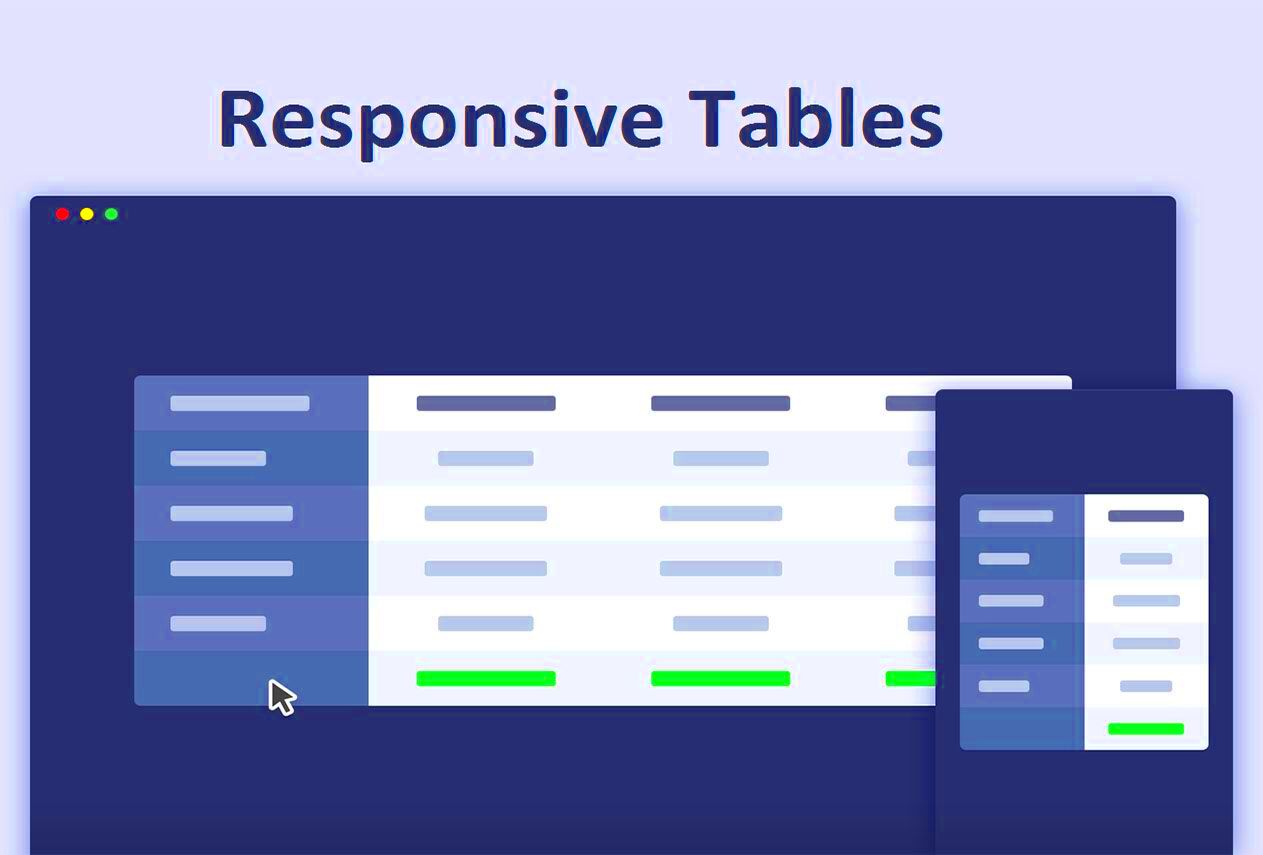
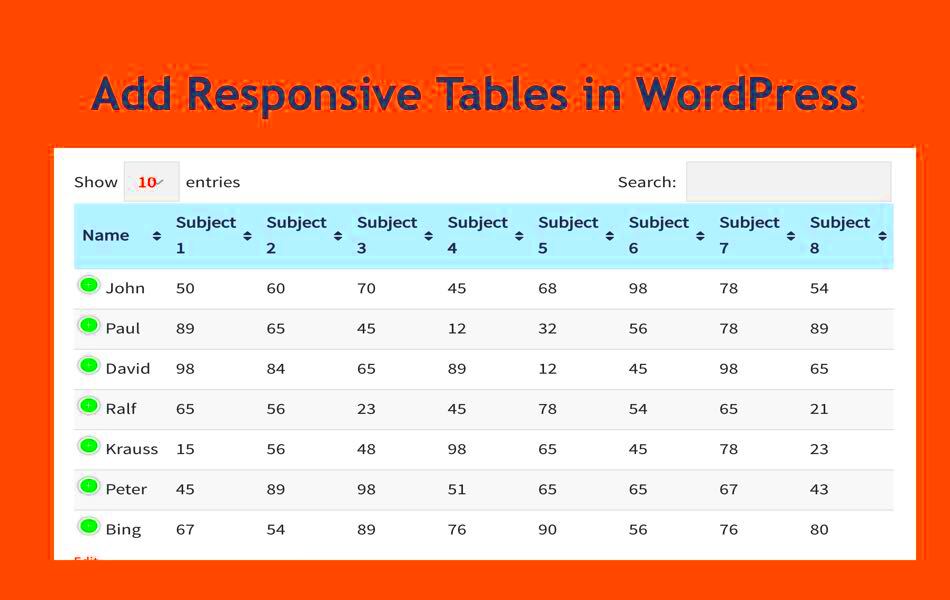
Creating a responsive table is essential for any modern website, especially when it comes to user experience. With the rise of mobile browsing, ensuring that your tables look great on all devices has never been more important. Responsive tables automatically adjust their layout based on the screen size, which means users can access information easily, whether they’re on a smartphone, tablet, or desktop. In this guide, we’ll explore the ins and outs of responsive tables in WordPress and how they can elevate your content.
Why Use Responsive Tables in WordPress?

So, you might be wondering: why should you bother with responsive tables on your WordPress site? Here are some compelling reasons:
- Improved User Experience: A responsive table ensures that visitors can read and interact with data effortlessly, regardless of their device.
- Enhanced Accessibility: Making your information accessible on various screen sizes means more users can benefit from your content.
- SEO Benefits: Google and other search engines favor websites that provide a good user experience, which can enhance your rankings.
- Professional Appeal: A well-designed responsive table can make your content appear polished and well-structured to visitors.
- Flexibility: Responsive tables can easily adapt to different types of data and display them in a format that works for all devices.
Now that you know why responsive tables are important, let’s dive into the specific steps to create them in WordPress!
Understanding Table Structure in HTML

Before diving into creating a responsive table in WordPress, it’s crucial to understand how table structures work in HTML. Simply put, an HTML table is a structured way of presenting data in rows and columns, making it easy to read and comprehend. Here’s a breakdown of the essential components of a table in HTML:
- <table>: This tag defines the start and end of a table.
- <tr>: The table row tag, which wraps around individual rows of the table.
- <th>: A table header cell, used to define header cells in a table, often styled bold.
- <td>: The table data cell tag that holds all the content/data within a row.
Here’s a simple example:
<table> <tr> <th>Name</th> <th>Age</th> </tr> <tr> <td>Alice</td> <td>30</td> </tr> <tr> <td>Bob</td> <td>25</td> </tr></table>
In this example, there are two headers (Name and Age) and two rows of data (Alice and Bob). Knowing how to structure your tables in HTML is essential because it also affects how you can style them and make them responsive. Remember, a well-organized table not only displays information but also enhances user experience on your WordPress site!
Setting Up Your WordPress Environment
Now that you have an understanding of table structure in HTML, it’s time to set up your WordPress environment for creating responsive tables. Setting up WordPress correctly lays the foundation for all your web design efforts. Here’s how to get started:
- Choose a Hosting Provider: Select a reliable hosting provider that offers easy WordPress installation. Popular options include Bluehost, SiteGround, and WP Engine.
- Install WordPress: Follow your hosting provider’s instructions for installing WordPress. Most offer a one-click installation!
- Select a Theme: Choose a responsive theme that complements your style and is compatible with tables. Look into themes like Astra or GeneratePress as they are known for flexibility and good design.
- Install Required Plugins: Consider installing plugins like TablePress for advanced table features and responsiveness or WP Table Builder for drag-and-drop ease. This can simplify the process of creating and managing your tables.
- Customize Settings: Go through the WordPress dashboard to adjust settings according to your needs. This includes permalinks, SEO settings, and general appearance settings.
After completing these steps, your WordPress environment is all set up and ready to start crafting those responsive tables. With everything in place, you can focus on sharing data beautifully across your site!
Creating a Basic Table in WordPress
Creating a basic table in WordPress is incredibly straightforward, thanks to the built-in block editor (Gutenberg). Whether you’re looking to display data, compare products, or just organize information aesthetically, tables can enhance the readability of your posts. Let’s break down the simple steps involved in crafting a neat table.
Step 1: Open your WordPress post or page where you want to add the table. Click on the “+” icon to add a new block.
Step 2: In the search bar, type “Table” and select the Table block from the list. You’ll be prompted to choose the number of columns and rows for your table. Don’t worry; you can always adjust this later!
Step 3: Once the table block is inserted, you’ll see placeholder cells where you can start entering your content. Click on each cell to type in text, numbers, or any other information you wish to include.
Step 4: If you need to add more rows or columns, simply click on the “+” sign that appears at the end of the rows or columns. Want to remove a row or column? Just hit the three vertical dots in the table block menu and choose to delete as needed.
Remember, you can easily adjust the alignment of the text in each cell by using the toolbar that appears above the block. Don’t forget that you can also insert links, images, or other media into your cells to make your table more dynamic!
And that’s it! You’ve got a simple table set up in WordPress. Next, let’s move on to how you can jazz it up a bit with some CSS styling!
Styling Your Table with CSS
Once you’ve created a basic table in WordPress, you might find that you want to customize its appearance to better match your website’s theme or to enhance its visual appeal. Fortunately, styling your table with CSS is an excellent way to do just that. CSS (Cascading Style Sheets) allows you to control the colors, borders, spacing, and overall layout of your table.
Step 1: First, you’ll want to add a custom CSS class to your table. Click on the table block, then navigate to the right-hand sidebar under the “Advanced” section. In the “Additional CSS Class(es)” field, enter a custom class name, like my-custom-table.
Step 2: Next, head over to the WordPress Customizer or your theme’s CSS settings to add your custom styles. Here’s a basic example of CSS you could use:
.my-custom-table { width: 100%; border-collapse: collapse;}.my-custom-table th { background-color: #4CAF50; /* Green */ color: white; padding: 10px;}.my-custom-table td { border: 1px solid #ddd; padding: 8px;}.my-custom-table tr:nth-child(even) { background-color: #f2f2f2;}.my-custom-table tr:hover { background-color: #ddd; /* Gray */}Step 3: Save your CSS changes and preview the page to see how it looks! You’ll notice that the table now has a cleaner and more engaging layout. Play around with different color values, paddings, or borders to find your desired look.
Customizing your table with CSS can make a huge difference in how it interacts with readers. It’s a great way to make data stand out or to simply follow a specific design pattern on your website. Go ahead, unleash your creativity!
7. Making the Table Responsive
In today’s mobile-driven world, having a responsive table is crucial for ensuring that your content looks good on any device. A responsive table adjusts to the screen size, making it easier for users to read and navigate, regardless of whether they’re on a desktop, tablet, or smartphone. So, how exactly do you make a table responsive in WordPress?
First off, you can achieve responsiveness by using CSS. That’s right! With a bit of custom coding, you can transform a standard table into a mobile-friendly format. Here’s a simple approach:
- Set up your HTML table as usual, ensuring it has the basic structure.
- Now, add a CSS class for your table. For a responsive effect, use a class like
.responsive-table. - In your custom CSS, use media queries to adjust the table styling depending on the screen size. For instance:
@media only screen and (max-width: 600px) { .responsive-table { display: block; overflow-x: auto; white-space: nowrap; }}
This approach essentially tells the table to allow horizontal scrolling on smaller screens, maintaining readability without breaking the layout. You can also use the max-width property to limit the width of your table on larger screens.
Another way to make your tables responsive is by leveraging WordPress’s built-in features. Some themes come with responsive tables out of the box, so checking your theme settings is a great starting point. By using the right combination of CSS and theme options, you can create stunning, responsive tables that enhance the user experience!
8. Using Plugins for Enhanced Functionality
If coding isn’t your jam or you want to save time, no worries! There are plenty of WordPress plugins that can help you create beautiful, responsive tables without breaking a sweat. These plugins offer additional features that significantly enhance table functionality and customization. Here’s a quick rundown of some popular options:
- TablePress: This is one of the most popular table plugins. It allows you to create and manage tables easily, and it comes with built-in responsive features. Plus, you can easily import/export tables using Excel or CSV files!
- WP Table Builder: A drag-and-drop table builder that lets you design responsive tables visually. It’s super user-friendly and perfect for beginners.
- Ninja Tables: This plugin is not only easy to use but also supports custom CSS, so you can style your tables beautifully while ensuring they remain responsive.
When choosing a plugin, look for features like:
| Feature | TablePress | WP Table Builder | Ninja Tables |
|---|---|---|---|
| Drag-and-drop interface | No | Yes | Yes |
| Responsive design | Yes | Yes | Yes |
| Import/Export CSV | Yes | No | Yes |
Using these plugins not only saves you time but also gives you the flexibility to create stunning tables tailored to your site’s aesthetics. Ultimately, whether you choose to code it yourself or use a plugin, creating responsive tables in WordPress can elevate your content and improve user engagement! So, what are you waiting for? Start experimenting and make your tables shine!
9. Testing the Responsiveness of Your Table
Once you’ve created a responsive table in WordPress, the next crucial step is testing its responsiveness across different devices. After all, the primary goal of making a table responsive is to ensure that it looks great and functions well on every screen size.
Here’s how you can effectively test your table:
- Resize Your Browser: A simple method is to manually resize your browser window. As you adjust the size, pay close attention to how your table adapts. Look for any overflow issues or elements breaking out of their intended design.
- Use Developer Tools: Most browsers come equipped with developer tools. You can usually activate this by right-clicking on the page and selecting “Inspect” or by pressing F12. Use the responsive design mode to simulate various screen sizes and orientations.
- Mobile Testing: If you have a mobile device on hand, open the site and check how the table appears. Sometimes issues are only apparent on physical devices that might render elements differently.
- Online Testing Tools: Consider using online testing tools like BrowserStack or Responsinator. These platforms allow you to see how your table looks on various devices and browsers without needing actual hardware.
By thoroughly testing your table, you can address potential issues early on and ensure a seamless viewing experience for all users.
10. Best Practices for Responsive Tables
Creating a responsive table isn’t just about making it mobile-friendly; it’s also about ensuring it’s user-friendly and visually appealing. Here are some best practices you should adopt while designing your responsive table:
- Keep It Simple: Limit the amount of information displayed. If the table becomes too cluttered, it can overwhelm users. Try to present only the most crucial data to maintain clarity.
- Use Clear Headers: Use headers to clearly label your rows and columns. This will help users understand the information at a glance, making navigation easier, especially on smaller screens.
- Utilize Scrollable Tables: When dealing with wide tables that contain a lot of data, consider making your table scrollable horizontally. This allows users to scroll through details without compromising the overall layout.
- Prioritize Content: On smaller screens, think about which data is most important. You can choose to hide less critical columns or use an accordion-style for additional details.
- Test Regularly: Ultimately, always revisit and test your tables whenever you update your content or the WordPress theme. What worked before might not function well after changes, so stay vigilant.
When you follow these best practices, your responsive tables will not only look great but will also enhance the overall user experience, making information more digestible for everyone!
Conclusion
Creating a responsive table in WordPress is essential for providing an optimal viewing experience across various devices. By following the steps outlined in this blog post, you can enhance the usability of your content significantly. Responsive tables ensure that your data is easily readable on mobile phones, tablets, and desktops, improving user engagement and satisfaction.
Here’s a quick recap of the methods you can use to create responsive tables in WordPress:
- Using Plugins: Leverage plugins like TablePress or WP Table Builder to easily create and manage responsive tables without needing to code.
- Custom CSS: Write custom CSS to make static tables responsive. Utilize media queries and overflow properties to adjust your tables on smaller screens.
- HTML & CSS: Manually code your tables with HTML for structure and CSS for styling to ensure responsiveness across devices.
In summary, whether you choose to use a plugin or write custom code, creating a responsive table is a straightforward process that enhances the effectiveness of your WordPress site. By prioritizing responsiveness, you cater to a diverse audience and provide an improved user experience.


