Are you looking to give your WordPress blog a fresh new look? One of the simplest yet most impactful changes you can make is adjusting the width of your blog. Whether you want to create a more spacious feel or squeeze in more content, changing the width can make a world of difference. In this post, we’ll explore how to modify the blog width in WordPress, diving into the default settings, step-by-step methods, and some handy tips along the way. Let’s get started!
Understanding the Default Blog Width in WordPress

Before we hop into the nitty-gritty of changing the width, let’s first understand what the default blog width is and why it matters. Most WordPress themes come with a pre-defined width that dictates how your content is displayed. This width can significantly affect the overall layout and visual appeal of your blog.
Here are some key points to consider:
- Standard Width: Typically, themes have a standard width ranging from 600px to 1200px. This varies by theme.
- Responsive Design: Many modern themes automatically adjust to different screen sizes, so the blog width isn’t always static across devices.
- Impact on Readability: A wider blog can improve readability by allowing for more white space, while a narrower width might make reading on mobile devices easier.
Understanding how your blog’s width is set up gives you a better idea of what changes will be effective. Here’s a simple comparison table of common factors related to blog width:
| Aspect | Narrow Width (600px) | Standard Width (800px) | Wide Width (1200px) |
|---|---|---|---|
| Content Density | High | Medium | Low |
| Readability on Mobile | Excellent | Good | Fair |
| Visual Appeal | Compact | Balanced | Spacious |
Now that we have a grasp of the default blog width and its implications, we can move on to adjusting it to suit your needs!
Method 1: Changing Width via the WordPress Customizer

Are you looking to tweak the width of your blog? The WordPress Customizer makes this no-fuss and straightforward, allowing you to see changes in real-time. It’s a great option if you’re not too familiar with coding and want quick adjustments. Here’s how to do it!
- Log into Your Dashboard: Start by logging into your WordPress dashboard. You’ll need administrative access to modify the width settings.
- Access the Customizer: On the left sidebar, go to “Appearance” and then select “Customize.” This will open up the WordPress Customizer.
- Look for Layout Settings: In the Customizer, navigate to “Layout” or “General Settings.” The naming can vary based on your theme.
- Adjust Width: Find the option for “Content Width” or “Site Width.” You can often adjust this using a slider or by entering a specific pixel value.
- Preview Changes: As you make adjustments, take a look at the live preview on the right side of the screen to see how it affects your blog.
- Publish: Once you’re satisfied with the new width, click on the “Publish” button to apply the changes to your site.
And there you have it! That was easy, right? With just a few clicks, you’ve transformed the look of your blog. Remember, changes made via the Customizer are usually theme-specific, so keep that in mind when switching themes.
Method 2: Editing CSS for Custom Width

If you’re comfortable with a little bit of coding, editing CSS can give you fine control over the width of your blog. This method is ideal when you need specific adjustments that the Customizer doesn’t cover. Let’s break it down!
- Log into Your Dashboard: Similar to the first method, start by logging into your WordPress dashboard.
- Navigate to Additional CSS: Go to “Appearance” and click on “Customize.” In the Customizer, you’ll see an “Additional CSS” option at the bottom of the left panel.
- Add Custom CSS: Here, you can enter your CSS code to control the width. For example:
| CSS Code | Description |
|---|---|
body { max-width: 1200px; margin: 0 auto; } |
This sets the maximum width of your body content to 1200 pixels and centers it. |
.container { width: 80%; } |
This adjusts your content container to take up 80% of the available width. |
- Publish Your Changes: Once you’re done, hit the “Publish” button to save your changes.
- Test on Different Devices: After saving, check your blog on various devices to ensure width adjustments look good on mobile and desktop.
And just like that, you’ve updated your blog’s width using CSS! This method might take a bit of practice, but it provides great flexibility to customize your site just the way you want it. Always remember to backup your CSS before making significant changes to avoid any mishaps!
Method 3: Using a Page Builder Plugin
Are you looking for an easy way to change the width of your blog without getting too technical? A page builder plugin is your go-to solution! These intuitive tools let you create custom layouts that suit your blog’s personality, all without writing a single line of code.
Page builder plugins like Elementor, Beaver Builder, or WPBakery come packed with features that allow for precise control over your blog’s layout. Here’s how you can leverage a page builder:
- Install and Activate: First, you’ll need to install a page builder plugin of your choice. Just head to your WordPress dashboard, go to Plugins, and search for the desired plugin. Click “Install” and then “Activate.”
- Create or Edit a Page: Once the plugin is activated, you can either create a new page or edit an existing one. Most page builders have a “Edit with [Plugin Name]” button that makes this super easy!
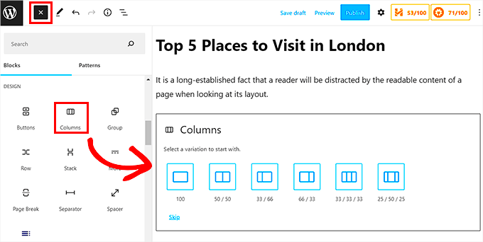
- Adjust Width: In the page builder interface, you can easily change the width by dragging and adjusting the columns. Most builders will have options to set exact pixel values or percentages for container widths.
- Preview and Publish: Always preview your changes to see how they’ll look on different devices. If you like what you see, hit that publish button!
With a page builder, the possibilities are endless. You can customize not just width but also margins, paddings, and even more intricate layouts—perfect for creating a unique blogging experience!
Method 4: Modifying Theme Files (Child Theme Recommended)
Now, if you’re a little more tech-savvy and willing to dive into some code, modifying your theme files can give you complete control over your blog’s width. But tread carefully; it’s essential to use a child theme to ensure your changes aren’t lost when the parent theme updates!
Here’s a quick guide on how to modify theme files:
- Set Up a Child Theme: If you haven’t done this already, create a child theme. This involves creating a new folder in your themes directory and adding a style.css and functions.php file with appropriate headers.
- Locate the Correct File: Find the CSS file that controls the layout. Typically, this will be within your theme’s style.css or a custom CSS file.
- Modify the Width: Look for width settings, which could be defined in percentages or pixels, such as
width: 80%;. Change these values as per your requirement. For example, if you want it more narrow, adjust it towidth: 70%;. - Test Your Changes: Save your changes and refresh your blog to see how it looks. Make sure to clear your cache if things don’t appear as expected.
While coding might seem intimidating, a little trial and error can go a long way. Just remember to back up your files before diving in! Modifying theme files gives you precision and flexibility, allowing you to tailor every inch of your blog.
7. Best Practices for Responsive Design
Responsive design is all about ensuring that your blog looks great on any device, be it a desktop, tablet, or smartphone. If you’re looking to change the width of your blog in WordPress, incorporating best practices for responsive design is vital. Here are some tips to keep in mind:
- Use Fluid Grid Layouts: Instead of fixed widths, utilize percentages for widths. This approach allows your blog components to resize according to the screen size.
- Flexible Media: Ensure that images, videos, and other media elements scale according to their parent containers. Using CSS properties like
max-width: 100%;can help. - Mobile-First Approach: Start designing for the smallest screens first before scaling up to larger devices. This helps prioritize essential content for mobile users.
- Viewport Meta Tag: Always include the viewport meta tag in your site’s header to control the layout on mobile browsers. It’s as simple as adding:
<meta name="viewport" content="width=device-width, initial-scale=1">. - CSS Media Queries: Use media queries to apply different styles based on device characteristics like width and orientation. Here’s a small example:
@media (max-width: 768px) { .blog-post { width: 90%; }}By incorporating these best practices into your blog design, you can create a seamless user experience, regardless of the device your audience is using. Remember, the more adaptable your blog is, the more likely users will stick around!
8. Testing Your Changes
After you’ve made adjustments to the width of your blog, testing those changes is crucial. You want to ensure everything looks and functions as intended across various devices. Here’s how you can effectively test your changes:
- Use Responsive Design Tools: Tools like Google Chrome’s Developer Tools or Firefox’s Responsive Design Mode allow you to simulate different screen sizes right from your desktop. Just press
F12to access these features. - Cross-Browser Testing: Make sure to check how your blog appears on different web browsers. Sometimes, variations occur due to how browsers render CSS and HTML. Tools like BrowserStack can be quite handy.
- Test on Real Devices: While tools are great, nothing beats testing on actual devices. Make sure to check your blog on various smartphones and tablets to see how it performs.
- Check Accessibility: Ensure that all users, including those with disabilities, can access your content. Tools like WAVE or Lighthouse can help evaluate your blog’s accessibility.
- Monitor Load Times: Changes in width can impact how quickly your blog loads. Use tools like Google PageSpeed Insights to analyze load times and optimize accordingly.
Remember, testing is an ongoing process. After implementing changes, keep an eye on user feedback and analytics to understand how well your blog design is performing. Adjust as necessary, and you’re well on your way to providing a better experience for your readers!
Conclusion
Changing the width of your blog in WordPress can significantly enhance the user experience and improve the visual appeal of your site. By adjusting the content width, you can ensure that your blog is optimized for various devices, be it desktop or mobile. Here are a few key steps to remember when implementing width changes:
- Use CSS: Customizing the width through CSS allows for greater control over layouts. Implement custom styles in the
style.cssfile or through the theme customizer. - Page Builders: Utilize page builders like Elementor or WPBakery for a drag-and-drop option that simplifies width adjustments without coding.
- Responsive Design: Ensure your adjustments are responsive. Consider using percentages instead of fixed pixel values to create a fluid layout.
- Theme Options: Some WordPress themes come with built-in options to adjust layout widths. Check your theme’s documentation for layout settings.
- Preview Changes: Always preview your changes before publishing. This helps you see how adjustments will look on various devices.
By following these guidelines, you have the potential to transform your blog’s layout and functionality. Taking into consideration both aesthetics and usability aspects will contribute to your blog’s success.


